Written by:

Reviewed by:

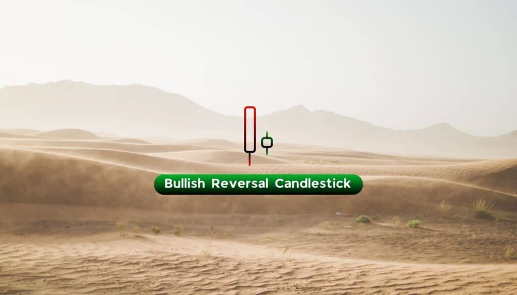
Bearish
Bullish
- November 24, 2025
- 25 min read
How to Read Candlesticks (Charts, Patterns for Beginners)
Do you ever wonder what the language of a chart really means?
Every candle on a chart tells a story about who’s in control, the buyers or the sellers. Each movement, colour, and shape reflects the emotions driving the market at that moment. Candlestick charts translate market movement into a visual language traders can understand at a glance.
In this guide, you’ll learn how to read candlesticks, understand their key parts, and recognise common patterns across markets so you can read price action confidently and make better trading decisions.
What Is a Candlestick Pattern?
A candlestick pattern is a visual formation on a chart that represents market sentiment and potential price direction based on one or more candles. Each pattern reflects the ongoing battle between buyers and sellers, helping traders anticipate reversals or continuations in price movement.
A candlestick chart displays the price movement of an asset over a specific time period, using candles instead of simple lines. Each candle shows four key data points: the opening, closing, highest, and lowest prices, giving a complete picture of market activity.
These patterns form when one or more candles align in a specific way, signalling potential changes in market direction. For example, a bullish engulfing pattern often suggests an upcoming move to the upside, while a bearish engulfing pattern may indicate further price declines.
Originating from Japanese rice trading centuries ago, candlestick charts have become a cornerstone of modern technical analysis. Today, traders use them across markets from forex to commodities and cryptocurrencies—to identify bullish or bearish biases and recognise high-probability setups.
How to Read Candlesticks

Japanese candlesticks in trading appear as rectangles that define whether the price of an asset has increased or decreased within a timeframe.
Candlesticks commonly appear in a few colours:
- Green for bullish, red for bearish
- White for bullish, black for bearish
Each candlestick can also have a thin line, known as a tail or a wick, extending from the top or bottom of the body. Wicks show the highest and lowest prices reached during the candle’s time period, representing price levels that were visited but not sustained by the time the period closed.
For example: If a candle starts at $1.50, closes at $1.40, but has a long wick going up to $2, that means the price managed to push higher to $2 — but failed to sustain that bullish price. The market did not view $2 as a fair price for the asset and thus rejected the higher price, causing a wick to occur.
How to Read Candlesticks in Forex?
In the forex market, currencies are quoted in pairs such as EUR/USD or GBP/USD. The first currency in the pair (EUR in EUR/USD) is the base currency, while the second (USD) is the quote currency. The exchange rate shows how much of the quote currency is required to buy one unit of the base currency.
Each candlestick represents how the exchange rate between the two currencies changes during a specific period:
- A green candle shows that the closing price was higher than the opening price, meaning buyers dominated during the timeframe in which the candle formed.
- A red candle shows that sellers were dominant, with the price closing below the opening level, indicating downward pressure during that same timeframe.
Each timeframe defines how long it takes for a candlestick to form completely from its open to its close. A daily candle forms over 24 hours, while a 15-minute candle forms in just 15 minutes. If you were trading on a 1-hour timeframe and it’s 8:00 AM, the candle will close at 9:00 AM.
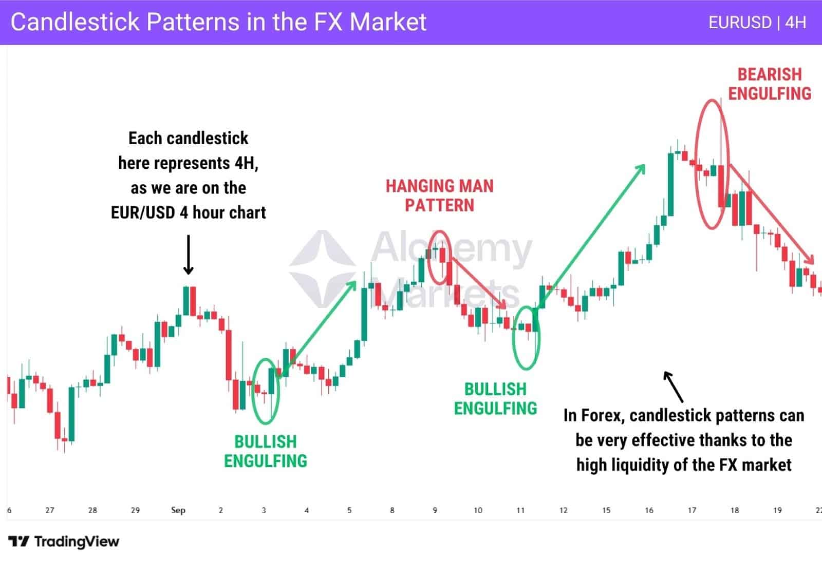
The forex market is one of the most liquid and efficient markets in the world. Due to its high trading volume and the constant flow of economic data such as inflation figures, employment reports, and central bank announcements, candlestick patterns tend to be more reliable here than in other markets, especially on higher timeframes.
Since currencies are traded in pairs, each candle reflects the relative strength or weakness between two economies, helping traders identify continuation or reversal points with greater accuracy.
How to Read Candlesticks in Crypto?
In the crypto market, candlesticks help bring structure to an environment known for high volatility and emotional trading behaviour. Prices can move sharply within minutes, forming large candles with extended wicks that represent sudden surges or drops in momentum.
A strong green candle signals aggressive buying, while a long upper or lower wick can indicate uncertainty or profit-taking. Compared to forex, the crypto market is less efficient and less liquid, so candles tend to look more irregular with large wicks.
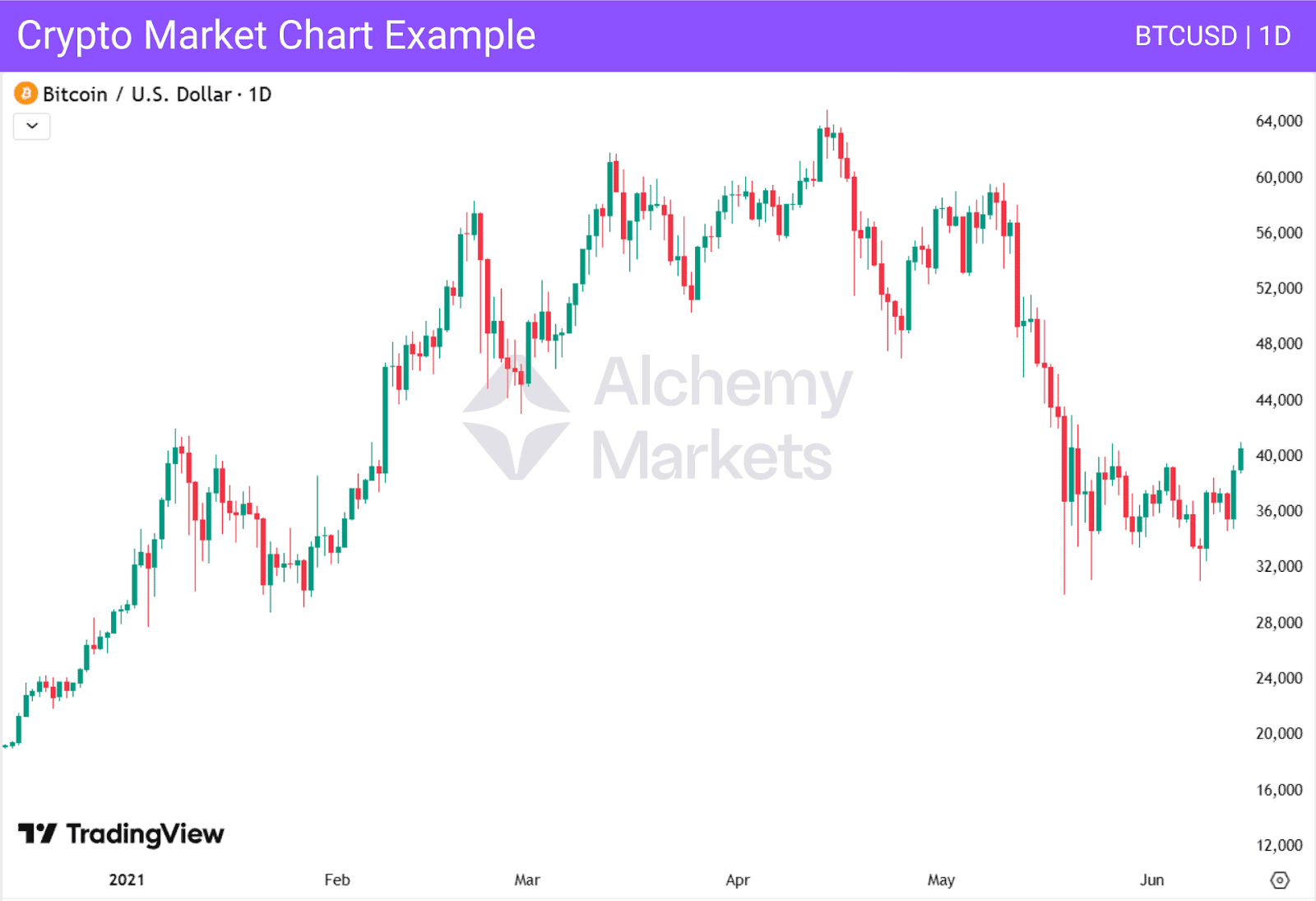
The Bitcoin daily chart above shows how quickly price sentiment can shift. Large candles and deep wicks reflect emotional reactions in the market, making context essential when analysing candlestick patterns.
Traders interpret candles alongside overall market trend, Bitcoin dominance, and news sentiment to understand whether momentum is likely to continue or reverse.
How to Read Candlesticks in Commodities?
In commodities trading, candlestick charts reveal how supply and demand shape price movements in assets such as Oil, natural gas, or cotton.
These markets often show stronger trending behaviour compared to forex or crypto, as prices react to real-world fundamentals like weather conditions, harvest data, or trade policies.
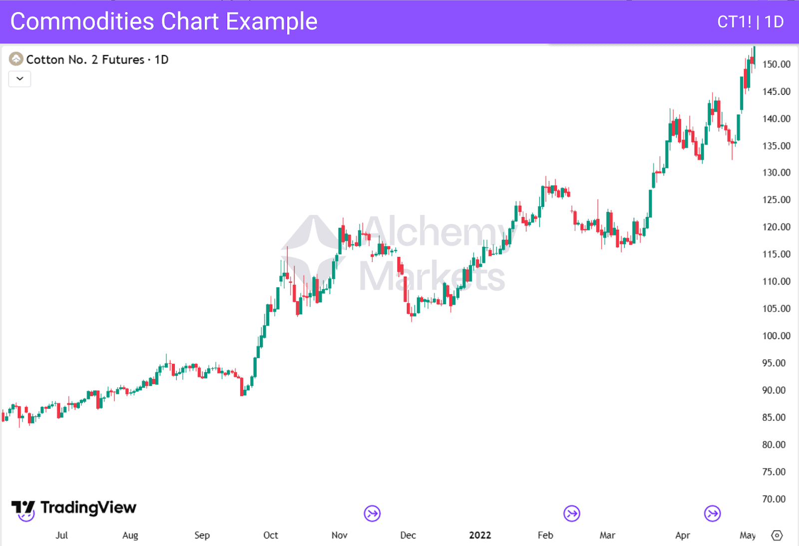
As shown in the Cotton No. 2 Futures chart above, a sequence of strong green candles reflects an upward trend driven by increased demand or limited supply. Conversely, several red candles in a row may indicate oversupply or declining consumption.
Commodities often have a stronger connection to the real economy, meaning that changes in production, inventories, exports, or supply shocks can influence price trends.
In contrast, the forex market is highly efficient and reacts quickly to macroeconomic and monetary policy shifts. Because of this, traders in commodities often combine candlestick analysis with fundamental data to determine whether a move reflects structural change or short-term sentiment. This helps identify opportunities in the market, whether for the short or long term.
How to Read Candlesticks for Day Trading?
For day traders, candlestick reading is about timing, precision, and adapting to session dynamics.
Day traders tend to use timeframes from 15 minutes to observe short-term price action, up to the daily timeframe to identify the overall trend and whether the market was bullish or bearish on a specific day based on the daily candle.

In day trading, volatility shifts throughout the trading session, mainly across three key sessions:
- Asian Session (00:00–09:00 GMT): Typically quieter with smaller ranges and slower momentum. Liquidity is lower, and price often consolidates as most European and American traders are offline.
- London Session (07:00–16:00 GMT): Known for higher volatility and stronger trends. It overlaps with Asian markets early on, creating breakouts, and later with New York, when volume and momentum peak.
- New York Session (12:00–21:00 GMT): This session brings sharp movements and often sets the final intraday direction, especially in the forex market. Major U.S. economic data such as Non-Farm Payrolls (NFP), CPI, GDP, FOMC statements, and interest rate decisions frequently cause strong reactions.
The U.S. dollar is involved in about 88% of all forex transactions, according to the latest Bank for International Settlements (BIS) 2022 report.
As the forex market is the largest financial market in the world, this dominance means that when U.S. traders and institutions become active, price movements accelerate, especially during the London and New York overlap between 12:00 and 16:00 GMT, which is known as the most volatile period of the trading day.
Understanding how candles form and behave within each session helps traders anticipate when volatility is likely to rise or fade, improving timing and precision for intraday setups.
Candlestick Components
Each candlestick represents a complete snapshot of market activity within a set period. It shows where the price opened, how high and low it moved, and where it finally closed.
The body and wicks reveal the battle between buyers and sellers, while the candle’s colour indicates who won that round.
Together, these elements create a visual record of price movement that helps traders interpret momentum, strength, and potential continuation or reversal within the market.
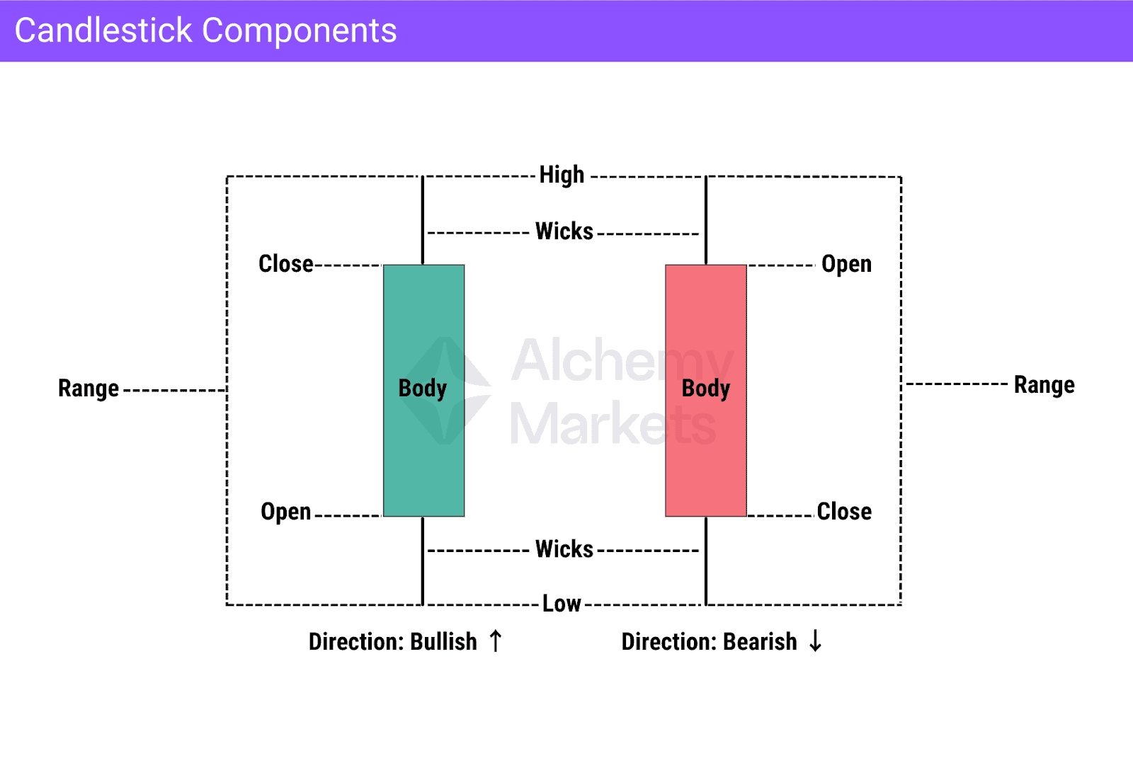
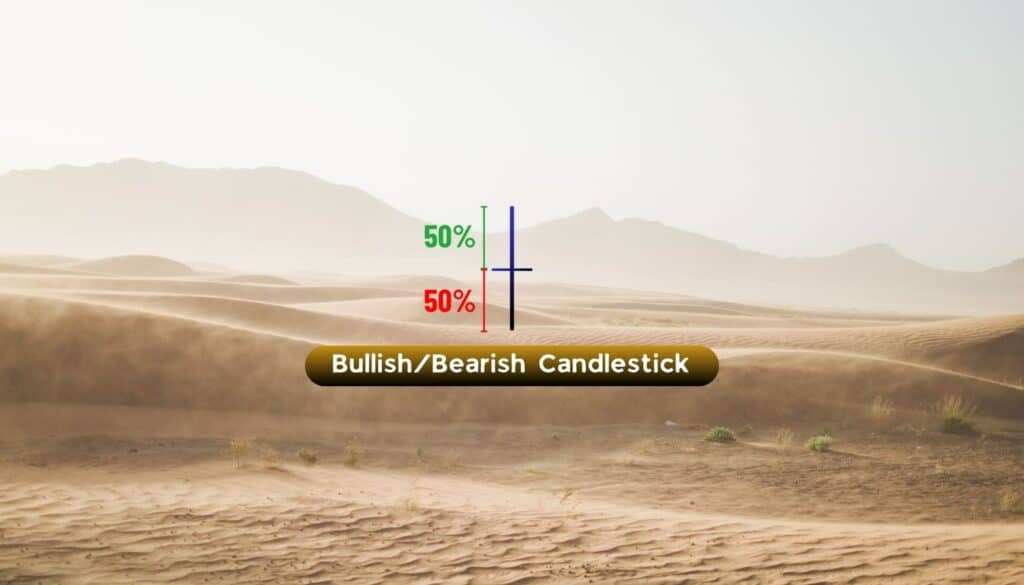
Body
The body is the central part of a candlestick and displays the distance between the opening and closing prices.
A large body indicates strong participation and clear control by either buyers or sellers:
- When the close is above the open, the candle is bullish and usually shown in green.
- When the close is below the open, it’s bearish and often red.
Short bodies suggest indecision or consolidation, where neither side dominates.
Wicks
Wicks, also known as shadows or tails, extend above and below the body to mark the highest and lowest traded prices during the period.
The upper wick shows how far buyers pushed price before sellers stepped in, while the lower wick shows how far sellers drove price before buyers responded.
Long wicks on either side often signal rejection or exhaustion. For example, a long upper wick may warn of fading buying pressure, while a long lower wick can reveal hidden strength from buyers.
Open
The open marks the first traded price of the session and sets the initial tone for that candle. Comparing the open to the close reveals whether buying or selling dominated.
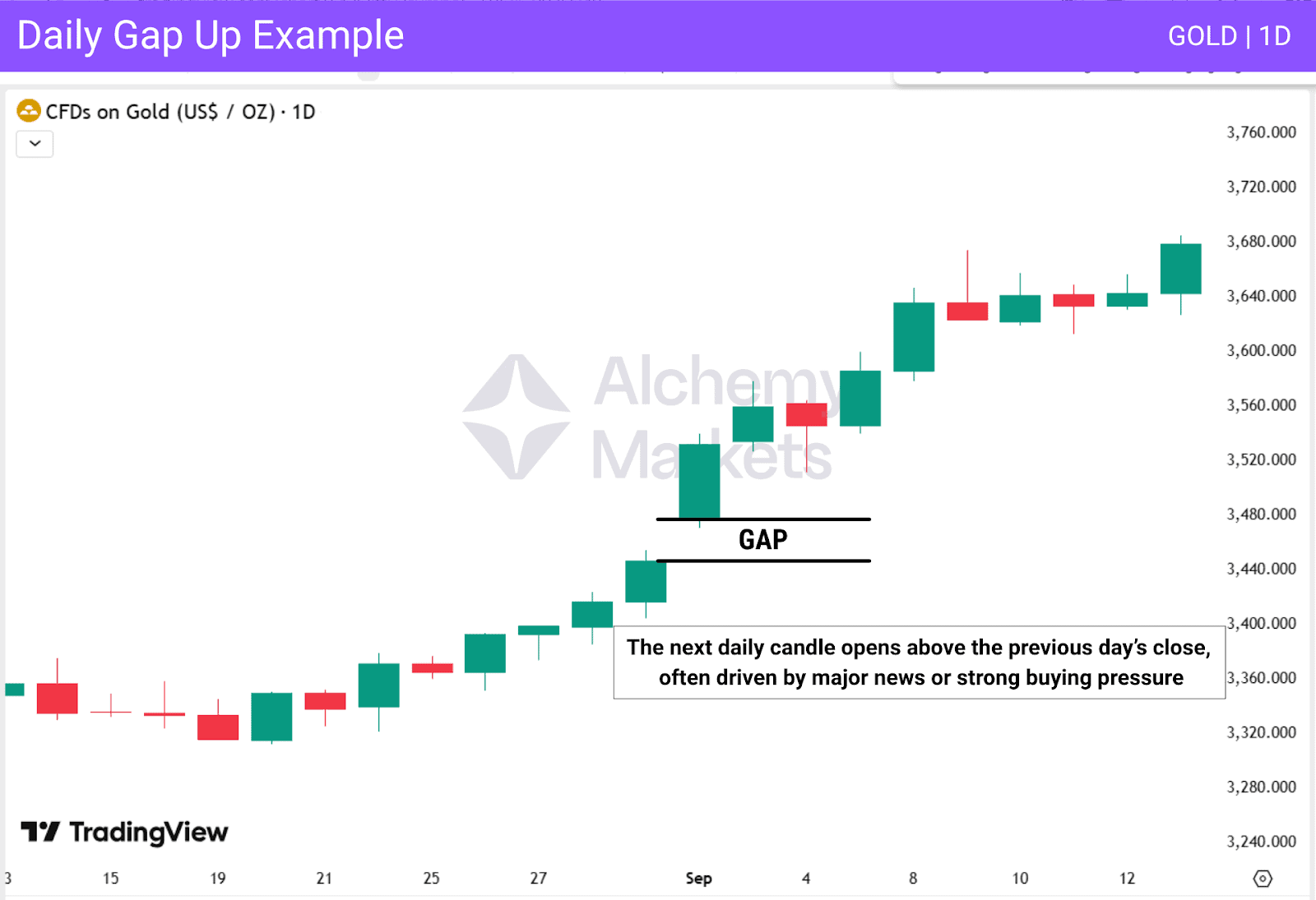
In volatile markets, a large gap between opens across candles can also highlight changes in momentum or strong news impact.
High
The high represents the maximum price reached during the candle’s timeframe. It reflects the top of buying pressure before sellers entered.
A candle closing near its high often confirms bullish strength, while repeated highs near the same level can form resistance zones that traders watch for possible reversals.
Low
The low shows the minimum price traded in that period, revealing the deepest point of selling pressure.
A candle closing near its low usually signals bearish sentiment, while a sharp rebound from the low leaves a long lower wick, often interpreted as potential buying interest or support.
Close
The close is the final traded price of the candle and the most important value for technical analysis. It defines whether the candle ends bullish or bearish and confirms market sentiment for that period.
Analysts often compare candle closes across multiple candles to identify trends or upcoming shifts in momentum.
Direction
Direction indicates whether price moved upward or downward between open and close. A candle that closes higher suggests bullish movement, while one closing lower reflects bearish momentum.
Monitoring directional consistency over several sessions helps traders assess trend strength and decide whether to align with or trade against prevailing market flow.
Range
Range measures the total distance between a candle’s high and low. A wide range signals strong volatility and decisive activity, whereas a narrow range shows consolidation or uncertainty.
Tracking the expansion and contraction of ranges helps traders understand market energy and anticipate breakouts or fading momentum.
What Do Candlesticks Tell Us?
Candlesticks provide traders with valuable information about market sentiment and structure. A single candle can reveal several key insights:
Direction Bias
The relationship between the opening and closing prices shows the market’s directional bias.
A green candle often signals a bullish bias, while a red candle indicates a bearish one. However, this signal becomes more reliable when aligned with other factors such as support and resistance. For example, if a green candle forms at a support level, it can confirm that price may rise. In the opposite scenario, when a red candle forms near resistance, price is more likely to move lower.
Strength
The size of the body indicates the strength behind a move. A large body shows strong momentum and conviction, while a smaller body compared with previous candles suggests hesitation or reduced activity.
Rejection
The wicks, or shadows, show where price was rejected. A long upper wick reveals failed attempts to move higher, while a long lower wick suggests buyers defended that level. Rejection becomes more meaningful when it occurs at known support or resistance areas.
Key Levels
A single candle, especially from a higher timeframe, can outline important key levels that traders use to analyse and trade the market.
The high, low, open, and close of a daily or weekly candle often act as strong levels where future reactions may occur.

Timing
Candlesticks also reveal how price behaves over a specific period. For example, a single weekly candle summarises the entire story of how price moved during that week — from its open to its highs and lows to its close.
By zooming into lower timeframes, traders can study how that candle was formed in detail, gaining a clearer view of intraperiod structure and shifts in momentum.
Candlestick Patterns Examples
The chart below of USD/JPY on the 4-hour timeframe highlights several classic candlestick formations and how they signal potential shifts in market sentiment:
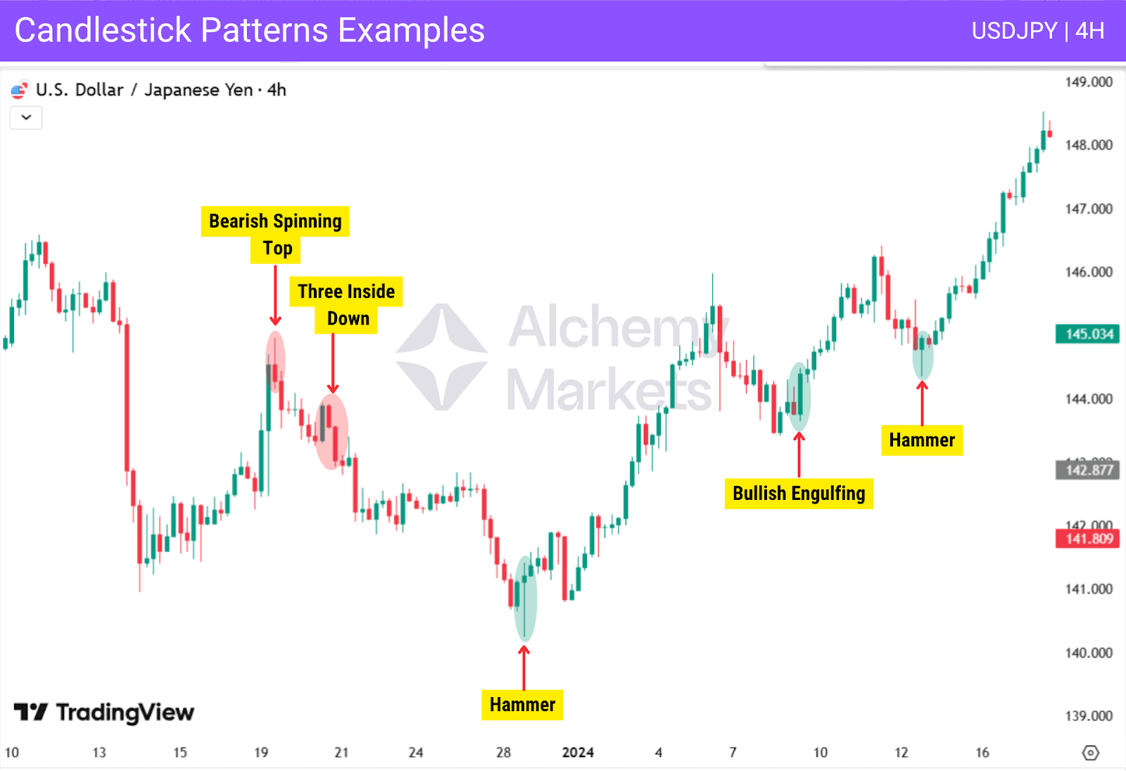
At first, price action was bearish, forming a series of large red candles that showed strong selling momentum. After this decline, buyers stepped in and prices began to recover. A Bearish Spinning Top then appeared near the top of the rebound, signalling indecision and a potential slowdown in buying pressure. It was soon followed by a Three Inside Down pattern, confirming bearish sentiment and marking the start of a short-term reversal.
Later, a Hammer appeared, indicating that sellers were losing momentum and buyers had started to step in. Price then developed a series of bullish candles as buyers drove the market higher.
After a brief pullback, new bullish patterns such as a Bullish Engulfing and a Hammer formed, showing renewed buying strength and confirming the continuation of the upward move.
Basic Candlestick Patterns for Beginners
Hammer
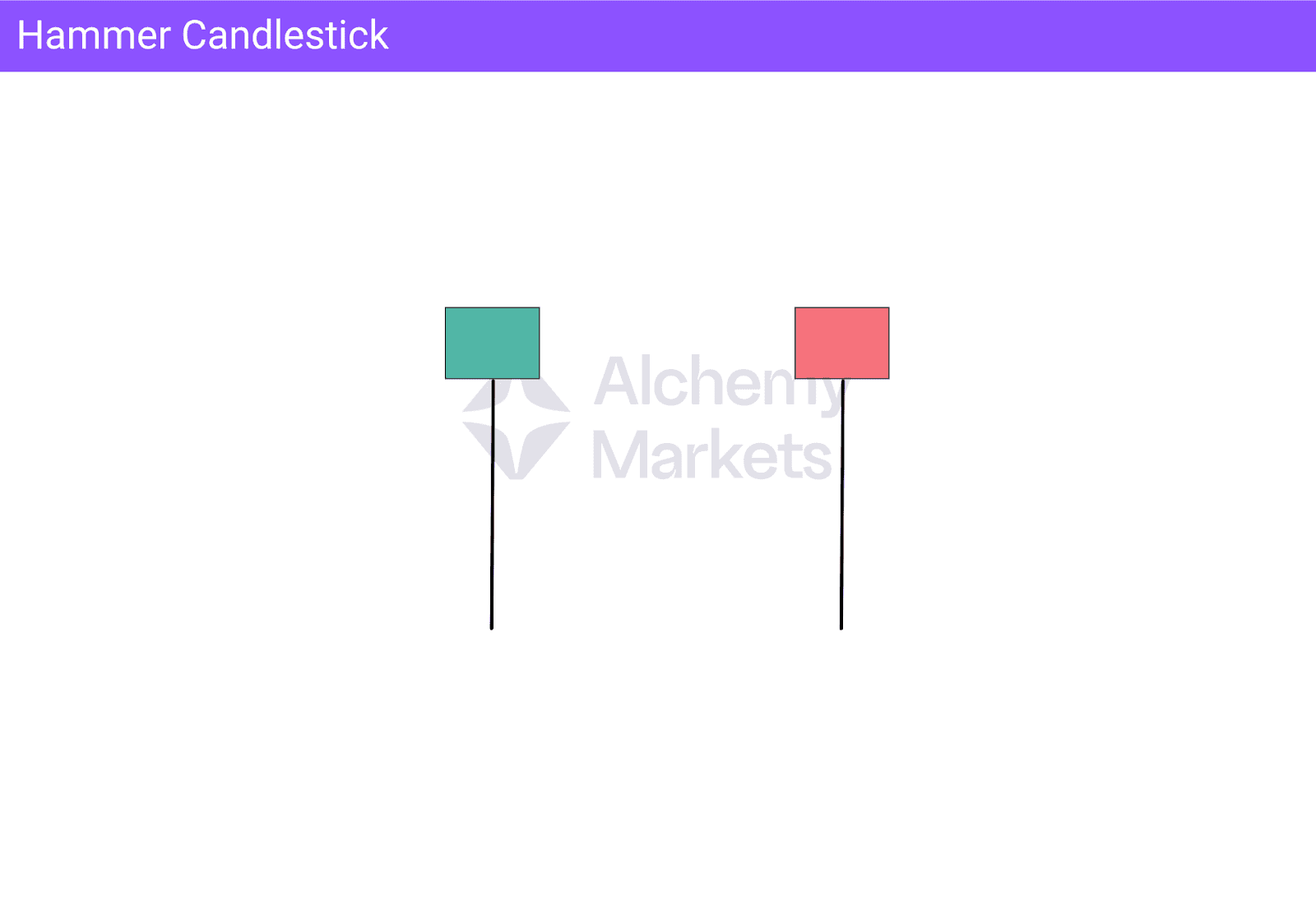
The hammer features a small body near the top with a long lower wick, showing that sellers initially pushed the price down but buyers regained control and drove it back up before the candle closed. This rejection of lower prices often signals a potential reversal or the formation of temporary support.
When a hammer forms after a decline near a support level or demand zone, it can serve as a strong signal of rejection and provide a good buying opportunity. Traders usually wait for confirmation from the next candle before entering a long position.
Shooting Star
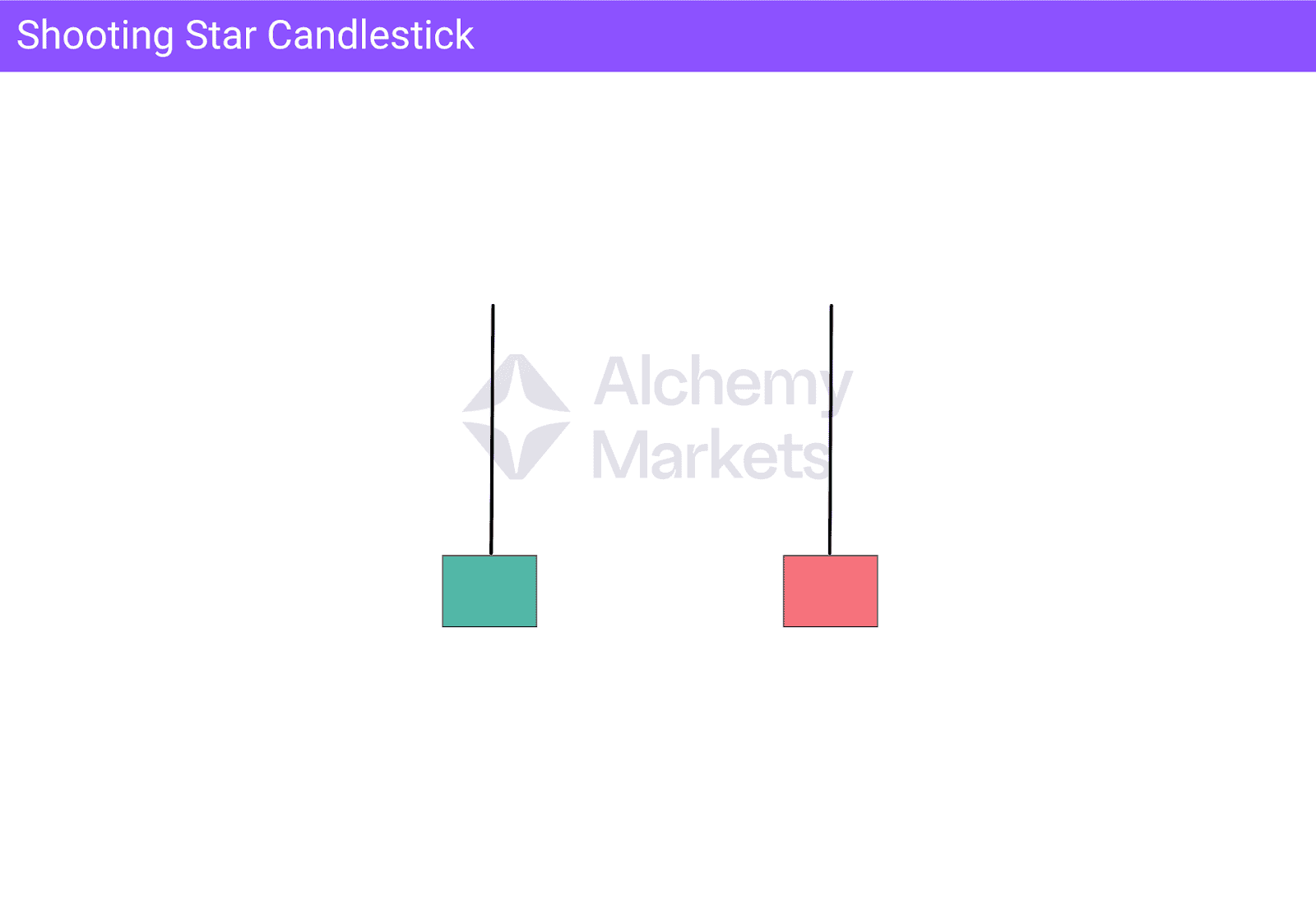
The shooting star looks like an inverted hammer, with a small body near the bottom and a long upper wick. It shows that buyers tried to push the price higher but were overwhelmed by sellers before the session ended. This sudden loss of momentum can suggest that a top is forming, especially when it appears after an upward move near a resistance level or supply zone.
In such areas, it can act as a strong signal of rejection and offer a potential selling opportunity. Traders often wait for confirmation from the next candle before considering a short position.
Engulfing Candlestick Family (Bullish and Bearish Engulfing)
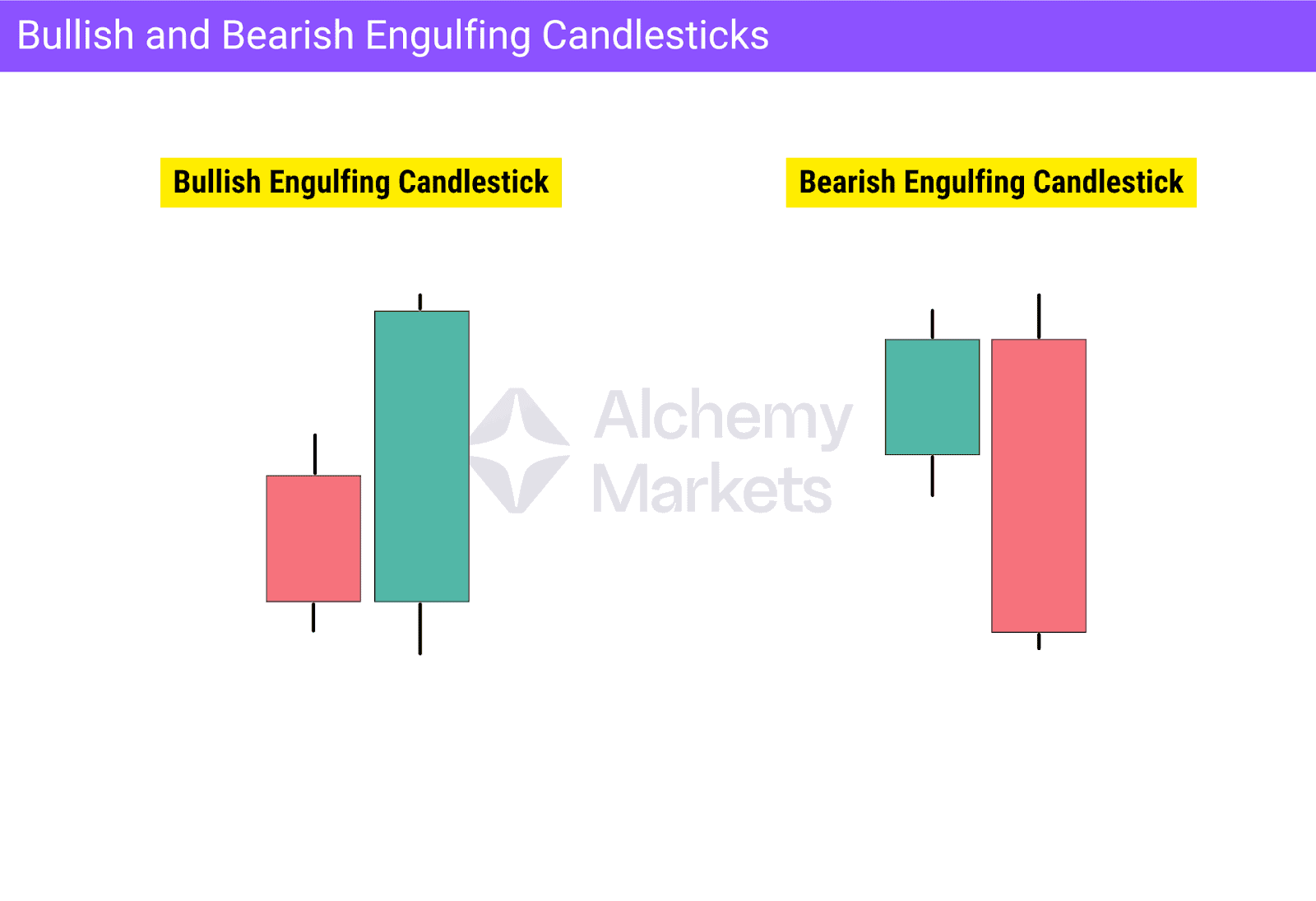
Engulfing patterns occur when one candle fully covers the previous one’s body:
- A bullish engulfing forms when a large green candle closes above the prior red candle, showing a powerful shift from selling to buying pressure.
- A bearish engulfing is the opposite: a strong red candle envelops the previous green one, indicating renewed control by sellers.
These patterns often mark major turning points, especially at key support or resistance zones or after a pullback. Traders confirm them by comparing volume and observing whether the follow-up candle continues in the same direction, strengthening the validity of the reversal signal.
Types of Candlestick Patterns
Candlestick patterns are grouped by how many candles form them and what they signal about price direction. Some patterns appear within a single candle, others unfold across two or more. Each pattern represents a unique expression of market sentiment, providing valuable insight into potential continuation or reversal in upcoming price movements.
Single Candle Patterns
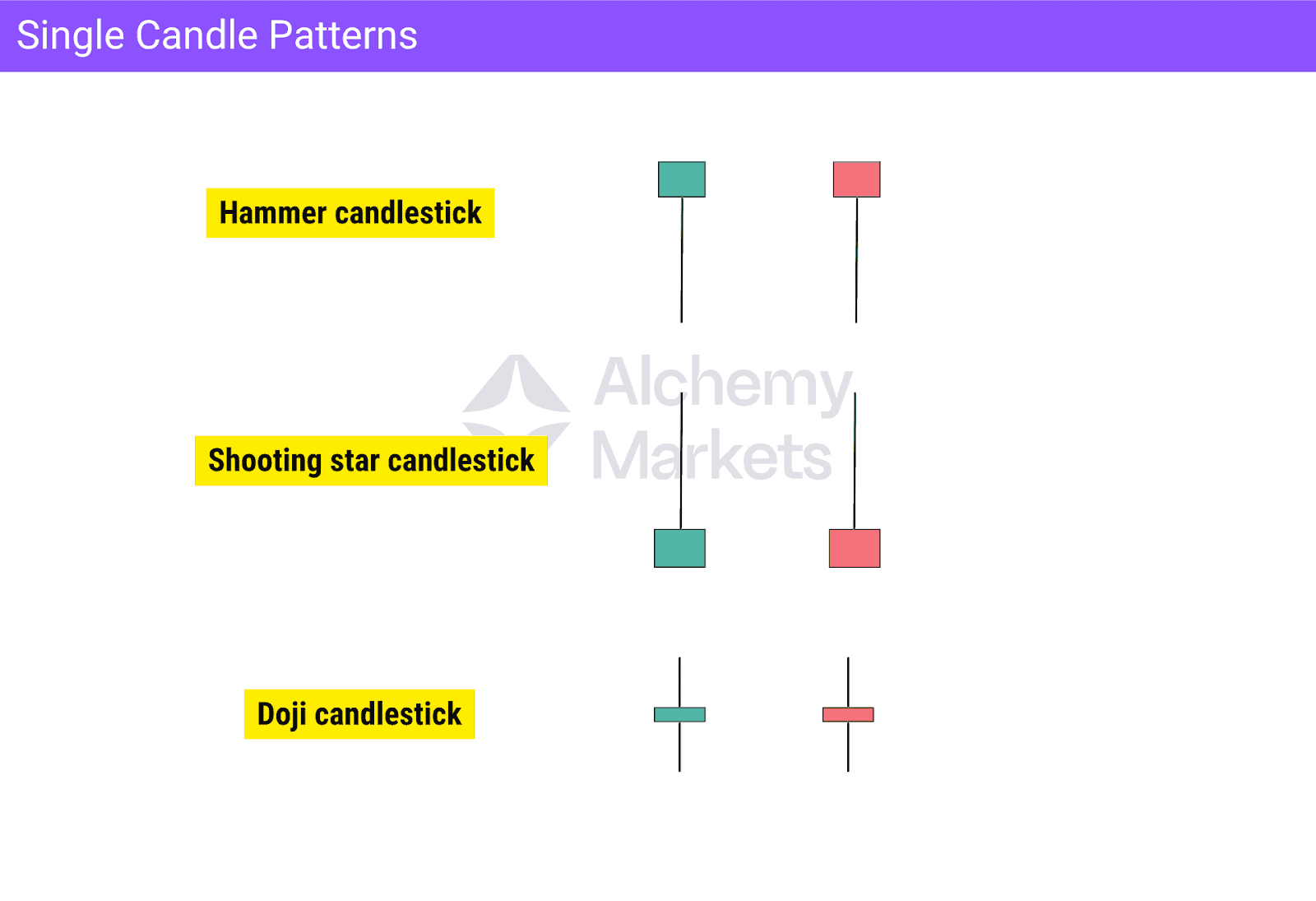
A single-candle pattern uses just one candle to convey the market’s immediate sentiment. Examples include the hammer, doji, and shooting star. These formations highlight moments of exhaustion or indecision where price movement may slow or reverse.
However, their meaning depends on the surrounding price action. A shooting star only indicates potential reversal when it appears after an upward move, while an inverted hammer takes the same shape but forms after a decline, hinting at possible bullish recovery. Similarly, a hammer after a downtrend can suggest renewed buying pressure, whereas a shooting star at resistance signals fading bullish momentum.
Because these patterns appear frequently, traders often look for extra confirmation before acting. This may include their appearance near support or resistance levels, or alignment with other tools such as volume or trend structure. There isn’t one fixed method, but combining signals helps confirm context and identify higher-probability trading setups.
Double Candle Patterns
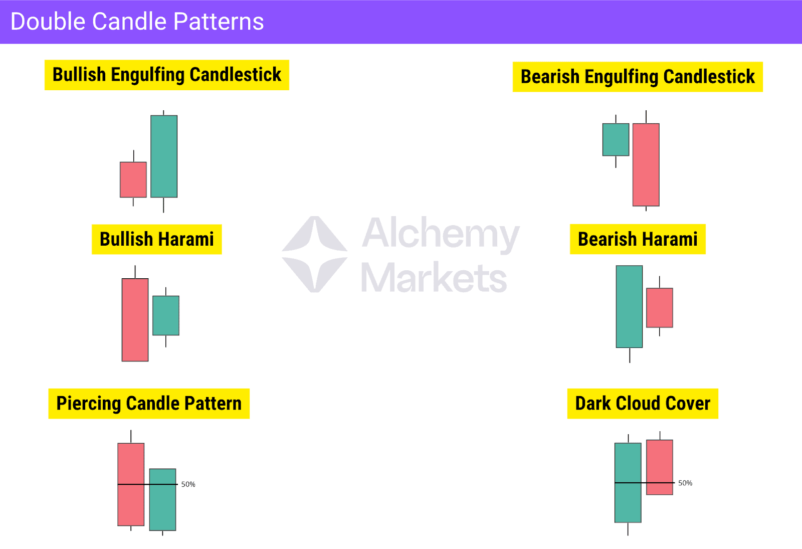
Double candle patterns involve two consecutive candles that interact in a meaningful way. The most recognised examples are the Bullish Engulfing, Bearish Engulfing, Bullish Harami, Bearish Harami, Piercing Candle Pattern, and Dark Cloud Cover. These formations reflect a clear shift in market sentiment within a short period.
Typically, the first candle shows the dominant side losing strength, while the second candle confirms the change in control. Traders use these patterns to anticipate potential reversals or continuations, especially when they form near key support or resistance levels and align with the broader trend direction.
Multiple Candle Patterns
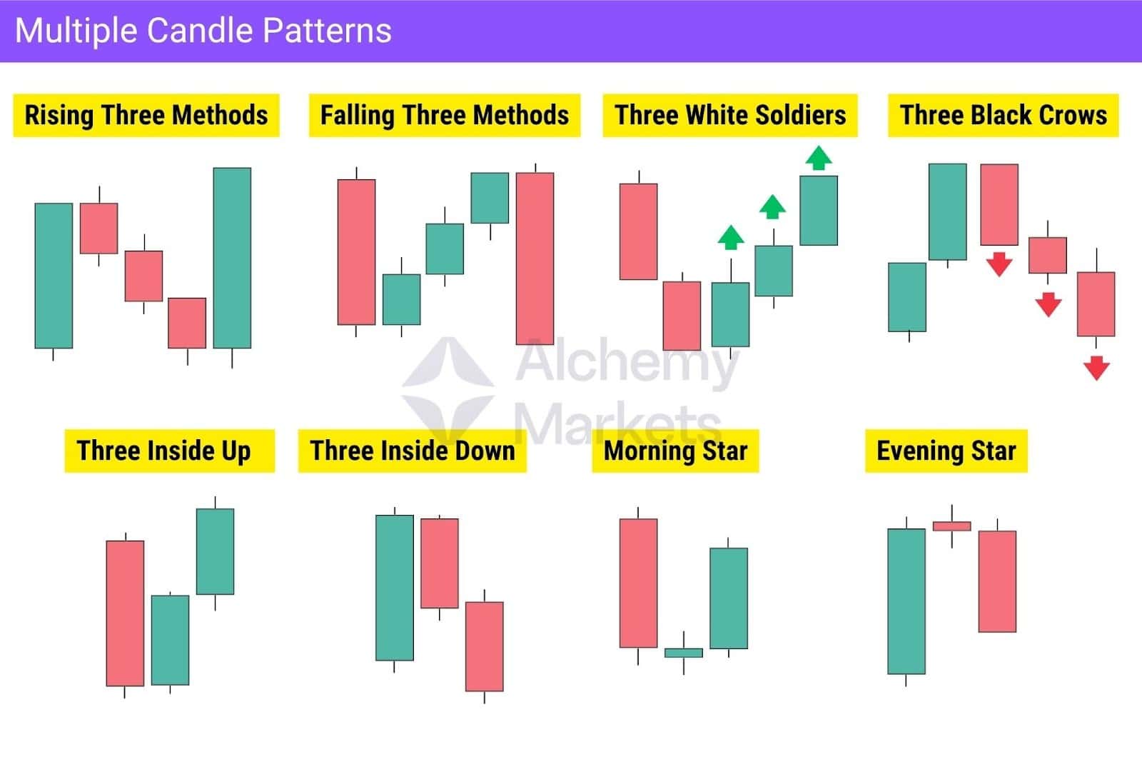
Multiple candle patterns, typically formed by three or more candles, offer stronger confirmation of market sentiment and highlight shifts in control between buyers and sellers. They also reveal market dynamics that single or double-candle formations might miss.
Common examples include the Rising and Falling Three Methods, Three White Soldiers, Three Black Crows, Three Inside Up, Three Inside Down, Morning Star, and Evening Star.
Multi-candle setups often indicate more sustained momentum or a decisive change in trend direction, compared to single or double candlestick patterns.
Continuation Candlestick Patterns
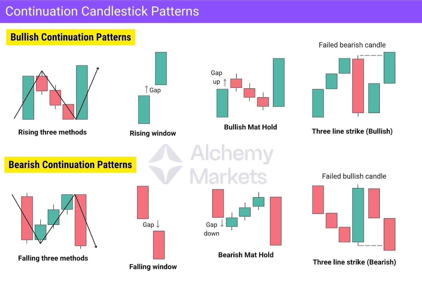
Continuation candlestick patterns all show the same thing: the trend pauses, not reverses. The market cools off, shakes out weak hands, then keeps moving in the same direction.
In bullish setups, buyers stay in control even when price dips:
- Rising Three Methods shows short pullbacks contained inside a larger bullish move.
- Rising Window confirms strong demand when a gap holds as new support.
- Bullish Mat Hold forms after a gap up, followed by three small bearish candles that stay within the prior range before being completely engulfed to the upside.
- Three Line Strike (Bullish) traps late sellers when a bearish candle fails and buyers take back control.
In bearish setups, sellers remain dominant even when the price climbs:
- Falling Three Methods shows a small bounce that never breaks the prior range.
- Falling Window confirms continued selling when a gap down doesn’t fill.
- Bearish Mat Hold forms after a gap down, followed by three weak bullish candles that are then fully engulfed to the downside.
- Three Line Strike (Bearish) exposes weak buyers when a bullish candle fails and momentum continues lower.
All of them follow one rhythm: impulse, pause, continuation. The stronger side holds its ground, proving the trend still has strength to carry on.
Reversal Candlestick Patterns
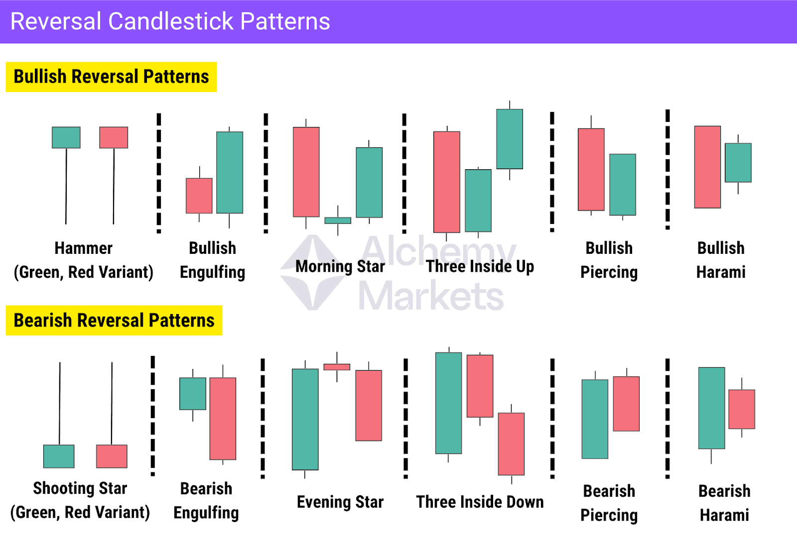
Reversal candlestick patterns highlight moments when market control shifts between buyers and sellers. They often appear near key support or resistance zones and mark potential turning points in price direction.
- A bullish reversal pattern, such as a Hammer or Bullish Engulfing, signals buyers regaining control after a decline.
- A bearish reversal pattern, like a Shooting Star or Bearish Engulfing, shows sellers taking over after a rally.
One key note to note is that reversal candlesticks aren’t absolute — they simply signal exhaustion from one side of the market, meaning that the conditions for a reversal are improving.
To improve their “hit rate”, traders often confirm these candlestick signals with RSI divergences, volume spikes, or structural breaks.
Indecision Candlestick Patterns
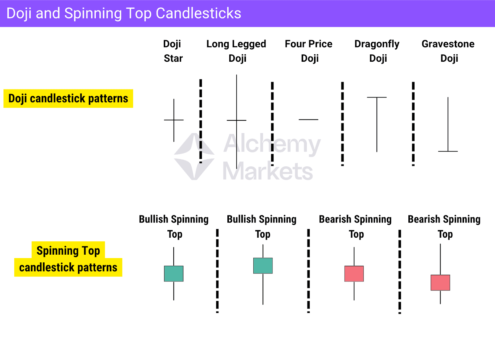
Indecision candles usually form after a long trend, which is a strong upswing or downswing where traders begin to question if price has stretched too far. As conviction fades, momentum slows and hesitation sets in. They can lead to either a continuation or a reversal, but most often hint at a reversal when they appear near key support or resistance levels.
The main indecision patterns are Dojis and Spinning Tops. These smaller-bodied candles show a clear tug-of-war between buyers and sellers.
A Doji, where the open and close occur at almost the same level, reflects fading strength and a potential shift in control. When they appear after an extended move, they often signal exhaustion and warn that the trend may be ready to turn. Dojis are more reversal-coded. Dragonfly doji and gravestone doji include long tails that can signal exhaustion and potential reversal.
Spinning Tops show the same kind of market hesitation but with slightly more body than a Doji. They form when price moves meaningfully in both directions within the same session, yet closes near the midpoint. This reflects balanced pressure between buyers and sellers. Tops are therefore more neutral than Dojis.
To trade indecision candles, it’s best to watch how the next candle or two form in order. In most cases, they reveal which side of the market is truly in control.
Bullish vs Bearish Candlestick Patterns
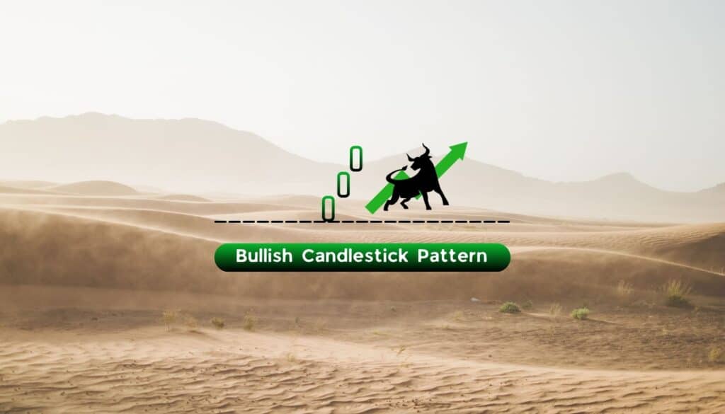
Bullish Candlestick
Bullish candlestick patterns form when buyers regain control after a period of selling, signalling that price may begin to rise or resume an existing uptrend. They are most effective when they appear after a correction, especially near a support level or demand zone, where buying pressure tends to strengthen.
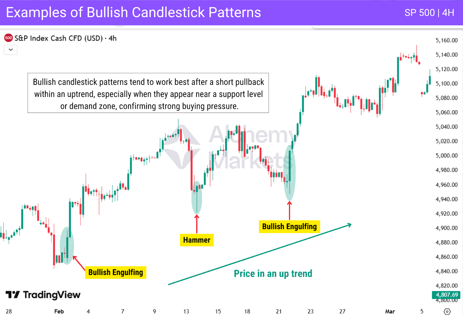
As shown above, bullish candlestick patterns work best when they develop within an uptrend or after a short pullback. These formations highlight renewed buyer activity and help traders time their entries in line with the dominant market bias. Using them alongside trend structure or volume confirmation can further increase the probability of success.
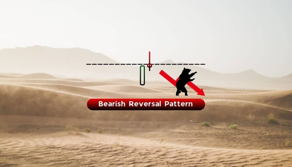
Bearish Candlestick
Bearish candlestick patterns form when sellers begin to regain control, signalling that upward momentum may be weakening. They are most effective after a correction within a broader downtrend, especially when they appear near a resistance level or supply zone, where selling pressure is likely to return.
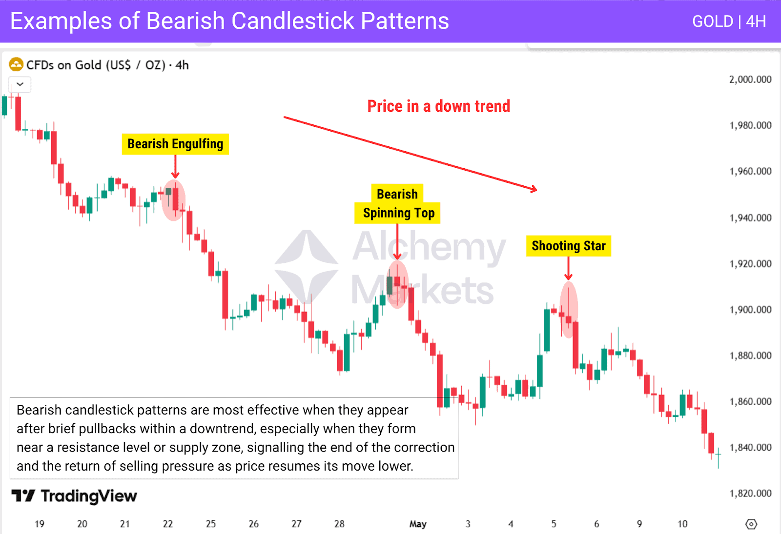
As seen above, bearish candlestick patterns work best when they develop during retracements within a downtrend. These formations reveal renewed selling strength and often mark the continuation of the dominant move lower. Traders use them to find good short opportunities, confirm entries, or secure profits from existing long positions.
Candlestick vs Bar Charts
Both candlestick and bar charts show the same core information: the open, high, low, and close of each session.
However, the way they present that data greatly affects how traders interpret market behaviour. The visuals below highlight how these two chart types differ in appearance and readability.

Bar charts display price movement through simple vertical lines with small horizontal ticks to mark the open and close. While accurate and data focused, they can look dense and be harder for beginners to interpret quickly.
Candlestick charts, however, make price action and market psychology far more visible.
The coloured bodies instantly show who dominated the session, while the wicks capture the highs and lows. This makes it easy to spot shifts in momentum or areas of rejection at a glance.
Because candlestick charts form identifiable patterns such as hammers, dojis, or engulfing candles, they provide visual context that bar charts lack.
Key Differences Between Candlestick and Bar Charts
| Feature | Candlestick Charts | Bar Charts |
| Data Shown | Open, high, low, and close | Open, high, low, and close |
| Visual Clarity | High; easy to read at a glance | Lower; requires closer inspection but often offers a cleaner visual appearance |
| Best For | Price action and sentiment analysis | Pure data analysis and simplicity |
Candlestick charts offer clearer insights into market behaviour and momentum, making them the preferred choice for most traders. Bar charts, on the other hand, remain useful for those who prioritise precise price data and prefer a cleaner, less visual representation of market activity.
Trading Tips and Strategies
Understanding how to read candlesticks is only the first step. True consistency comes from applying that knowledge through a clear, structured trading plan built on discipline, testing, and continuous improvement.
Build a Solid Trading Strategy
Before entering any market, you should have a well-defined strategy that’s been backtested and refined over time. A solid plan includes:
- Entry criteria: The exact candlestick patterns, confirmations, or conditions that trigger your trades.
- Exit rules: How and when you will take profits or close losing positions.
- Assets to trade: Focus on specific pairs, indices, or commodities you understand best.
- Timeframes: Decide which timeframes you’ll analyse and execute trades on.
- Trading hours: Stick to sessions or times when liquidity and volatility fit your system.
Having these parameters in place removes guesswork and keeps your decisions objective.
Master Risk Management
You can’t control the outcome of a trade, but you can control how much you lose.
Effective traders treat risk management as their first priority:
- Always use a stop-loss, placed logically beyond the pattern’s high or low.
- Risk only a small percentage of your capital per trade (for example, 0.5–1%).
- Aim for a positive risk-to-reward ratio (at least 1:2 or better).
- Never add to losing positions.
Protecting capital is what keeps you in the game long enough for your edge to play out.
Develop Trading Psychology
Even the best strategy fails without the right mindset. Successful traders learn to:
- Stay patient and wait for clear setups that meet their plan.
- Avoid revenge trading after losses.
- Accept uncertainty and focus on process over outcome.
- Maintain emotional balance through journaling and regular breaks.
Trading is a mental game, mastering your psychology is as important as mastering your charts.
Use the Right Tools
To grow consistently, use tools that help you measure, reflect, and improve:
- Journaling: Record your trades, screenshots, emotions, and outcomes.
- Backtesting: Validate your strategy using historical data to confirm its performance.
- Keep learning: Markets evolve, and continuous learning ensures you stay adaptable and improve over time.
FAQ
What is the most powerful candlestick pattern?
The bullish engulfing pattern is often considered the most powerful because it shows a complete shift from selling to buying momentum. A large green candle fully covers the previous red candle, signalling a potential reversal and renewed bullish sentiment.
What candlestick pattern is most reliable?
Engulfing and morning star patterns are among the most reliable, especially when they form near key levels. Candlesticks formed on higher timeframes tend to be respected more because they capture greater trading activity and reflect stronger market sentiment.
What candlestick pattern is most accurate?
The hammer and engulfing patterns are among the most accurate when confirmed by structure and momentum. Accuracy improves when these signals align with key levels, strong volume, or a confirming candle that supports the direction.
What is the three-candlestick rule?
The three-candlestick rule suggests waiting for three consecutive candles to confirm a reversal or continuation. It’s more of a trader’s guideline than a fixed rule, helping beginners filter false signals and stay disciplined.
How do you interpret candlesticks?
Interpretation involves comparing the open, close, highest and lowest price, and wick length. Long bodies indicate conviction, while long shadows show rejection or indecision between buyers and sellers.
What is the history of candlestick charts?
Candlestick charts originated in 18th-century Japan, developed by rice trader Munehisa Homma. His visual method of analysing price and psychology became the foundation for modern candlestick charting.
Should I consult other tools beyond candlestick charts?
Yes. While you can read candlestick charts to gauge sentiment, combining them with indicators, market structure, and volume analysis provides stronger confirmation for any trading strategy.
How do you analyze a candlestick chart?
Start by identifying the trend and major support or resistance levels. Observe each candle’s body and wicks to gauge buying or selling pressure, and confirm recurring candlestick chart patterns with technical indicators.
What is the difference between a candle with a long body and a short body?
A long body shows strong participation and clear market conviction, while a short body reflects hesitation or reduced trading activity. Comparing these across sessions helps traders assess shifts in momentum.
What is the difference between long and short shadows?
Long shadows signal rejection of extreme prices, suggesting failed attempts to continue the move. Short shadows imply control and stability by one side, often seen in trending markets.
What can’t candlesticks indicate?
Candlesticks can’t predict future price with certainty or reveal the reasons behind moves. They show emotion and structure, but traders must combine them with fundamentals or volume for confirmation.
Which chart is best for day trading?
Most day traders prefer candlestick charts because they visually display intraday momentum, reversals, and volatility more clearly than bar or line charts. Their structure helps identify quick trade opportunities.
What is the most bullish pattern?
The hammer candle and bullish engulfing are among the strongest bullish signals. Both suggest buyers have regained control and may drive a reversal or continuation of an uptrend.
What is the most bearish pattern?
The bearish engulfing candlestick pattern and shooting star often mark the start of a bearish reversal candlestick setup. They show sellers overpowering buyers and can lead to further downside pressure.
What are common mistakes to avoid when using candlestick patterns?
Common mistakes include not considering the overall trend when analysing candlestick patterns and relying solely on individual signals without context. Many traders also ignore proper risk management or fail to combine patterns with other forms of technical analysis, leading to false entries and inconsistent results.
Can ChatGPT read candlestick charts?
Yes — but only with help. ChatGPT and other AI models can interpret candlestick charts when given clear context and annotations. A raw, unlabelled chart has too much noise and it might misread wicks, miss subtle price structure, or confuse trend context.
In short, ChatGPT can read candlestick charts, but it’s prone to mistakes without guidance. It works best as a double-check tool: highlight what you think is a chart pattern (eg. bull hammer), note your reasoning (eg. descending volume or breakout structure), and let ChatGPT confirm or challenge your interpretation.