Written by:

Reviewed by:

- November 19, 2025
- 26 min read
22 Best Trading Indicators for Better Market Predictions
What is a Trading Indicator?
A trading indicator is a visual tool that helps traders understand market behaviour by turning price data into easy-to-read signals on a chart.
It’s used to spot trend direction, market strength, and key support or resistance levels, giving traders an arguably faster and more structured way to analyse the markets (compared to pure candlestick analysis).
On charting platforms like TradingView and MetaTrader, you’ll find a mix of classic indicators such as Moving Averages, Bollinger Bands®, and RSI, alongside community-made tools that remix or reinvent these originals for new trading styles.
Types of Trading Indicators
| Type of Analysis: | Focuses On: | Common Indicators: | Most Often Used For: |
| Price Action | Price movements | Support and resistance, price patterns | All time frames use price action |
| Momentum | Speed of changes | Relative Strength Index, MACD, Moving Averages | Short-term trading |
| Trend Following | Market direction | Moving averages, trendlines | Longer-term trading |
| Volume | Trading activity and sales | Volume bars, On-Balance Volume | Confirmation of movement |
| Combination of Indicators | Blends more than one technical factor | Money Flow, Elder Force Index, Chaikin Money Flow | Spotting trend changes and reversals |
Trading Indicator Criteria
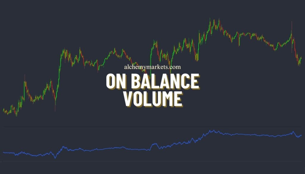
1. On-Balance Volume Indicator
Type: Volume indicator
Best Used For: Determining trend strength and divergence
Best Trading Time Frames: On-Balance Volume is used on all time frames
Indicator Complexity: OBV is considered to be low complexity, as it is one of the simpler indicators that traders will use to make decisions
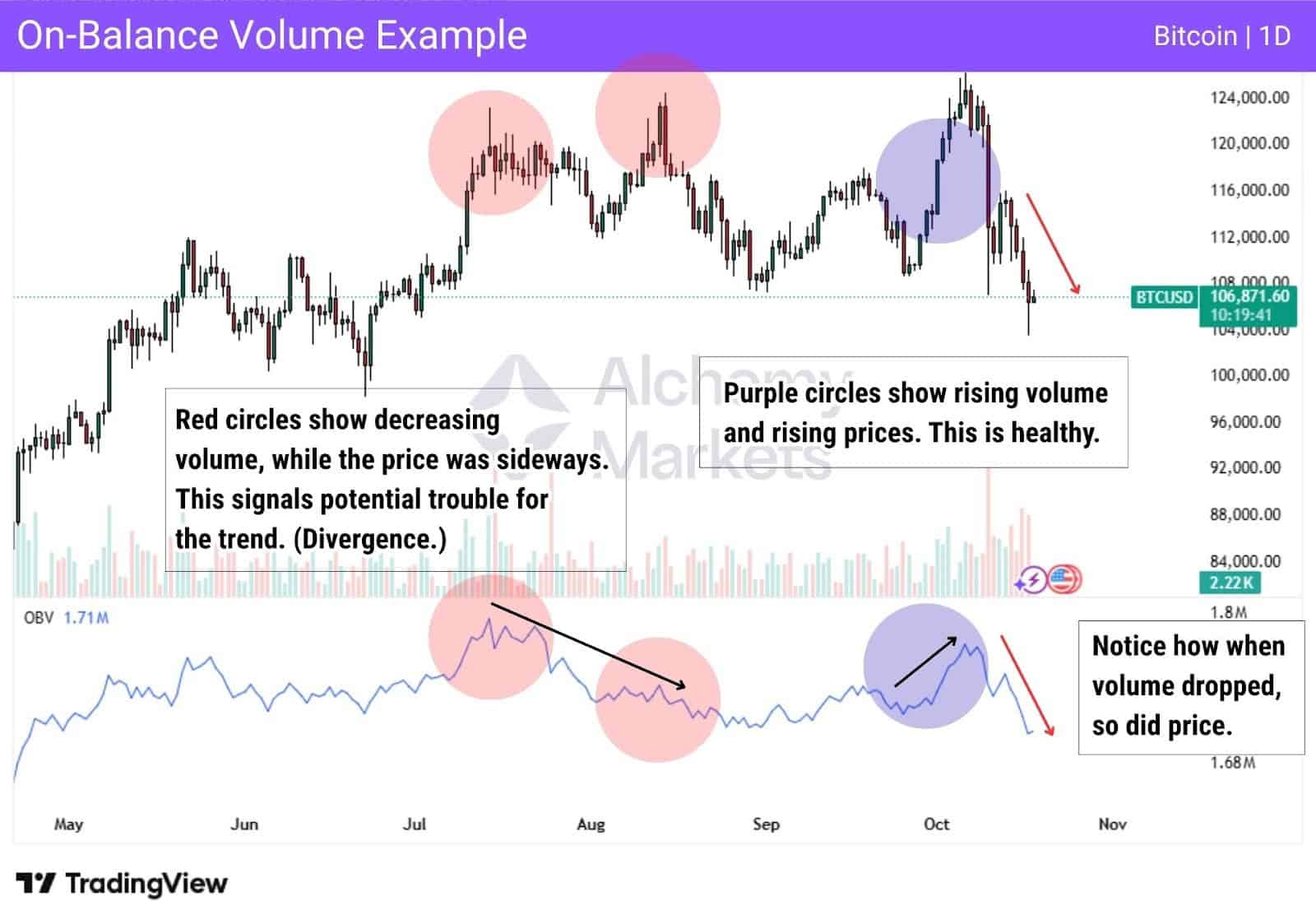
How On-Balance Volume Works:
OBV is used by traders to gauge trend strength, confirm trends, detect divergences, and find clues for trade entries and exits. The indicator does this by showing trend strength (hints at continuation), and divergence (hints at reversal or end of trend).
- If both OBV and price are rising, it suggests the uptrend is strong and supported by volume.
- If both are falling, it indicates that the downtrend is strong.
- If the OBV and price are moving in opposite directions, then a divergence is forming.
Divergences signal at changing market conditions, which open the pathway for a reversal (though not always immediate).
As highlighted in the red below, notice where price forms a higher high, but OBV doesn’t. That’s a bearish divergence. The price then reverses to the downside shortly after.
2. Accumulation/Distribution Line
Type: Volume indicator
Best Used For: Identifying divergences and buying/selling pressures in the market
Best Trading Time Frames: Daily and intraday
Indicator Complexity: Intermediate
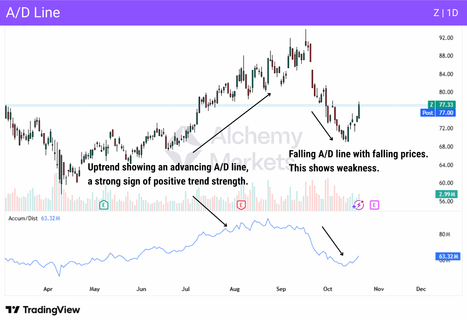
How the Accumulation/Distribution Line Works:
The A/D line differentiates between buying and selling, unlike the OBV indicator. This indicator helps traders compare volume and price in an asset to determine whether it is being bought or sold with momentum.
If the asset finishes near its high price, typically of the daily range, it gives more weight than if it closes in the middle of the range. Alternatively, if the asset finishes near the low price, it also gives more weight than if it closes in the middle of the range, showing weakness. This highlights that the market has conviction in it, and this is the biggest use case scenario
However, if the price in the market is rising, but the A/D line is dropping, this can be a sign of divergence, and therefore weakness. The opposite is also true; if the price is falling, but the A/D line is rising, this is a sign of positive divergence, showing that the selling could be coming to an end.
3. Average Directional Index
Type: Trend Strength Indicator
Best Used For: Measuring trend strength and detecting range-bound markets
Best Trading Time Frames: 5-minute charts or above
Indicator Complexity: Advanced
How Average Directional Index Works:
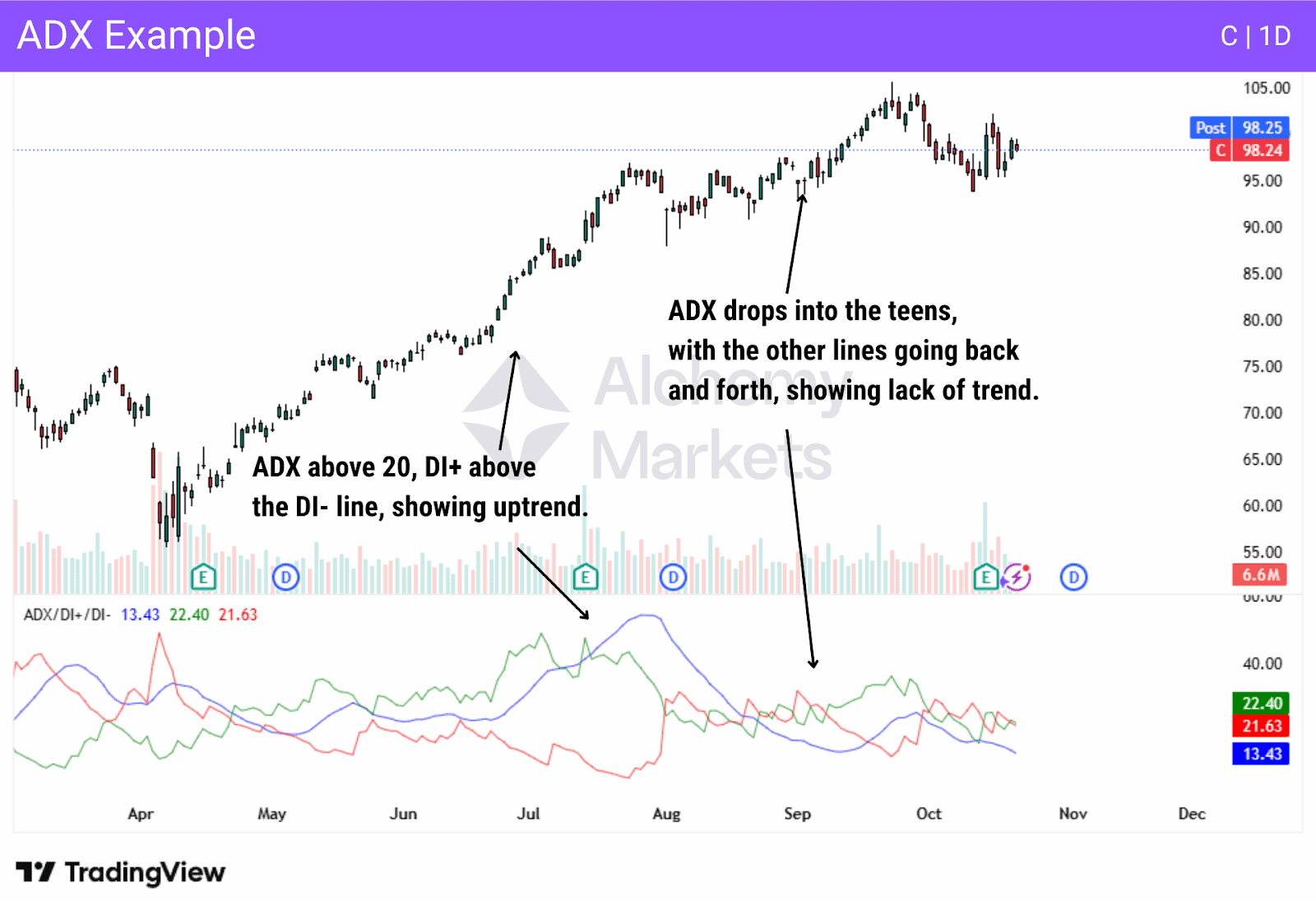
ADX measures both trend strength and helps to identify range-bound conditions. The ADX is considered a trend indicator that only measures the overall strength of a move, not necessarily the direction.
The indicator has three lines: the ADX line, the positive directional indicator (DI+), and the negative directional indicator (DI-), showing trend direction. The following observations can help traders decipher the readings being reported by this indicator:
- ADX above 20 and DI+ line above the DI- line: Uptrend.
- ADX above 20 and DI- line above the DI+ line: Downtrend.
- ADX below 20 is a weak trend, or even a range. Most times, the DI+ and DI- lines will be crossing over each other multiple times in this scenario.
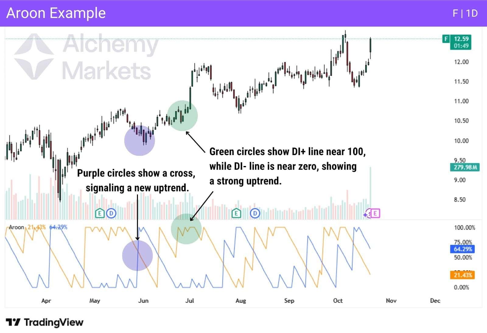
4. Aroon Indicator
Type: Trend Indicator
Best Used For: Detecting the start of a trend, trend strength or lack of
Best Trading Time Frames: Daily and weekly
Indicator Complexity: Intermediate
How the Aroon Indicator Works:
The Aroon indicator is used to measure how long it has been since the highest and lowest prices occurred in a specific timeframe. The indicator focuses on time instead of price movements, making it a bit different. The Aroon indicator consists of two lines, Aroon up and Aroon down. The Aroon indicator is used to identify the beginning of a new trend and trend strength.
How to read Aroon:
- Aroon up line above 70, and down line stays low – strong uptrend.
- Aroon down line above 70, and up line stays low – strong downtrend.
- When the up line crosses above the down line, a potential positive trend change.
- When the down line crosses below the up line, a potential negative trend change.
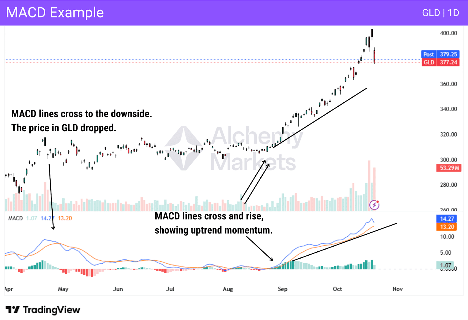
5. MACD
Type: Momentum and trend Indicator
Best Used For: MACD is used for identifying trends and momentum measurement
Best Trading Time Frames: MACD is used on all timeframes
Indicator Complexity: Intermediate to advanced
How MACD Works:
Moving Average Convergence Divergence (MACD) indicator is one of the most popular indicators used in the financial markets. It gauges divergence and trend strength.
MACD has two lines for this purpose: the MACD line and the signal line, which can also include a histogram in some platforms. These two features can be thought of as indications of two different times: the moving averages offer a look at the broader momentum of the asset, while the histogram will be more sensitive, and therefore can be thought of as a short-term look at the trend.
When the MACD line crosses below the signal line, it indicates that the price is falling and the momentum is dropping. On the other hand, when the MACD line crosses above the signal line, it shows strength and price rising in a market. The MACD indicator is very flexible and can even be used to determine divergence as well, as the line rising while the price is falling is a potential negative signal. The opposite is also true, with the price falling, and the line on the MACD rising can mean positive divergence, a bullish sign.
Many traders will look at the histogram and see if it is rising or falling, and if it is opposite to the price action, then divergence is detected. The histogram is the difference between the two moving averages that make up this indicator, often the 12 and 26-period moving averages. Understand that MACD is simply a representation of the difference between a couple of moving averages, giving a “heads up” on how momentum and trends are playing out.
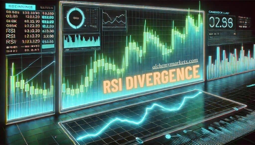
6. Relative Strength Index (RSI)
Type: Momentum
Best Used For: Identifying trend strength, overbought, and oversold conditions
Best Trading Time Frames: RSI is used in all time frames
Indicator Complexity: Beginner to intermediate
How the Relative Strength Index Works:
RSI measures price gains versus losses to measure momentum in a trend, as well as overall trend strength. It accomplishes this by measuring the speed and magnitude of price gains or losses. It also has two levels on the indicator, the overbought (70) and oversold (30) lines, to give signals as to whether or not the market could be heading to a trend change, or at least a pullback against the prevailing trend.
On the flipside, RSI staying within the 30 and 70 levels during a trend suggests that the trend is still healthy (not overheated in a direction).
The RSI indicator is also used for spotting divergence in a trend. For example, if the price is rising, but the RSI indicator is falling, it can be a sign of divergence, and a potential change in trend direction.

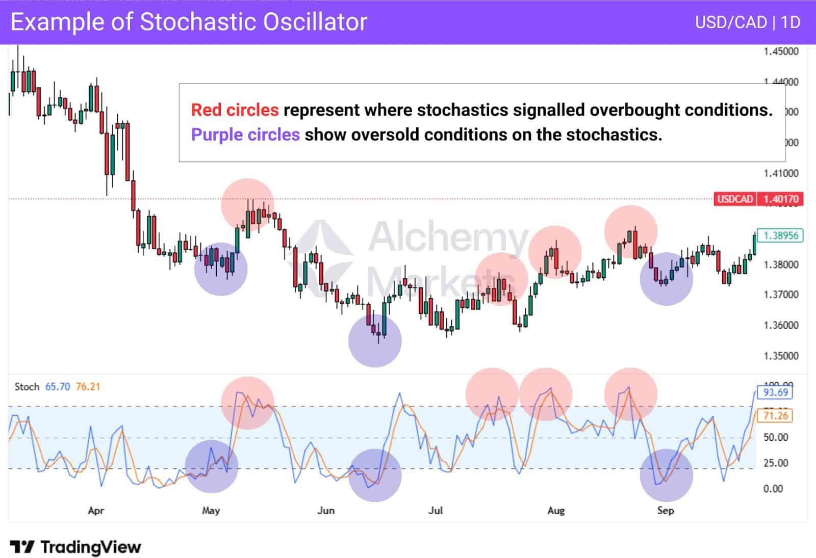
7. Stochastic Oscillator
Type: Momentum
Best Used For: The Stochastic Oscillator helps determine potential trend changes and shifts in momentum of an asset. It can also determine divergence.
Best Trading Time Frames: Most popular on the 1H and 1D timeframes, but applicable on any timeframe
Indicator Complexity: Intermediate in complexity
How the Stochastic Oscillator Works:
The stochastic oscillator is used by traders to determine potential trend changes and momentum shifts. It can also be used for finding divergences at times, although more often than not, this technical indicator is used to determine overbought and oversold conditions.
Like the RSI, the stochastics have two main levels to determine overbought or oversold conditions: Above the 80 level, price is considered potentially overbought, while the lines being below 20 show a potentially oversold market.. If the indicator is between those two lines, it is considered not to be either.
The indicator is often used in range-bound markets, as a trending market can often cause the stochastics to stay in oversold or overbought levels for prolonged periods (false signals).
That being said, this indicator is still popular in many trading strategies as it provides a simple overview of market conditions.
8. Bollinger Bands®
Type: Price action and trend following
Best Used For: Identifying overbought and oversold conditions in a trend, as well as volatility
Best Trading Time Frames: Any timeframe
Indicator Complexity: Intermediate
How Bollinger Bands Work:
Bollinger Bands are used to show how far a market might be stretched. Bollinger Bands are typically based on the 20 SMA. This simple moving average is plotted, and the indicator also takes into account a certain number of standard deviations from that “average” in the market. While traders can change the standard deviations shown on the chart, two standard deviations is the most common setup. This is based on the fact that roughly 95% of values will fall within these deviations.
Visually, the Bollinger Band is typically displayed with three lines – the moving average, an upper line, and a lower line, which reflects prices at 2 standard deviations away.
The indicator widens and shrinks based on volatility (how rapidly the price is moving). Expansions signal that volatility is increasing, and therefore expected price deviations as well. Shrinkage signals that volatility is decreasing, and therefore, a range-bound environment is more likely.
Bollinger Bands typically are a secondary indicator, as raw price action is confirmed by them. In other words, it is rare for a trader to blindly follow them. Most often, traders will look for price action setups that are confirmed by the bands. They are simple to interpret with the standard two-deviation setup. This is the most common interpretation:
- If an asset is close to the top of the bands, it could be overbought.
- If the asset is near the bottom of the bands, it could be oversold.
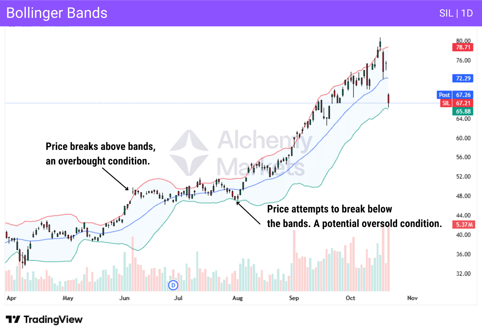
Bollinger Bands are most effective as support and resistance markers when the market is in a rangebound environment. However, it is susceptible to false signals in a trending market.
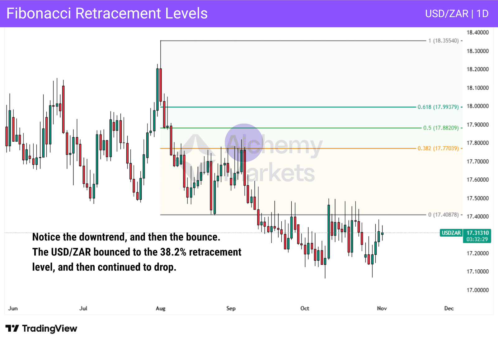
9. Fibonacci Retracement Levels
Type: Price action
Best Used For: Fibonacci levels are used to determine potential support or resistance levels when price retraces
Best Trading Time Frames: Any timeframe
Indicator Complexity: Intermediate, mainly due to the end user and whether they can cleanly identify areas of interest
How Fibonacci Retracement Levels Work:
The Fibonacci retracement tool is drawn from a swing low to a swing high, or from a swing high to a swing low to give potential areas of support after a move has started in the markets. The tool will list several levels as potential areas of interest, based on the mathematical concept of Fibonacci sequences.
For example, if a stock has risen significantly, but then starts to pull back, a trader can use the Fibonacci retracement tool to plot potential support levels. The idea is to try to find where the overall trend may pivot after a retracement to continue a trend. The indicator sits on top of the price chart, and is typically used in conjunction with support and resistance areas to find potential trading setups.
The most common levels traders use include:
- 38.2% – a pivot here reflects a powerful, strong trend
- 50% – very popular, which is ironically, not a real Fibonacci number
- 61.8% – the most popular, known as the “Golden Ratio”
- 78.6% – a deep retracement
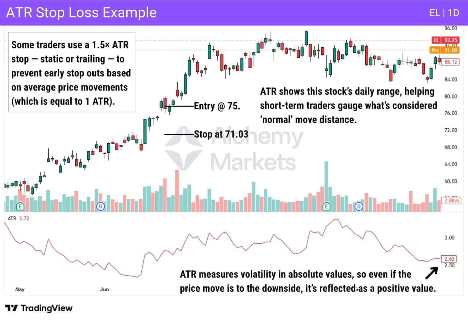
10. Average True Range
Type: Momentum
Best Used For: Measuring volatility in a market
Best Trading Time Frames: Although ATR can be used on any time frame, generally speaking, it is geared towards daily, but is used by short-term traders to determine how far a move could go
Indicator Complexity: Beginner
How Average True Range Works:
Average True Range (ATR) measures an asset’s volatility typically across 14 periods, by showing its average expected movement in raw price. Traders most often use this to gauge daily volatility and understand what a ‘normal move’ for the market might be.
Unlike a lot of other technical indicators, ATR doesn’t worry about price direction, but rather the amount of distance the market travels. This allows a trader to find an exit from a trade entry.
For example, when day trading a market, it can tell you how much the market is likely to move during a given day. Other uses can be for trend followers to set stop losses and trail them. While the most common level for a stop loss is 2 times the daily ATR, there are several other levels that people will use, depending on their trading systems.
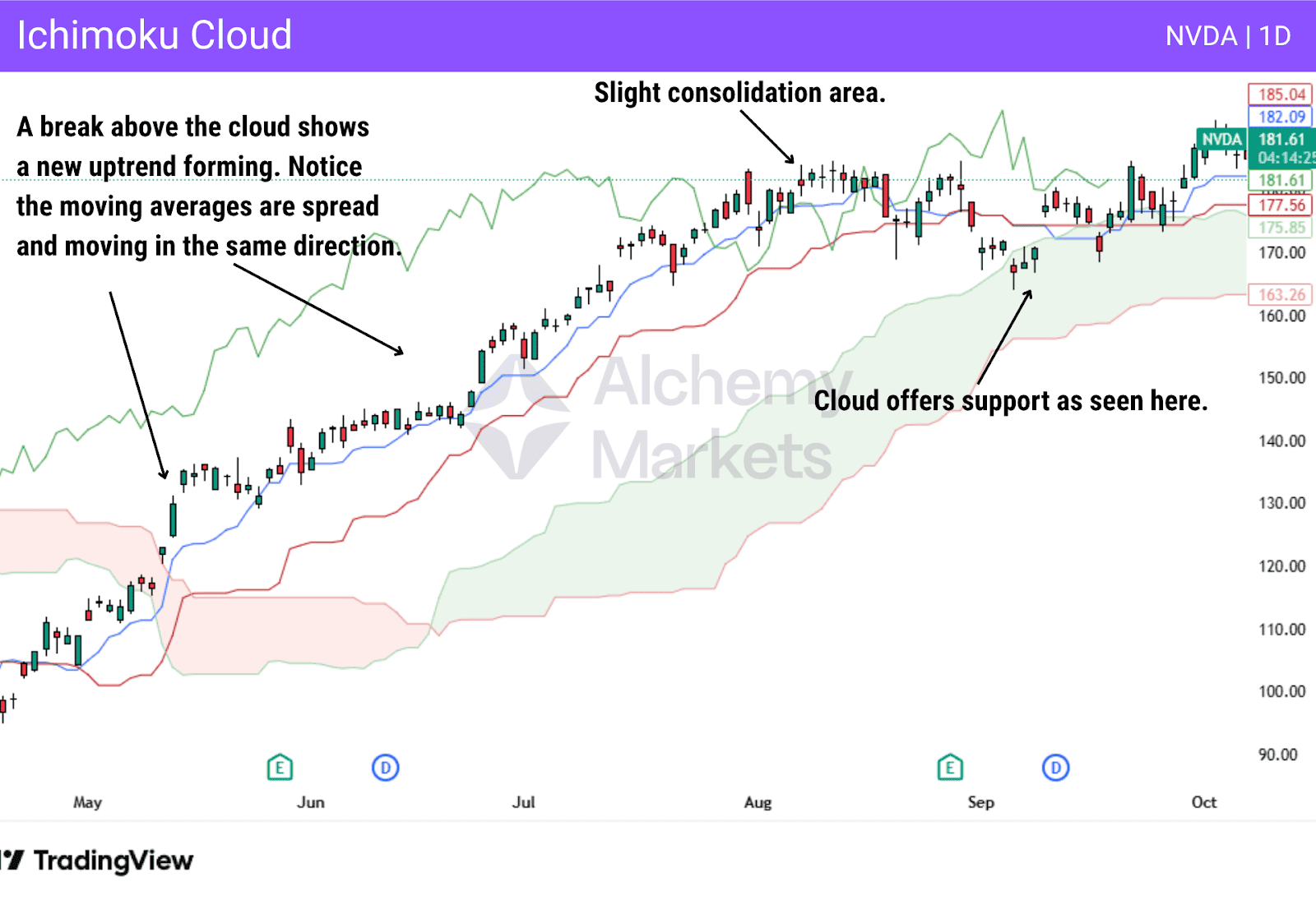
11. Ichimoku Cloud Indicator
Type: Trend following with momentum elements
Best Used For: The Ichimoku Cloud indicator is used to measure trend direction, as well as momentum shifts. It can also suggest support and resistance zones, based on the boundaries of the clouds.
Best Trading Time Frames: Most traders will use this indicator for higher time frames
Indicator Complexity: Expert
How Ichimoku Cloud Indicator Works:
The Ichimoku Cloud uses the direction and strength of a trend using multiple moving averages, known as Tenjan-sen, Kijun-sen, Senkou Span A, and Senkou Span B. The momentum is measured via the relationship between the Tenkan-sen and Kijun-sen lines.
The space between Span A and Span B forms the Kumo, or cloud. If the price is above the cloud, this signals an uptrend. If the price is below the cloud, it signifies a downtrend. When the price is inside the cloud, it is in consolidation or transition. The thicker the cloud, the stronger the potential support or resistance. It is because of these factors that a lot of people think of it as an all-in-one indicator.
Ichimoku Cloud is more popular in Asia than in many other parts of the world. In fact, some traders will use it to trade Asian markets, as the settings are supposedly optimised for Japanese markets. The effectiveness of this is debatable, though, as they were established decades ago.
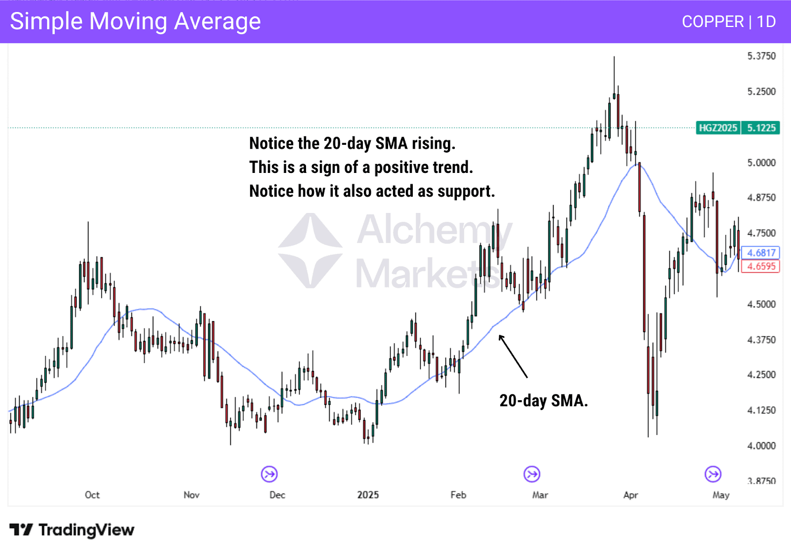
12. Simple Moving Average
Type: Trend following
Best Used For: Shows the average price of the market over a set period of time
Best Trading Time Frames: Any, but more reliable on higher timeframes
Indicator Complexity: Beginner
How Simple Moving Average Works:
A Simple Moving Average (SMA) is a technical indicator that smooths out an asset’s price data to create a single, flowing line on a chart. Its primary purpose is to help traders easily identify the overall market trend by filtering out short-term price “noise.”
The SMA is calculated by taking the average closing price over a specific number of periods. This period length is an adjustable setting within the indicator. While any number can be used, traders often use settings like 20, 50, 100, and 200 periods.
Traders use the SMA in two main ways:
- Trend Identification: The slope of the line shows the trend’s direction. A rising SMA signals a bullish trend (prompting buys), while a falling SMA signals a bearish trend (prompting sells). Price trading above the SMA confirms an uptrend; price below it confirms a downtrend.
- Dynamic Support & Resistance: The SMA line itself often acts as a price “floor” (support) in an uptrend or a “ceiling” (resistance) in a downtrend, providing potential areas for trades.
13. Exponential Moving Average
Type: Trend following
Best Used For: Showing the average trend, with more weighting placed on recent price action
Best Trading Time Frames: Any, but more reliable on higher timeframes
Indicator Complexity: Beginner
How Exponential Moving Average Works:
An exponential moving average displays a flowing line, which represents the average price of the market across a selected period of time.
The calculation is typically based on the average closing price, like the SMA, of the last number of candles for a specific number of candlesticks. By giving more weight in the calculation for the last handful of candles, this means it will move more quickly than the SMA.The 20 EMA on the daily chart shows the average closing price over the last 20 days. The exponential moving average is represented by a line on the chart.
The direction of the EMA, just like in the SMA, suggests the overall direction of the trend. If it is falling, this suggests a downtrend, while a rising line suggests an uptrend. It can also be used at times to suggest support or resistance for those who use them.

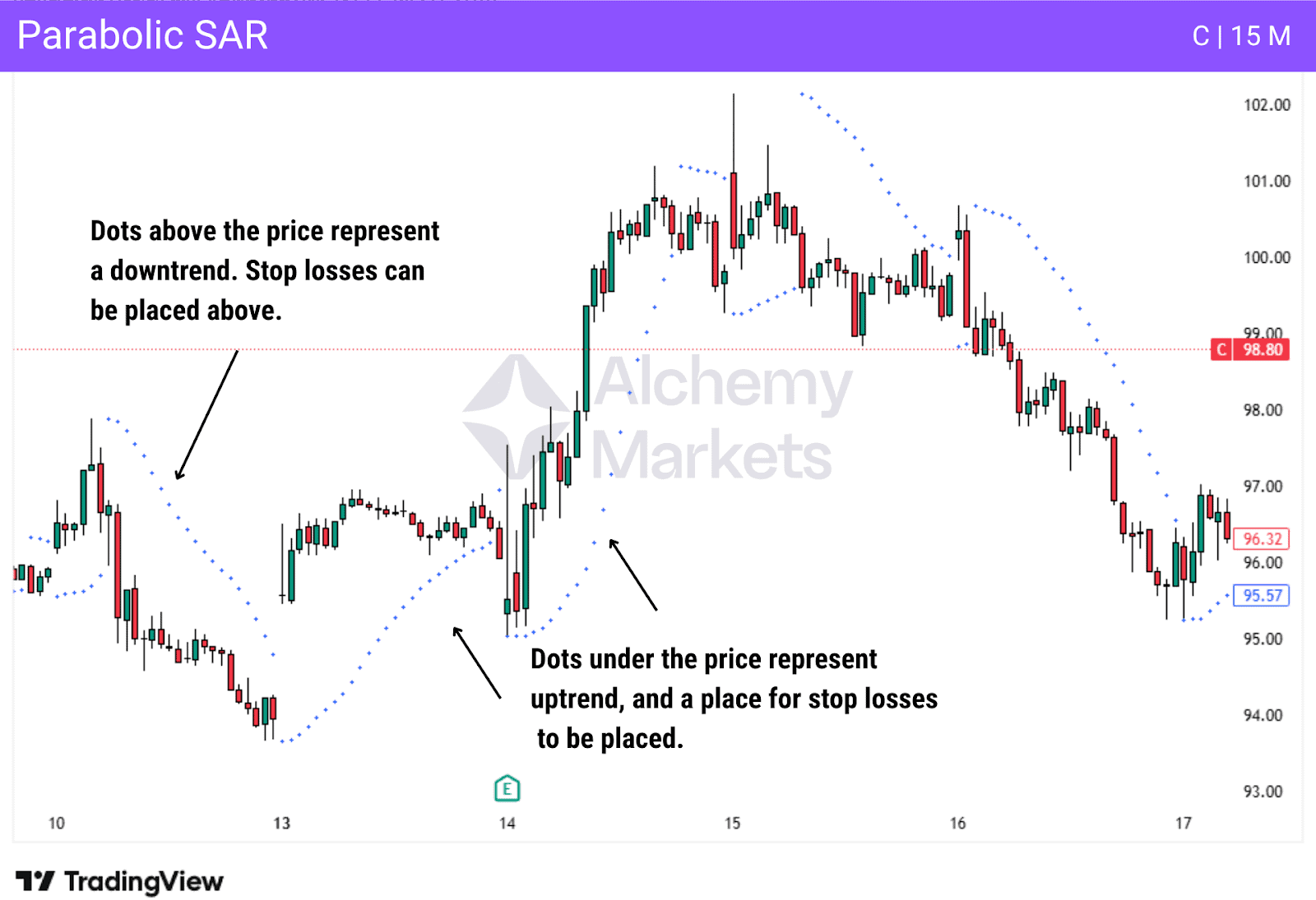
14. Parabolic SAR
Type: Trend following
Best Used For: Enter and exit signals, trend identification, and a trailing stop tool
Best Trading Time Frames: All time frames are possible, but a lot of traders like the indicator for intraday trading
Indicator Complexity: Beginner to Intermediate
How Parabolic SAR Works:
Parabolic SAR, or “Parabolic Stop and Reverse”, is an indicator that plots trends via dots on the chart. If the dots are below the price, it means that the trend is upwards. If the dots are above, then it means the market is in a downtrend. When the dots flip sides, it will signal potential trend reversals.
Traders will trade in the same direction as the Parabolic SAR signals, with a potential use of the indicator as a placement for stops. In other words, if the price drops below the dots in an uptrend, that would be a signal to exit the market. This is true with the opposite direction as well, with the dots above the price being violated by a move to the upside, which would signal a time to exit any short positions.
While the indicator can be used for swing trading, it is very rare to see this in the trading world. The PSAR is most popular for short-term, intraday trading as it helps traders capitalise on short-term volatility.
Some traders also use it as an “always-in” reversal system, simply flipping their position (from long to short or vice versa) each time the dots switch to the opposite side of the price; however, this can be a risky practice without other solid conditional filters.
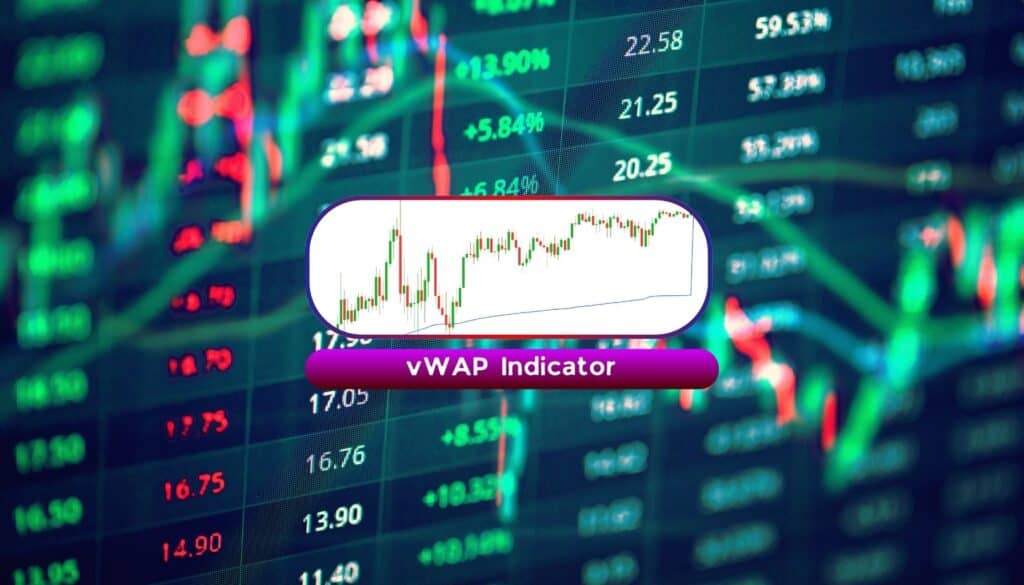
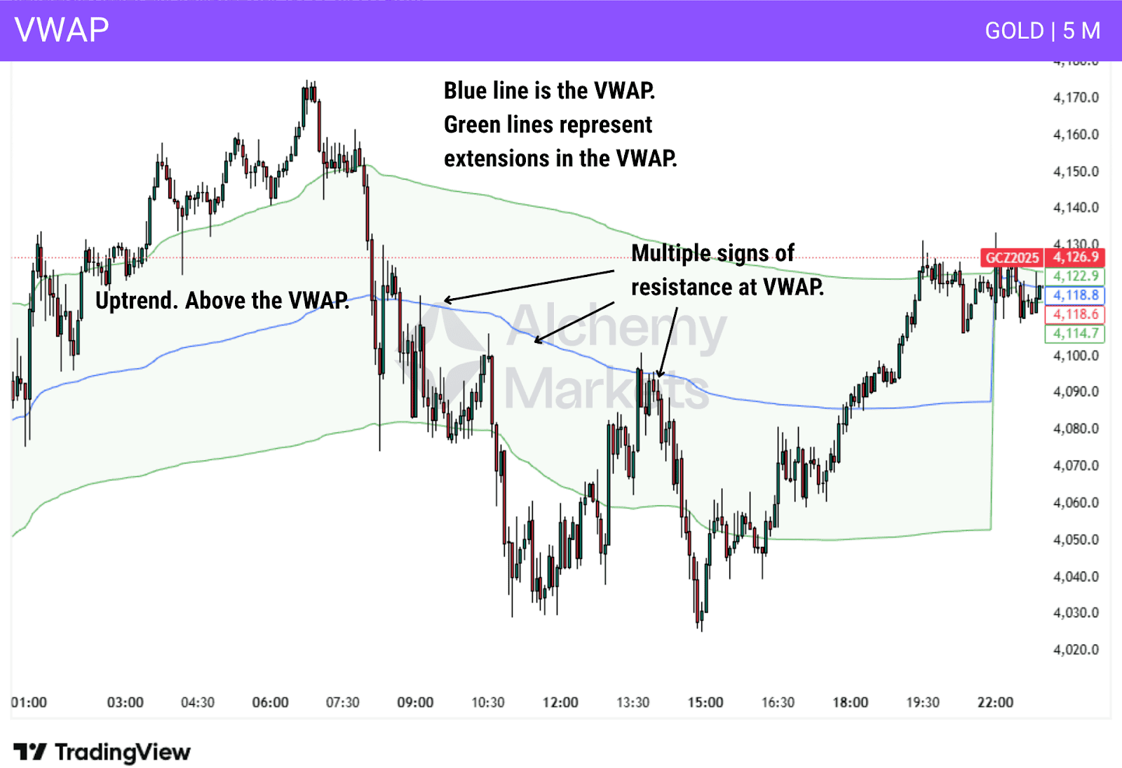
15. VWAP
Type: Volume indicator
Best Used For: Determining whether the buyers or sellers are in control of the market.
Best Trading Time Frames: Intraday trading
Indicator Complexity: Intermediate
How VWAP Works:
VWAP (Volume-Weighted Average Price) displays an asset’s average price, weighting it more heavily toward price levels with higher trading volume.
For example, if an asset trades between $4 and $5, but most of the volume occurred at $5, the VWAP would be pulled closer to $5. In contrast, a Simple Moving Average (SMA) would likely show a price near $4.50, as it only averages the prices and ignores the volume.
Traders typically use the vWAP as a singular line, but by default on TradingView, the indicator shows an upper and lower band (like the Bollinger Bands). These are priced at 1 standard deviation away from VWAP, which predicts the ‘normal’ movement range of the market.
The VWAP is used as a trend filter, whereby if the price is above, the asset is bullish. If it’s below, it is bearish. Whenever the price retraces to the VWAP, there is an expectation
The VWAP will often be looked at as a support or resistance level as well. VWAP initially was one of the favorite technical indicators of futures day traders, but it has since seen increasing popularity in stock trading as well. The essential component of this indicator is that you have centralised volume, so Forex traders typically won’t use it.
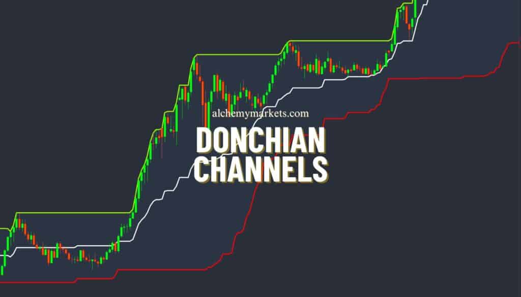
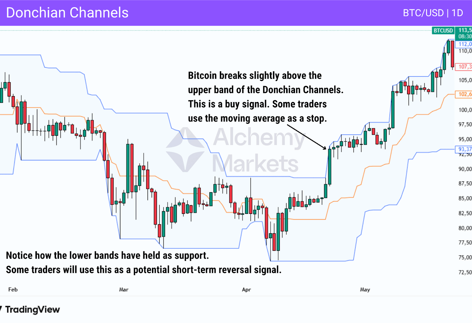
16. Donchian Channels
Type: Trend following.
Best Used For: Helps identify breakouts in trending markets.
Best Trading Time Frames: Higher time frames like the 4-hour or daily charts.
Indicator Complexity: Intermediate.
How Donchian Channels Work:
Donchian Channels are an indicator that is designed to identify breakout points in trending markets. The indicator plots the highest high and lowest low over a specified period of candles, often 20 days, and is then overlaid on the price candles.
Traders execute entries when the donchian channel signals a price break above or below recent extremes (across the last 20 days – or other measured days).
This can show a continuation or even reversal of the current trend. Furthermore, many traders will use the moving average in the middle of the indicator for a stop loss area.
Donchian Channels were used by Richard Dennis in the famous “Turtle Trading Strategy”, where traders in that group bought when the price broke above the upper band, and sold when it broke the lower band. These traders became legends after they accomplished roughly 80% returns for a five-year period of time. That being said, the popularity of the Turtle Trading Strategy has waned over the last several years, and with it, Donchian Channels.
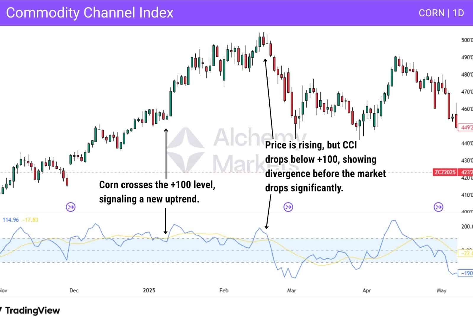
17. Commodity Channel Index (CCI)
Type: Momentum indicator
Best Used For: Understanding overbought or oversold conditions in a market
Best Trading Time Frames: CCI is used on all time frames
Indicator Complexity: Beginner to intermediate
How the Commodity Channel Index Works:
CCI is an oscillator that measures the current price level in relation to the average price over a given period of time. The reading is between +100 and -100, with a 0 level between.
When the indicator breaks above the +100 level, the asset is showing strong upside momentum, or even the possibility of an overbought condition..The indicator breaking below -100 is a sign of strong downside momentum, or even oversold conditions. Initially geared for commodity markets, hence the name, it has been adapted for several other markets.
Some things to think about when using the CCI:
- When CCI crosses above +100, it shows increasing momentum, potentially the start of an upward trend or breakout. When CCI drops below +100 drops again, this is a potential exit signal as momentum is dropping.
- When CCI crosses below -100, it shows increasing momentum to the downside, potentially the start of a strong downtrend. When CCI crosses back above the -100 level, it shows momentum fading.
Some traders will use a rise above +100, followed by a cross back below it as a sign to start shorting. Conversely, they may use a drop below -100, followed by a cross back above it as a buy signal, showing the versatility of the Commodity Channel Index.
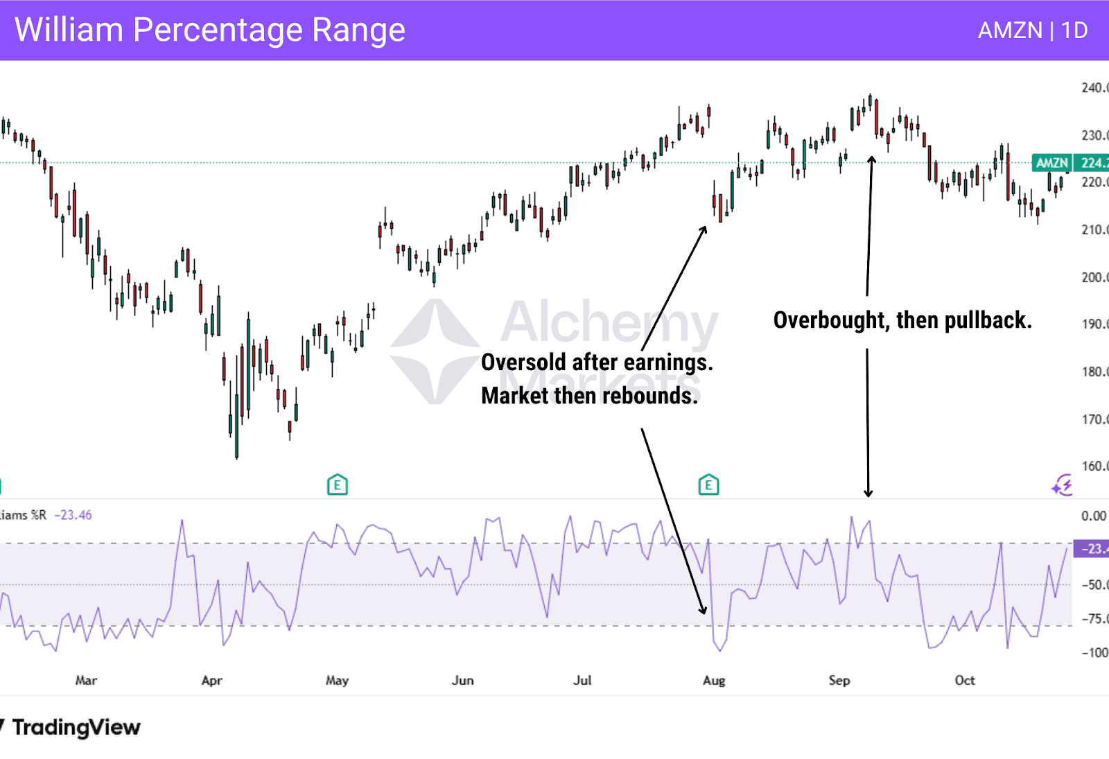
18. Williams Percentage Range
Type: Momentum indicator
Best Used For: Identifying overbought and oversold conditions. It can be used to potentially spot divergence as well
Best Trading Time Frames: Daily or 4-hour charts
Indicator Complexity: Beginner
How Williams Percentage Range Works:
Williams Percentage Range compares the current closing price to the highest high and lowest low over a chosen period. Typically, this is 14. It has a range of 0 to -100, with anything above -20 being an overbought condition, and a reading below -80 considered to be oversold. Most traders will refine entries using price action, support and resistance, or some other filter.
Some traders will use the Williams Percentage Range as a potential signal for divergence, but the volatile nature of the indicator can make that somewhat difficult without other conditional filters.
Often, traders will combine the Williams Percentage Range with basic support and resistance levels to determine trading signals and entries/exits in a market.
19. Fibonacci Extension
Type: Price action
Best Used For: Setting price targets and identifying potential exhaustion areas
Best Trading Time Frames: All time frames are used by traders
Indicator Complexity: Intermediate
How Fibonacci Extension Works:
The Fibonacci Extension tool projects potential future price levels by using Fibonacci ratios calculated by three points on a chart.
To apply the Fibonacci Extension tool, first identify a price move that breaks the previous trend such as a rally that pushes past a prior lower high or a drop that breaks a previous lower low. Wait for that move to retrace and form a clear pivot point; this confirms a potential second leg in the trend.
Mark three key points: the start of the initial move, the end of that move (the swing high in an uptrend or swing low in a downtrend), and the retracement point where price pulls back.
Once these levels are selected, the Fibonacci Extension tool automatically projects potential targets beyond the prior swing, helping traders estimate where the next leg might reach:
- 100%: An equal move from the initial one. (Measured move)
- 127.2%: Moderate extension target
- 161.8%: “Golden ratio”, strong extension level
- 200%, 261.8%, 423.6%: as extended levels

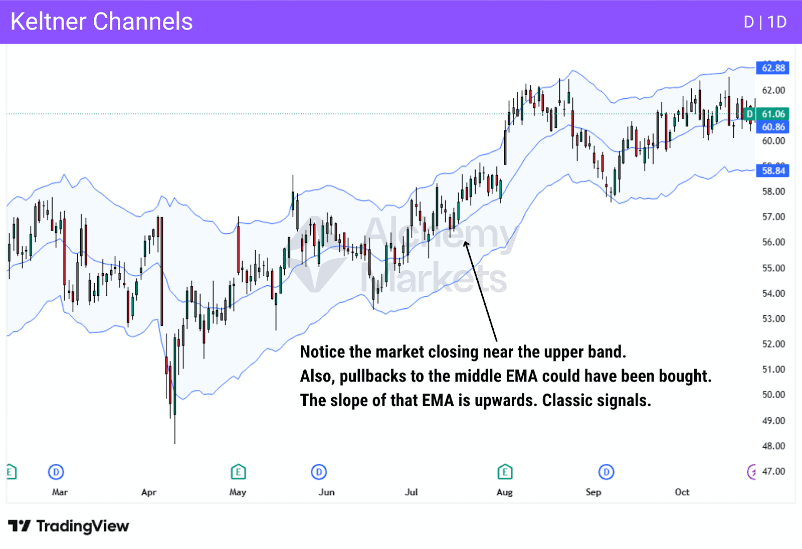
20. Keltner Channels
Type: Trend Following
Best Used For: Identifying trend direction and trend strength
Best Trading Time Frames: Works with all time frames
Indicator Complexity: Intermediate
How Keltner Channels Works:
Keltner Channels consist of three lines built around Exponential Moving Averages (EMAs). The middle line is usually a 20-period EMA, while the upper and lower bands are calculated by adding and subtracting a multiple of the Average True Range (ATR) from it. Because ATR reflects market volatility, the channels naturally widen during volatile periods and contract when price action settles down.
Traders often look for pullbacks toward the middle band, as this area represents “fair value”, which is the average price within the current trend. In an uptrend, this midpoint can act as a dynamic support zone where buyers re-enter before price pushes higher again.
- When price consistently touches or closes near the upper band and the middle EMA is sloping upward, it signals an uptrend.
- When the price consistently touches or even closes near the lower band and the slope of the middle EMA is downward, we are in a downtrend.
- If the EMA is relatively flat, the market is considered to be “sideways” and range-bound.
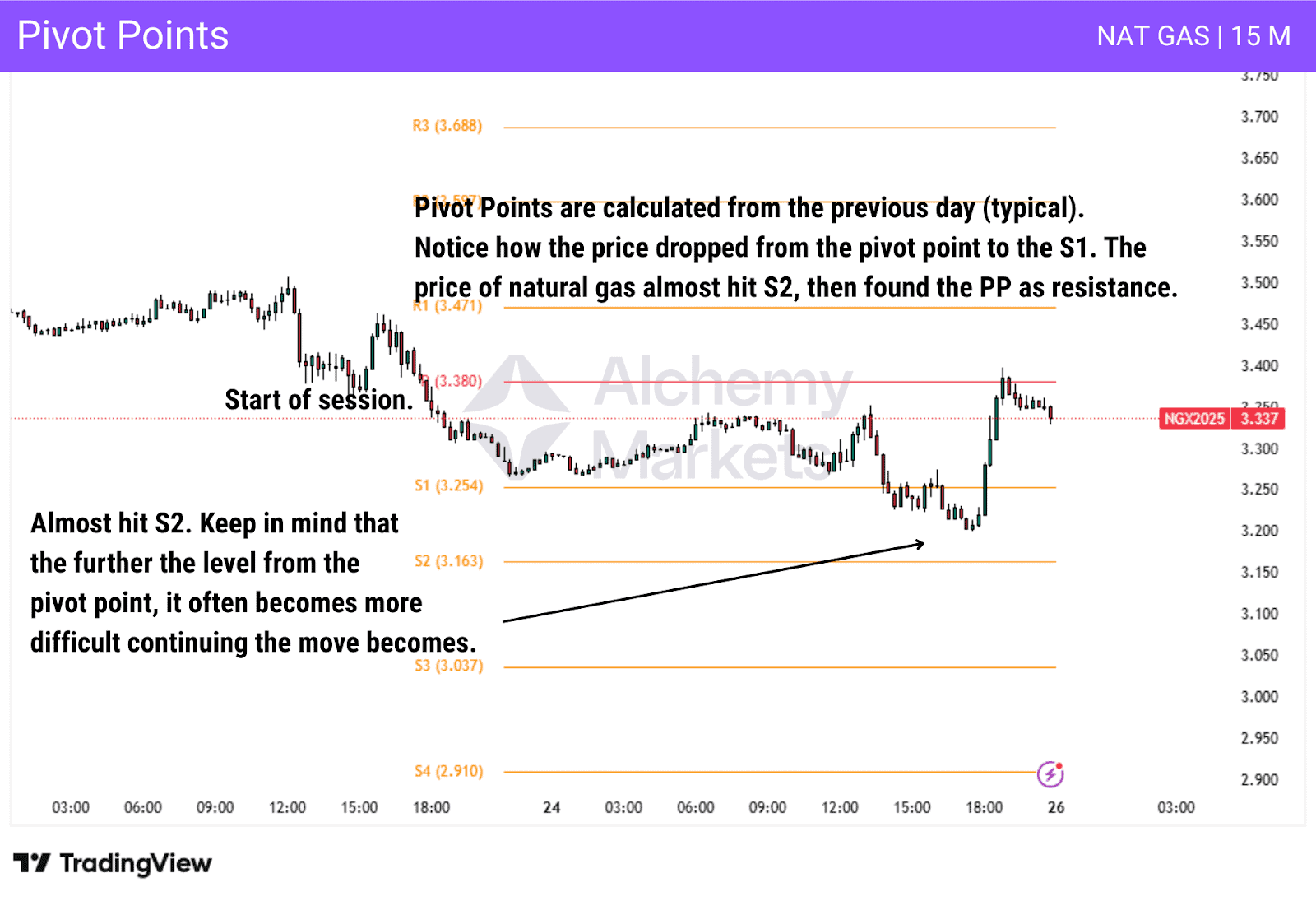
21. Pivot Points
Type: Price action
Best Used For: Determining key intraday or daily support/resistance levels
Best Trading Time Frames: All time frames, but mostly used for intraday trading
Indicator Complexity: Beginner
How Pivot Points Work:
Pivot points will calculate a central price level, known as “the pivot”, from the previous high, low, and close, then suggest support (S1, S2, and S3) and resistance (R1, R2, R3) levels around it.
Typically, traders will get these pivot points from the calculation of the high, low, and close of the previous day, then trade those levels on short-term charts. While they can be used for swing trading, the majority of use cases come from intraday trading, especially in Forex and futures.
The indicator ends up being several lines on a chart, and traders will be looking to play bounces or pullbacks from these levels. If the price of the asset is above the pivot point, then it is a market that traders will be looking to buy, and if the price is below that level, then they will be looking for shorts.
Traders will also use the levels to determine take-profit levels. Think of them as short-term support and resistance barriers.
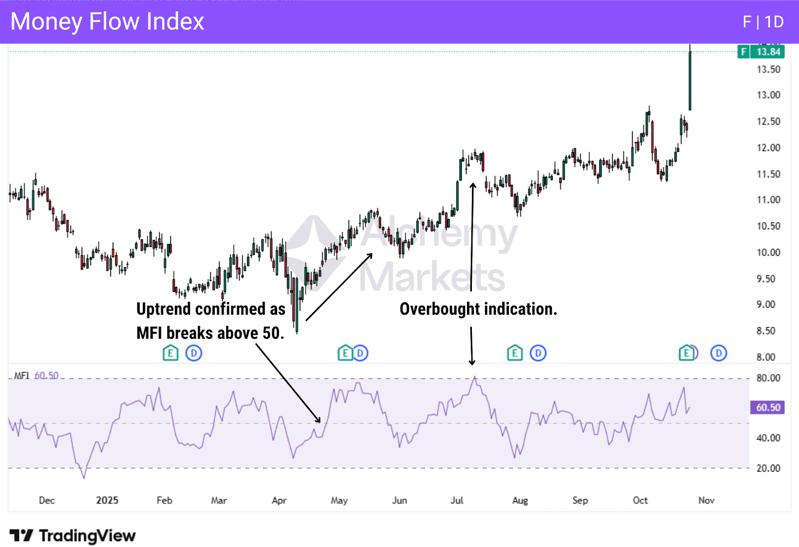
22. Money Flow Index
Type: Momentum indicator
Best Used For: Understanding whether a trend or move has the potential to continue
Best Trading Time Frames: While it can be used on all time frames, the higher the time frame, the more reliable MFI is
Indicator Complexity: Intermediate
How Money Flow Index Works:
The money flow index combines both price and volume to get a reading. The indicator compares “positive money flow”, when price and volume rise simultaneously, to “negative money flow” when price and volume fall together. The indicator will show a value between 0 and 100 in its own window.
If the indicator is above 80, it is potentially overbought, while a move below 20 can be a sign of being oversold. Divergences between MFI and price can often signal potential trend reversals.
Another way traders use the MFI is by observing a cross of the midsection:
- When the reading crosses above the 50 level, it is considered to be bullish
- A crossing below the 50 level is bearish.
FAQ
What’s the difference between momentum indicators and trend following indicators?
Momentum indicators (like RSI and ADX) measure the speed and strength of price movements, helping traders spot when momentum is building, fading, or reaching overbought/oversold levels. In contrast, trend-following indicators (like the EMA) track the direction of the market, smoothing price data to reveal whether an uptrend or downtrend is in place. In short, momentum shows how strong the move is, while trend-following shows which way the market is moving.
Are trading indicators reliable?
Indicators can be useful tools, but they aren’t foolproof. They work best when combined with price action, risk management, and overall market context rather than being used in isolation.
Which technical indicator can best spot overbought and oversold conditions?
The Relative Strength Index (RSI) is the most common indicator for spotting overbought and oversold conditions, with readings above 70 often signalling potential overbought zones and below 30 suggesting oversold levels.
What are the best technical analysis indicators for day traders?
Day traders often rely on short-term tools like Moving Averages, RSI, MACD, and Bollinger Bands to catch quick intraday price swings and trend reversals.
What are the best forex trading indicators?
Popular forex indicators include Moving Averages, MACD, RSI, and Fibonacci tools. They are all useful for identifying trends, momentum shifts, and entry points across volatile currency pairs.
What are the best crypto trading indicators?
Crypto traders commonly use RSI, MACD, Volume Profile, and Bollinger Bands to track volatility and momentum in fast-moving markets.
What are the best stock trading indicators?
For stocks, indicators like Moving Averages, RSI, and Volume are key to identifying strong trends, breakout setups, and potential reversals.
How many indicators should I have on my charts?
Keep it simple. Two to four well-chosen indicators are usually enough. Too many signals can lead to confusion or “analysis paralysis.”
Are you a beginner, intermediate, or experienced trader?
Beginners should focus on learning a few core indicators and understanding market structure before layering on complexity. As you gain experience, you can adapt or combine tools to fit your strategy.
Are you a short-term or long-term trader?
Short-term traders prioritise momentum and volatility indicators, while long-term traders tend to rely more on trend and macro-level tools like EMAs or volume-based metrics.
What are your own preferences?
The best indicators are the ones you understand deeply and can use consistently. Tailor your chart setup to your goals, timeframe, and comfort level. And not what’s trending.