Written by:

Reviewed by:

- June 11, 2024
- 34 min read
Relative Strength Index: A Comprehensive Guide to the RSI
Unsure about the right time to enter or exit the market? The Relative Strength Index (RSI) can serve as your guide. In this article, we’ll break down how the RSI works, how to interpret it, and how to use it to make more informed trading decisions. We’ll share experiences and insights from a trader’s point of view who has been studying and using the RSI for years.
What is Relative Strength Index
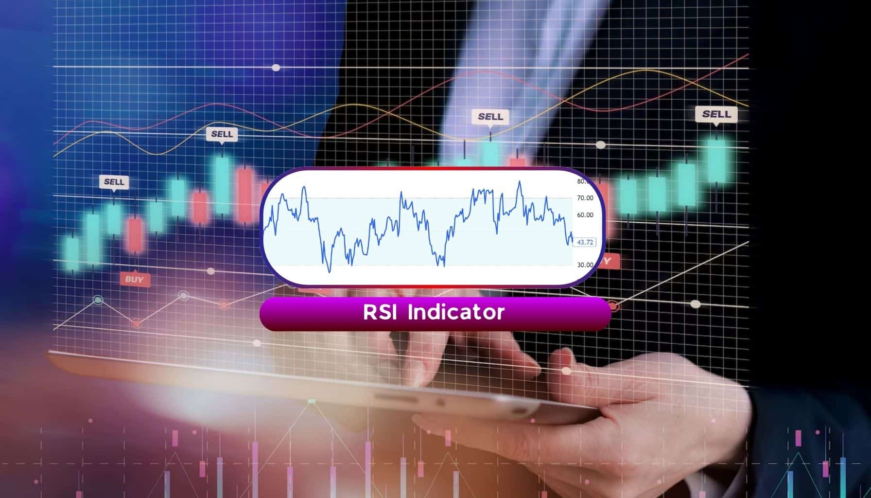
The Relative Strength Index (RSI) is a widely used momentum indicator in technical analysis that measures the speed and magnitude of price changes in a given asset. Displayed as an oscillator on a separate window of the chart, the RSI is bounded between 0 to 100, it assists traders by raising awareness that an asset is potentially trading in overvalued or undervalued territory based on recent price movements.
In essence, RSI is like a speedometer for a stock or other financial asset. It helps us understand how fast the price is changing, and how the average gains compare to the average losses.
If the average gains are outpacing the average losses, then the RSI will be at a higher level suggesting an uptrend. Alternatively, if average losses are outpacing average gains, then the RSI values will be smaller indicating a downtrend.
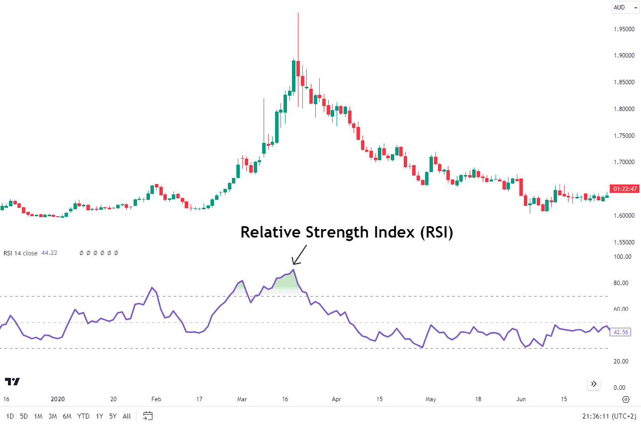
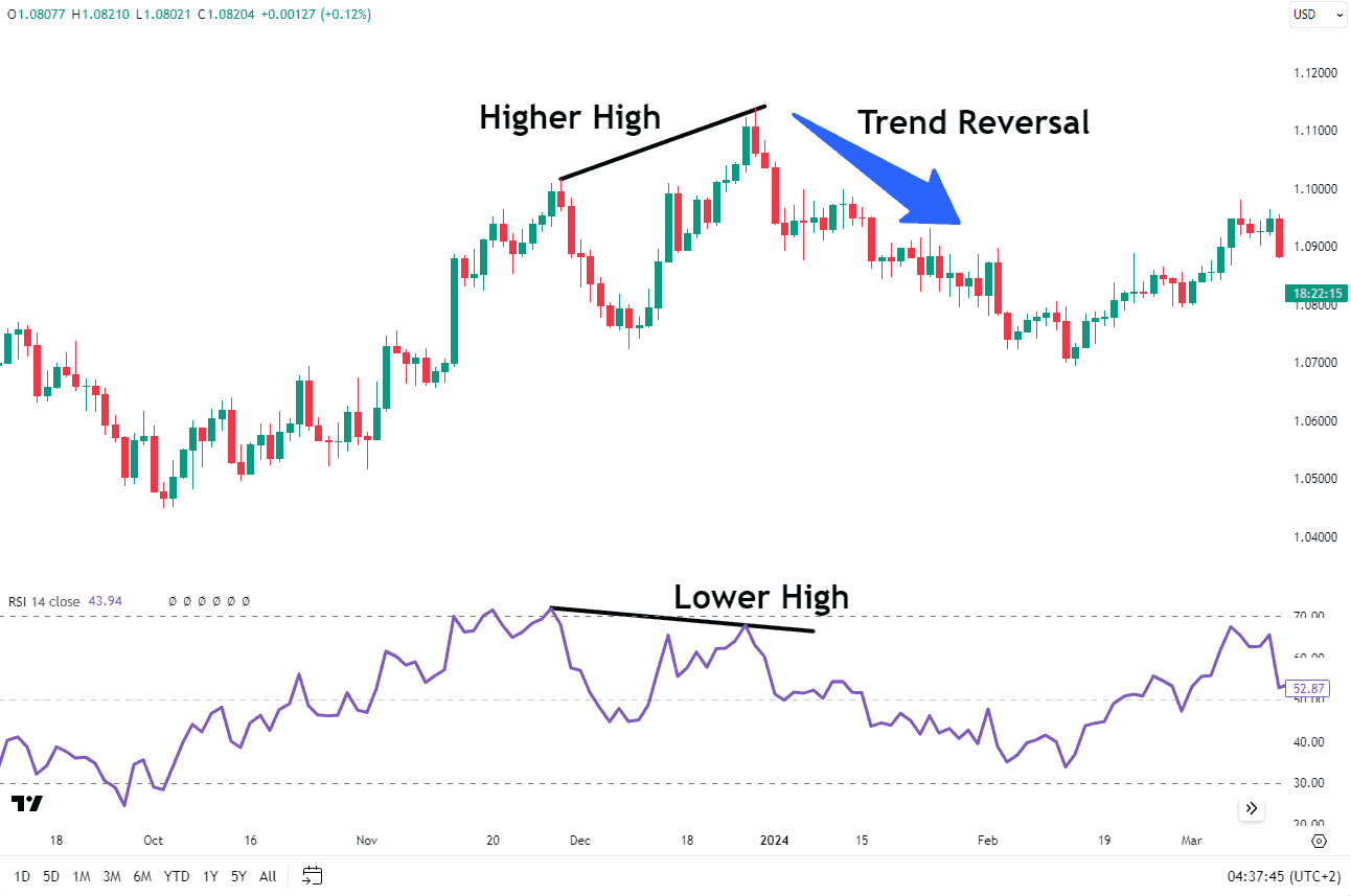
When the RSI displays an oversold reading followed by a higher low, it can indicate rising bullish momentum, suggesting a potential increase in bullish market dynamics. The RSI is then used to evaluate a potential shift in momentum which in turn suggests that the price may reverse in due course.
Above, is a chart example of the RSI in action and how it looks on a EURAUD Daily Chart. The RSI is an oscillator that sits in a separate window pane of the chart. The example above shows the RSI pane below the price chart.
Developed by J. Welles Wilder Jr, the RSI was introduced in his book New Concepts in Technical Trading Systems in 1978. Traditionally, the RSI has been most effective in trading ranges. Nowadays, RSI has additionally been used to determine when momentum may be shifting and when a trend change is imminent.
How to Use the Relative Strength Index (RSI)
The Relative Strength Index (RSI) operates on a scale from zero to 100, providing traders with a measure of the velocity and magnitude of price movements.
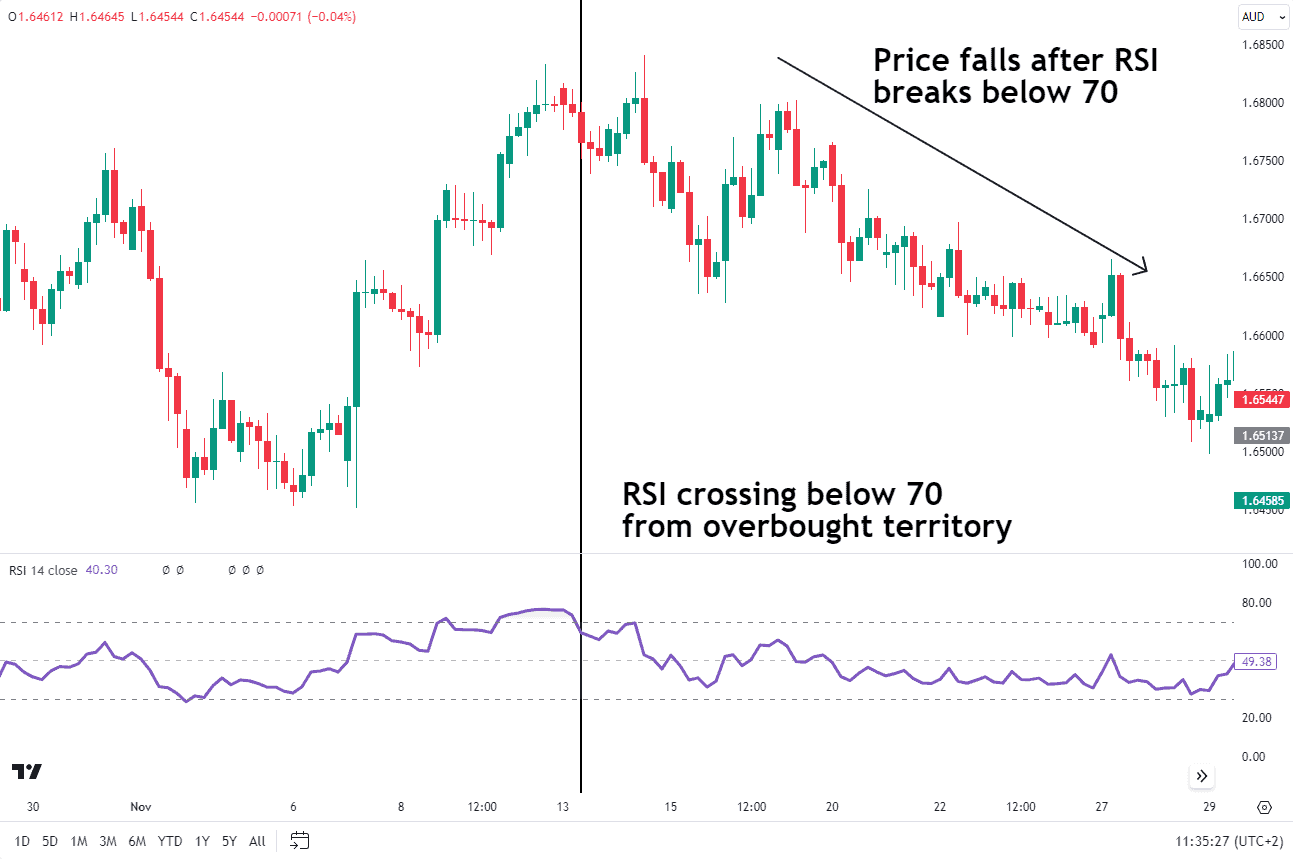
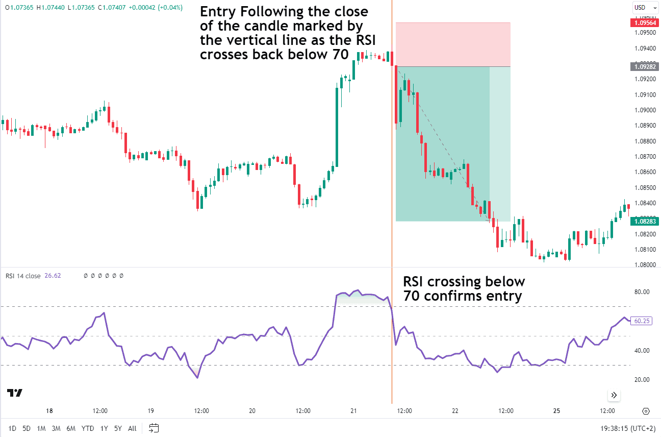
Think of the RSI scale like a thermometer for market momentum. When the RSI is above 70, it alerts you that the market is getting hot and it suggests prices are becoming overbought. Prices can continue to move higher even when RSI is in overbought territory. Therefore, if a trader is anticipating a bearish trend reversal, they will wait until RSI drops back below 70 as that suggests the average losses are catching up to the average gains. This dynamic is a symptom of slowing upward price momentum.
In the EURAUD chart below, notice how the RSI remains above 70 for several days. However, once the RSI breaks below 70, the price also begins to fall.
Source: Tradingview
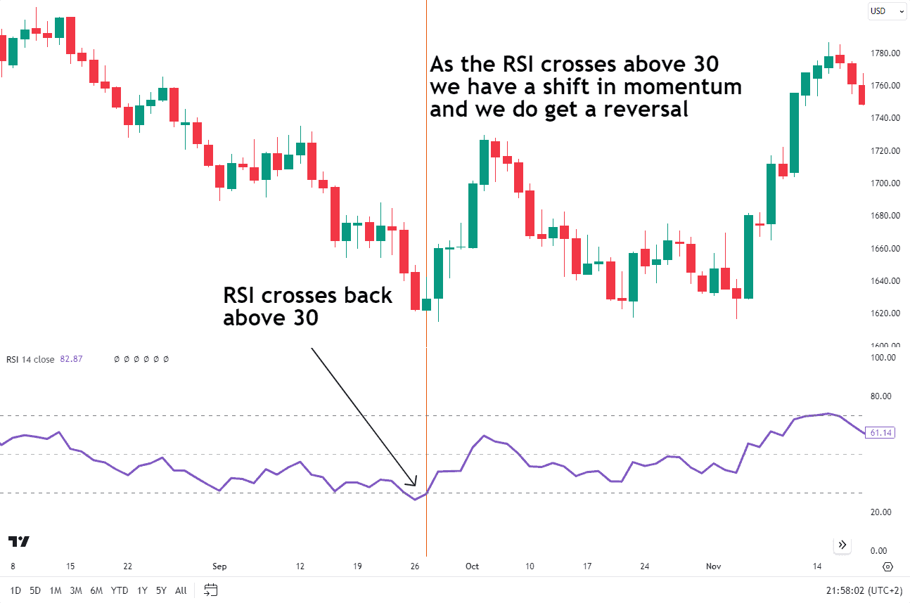
When the RSI is below 30, it’s like a green light that suggests prices are becoming oversold. The same rule applies here in that the RSI can hover below the 30 level while the price continues to trend lower for extended periods. Therefore, if you are using RSI as a reversal signal, it is key to wait for the RSI to move back above 30 as this would suggest that selling momentum may be slowing down.
The Gold chart below shows an example of the RSI crossing below 30. When it does break above 30, price pushes above a previous swing high indicative of a trend change.
Source: Tradingview
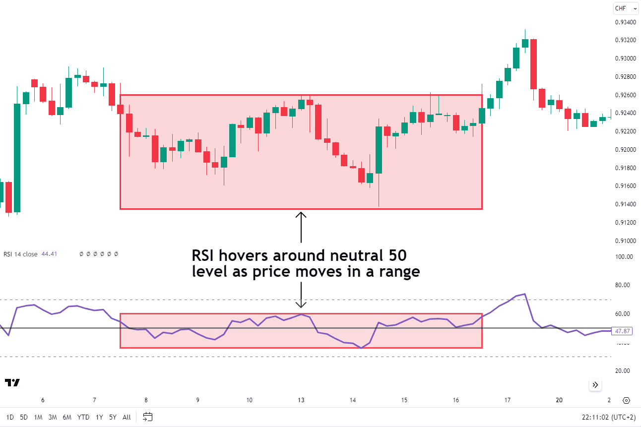
The neutral zone, which rests around 50, means things are calm. The neutral zone suggests the conditions are not too hot nor too cold. The market isn’t too bullish (optimistic) or too bearish (pessimistic).
A value above 50 means the average gains are slightly outpacing the average losses and viewed as an uptrend. Likewise, a value below 50 suggests average losses are outpacing average gains and viewed as a downtrend. The RSI isn’t perfect, but it’s a handy tool to keep an eye on potential market moves.
The USDCHF chart below provides an example of how the RSI looks when it hovers around the neutral 50 mark. As you can see, the price is non-trending and appears indecisive while stuck in a trading range.
Source: Tradingview
Importance of RSI in Technical Analysis

The Relative Strength Index (RSI) is a popular tool in technical analysis for traders. Imagine the stock market as a roller coaster. RSI tells you how fast the coaster is going and whether it’s climbing or falling. It helps you understand if prices are in a steep and aggressive uptrend or declining in an aggressive downtrend. The RSI can also help you see if the momentum is slowing down and if a reversal is imminent.
The RSI helps traders find potential buying or selling moments. It’s like having a compass to navigate the market twists and turns. Remember, RSI isn’t a crystal ball, but it’s a handy guide to help you ride the market coaster!
Calculating the RSI
The RSI uses a straightforward calculation. The needed ingredients are determining the average gain and average loss of the asset over the previous specified number of periods.
If the average gains are larger than the average losses, then the RSI valuation will be greater than 50 suggesting there is some underlying strength in the bull market.
If the average gains are smaller than the average losses, then the RSI valuation will be smaller than 50 indicating overall weakness in the market.
RSI Formula
The RSI is calculated using a pretty straightforward formula. The formula looks like this:
- RSI = 100 – (100 / (1 + RS))
Where RS (Relative Strength) is the Average gain of up periods during the specified time frame divided by the Average loss of down periods during the specified time frame.
- RS = Average Gain/Average Loss
- Average gain: sum of gains over X periods/X
- Average loss: sum of losses over X periods/X
The X is typically set to 14 periods by default, but you can tweak it to fit your trading style. Fortunately, the charting packages perform these calculations automatically so you don’t have to.
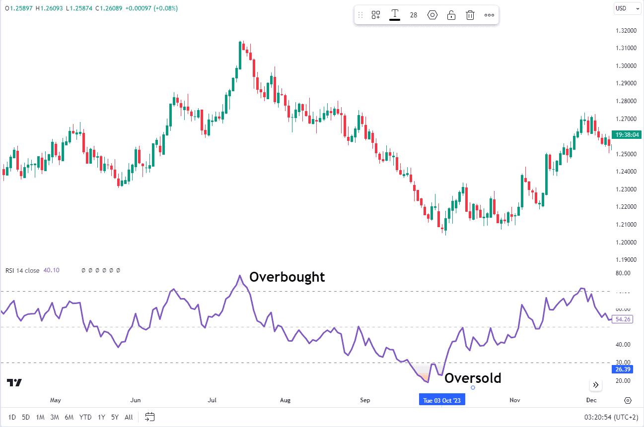
A Traditional RSI Example: Overbought and Oversold Levels
One of the most common ways to use the RSI is to identify momentum changes as the RSI leaves overbought readings and oversold regions.
As previously mentioned, an RSI reading above 70 is generally considered overbought, while a reading below 30 is considered oversold. When the price moves back down below 70 or back above the 30 mark, these are seen as signs of a momentum change with a trend change likely to follow.
GBPUSD Daily Chart
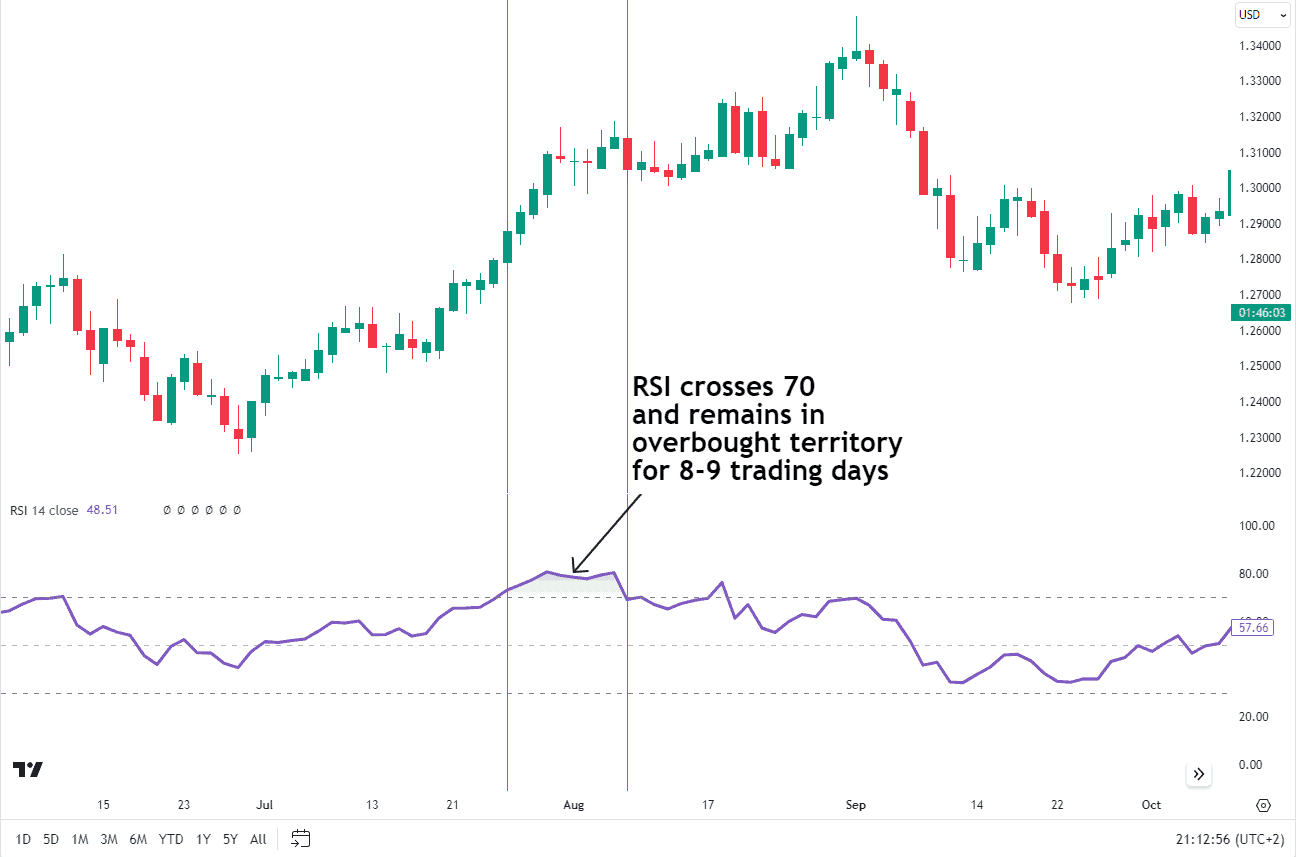
Source: Tradingview
As you can see from the chart example above, the RSI remains in overbought territory (70 and above) for 9 days. Once RSI crossed above 70, the price continued to rally for another 300 pips. By the time the RSI does break back below 70, the price continued to rally to a new high even after the RSI reached the overbought zone.
This is a prime example of where many traders go wrong, as they tend to take a sell position the moment the RSI rises above 70. In doing so, you run the risk that the RSI remains in overbought territory for an extended period of time while the price extends higher.
Source: Tradingview
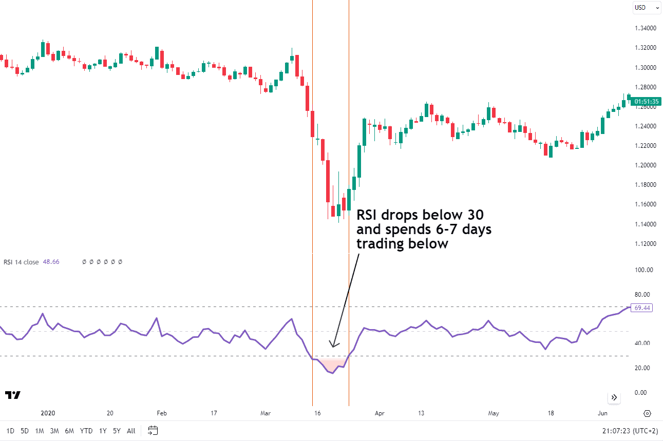
The next chart above serves as an example of the oversold territory (30 and below) and how the price continues to trade lower even though RSI is oversold. There are 6-7 days with RSI in oversold territory prior to a reversal in price.
The traditional overbought and oversold levels of 70 and 30 are just guidelines, not hard rules. Some traders prefer to adjust these levels based on their risk tolerance or the volatility of the market they’re trading. It’s all about finding what works best for you and your market strategy.
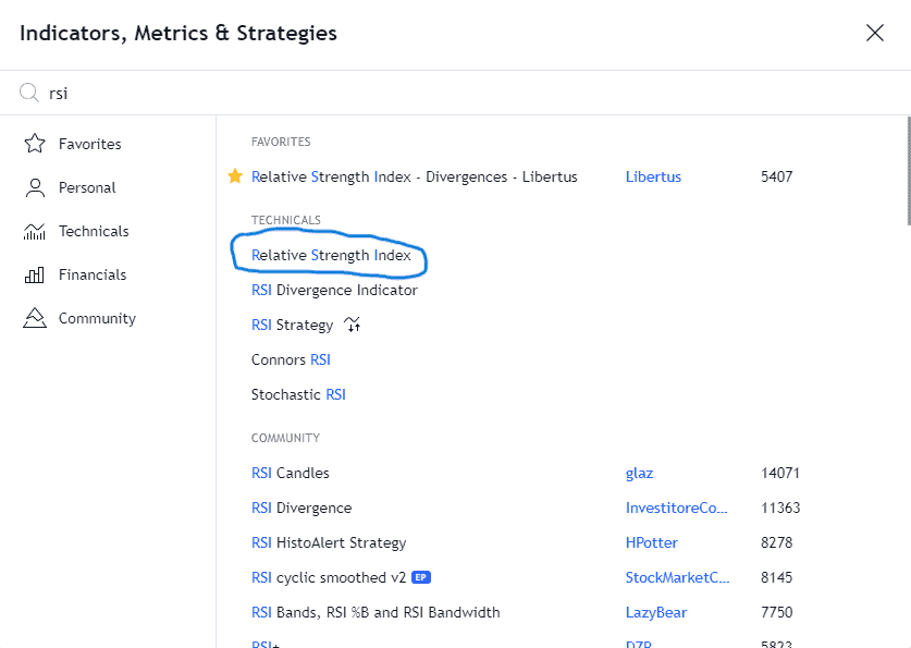
To add the Relative Strength Index to your charts, follow these steps if you use TradingView. First step would be selecting the indicator tab on TradingView and searching for the term “RSI”.
Source: Tradingview
Next, select “Relative Strength Index” then you will see the settings tab pop up. The period setting remains at 14.
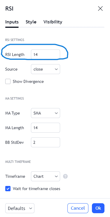
Source: Tradingview
Once you press OK, the RSI indicator will appear as a separate window at the bottom of your chart. Here is an example of what the RSI looks like on a chart.
Source: Tradingview
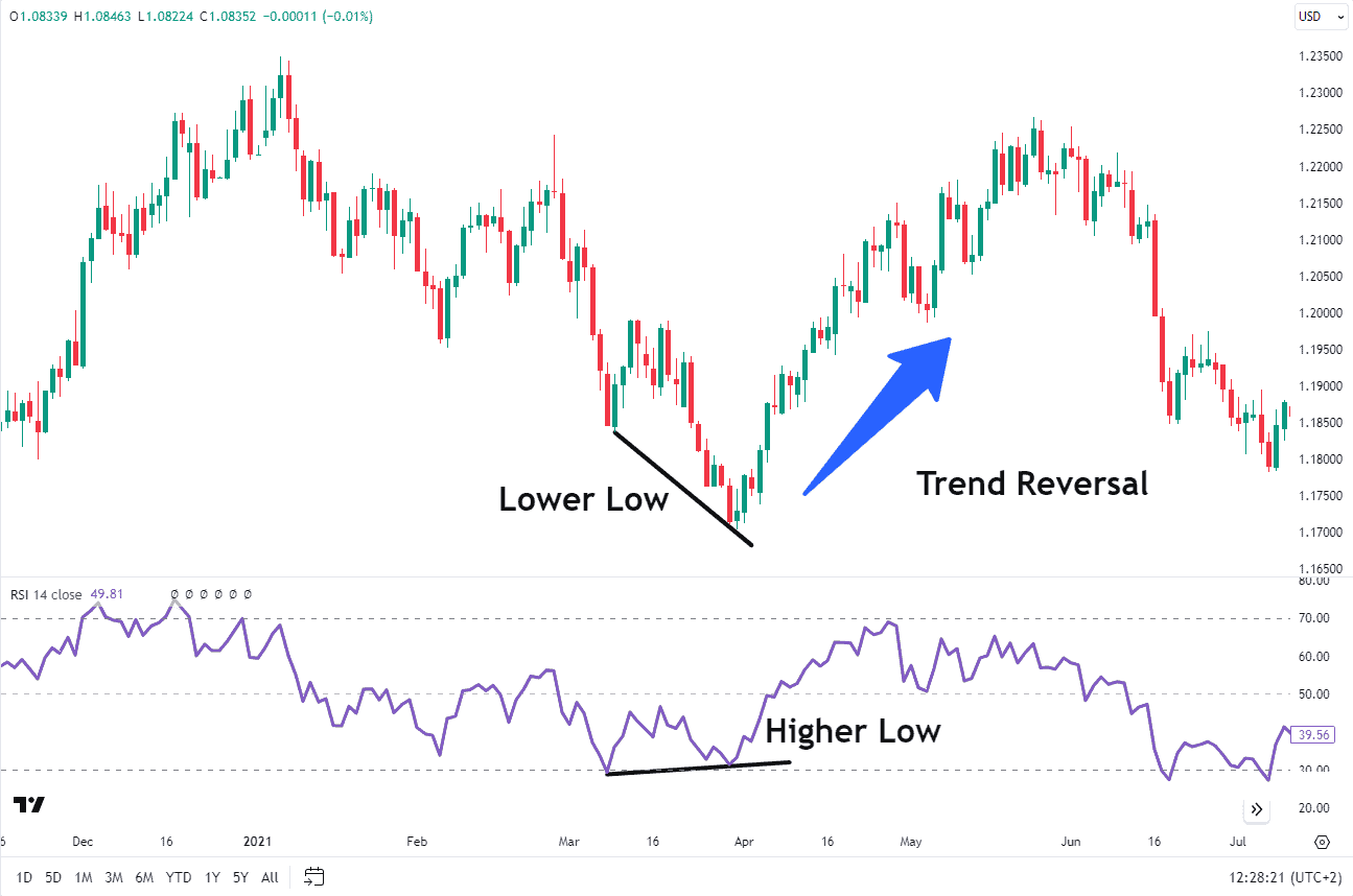
How to Use RSI To Identify Trends
Let’s dive into how you can use the Relative Strength Index (RSI) to identify trends. In different market conditions, RSI maintains different ranges.
In bull markets, the RSI stays within readings of 40 to 90, with 40-50 as support. In bear markets, RSI ranges from 10 to 60, with 50-60 acting as resistance areas.
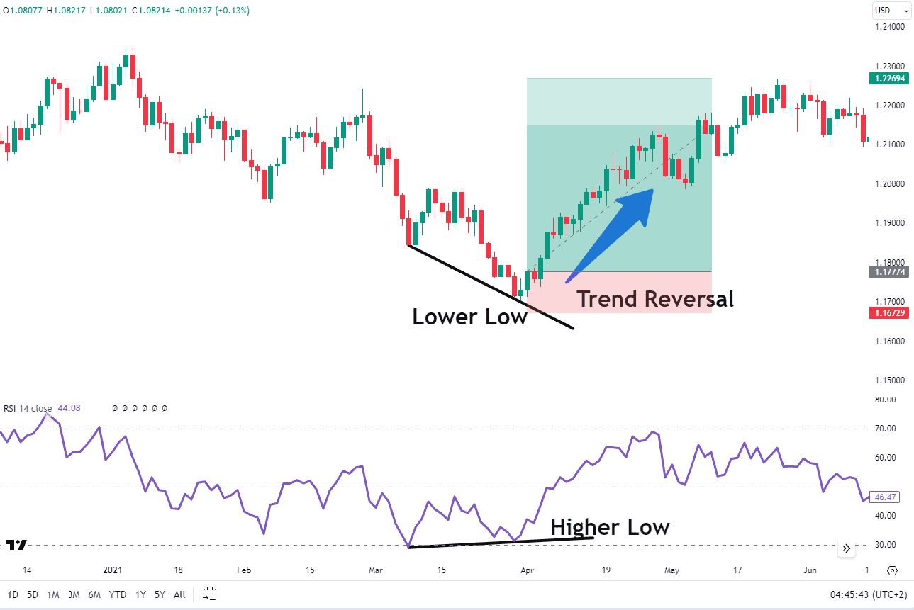
The centerline of the RSI, marked at 50, plays a vital role in trend identification. An RSI value crossing above suggests a bullish trend, while crossing below indicates a bearish trend. Additionally, when the RSI shows an oversold reading followed by a higher low, it can signal rising bullish momentum, indicating a potential increase in bullish market dynamics.
The behavior of the RSI in an uptrend is indicated on the chart below.
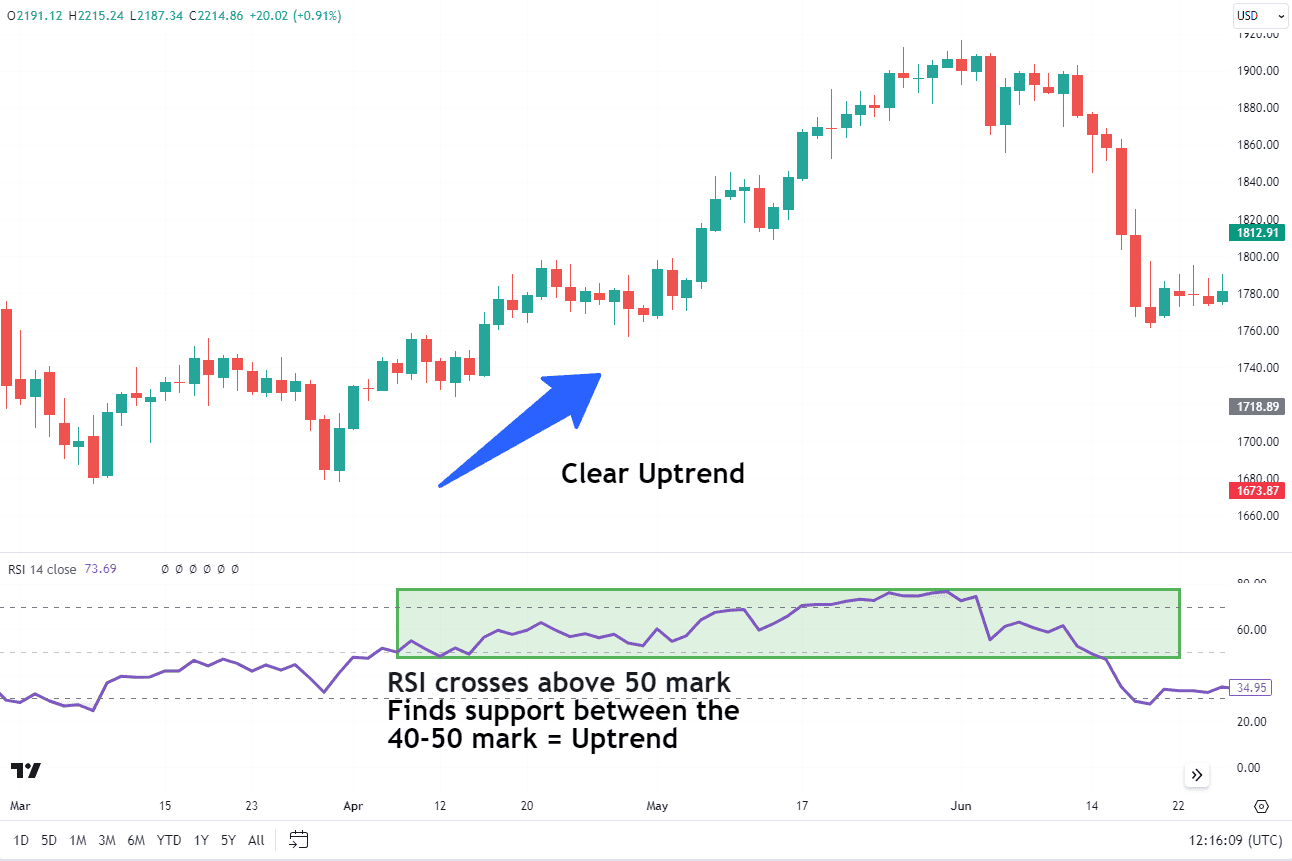
Source: Tradingview
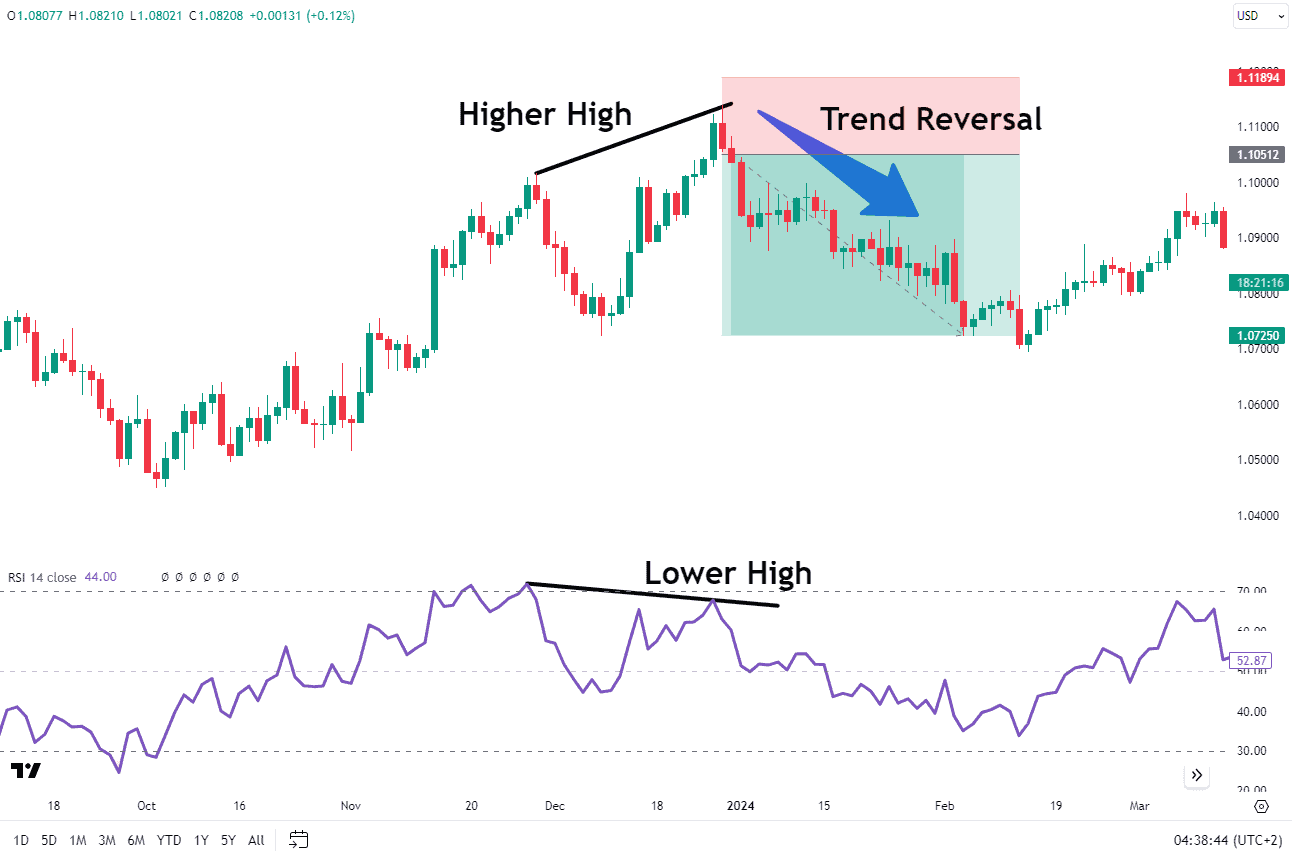
In a downtrend, an RSI that peaks and fails to rally above the 50-60 level implies a continuation of bearish market conditions. Traders can draw trendlines on the RSI chart, which helps to highlight the market’s trend direction and signals potential breakouts when RSI breaks through these lines.
Looking at the chart below, the market is clearly in a downtrend. Now pay attention to the green block drawn on the RSI chart with the top end of the block at the 60 mark. Each time the indicator reaches this 50-60 level, a downward movement occurs in the market. These downward movements are in accordance with the market’s larger trend.
Although no clear signals are generated in these levels, the RSI indicator serves as a warning at these levels for trend continuation. Hence, in a downtrend the best region for a continuation is when the RSI is around the 50-60 level. It is important to note that the moment the RSI broke above the green block we witnessed a change in trend.
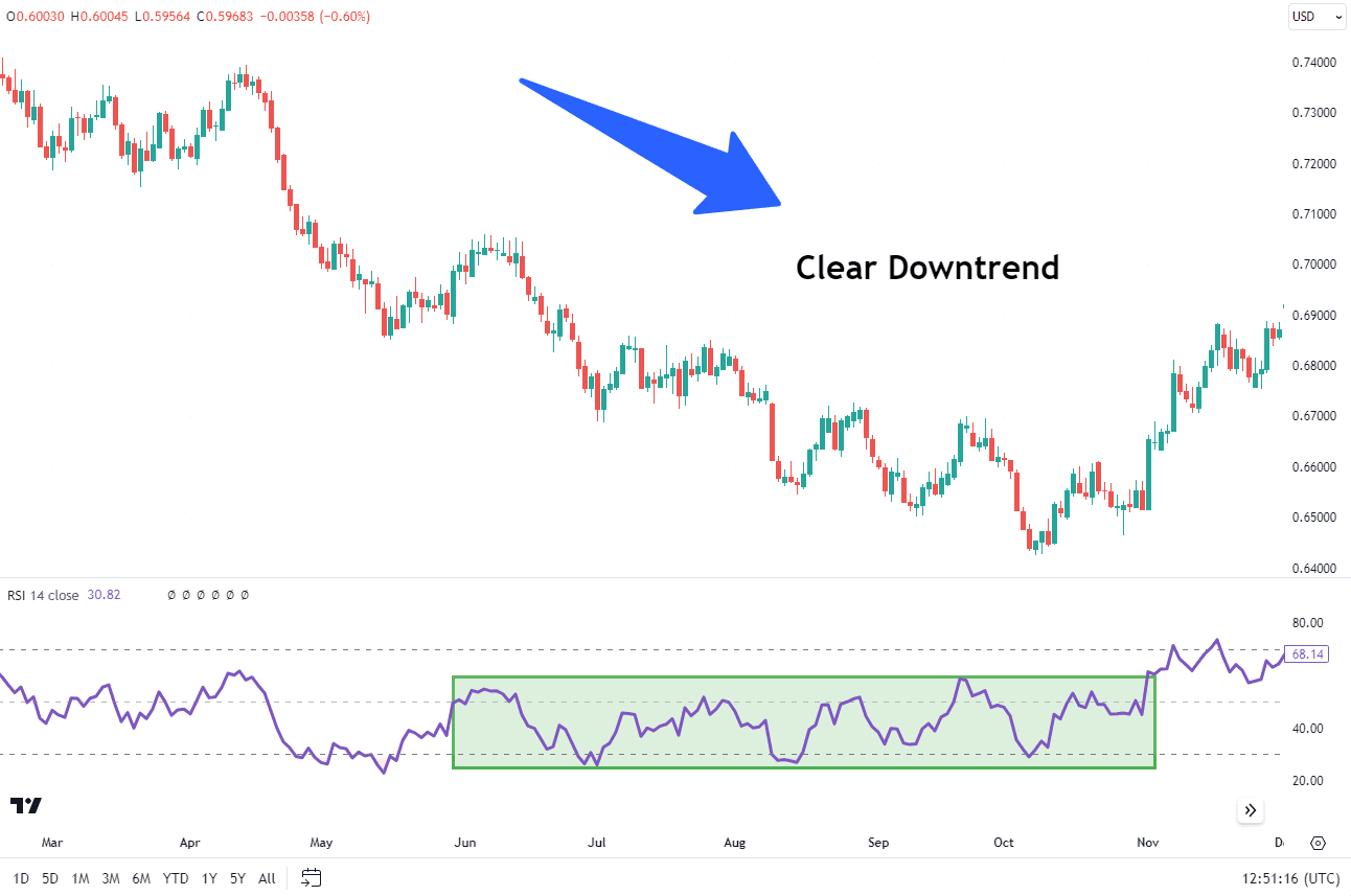
Source: Tradingview
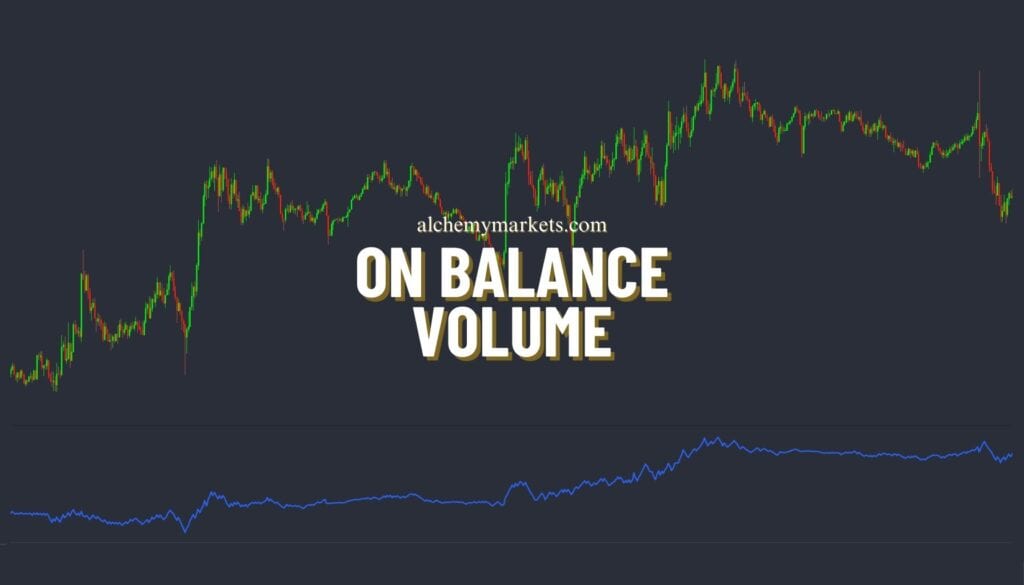
Furthermore, a more comprehensive analysis can be provided by using RSI in combination with volume indicators like On Balance Volume (OBV) or alongside candlestick patterns, which can confirm market trends. So, understanding how to use RSI to identify trends can significantly enhance your trading strategy.
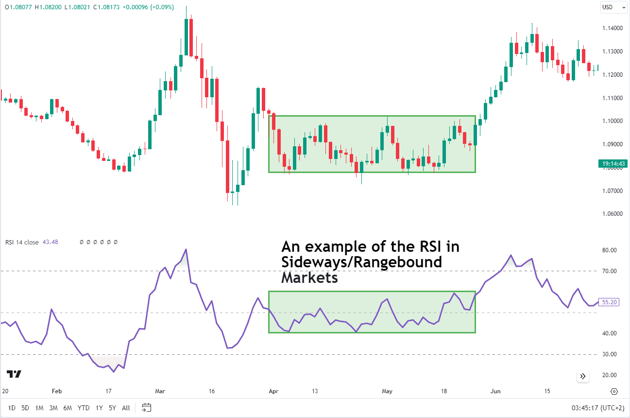
RSI in Sideways Range Markets
In a sideways range (flat) market the RSI values tend to seesaw between 40 and 60. This lack of powerful trend in the RSI indicates a lack of strong trend in the price. Therefore, trend-following strategies are more likely to fail.
Using RSI in sideways markets requires careful interpretation, as the conventional overbought and oversold RSI levels of 30 and 70 may not be as relevant.
In sideways markets, patience is key. Wait for RSI to give clearer signals by using it in combination with another indicator.
Effectively, when the RSI reaches the top of the 40-60 range, a trader could look for a bearish candlestick pattern (like a shooting star, hanging man, bearish engulfing) or use a moving average crossover on a smaller time frame chart to confirm a short position. Likewise, if the RSI approaches the 40 mark (lower end of the range), traders could keep an eye out for a bullish engulfing candle, morning star pattern, or moving average crossover to confirm a potential long position.
EURUSD Daily Chart
Source: Tradingview
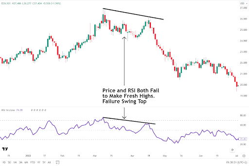
RSI Failure Swing Rejections
Another important method of using the RSI is to trade swing rejections. RSI Swing Rejections are similar to divergence except that price makes a lower high causing the RSI to create a lower high too. This pattern is confirmed when the RSI passes through the extreme level between the two tops (or bottoms).
There are two types of swing rejections:
| 1.Failure Swing Top | Occurs when price and the RSI fail to make a higher high and falls below the recent swing low of the indicator triggering a sell signal. |
Example of a swing top failure on the chart below.
XAGUSD Daily Chart
Source: Tradingview
| 2.Failure Swing Bottom | Occurs when both the price and RSI (Relative Strength Index) fail to form new lows. This pattern is confirmed when the RSI rallies above the previous RSI resistance and carves a higher high. |
Example of a swing bottom failure on the chart below.
EURUSD Daily Chart
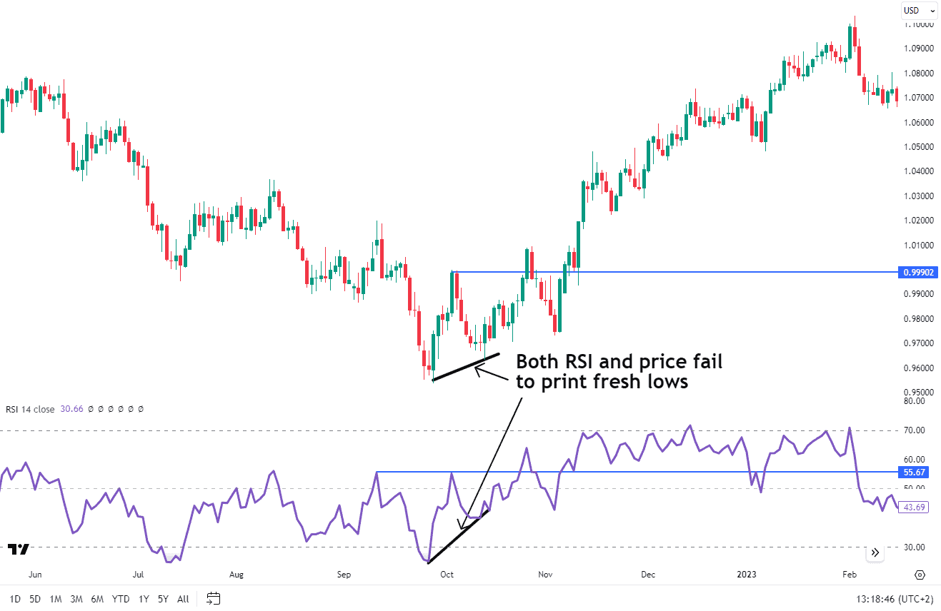
Source: Tradingview
RSI Classic Bullish and Bearish Divergence
Divergences between the RSI and price action can be powerful trading signals. Classic bullish divergence occurs when the price makes a new low, but the RSI fails to confirm this by making a higher low.
This divergence can be an early warning sign of a potential price reversal to the upside.
Source: Tradingview
Conversely, a bearish divergence happens when the price makes a new high, but the RSI fails to confirm this by making a lower high.
Source: Tradingview
RSI Trading Strategies
Maximizing the benefits of RSI requires understanding the various ways it can be used in trading strategies. These strategies can range from multi-time frame analysis to identify the overall trend and potential reversals, to using RSI divergences to signal possible price reversals
Using RSI in Multi-Time Frame Analysis
Multi-timeframe analysis is a powerful technique used by traders to gain deeper insights into the longer and shorter term market trends. Traders will seek out those opportunities where both trends align making for potentially strong trades. This involves examining the same asset or security’s price across different timeframes (e.g. weekly, daily, or hourly).
Multi-time frame analysis is a three step process.
- Identify the direction of the longer-term trend on the longer-term chart.
- Filter RSI buy and sell signals so that they align with the direction of the longer-term trend
- Make the trade based on the RSI and set the stop loss and take profit levels
Let’s walk through an example of how this would work.
Step 1
Identify the direction of the trend on a daily chart using a 200-period simple moving average.
If the price is above the simple moving average, then the trend is considered up. If the price is below the moving average, then the trend is considered down.
GOLD/XAUUSD Daily Chart
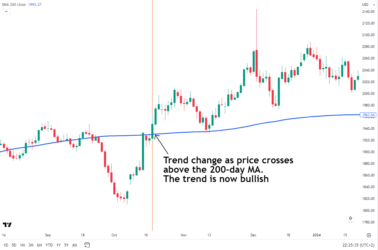
Source: Tradingview
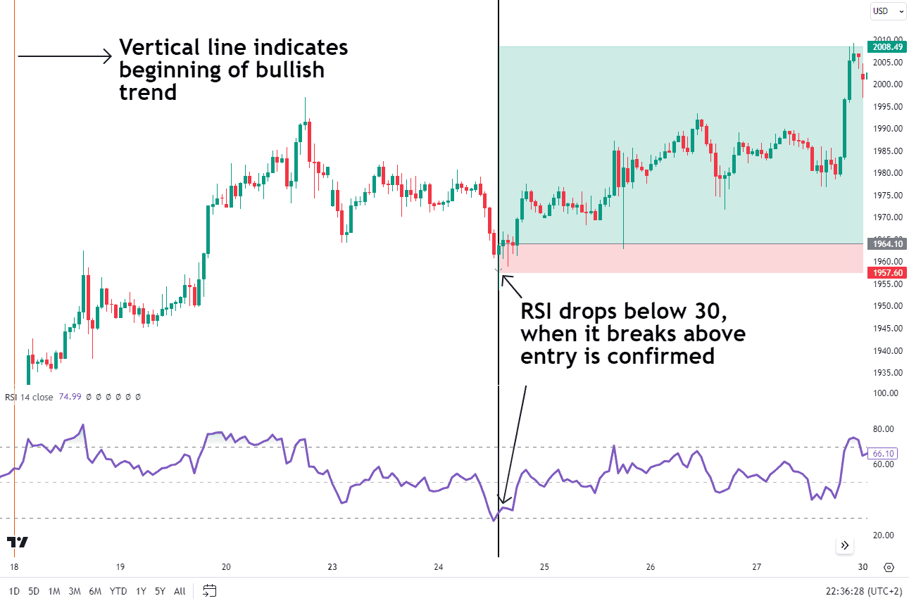
Step 2
Next, we step down to a smaller chart time frame to wait for RSI signals that align in the direction of the larger trend.
From step 1 above, we determined the trend is up on gold. Now, we’ll scale down to a 1-hour chart and look for only RSI buy signals. We will ignore any RSI sell signals that suggest a short position because we’ve determined the larger trend to be up. We only want to look for buying opportunities when the trend is up.
Therefore, we will wait for the RSI to drop below the 30 level. Entry will occur when the RSI crosses back above the 30 level from oversold readings on the smaller chart time frame.
Step 3
Place the trade and set your stop loss and take profit level.
When the trade is entered, set the stop loss just below the recent price swing low. The take profit level is at the next resistance level or at a distance at least twice the size as the stop loss. That way, the trading opportunity creates a better than 1-to-2 risk-to-reward ratio.
One benefit of this strategy is that it allows you to utilize a tighter stop loss level which then translates into a better risk-to-reward ratio.
GOLD/XAUUSD 1h
Source: Tradingview
RSI Failure Swing
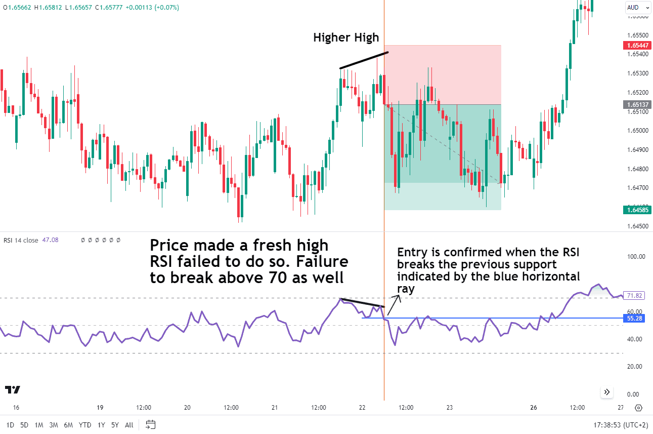
Another way to use the RSI for trading signals is to look for RSI Failure Swings. A failure swing top occurs when the RSI fails to cross above 70 after recently reaching overbought levels. In essence, the second high (or top) does not create the same robust RSI reading and the RSI fails to print about 70.
This type of price action suggests a reversal may be near.
Source: Tradingview
The first price high on the 21st creates an RSI reading that reaches 70. After a brief dip, the second price high created a lower RSI reading that was unable to reach 70 marking a potential failure swing.
Draw a horizontal line across the low of the RSI between the two highs. The pattern is confirmed when the RSI breaks below the recent swing low (horizontal line).
Entry is on the next candle. The stop loss will be placed above the recent highs and the take profit at the previous support level or twice the distance of the stop loss.
A bullish setup using this strategy occurs when the price makes a new low with RSI following it down to below 30. Then, after a brief rally, price prints a lower low but the RSI fails to fall below 30.
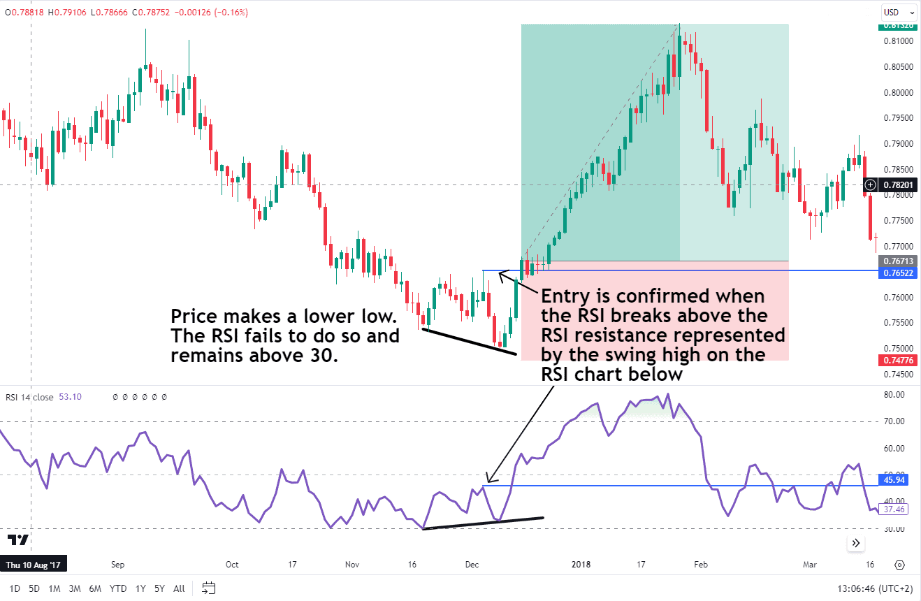
Source: Tradingview
This pattern could be a signal that the downtrend is losing steam and a potential reversal to the upside might be in the works. Entry is confirmed when the RSI breaks above the RSI resistance represented by the swing high on the RSI chart below.
As for the placement of the stop loss, this would usually be below the most recent swing low. The take-profit level could be at a key area of support and resistance or at an appropriate risk to reward depending on your strategy. (please see images above for examples).
RSI Divergences
Divergences between the RSI and the price action can be powerful trading signals. A classic bullish divergence occurs when the price makes a new low, but the RSI fails to confirm this and ends up making a higher low. This divergence can be an early warning sign of a potential price reversal to the upside.
EURUSD Daily Chart
Source: Tradingview
Conversely, a bearish divergence happens when the price makes a new high, but the RSI fails to confirm this by making a lower high. This divergence could be a signal that the uptrend is losing momentum and a potential reversal to the downside might be on the horizon.
Source: Tradingview
As you can see from the chart above. Once divergence is detected, entry can be made using another mode of confluence. In this case, the shooting star candlestick appears at the top of the divergence providing further evidence of a potential reversal. A trade may be entered with the stop loss just above the high and the take profit level can either be at a previous support or resistance level or at an appropriate risk-to-reward level (twice the stop loss distance)..
RSI with Exponential Moving Averages
Moving averages (MAs) are lagging indicators mainly used to identify trends. The combination of the RSI and moving averages can help confirm market trends.
This strategy works best when the market is in a strong trend, regardless of direction. Sideways ranges may not be suitable for this strategy.
Here’s a step-by-step guide on how the strategy works.
- Plotting Indicators:
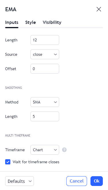
- Add the RSI indicator to your chart with a 21-period setting. Also, include the 50 line for reference.

- Plot two Exponential Moving Averages (EMAs): one with a 12-period setting and another with a 26-period setting. Go to the indicator tab and search for exponential moving average. See image below.
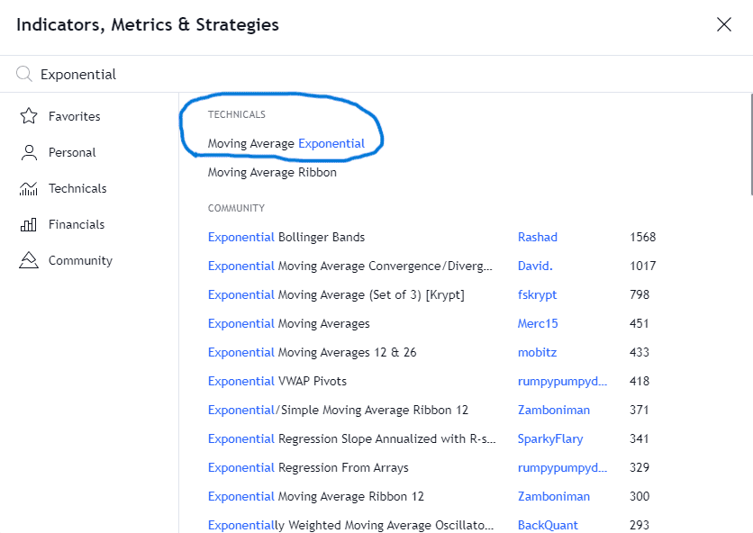
Once the exponential moving average is selected you will need to add it twice to the chart. The reason being that we require both an exponential moving average with a 12 and 26 period.
- Observe EMA Location:
- When the 12-period EMA is located above the 26-period EMA, consider long positions only (buy).
- If the 12-period EMA is below the 26-period EMA, look for a short position only (sell).
- RSI Confirmation Signal:
- Wait for confirmation from the RSI. If you’re aiming for a long position, wait for the RSI to cross above 50.
- For a short position, wait for the RSI to cross below 50.
- Signal Alignment:
- Enter your trade when both the EMA and RSI signals align. Place a buy stop order above the high of the candle that triggered both signals for a long position.
- Similarly, place a sell stop order below the low of the candle that triggered both signals for a short position.
- Risk Management:
- Set your stop loss either at the low of the same candle or below/above (depending on your trade direction) the longer-term EMA.
- Determine your take profit target using either a risk-reward ratio or a trailing stop.
Remember to adapt these steps to your trading strategy and risk tolerance.
In the chart example below, the price consolidated to form a bottom. The RSI slowly moves up toward the 50 level. It crosses above the 50 level just before the 12 EMA crosses above the 26 EMA. This signals a long position.
The stop loss may be placed at the low of the same candle or below the longer-term EMA. Determine your take profit target using either a risk-reward ratio and you could also trail your profit at a certain point.
BTCUSD Daily Chart
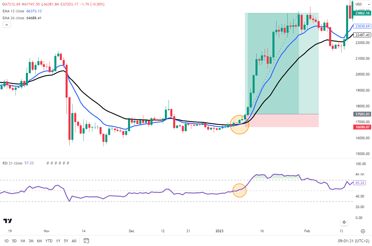
Source: Tradingview
RSI with Bollinger Bands®
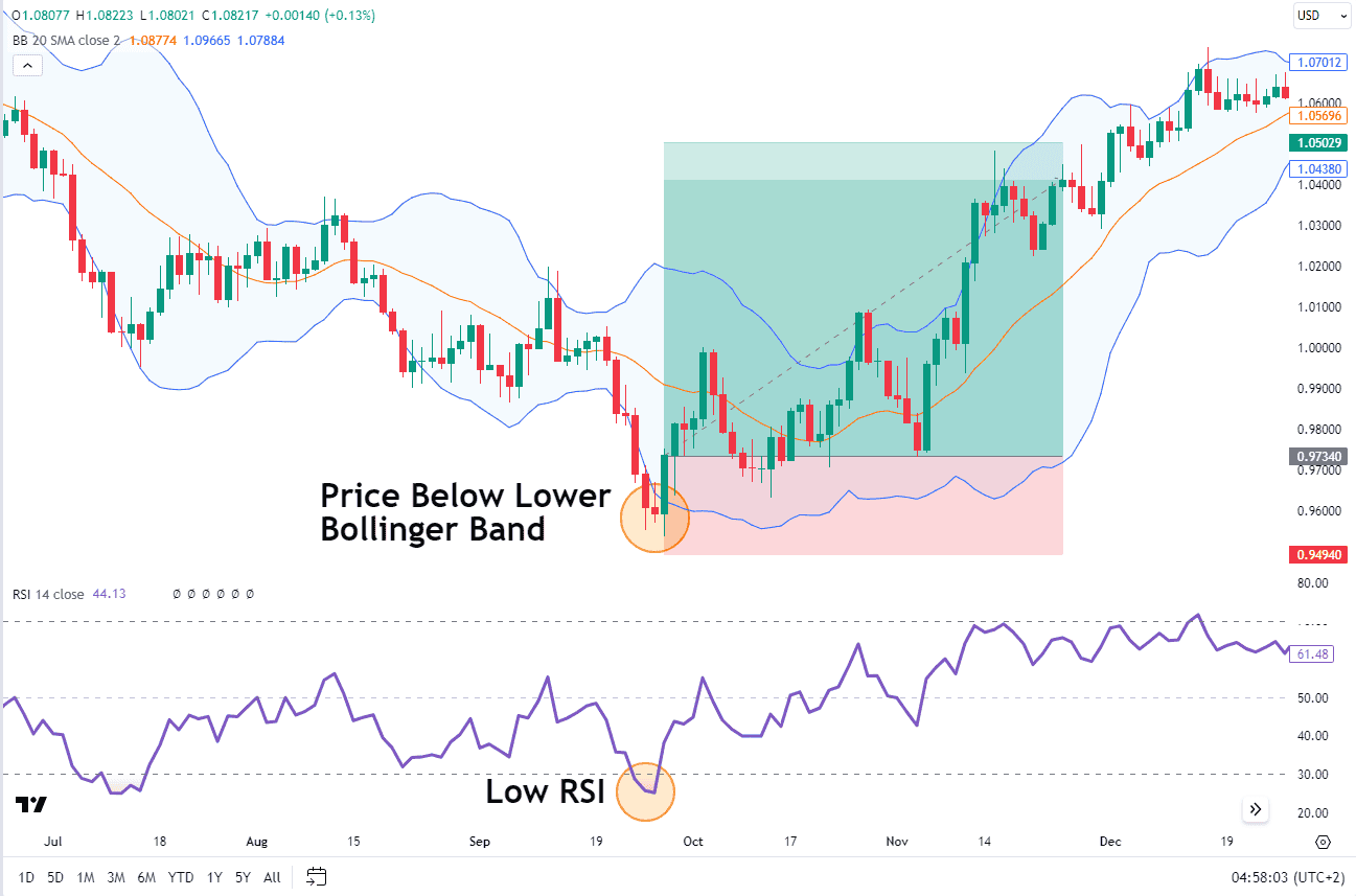
Combining the RSI with Bollinger Bands can help identify volatility and potential price reversals. Use Bollinger Bands to assess market volatility and the RSI to identify overbought or oversold conditions. A low RSI in a high-volatility market could indicate a stronger buy signal.
Look for the price touching or breaking through the lower Bollinger Band with an accompanying low RSI as a buy signal.
Conversely, a price at the upper Bollinger Band with a high RSI can signal a sell opportunity.
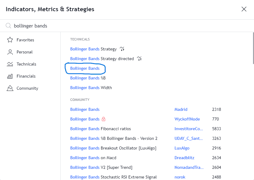
First, add the Bollinger Bands to the chart in question. Search the indicators tab on TradingView.
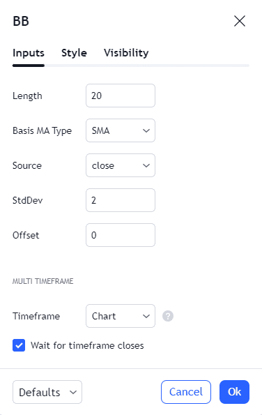
Next, we look at the generic settings as they are.
Once all the settings are in place we can now look at the placing of a trade and a potential stop loss and take profit levels.
As you can see in the chart below, the price dips below the lower Bollinger band which coincides with an oversold RSI. As the RSI crosses back above the 30 level this would be the signal for an entry with a stop loss below the recent lows and a take profit at a previous resistance level.
EURUSD Daily Chart
Source: Tradingview
RSI with MACD
The Moving Average Convergence Divergence (MACD) and RSI can complement each other, offering insights into momentum and potential reversals.
Use the MACD to confirm the trend direction and the RSI to pinpoint entry and exit points based on overbought and oversold conditions. A bullish signal occurs when the MACD shows upward momentum, and the RSI moves out of the oversold territory. A bearish signal is when the MACD indicates downward momentum, and the RSI exits the overbought zone.
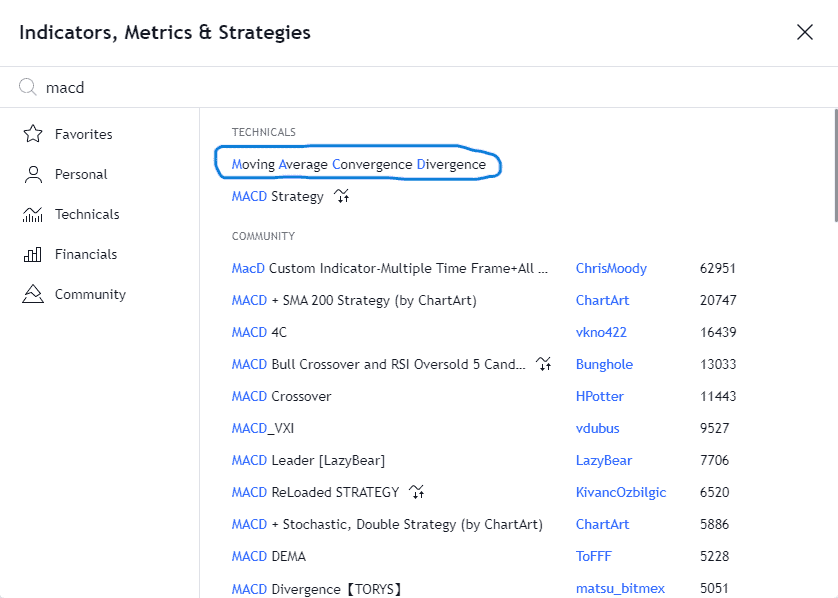
Step 1: Add the MACD to a chart by searching through the indicator tab on TradingView.
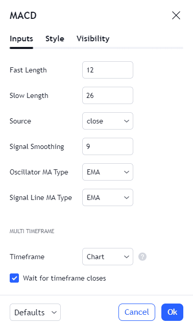
Below is a screenshot showing the default settings used.
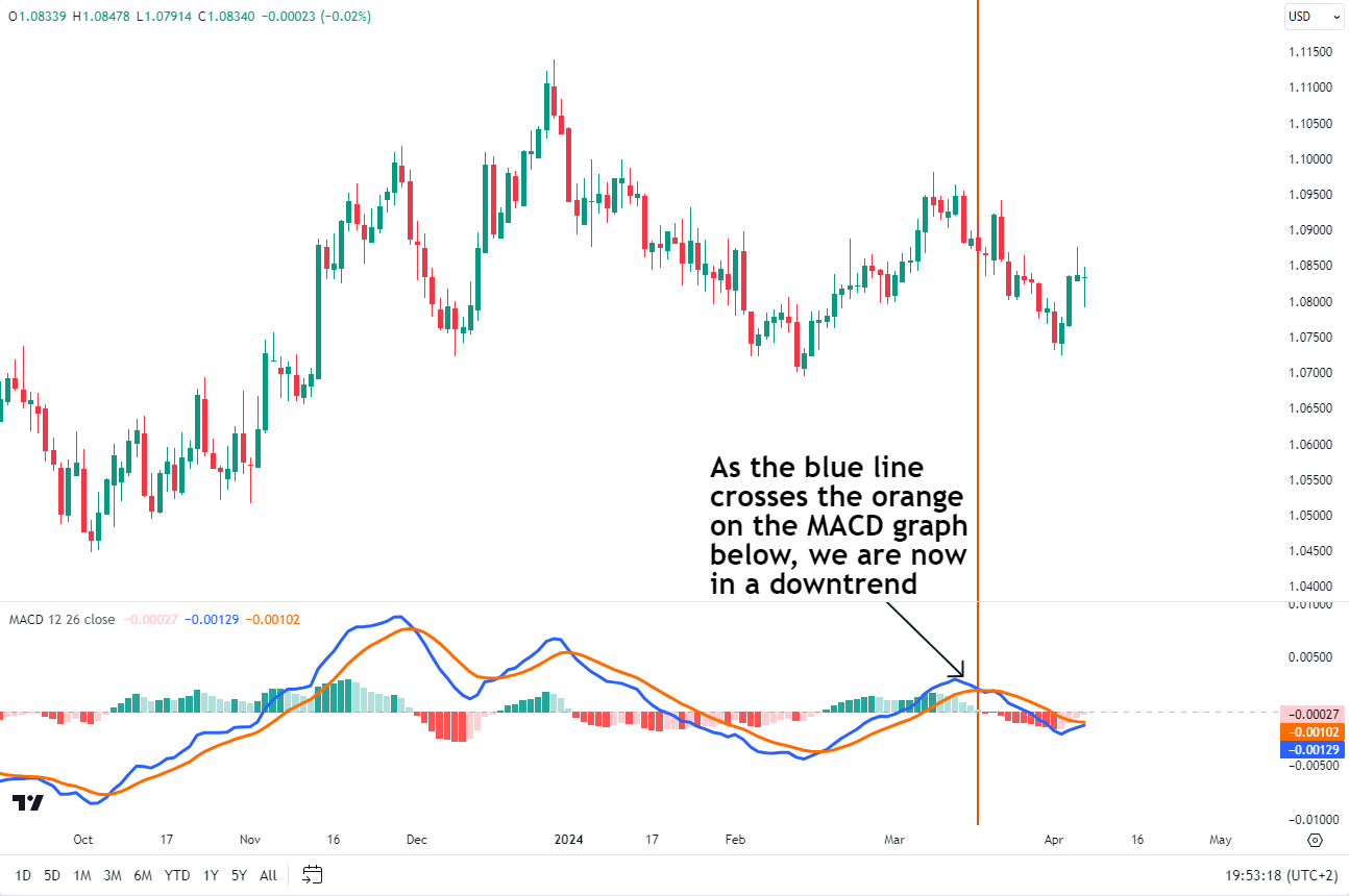
Step 2: The chart below shows just the MACD applied so that we may gauge the trend on a daily chart time frame. Remember with the MACD when the slower period MACD (blue line) in the chart below crosses back above or below the orange line then a trend change has occurred.
Step 3: Find an entry. Lastly, we drop down to a 1 hour chart and use the RSI to look only for potential shorts as we look to follow the overall trend.
Source: Tradingview
Look at the chart above. Entry is confirmed when the RSI, having been above the 70 level, crosses back below it. The stop loss will be placed above the most recent high with a take profit at a previous support level or to an appropriate risk-to-reward ratio.
RSI with Fibonacci Retracement
The Fibonacci retracement levels are another tool that can be combined with RSI. Fibonacci retracement levels are horizontal lines that indicate where hidden levels of support and resistance levels are likely to occur. The levels are derived from the Fibonacci sequence which is beyond the scope of this piece.
When combined with RSI, traders can use these levels to identify potential trend reversals by looking for Fibonacci levels that coincide with overbought or oversold RSI readings. Essentially, we can use the RSI as a form of confirmation to see if Fibonacci retracement levels are repelling or supporting prices.
Combining RSI and Fibonacci helps traders make smarter decisions. It’s like having two tools that agree: “Yep, this level is important!” So, when both say the same thing, it’s more reliable. It is like using a map and a compass together – they guide you better when they point in the same direction!
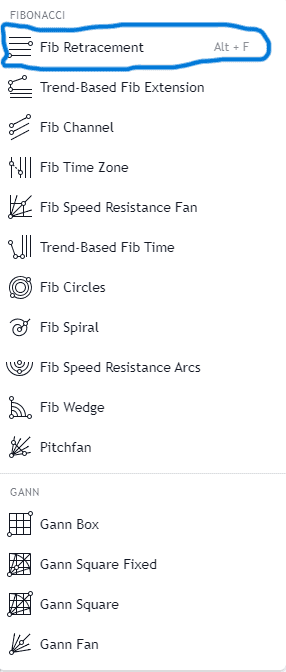
Step 1: Add the Fibonacci retracement tool to the chart. On Tradingview the Fibonacci retracement tool may be located on the left panel of the chart and is the third icon from the top. See image below, the blue circle on the left of the chart is the correct icon.
Source: Tradingview
Step 2: Click the icon and the first option says “fib retracement”. Once selected you will be able to plot the fibonacci retracement on the chart. See image below.
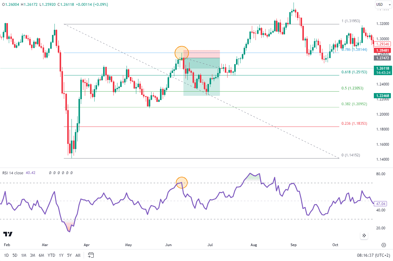
The chart below shows a price rejection of the 78.6% Fibonacci retracement level that is followed up by the RSI briefly crossing above 70 before dropping lower. When it drops back below the 70 mark that would be entry confirmation with a stop loss above the swing high. The take profit level could be at the 61.8% or 50% fib retracement levels or a risk to reward in line with the trader’s strategy.
Source: Tradingview
RSI with Ichimoku Cloud
The Ichimoku Cloud is a collection of indicators that show support and resistance levels as well as providing information on the trend direction and momentum.
When combining Ichimoku and RSI we are improving our probabilities of success by aligning the trend and relative strength of the trends onto one chart. However, unlike some of the other strategies listed here, we do not necessarily use the “overbought and oversold zones” of the RSI to monitor for potential entries.
Instead, to understand how to use the strategy better, I have compiled a full breakdown below:
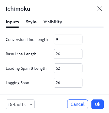
Step 1: Add the Ichimoku cloud to a chart by searching through the indicator tab on TradingView.
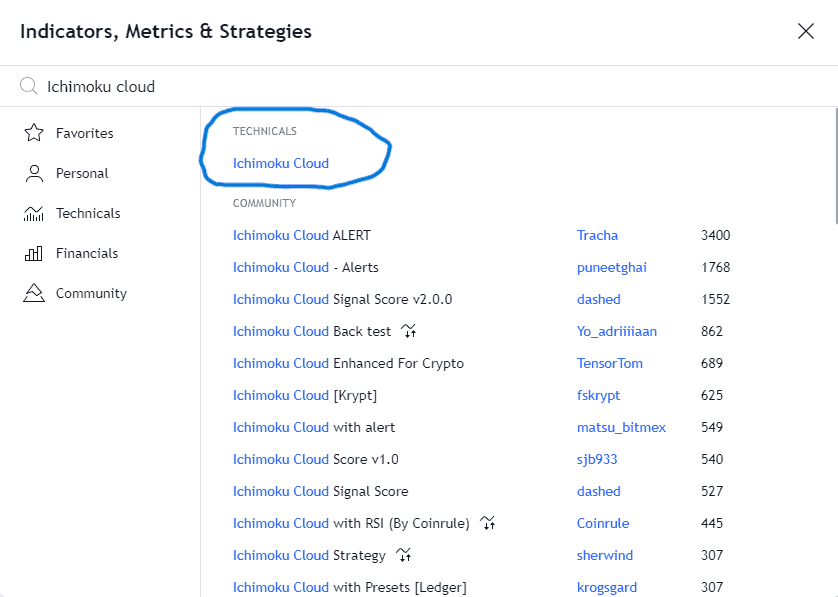
Below is a screenshot showing the default settings used for the ichimoku cloud.
Components of the Ichimoku Cloud:
| Conversion Line (Tenkan Sen) | Calculated as the average of the highest high and lowest low over a nine-period span. |
| Base Line (Kijun Sen) | Calculated as the average of the highest high and lowest low over a 26-period span. |
| Leading Span A (Senkou Span A) | The average of the Conversion Line and Base Line, plotted 26 periods ahead. |
| Leading Span B (Senkou Span B) | Calculated as the average of the highest high and lowest low over a 52-period span, also plotted 26 periods ahead. |
| Lagging Span (Chikou Span) | This represents the closing price plotted 26 periods behind. |
Step 2: Identify the Trend
Effectively when price is below the cloud the trend is down and when the price is above the cloud the trend is up.
Step 3: Look for a Setup and Entry
A long position is suggested when:
- The conversion line (Tenkan-sen) crosses above the baseline (Kijun-sen).
- The lagging line (Chikou Span) is above the cloud
- RSI is above 50.
The chart below shows an example of a long position as the rules above have been met. The RSI moves from below the 50 (neutral) to above the 50 line just around the time the conversion line crosses above the base line. The stop loss goes just below the most recent low with a take profit based on the trader’s risk-to-reward profile. Alternatively, the take profit level could be at a resistance level as well.
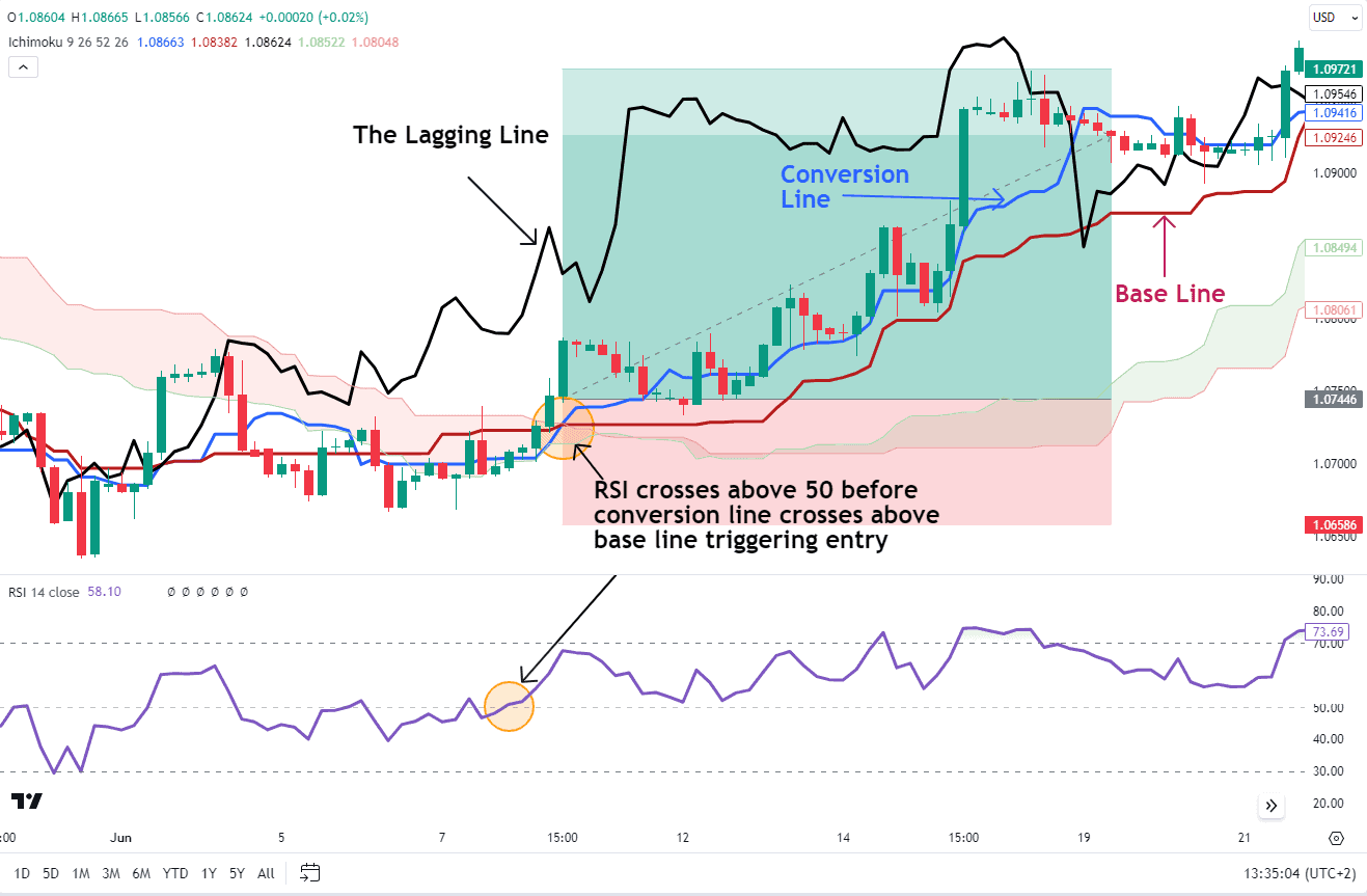
Source: Tradingview
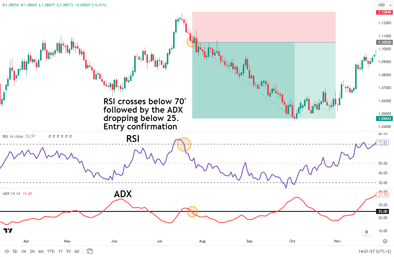
RSI with Average Directional Index (ADX)
The Average Directional Index (ADX) measures trend strength, while the RSI indicates overbought or oversold conditions, making them a powerful combination. Use the ADX to determine the strength of the current trend and the RSI to identify potential reversal points within that trend.
In a strong trend (ADX > 25), use the RSI to find temporary overbought or oversold conditions for potential entry points. For example, in a strong uptrend, an RSI dip below 30 could indicate a good buying opportunity, assuming the trend will resume.
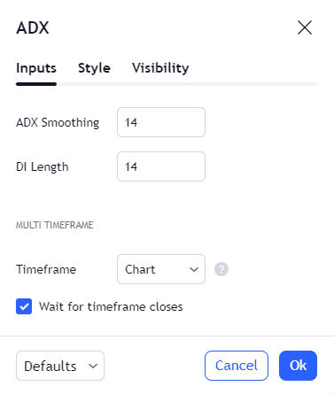
First things first will be selecting the ADX from the indicator menu on TradingView.
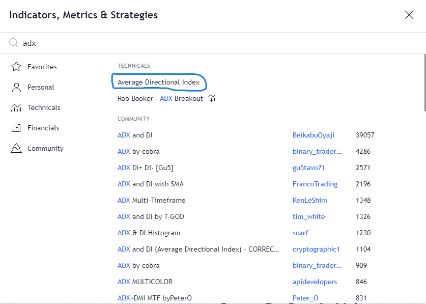
The next image shows the default settings used by the ADX.
The chart below shows an example of a trend change as the ADX is around the 25 level which is a sign that the underlying market is not trending. This then coincides with the RSI entering overbought territory and a sign that a trend reversal may be imminent.
Source: Tradingview
Entry will take place when the RSI leaves the overbought region and crosses back below the 70 level.
As for the placement of stoploss and take profit, as you can see on the chart above, the stop loss is usually placed above the most recent swing high in the case of a sell position with the recent support levels serving as potential take profit levels. Alternatively, traders may target a risk-to-reward ratio that lines up with their risk management strategy.
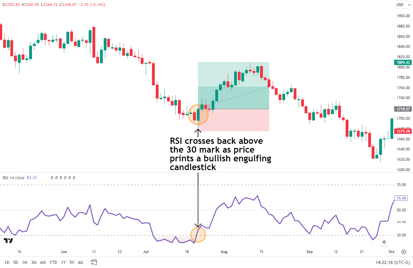
RSI with Candlestick Patterns
This is a personal favorite of mine. This strategy uses the RSI as a guide that a trend change may be incoming with entry and confirmation coming when a candlestick pattern confirms as much. This also needs to coincide with the RSI moving out of the overbought and oversold regions.
The first step is the RSI in either overbought or oversold territory. At this point, traders may start to pay attention to price action. As we can see in the example below, we have a bullish engulfing candlestick pattern which coincides with the RSI leaving the oversold region. This is the confirmation needed for entry.
Gold Daily Chart
Source: TradingView
As for the stop loss, this is placed just below the most recent low with the take profit level at a resistance level or an appropriate risk-to-reward level based on the trader’s strategy.
Stochastic RSI
One popular indicator is when stochastic is combined with the Relative Strength Index (RSI) to become the Stochastic RSI indicator. Stochastic RSI helps provide insight into the momentum of the trend. A value above 70 or below 30 is a sign that momentum is strong. Once an asset is above 70 or below 30 traders may begin to pay attention for a potential slowdown or weakness in the trend.
Putting this into practice and setting up the chart with the Stochastic RSI and RSI involves the following steps:
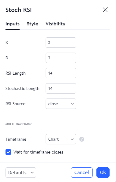
- Add Stochastic RSI to the chart: Most platforms have an ‘Indicators’ menu where you can select ‘Stochastic RSI’ or ‘Stoch RSI’.
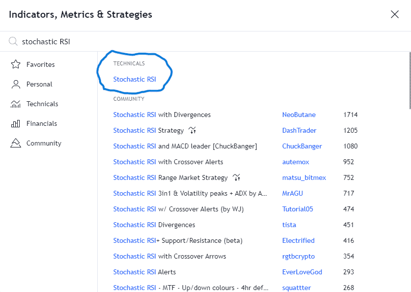
- Default Settings: Using the standard setting for the stochastic oscillator which would be K=3, D=3, RSI=14, with the stochastic length =14.
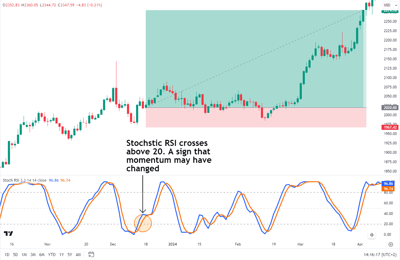
Source: TradingView
The chart above provides an example of the stochastic RSI below the 20 mark. This a sign that although the trend is strong, there is a possibility that it may run out of steam and a retracement or change in trend may occur. As mentioned previously this could still be used in conjunction with price action/candlestick patterns etc to confirm an entry should you desire to do so.
My major gripe with the stochastic RSI and one of the main reasons I hesitate to use it is that it simply runs the algorithm over the RSI values and not the price. As a trader, I am trading price and not the value of the RSI or stochastic.
As a trader, the price is the heartbeat of trading and the price is what matters most. Indicators are simply serving as a sidekick.
Advantages of RSI
The Relative Strength Index (RSI) is a valuable tool for traders and investors. Let’s explore its advantages:
Simplicity: Visually the RSI is simple to interpret as it is a single line that oscillates between 0 and 100. This allows traders to spot patterns more easily.
Identifying Overbought and Oversold Areas: It remains one of the simplest ways to alert traders to pay more attention to a particular asset. When an asset enters the overbought and oversold zones around 70 and 30 it is easy to spot when the RSI is reversing out of the zone which is a sign momentum is shifting.
Divergence Detection: RSI can show when price and momentum don’t agree. RSI goes up while price goes down, which is a sign of bullish divergence. Alternatively, The RSI goes down while price goes up is a sign of bearish divergence.
Disadvantages of RSI
From a traders perspective the following disadvantages or limitations tend to arise with the RSI.
Can Lead to Counter Trend Trading: There is a chance that during trending market conditions the RSI remains in the overbought and oversold zones for extended periods. As a result, overbought and oversold doesn’t create a signal as taking an trade while RSI is in those zones would likely create a “false signal” as you are trading against the trend.
Lagging nature: It is also important to note that the RSI is a lagging indicator. That means it might not give you the most timely signals, especially in fast-moving markets. By the time the RSI catches up, the opportunity could be gone. So, you’ve got to be patient and wait for the right setups.
I would like to reiterate, no single indicator is foolproof. Always consider the broader market context, news, and risk management when making trading decisions.
Adjusting RSI Parameters
The traditional overbought and oversold levels of 70 and 30 are just guidelines, not hard rules. Some traders prefer to adjust these levels based on their risk tolerance or the volatility of the market they’re trading. It’s all about finding what works best for you and your market surf strategy.
For example, in a highly volatile market, you might want to raise the overbought level to 80 or even 90 to avoid getting shaken out of trades prematurely. Conversely, in a quieter market, you could lower the oversold level to 20 or even 10 to catch potential reversals earlier.
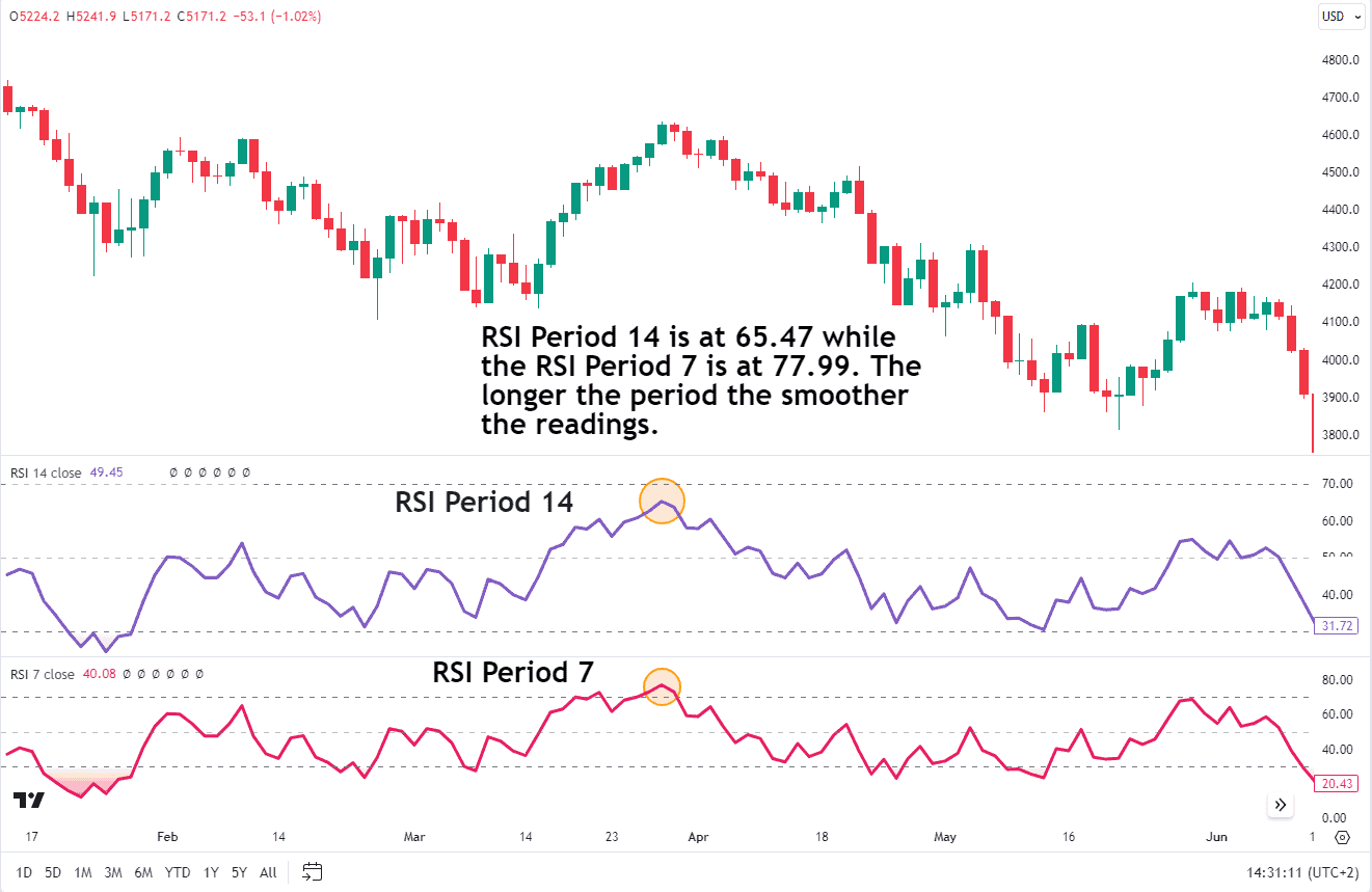
The standard RSI calculation uses a 14-period time frame, but you can adjust this to better align with your trading horizon. A shorter period, say 9 or 7, will make the RSI more sensitive to recent price changes, potentially generating more signals but also increasing the risk of false signals or whipsaws.
On the other hand, a longer period, like 21 or 30, will smooth out the RSI and make it less reactive to short-term fluctuations. This can be useful for longer-term traders who want to filter out noise and focus on more significant trends.
Here is a chart example below of the RSI with default settings of period 14 and the RSI with a period of 7, which makes the RSI more sensitive to price changes.
SPX Daily Chart
Source: TradingView
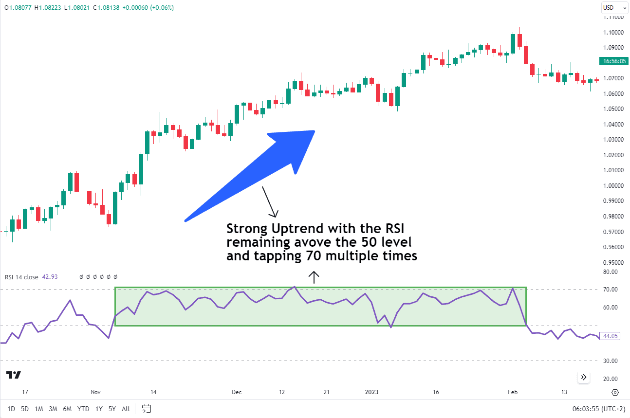
RSI in Uptrends and Downtrends
During an uptrend, the RSI tends to stay above 50 and frequently hits 70 which is a reflection of the strength of the upward momentum. RSI values above 70 indicate overbought conditions but does not guarantee a potential pullback may be imminent. Instead when the RSI crosses below 70 after being in the overbought zone, then that suggests momentum is shifting and a pullback may be gaining steam.
During a downtrend the RSI tends to stay below 50 which is seen as a reflection of the strength of the downward momentum. RSI values below 30 indicate oversold conditions, suggesting a potential bounce may be imminent.
The chart below is an example of the behavior of the RSI in an Uptrend.
Source: TradingView
RSI can form distinct chart patterns like double tops and bottoms, highlighting support or resistance levels that may not be visible on the price chart alone. Understanding how the RSI forms in different trend conditions can help traders make more informed decisions.
FAQs
What is considered as overbought and oversold RSI?
When RSI is above 70, it’s considered overbought and in an uptrend. Conversely, when RSI is below 30, it’s oversold, indicating a downtrend. However, during strong trends, RSI can remain in these zones for extended periods, leading to potential misinterpretations. When RSI crosses below 70 or above 30 then it can be a potential entry signal.
What is the difference between RSI and MACD?
The Relative Strength Index (RSI) measures the strength and speed of price movements, aiding in identifying potential trend reversals. In contrast, the MACD (moving average convergence divergence) indicates trend strength, potential changes in direction and focuses on the relationship between two exponential moving averages.
Is RSI leading or lagging?
The Relative Strength Index (RSI) has been described as both a leading or lagging indicator depending on how it is applied and used. It often anticipates price movements by showing divergences, when RSI moves opposite to the price. On the other hand, the RSI is described as a lagging indicator because it compares recent gains and losses over a specified period (usually 14 days). While it provides valuable insights, it doesn’t predict future price movements directly.
Can the RSI be used as a standalone indicator?
Despite being a powerful tool in technical analysis, it is generally not recommended to use the Relative Strength Index (RSI) as a standalone indicator. There seems to be a debate that there is a higher probability of success when the RSI is used in combination with chart patterns or other technical indicators.
What is the history of Relative Strength Index?
The Relative Strength Index (RSI) is a popular technical indicator developed by J. Welles Wilder in 1978. Wilder, a mechanical engineer and trader. Wilder introduced the concept to the public in his book “New Concepts in Technical Trading Systems”. Wilder’s original theories of RSI interpretation, along with subsequent developments by others such as Andrew Cardwell, expanded how RSI could be used to determine and confirm trends.
What is considered as good and bad RSI?
A good or bad RSI can depend on the overall market conditions, the prevailing trends, or the asset in question. A low RSI, typically below 30, indicates that the asset is trending lower while an RSI value above 70 indicates an uptrend. Typically, a trend change is viewed when RSI crosses above 30 or below 70, offering a potential entry signal depending on the direction of the larger trend.
When should you buy a stock using RSI?
Buying a stock using the RSI may take place using a variety of different strategies. The most pertinent being classic divergence or a failure swing setup which are both tried and tested. It is important to note that when trading stocks there are a host of variables to consider such as earnings, announcements etc.
What timeframe should I use for RSI?
The timeframe you should use for calculating RSI depends largely on your trading strategy and style. According to the original RSI theory, the default setting of RSI is a 14-day period, which is suitable for medium-term swing traders. However, short-term intraday traders may prefer using RSI settings with periods in the range of 2 to 6 for more frequent trading signals.
Is RSI accurate?
The accuracy of the RSI depends on the strategy that it is used with. We’ve found that the reliability of RSI improves when signals are filtered within the direction of the larger trend. RSI is useful at spotting price divergences too.
Is High RSI good?
In simple terms, it is neither good nor bad. A high RSI value simply means that the price is in an uptrend and the asset is relatively strong. If the RSI begins to turn down, this is a sign that a trend change may occur soon.
Should I invest when RSI is low?
A low RSI value simply means that the market is in a downtrend. RSI doesn’t forecast trends but it can indicate when the momentum of the market is turning higher. Most traders interpret when the RSI is crossing above 30 as being a bullish change in momentum.
Is RSI better than MACD?
In short, neither is inherently better than the other while combining them also remains a viable option. Although both track price momentum they do so differently. The question regarding which one is better may hinge on your trading style. For example, the RSI on default setting does not give as many signals as the MACD thus making the MACD more favorable for intraday traders than the RSI.
What does RSI 14 mean?
“RSI 14” refers to the Relative Strength Index with a period setting of 14. The RSI will look back at the previous 14 periods to run its calculation over. The 14 periods could be days, weeks, or minutes depending on the chart time frame.