Written by:

Reviewed by:

Bullish
- February 7, 2025
- 32 min read
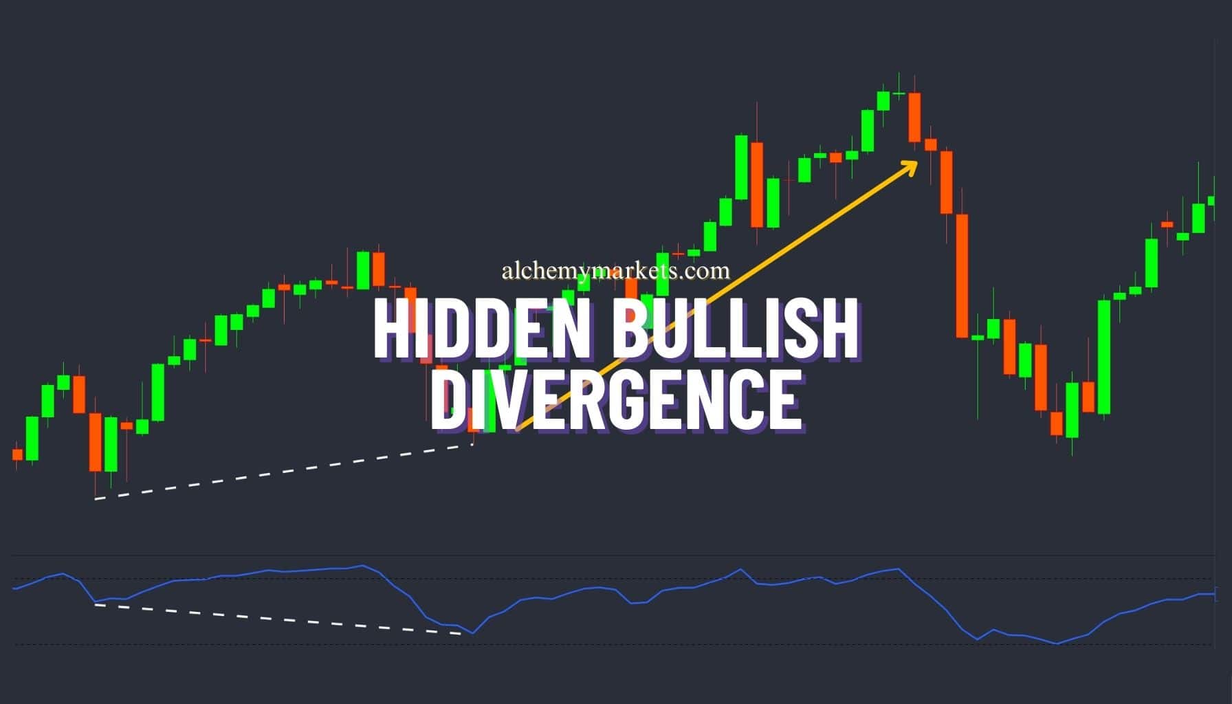
Hidden Bullish Divergence Comprehensive Guide
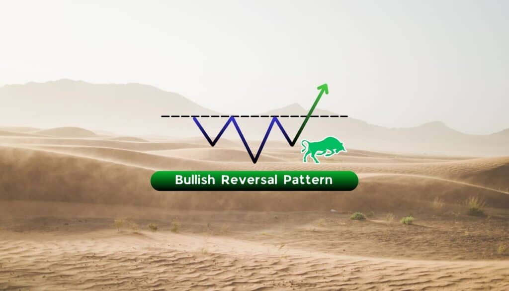
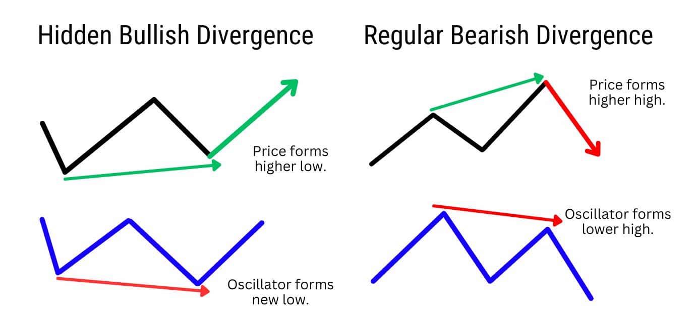
What is a Hidden Bullish Divergence?
Hidden bullish divergence is a pattern that technical traders use to spot the beginning of potential rallies within the context of a broader uptrend. Recognizing both bullish and bearish divergence is important to technical analysis and trading strategies, as divergence occurs when the price action and indicators move in opposite directions, signalling potential price reversals. Bullish hidden divergence occurs at the end of a consolidation within a bullish trend, hinting at a bullish trend continuation.
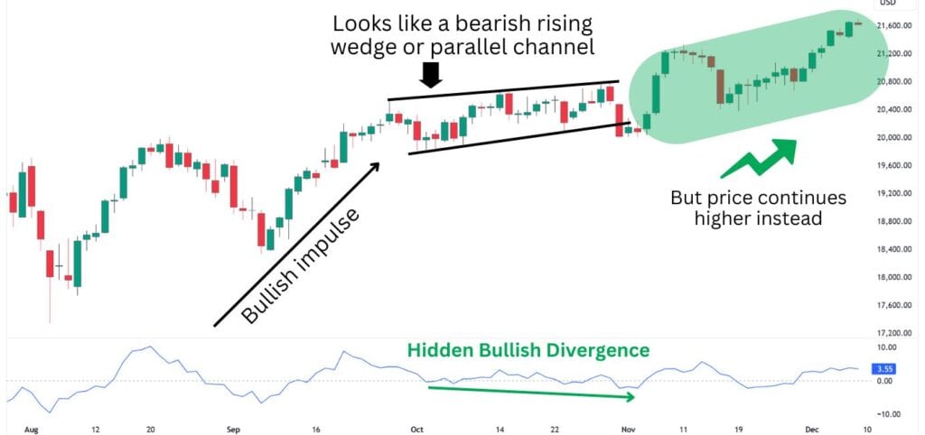
The price structure can confuse technical traders into seeing signs of an imminent bearish reversal, as they resemble bearish chart patterns such as Rising Wedges or Ascending Channels. However, those who can spot a hidden bullish divergence may instead look for a long trade opportunity, effectively going against the short term bearish signal, in favour of the longer term continuation signal.
What is Hidden Divergence?
Hidden divergences are a type of continuation pattern observed on a price chart with the use of an oscillator (a momentum indicator). If the overall trend is bullish, then a hidden divergence signals a higher likelihood for a continued uptrend. Hidden divergence is best used to offer counter signals amidst signs of a reversal.
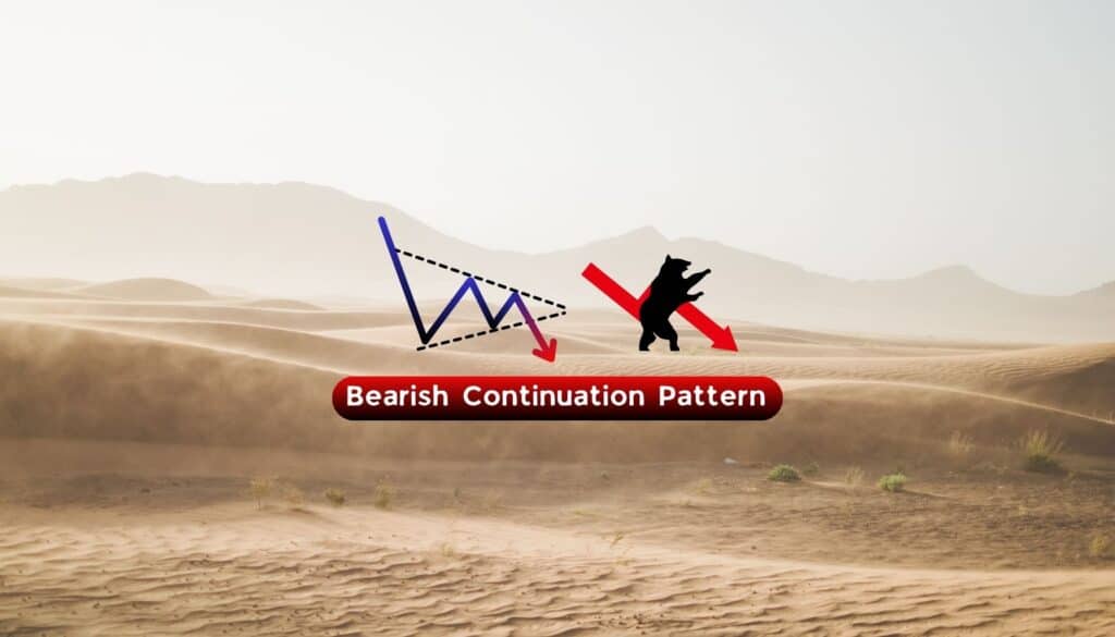
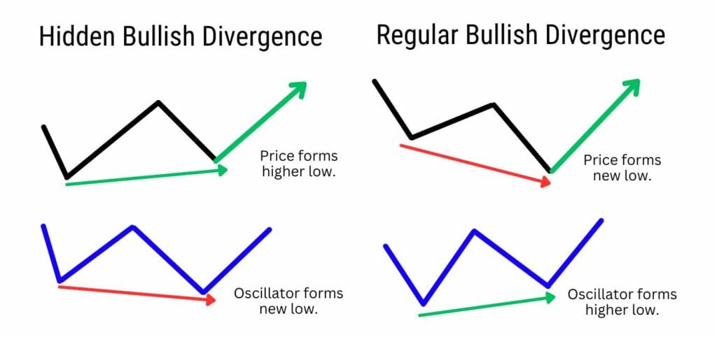
What Is a Regular Divergence?
Regular divergences, also called classic divergences, are instead used to signal a price reversal. If the overall trend is bearish, then a regular divergence signals a potential trend reversal from a downtrend into an uptrend.
Regular and hidden divergence play crucial roles in trading; regular divergence signals a potential trend reversal at the end of a long trend, while hidden divergence indicators trend continuation at the end of a consolidation phase.
How to Identify the Hidden Bullish Divergence ?
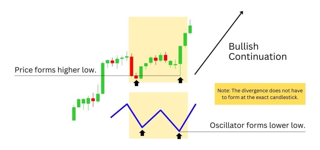
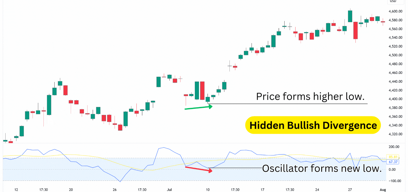
The hidden bullish divergence appears during broader uptrends, where the price is making higher highs and higher lows. It’s at these higher lows where traders can look for a potential hidden bullish divergence to be in play.
Let’s break it down step by step:
- Look for an uptrend, which needs to have higher highs and higher lows.
- Notice where the price forms a higher low.
- Add on an oscillator (momentum indicator), such as RSI, MACD, Stochastics, or Rate of Change etc.
- Notice if the oscillator forms a lower low – which, combined with the price’s higher low, creates the hidden bullish divergence.
Note that the higher low on price, and lower low on the momentum indicator does not have to form at the exact same time. The idea here is to look for a general trend on price that diverges from the momentum’s trend. As long as price is generally moving higher, while the momentum is dropping lower, you have the makings of a hidden bullish divergence.
Hidden bullish divergences can be tricky to spot at first!
But once you know what to look for, and why it works, it becomes much easier to identify.
How Does a Hidden Bullish Divergence Work?
Hidden bullish divergence is defined by a lower low on the momentum indicator, and a higher low in the price chart. This is considered a divergence because normally, the price and the momentum should share similar structures.
For instance, when the price moves up, so does the momentum to roughly the same relative area. However, hidden bullish divergence occurs when the price does not move as low as the momentum.
Although the indicator creates a lower low, the price does not. This indicates that despite some increase in selling pressure, price still remains bullish.
What Does a Hidden Bullish Divergence Tell You
Hidden bullish divergence tells you that the downward momentum is weakening, and the price is likely to reverse and move upwards. This is a bullish signal that indicates a potential trend continuation. It is called “hidden” because it is not as obvious as a regular bullish divergence, which occurs when the price makes a higher high and the oscillator makes a lower high.
Hidden bullish divergence reflects bullish absorption and strong demand. This strong buyer demand prevents the price from creating a new low, therefore maintaining the bullish market structure. This scenario is often accompanied by a positive divergence, where the price of an asset and associated technical indicator or working in opposite directions, but leads to a bullish price trend.
Think about it like a special sale auction. The sellers want to let go of an item at an extremely low price – but there is so much demand for the item that prices are prevented from falling too low.
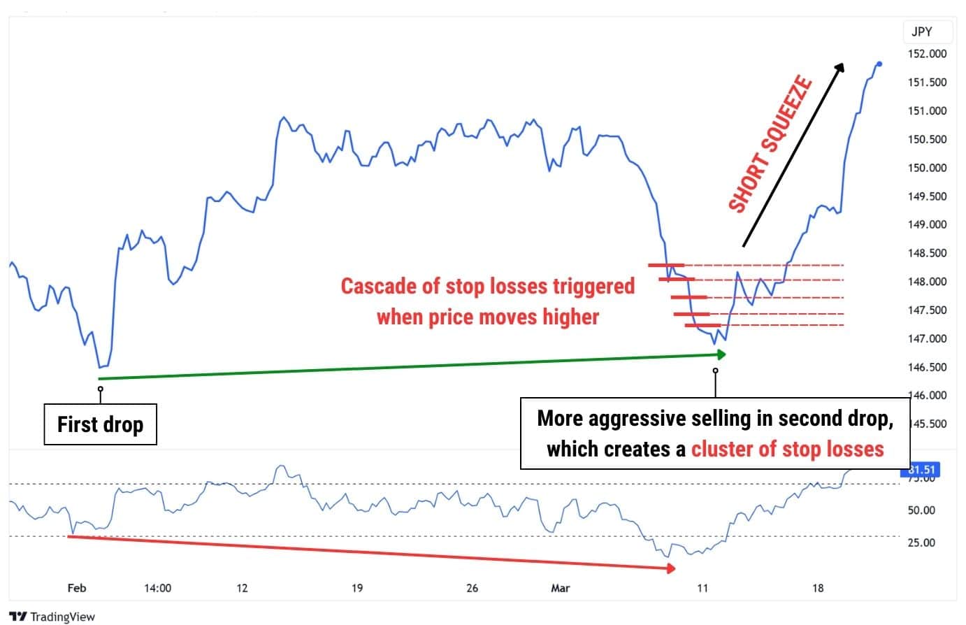
Additionally, a lower low on the momentum indicator usually means more sellers are jumping in during the second drop, adding to the pressure. This builds up a bunch of stop-loss orders just above the market, as traders expect the price to keep falling. This creates the perfect setup for a short squeeze.
When the market unexpectedly turns around and rallies, those stop-losses on short positions start triggering additional buy orders. This creates a cascade effect, where stop losses convert into buy orders – pushing price higher, triggering more stop losses, pushing the price higher again.
Hidden Bullish Divergence Example
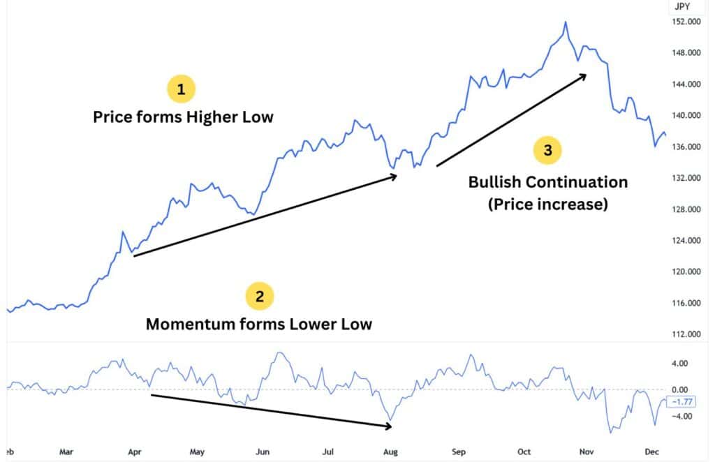
A fantastic example of the hidden bullish divergence can be found in 2022, on the daily price chart of the USDJPY pair. During this time, the asset ripped towards the upside for the majority of the entire year.
Using the RSI technical indicator, traders could spot two major instances of a bullish divergence. These divergences gave an early signal into bullish trend continuations, which resulted in price increases of approximately 9.29%, and 13.80%.
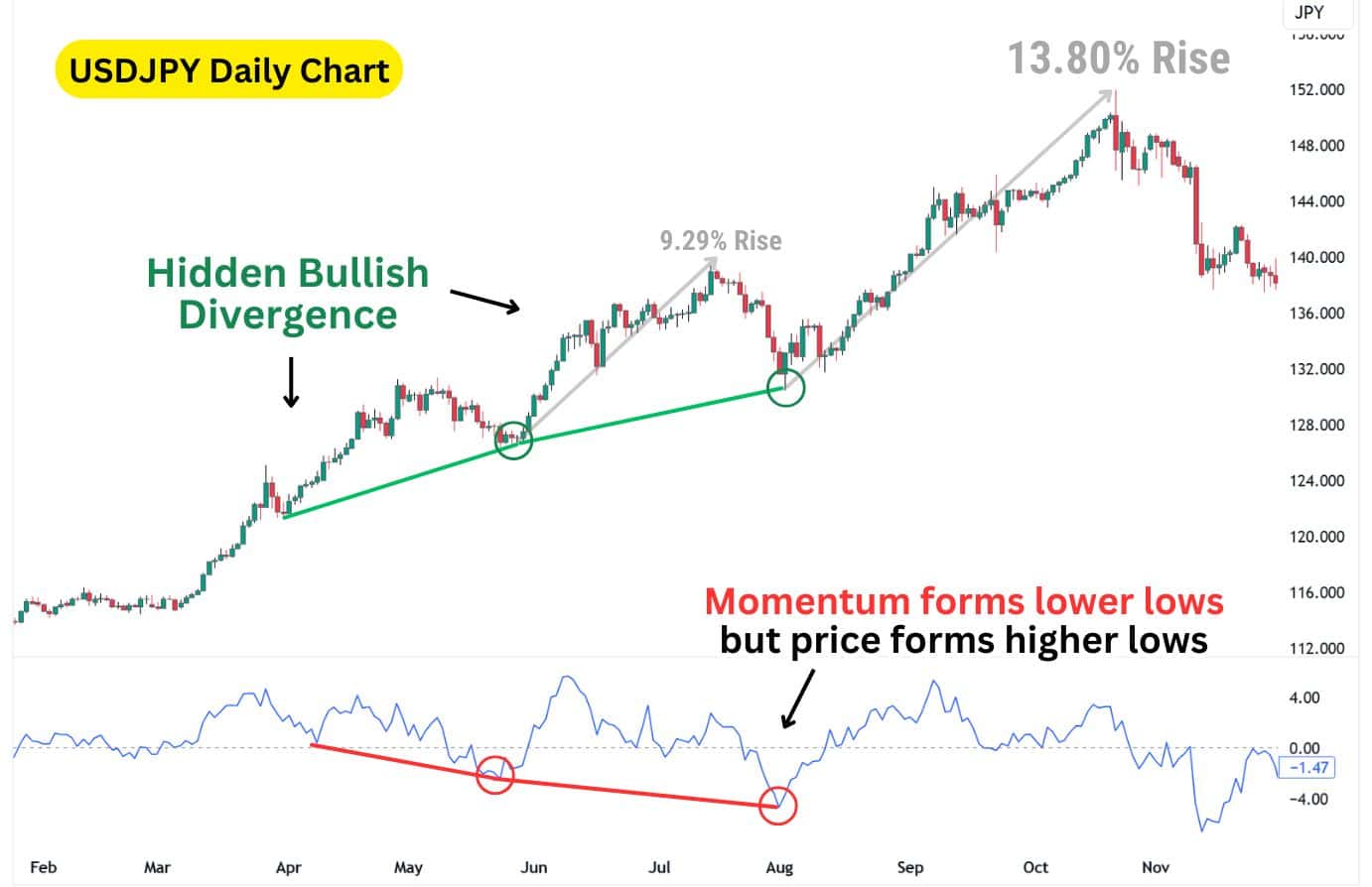
A key takeaway from this example is how long it takes for a hidden bullish divergence to form. Notice that for both instances shown, the divergence took roughly 50 bars to develop. This highlights the hidden bullish divergence’s lower frequency of occurrence, and helps put into perspective how far back the divergence can develop from.
Hidden Bullish Divergence Technical Indicators
In this section, we’ll go through several indicators you can use for identifying hidden bullish divergences.
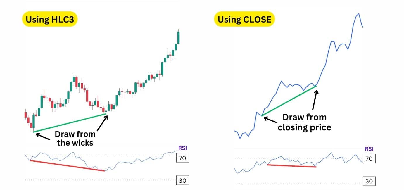
| An important tip: The source setting of your indicators matter. The source dictates whether your indicator uses candle bodies, or candle wicks for its calculation. To align better with wick-based divergence analysis, traders can set these indicators’ source to “HLC3” (High, Low, Close). This setting includes price wicks, fitting the common practice of using wick-based trendlines. However, if you are using line charts for your technical analysis, then the default “Close” source works perfectly fine as there are no wicks on line charts. |
To see the difference between using the HLC3 and CLOSE settings, observe this illustration below:
Commodity Channel Index (CCI)
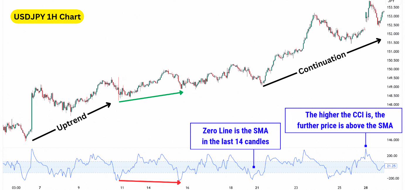
The Commodity Channel Index (CCI) is made up of three main components:
| The middle line, or Zero Line, effectively represents the Simple Moving Average (SMA), typically calculated over 14 candlesticks, acting as a baseline for price comparison. |
| The upper line, or +100 Line, indicates that the price is significantly above the moving average; when the CCI crosses this level, it signals overbought conditions. |
| The lower line, or -100 Line, signifies that the price is significantly below the average; crossing this level suggests oversold conditions. |
Traders can use this oscillator to find a hidden bullish divergence when the CCI falls below the zero line, which increases the likelihood for a divergence to occur. If the second low dips below -100, it enhances the divergence signal as oversold conditions hint at seller exhaustion, giving way for buyers to push the price higher.
Average Directional Index (ADX)
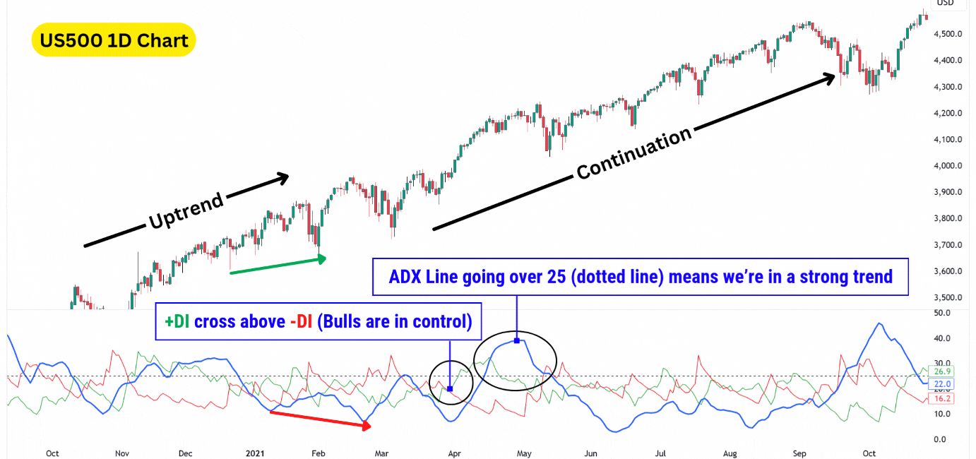
The Average Directional Index (ADX) measures the strength of a trend, regardless of its direction. It uses three components:
| +DI (Positive Directional Indicator): Represents bullish price movements. When this is above the -DI, it means the trend is bullish. |
| -DI (Negative Directional Indicator): Represents bearish price movements. When this is above the +DI, it means the trend is bearish. |
| ADX Line: Measures trend strength without indicating direction. A reading above 25 signals a strong trend, while some traders use 20 for quicker but less reliable signals. |
The ADX stands out by measuring trend strength and incorporating directional indicators, the +DI and -DI lines, which help identify potential trend shifts.
For hidden bullish divergences, we can actually use the ADX to confirm bullish continuation – when the +DI crosses above the -DI and the ADX is above 25, signalling a strong trend. This combination provides clear entry triggers for traders.
For instance, in the S&P 500 (US500) daily chart, the +DI crossing above -DI indicated a bullish move, while the ADX above 25 validated the trend’s strength.
Money Flow Index (MFI)
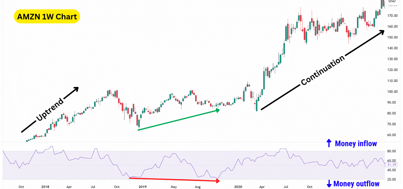
The Money Flow Index (MFI) is a momentum oscillator that uses both price and volume to measure the strength of money flowing into or out of an asset.
Many traders consider this indicator to be a “Volume-Weighted RSI”, measuring price changes while considering trading volume. The greater the volume behind a candlestick, the sharper the MFI moves in order to capture that momentum.
| 80 Level: If the MFI goes above 80, it suggests the asset might be overbought. This hints at potential buyer exhaustion. |
| 20 Level: If the MFI goes under 20, it suggests the asset might be oversold. This hints at potential seller exhaustion. |
In the AMZN weekly chart, the MFI displayed a hidden bullish divergence after the Amazon stock plummeted lower.
However, notice how the price of Amazon also broke down from a potential rising wedge, a bearish reversal pattern. This hints at a possible major move lower, and may have trapped traders into opening short positions.
In this example, traders who relied on the MFI’s hidden bullish divergence signal would have avoided being too bearish during the consolidation, and potentially even open a long trade to capture the bullish continuation.
William’s %R
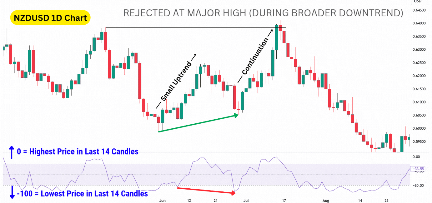
William’s %R is a momentum oscillator that measures the current price relative to its highest and lowest prices over a specified period, typically 14 candlesticks. Unlike many oscillators, W%R moves in reverse, with values ranging from 0 to -100.
Values closer to 0 suggest overbought conditions, while values near -100 indicate oversold conditions.
| 0 Level: Indicates the highest price within the period. |
| -20 Level: When the W%R is above -20, it indicates overbought conditions. |
| -100 Level: Indicates the lowest price within the period. |
| -80 Level: When the W%R is under -80, it indicates oversold conditions. |
In the NZDUSD daily chart, we showcased a hidden bullish divergence within a local uptrend during a broader downtrend.
While continuation divergences are typically used to confirm trend direction, this example demonstrates that a hidden bullish divergence can still trigger a rally even in the context of a larger downtrend.
After reaching a major high, NZDUSD faced rejection, and the broader downtrend resumed. This highlights that while hidden bullish divergences can signal opportunities in counter-trend moves, they may lead to smaller rallies, compared to hidden divergences found in the direction of the broader trend.
On-Balance Volume (OBV)
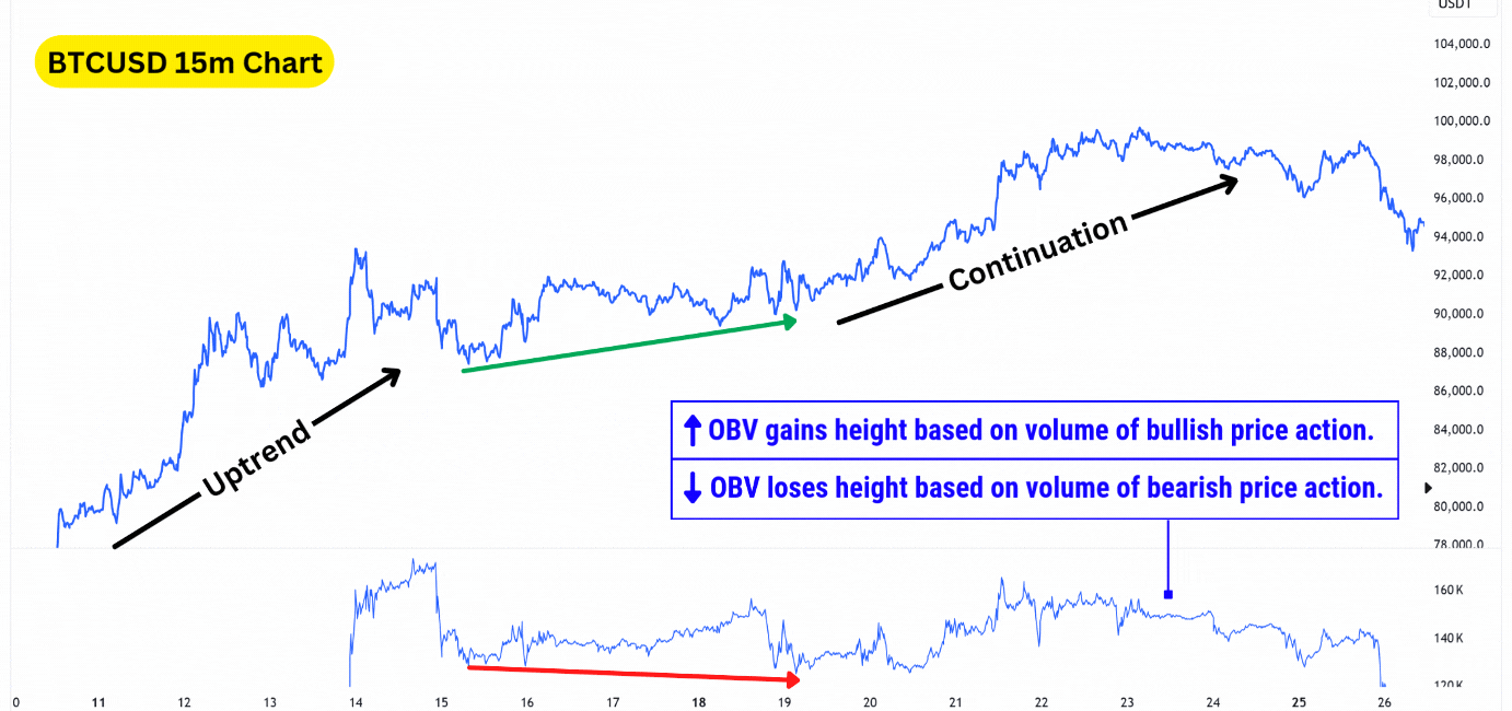
The On-Balance Volume (OBV) indicator measures cumulative trading volume to assess momentum. It adds volume on bullish price movements and subtracts volume on bearish price movements, creating a calculation that grows overtime with the price chart.
Traders interpret the OBV indicator by observing how the line moves:
| Rising OBV: Indicates strong buying momentum and supports price increases. |
| Falling OBV: Indicates selling pressure and potential for price declines. |
Just as with other momentum indicators, a hidden bullish divergence is detected with OBV by observing a lower low in the momentum, but a higher low in the price action.
Force Index
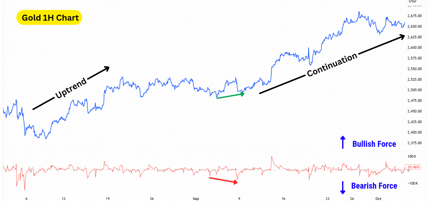
The Force Index (FI), also known as the Elder Force Index, is a momentum indicator that combines price and volume to measure the strength of buying or selling pressure in the market. Similar to the On-Balance Volume (OBV), it is calculated by multiplying the price change during a given period by the trading volume. However, what sets the FI apart is its use of a zero line as a midpoint.
The zero line represents a neutral point where there is no significant volume or directional pressure. When significant volume enters the market, the FI moves away from the zero line—upward if the price rises (indicating bullish force) or downward if the price falls (indicating bearish force). This dynamic makes the FI particularly useful for detecting momentum shifts and spotting divergence signals.
| Zero Line: This area shows there is no significant volume, and therefore no momentum. |
| Rising FI: Indicates an increase in buying volume/momentum. |
| Dropping FI: Indicates an increase in selling volume/momentum. |
In the Gold 1H example above, notice how the Force Index printed a lower low, while the price of Gold printed a higher low. This indicator tells us more sellers have stepped into the market on this second low, but failed to create a lower low.
This hints at buyers absorbing the aggressive sell orders, eventually pushing the price higher and triggering a short squeeze.
Hidden Bullish Divergence Trading Strategies
A hidden bullish divergence can be a powerful signal to look for long trades rather than shorts, but also cannot simply be traded by itself. Several things you must consider are:
- When exactly to enter a long trade based on the signal.
- Where to take profit.
- How you can confirm the long signal, leading into a continuation.
- How to use the momentum indicator to find the divergence.
Piecing these components together in a clear, defined way is what will provide you with a repeatable strategy, aimed at generating a profit over a series of trades.
In this section, we’ll go over several basic strategies you can use to get started.
Double Confirmation Hidden Divergence Strategy
The double confirmation strategy requires you to use multiple indicators to confirm the possibility for a continuation.
Here are the tools we’re using:
- Confirmation Tool 1 – Fibonacci Retracement: Provides hidden support and resistance levels.
- Confirmation Tool 2 – Bollinger Bands®: Helps time your entry after spotting a hidden bullish divergence.
- Momentum Tool – Relative Strength Index: Helps find the hidden bullish divergence (can be swapped with other oscillators).
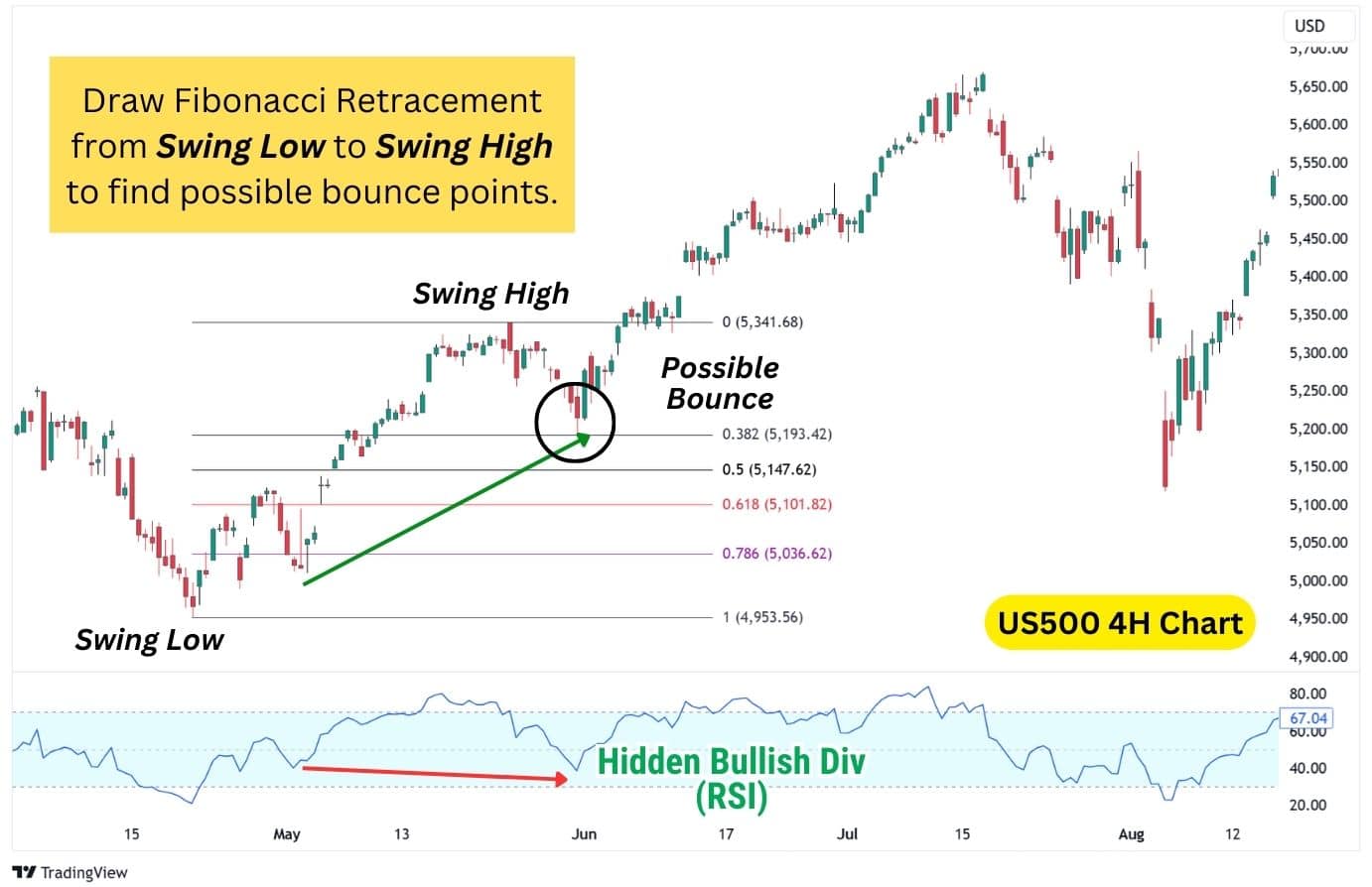
Steps to trade this strategy:
- Draw the Fibonacci Retracement from a major swing low to the recent swing high. This would map out the following retracement levels: 0.382, 0.5, 0.618, 0.786, where prices could potentially bounce.
- Use the RSI indicator to find a hidden bullish divergence as the price taps into these levels. If a divergence is present, we now have our first confirmation for a bullish continuation. In the US500 (S&P 500) example above, a hidden bullish divergence is spotted after the price tapped into the 0.382 Fibonacci Retracement.
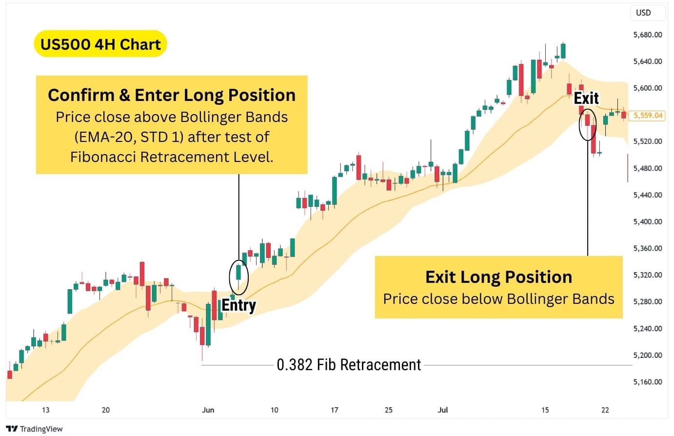
- Lastly, we’ll use the Bollinger Bands, with customised settings, to double confirm the continuation. When the price closes above the upper band, enter a long (Buy) position.
- Then, exit the trade when the price falls below the custom Bollinger Bands, as it hints at the bullish trend weakening or coming to an end.
| Customised Bollinger Bands Settings: Set EMA-20 as the midline to quickly adapt to price changes, and the Standard Deviation Bands should be set to 1, instead of the default 2 setting, to find breakouts. |
Notice how in the example above, the price taps into the 0.382 Fib Retracement (with a hidden bullish divergence), but chops around a bit before trending higher. Using this Bollinger Bands strategy, we can add confirmation to our bullish continuation trade, and only enter a long position when it’s safe to do so.
This strategy can be used on any timeframe, but is most effective on hourly timeframes or higher due to the increased reliability of hidden bullish divergences on higher timeframes.
| Disclaimer: No strategy is universally effective across all assets. Backtesting preferred strategies with specific assets, to gauge how they perform over a series of trades, will be key to your success. |
Trendline Break Hidden Divergence Strategy
This strategy uses a trendline breakout as the confirmation signal for bullish continuation. The price being able to break the trendline signals that the uptrend is strong, and will likely continue.
Using this trendline break, we can enter a long position while setting the stop loss at the recent lows, and placing the take profit to at least 1:2 risk-to-reward.
Indicators used: RSI (Can be swapped with other momentum indicators)
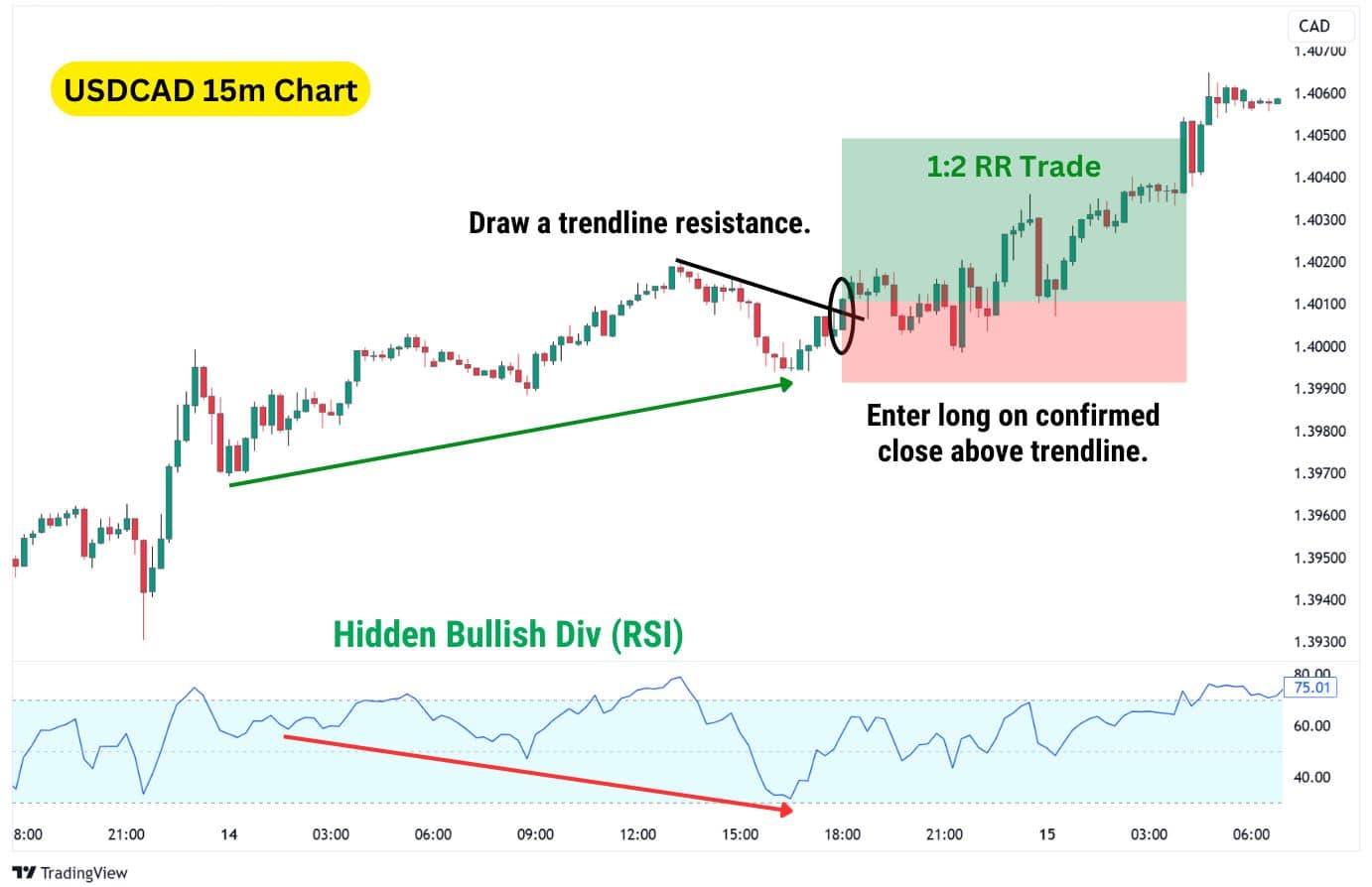
Steps to trade this strategy:
- Find a hidden bullish divergence as soon as the RSI dips below its previous low, while the price remains in a higher low.
- Draw a trendline connecting the highs of the recent downswing.
- A trendline simply is a line which connects the highs or the lows of recent price action. For this strategy, we’ll be drawing a trendline from the top of the recent highs.
- A trendline simply is a line which connects the highs or the lows of recent price action. For this strategy, we’ll be drawing a trendline from the top of the recent highs.
- Enter a long (buy) position when price closes above the trendline resistance.
- Stop loss placed below the recent pivot low, and take profit set to 1:2 risk-to-reward.
Notice how in the USDCAD example above, the trendline was drawn from the recent downswing in price. A break above this trendline usually signals that the price is ready to move up and form new highs.
This strategy can be used with any momentum oscillator, and on any timeframe. The RSI is the most simple and popular with traders.
| Disclaimer: No strategy is universally effective across all assets. Backtesting preferred strategies with specific assets, to gauge how they perform over a series of trades, will be key to your success. |
Volume Profile Hidden Divergence Strategy
Volume Profile (VP) is a charting tool that highlights price levels with high trading volume, often acting as support and resistance. It consists of three components:
- Value Area High (VAH): Key high within a trading range.
- Value Area Low (VAL): Key low within a trading range.
- Point of Control (POC): The price level with the highest traded volume.
There are two types of Volume Profile (VP) tools:
- Anchored VP: Tracks VAH, VAL, and POC from a chosen starting point to the latest price.
- Fixed Range VP: Focuses on a selected range to pinpoint key levels.
This strategy uses Fixed Range Volume Profile, drawing from a recent swing low to high, to identify the VAL for confirming bullish continuation.
When price breaks above the previous upswing’s VAL, we can have more confidence in a bullish continuation.
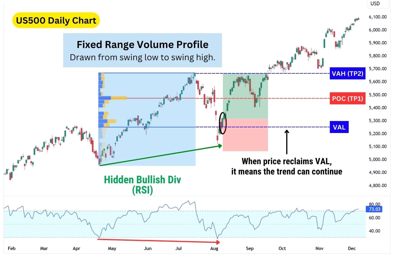
Steps to trade this strategy:
- Draw a Fixed Range Volume Profile for the previous upswing. This will highlight key levels to watch for a bullish continuation.
- Spot a hidden bullish divergence as the price falls to a higher low.
- Enter a long position when the price closes above the VAL (Value Area Low).
- Take partial profit at the Point of Control (the price with the highest traded volume).
- Take full profit at the VAH (Value Area High), which would act as resistance.
Notice in the example above, the price actually breaks above the Value Area High. In this scenario, you may reenter a long position and use another method to trail the uptrend. Consider using the custom Bollinger Bands® we discussed in the Double Confirmation Strategy, where you’d stay in the trade until a candlestick closes below the Bollinger Bands.
| Disclaimer: No strategy is universally effective across all assets. Backtesting preferred strategies with specific assets, to gauge how they perform over a series of trades, will be key to your success. |
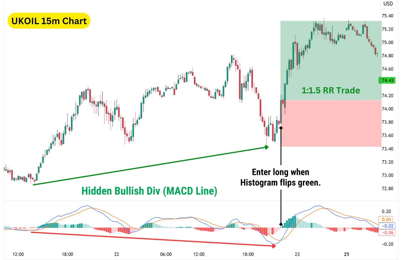
Hidden Bullish Divergence with the MACD
MACD, or the Moving Average Convergence Divergence, is an all-in-one oscillator that shows not only the trend direction, but also the momentum. There are two ways to spot divergences on the MACD, either through the histogram, or the MACD line.
Unlike the RSI, W%R, Money Flow Index (MFI), and Commodity Channel Index (CCI), the MACD does not provide any overbought or oversold signals.
Spotting Hidden Bullish Divergence with MACD Histogram
The MACD Histogram are bars that appear within the indicator, signalling short term momentum. The higher the bars are, the more bullish the momentum. Conversely, the lower they are, the more bearish.
Notice how in the chart below, the MACD histogram forms a lower low, which tells us bearish momentum is coming into the market. Sellers are trying to push the price lower at speed, but have failed to create a lower low in the price chart.
This gives buyers the opportunity to create a short squeeze, leading to a bullish continuation of the overall trend.
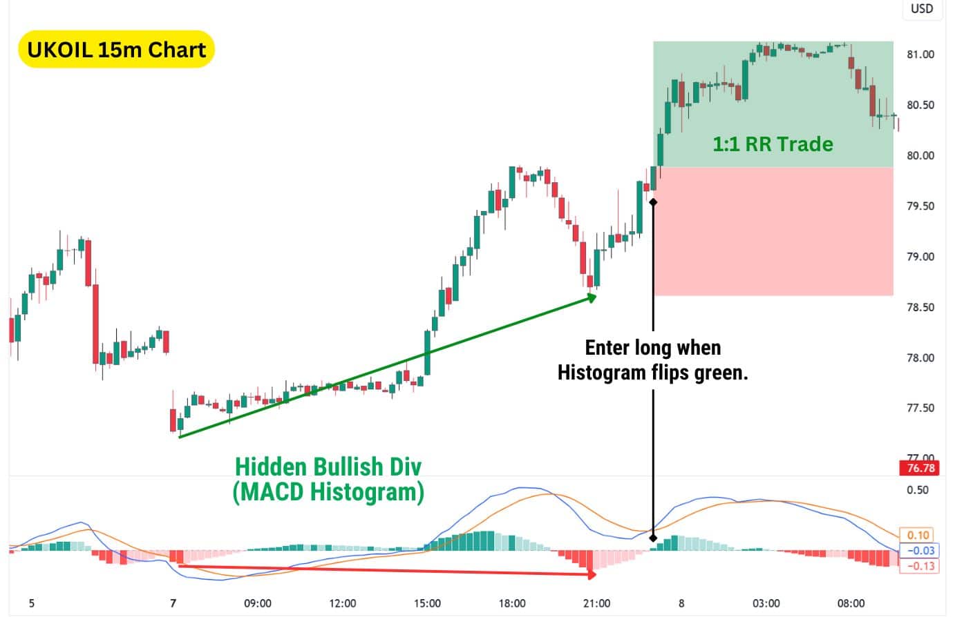
Steps to trade this strategy:
- Notice a hidden bullish divergence on the chart with the MACD histogram.
- Enter a long position when the MACD histogram flips green as it confirms the continuation signal.
- Set the stop loss below the most recent pivot low.
- Use a 1:1 risk-to-reward (RR) ratio for your take profit.
Remember, since the MACD histogram provides shorter term signals of momentum, the ensuing move may not be as large – this is why we recommend using a 1:1 RR ratio using this strategy.
Alternatively, you can use a trendline break instead to confirm the continuation, as detailed above in the Trendline Break Strategy section. This would net you a better risk-to-reward ratio at 1:2, but with increased frequencies of false signals.
| Disclaimer: No strategy is universally effective across all assets. Backtesting preferred strategies with specific assets, to gauge how they perform over a series of trades, will be key to your success. |
Spotting Hidden Bullish Divergence with MACD Line
Now, notice how the MACD has two lines that move, largely in unison, up and down. These are the MACD Line and Signal Line. For this strategy, you’ll only need to look at the MACD Line, which is the blue line in our chart.
The MACD Line represents the raw difference between the 12-period EMA, and 26-period EMA. This difference allows traders to evaluate the longer term momentum, compared to using the MACD histogram which is short term.
As a result, when a MACD Line hidden bullish divergence signal occurs, the ensuing move is usually more powerful than the histogram. For this strategy, we will be setting the take profit to 1.5x the stop loss distance.
Steps to trade this strategy:
- Notice a hidden bullish divergence on the chart with the MACD Line.
- Enter a long position when the MACD histogram flips green as it confirms the continuation signal.
- Set the stop loss below the most recent pivot low.
- Use a 1:1.5 risk-to-reward (RR) ratio for your take profit.
Note that using the Trendline Break Strategy or Bollinger Bands Double Confirmation Breakout Strategy’s confirmation method could potentially net you a greater RR, but at the expense of greater false signals.
| Disclaimer: No strategy is universally effective across all assets. Backtesting preferred strategies with specific assets, to gauge how they perform over a series of trades, will be key to your success. |
Spotting Hidden Divergence Using Stochastics
Stochastics, developed by George C. Lane in the 1950’s, is a classic momentum and trend indicator. It uses two lines to provide an indication of trend direction, and also momentum. There are two stochastic lines – the fast line (%K) and the slow line (%D).
- Fast Line (%K): Acts as signal in the immediate term. When it is above the %D Line, a bullish trend could be starting. When it is below, a bearish trend could begin.
- Slow Line (%D): Acts as the average trend indicator. It is a smoothened version of the %K Line across 3 periods.
To find hidden bullish divergences with Stochastics, we’ll only need to use the Slow Line (%D).
This is because the %D Line is much smoother to look at, and also anticipate in terms of direction. The %K Line by contrast can appear choppy, which makes it unsuitable for finding divergences – but perfect for finding quick entries into a potential new local trend.
Combined together with the hidden bullish divergence, the stochastics can provide excellent trades with high risk-to-reward.
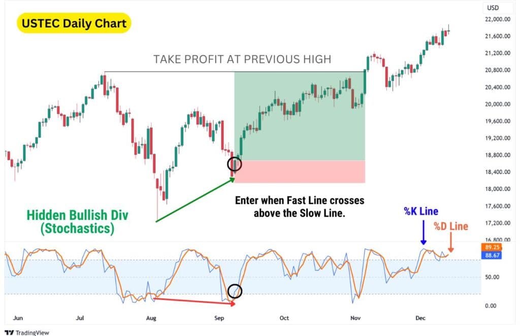
Steps to trade this strategy:
- Notice a hidden bullish divergence on the chart with the Slow Line (%D), highlighted in orange in our example.
- Enter a trade after a divergence occurs, and the %K Line has crossed above the %D Line with a candle close.
- Set the stop loss below the most recent pivot low.
- Take profit at the previous major high, or use a 1:2 or even higher risk to reward ratio.
As you can see in our example, the USTEC trade performed very well, tapping our target (the previous high), and continuing even higher to the upside. For traders looking to stay in the uptrend longer, we recommend using a trend-following indicator like the Parabolic SAR. This tool helps identify when to exit by signalling a potential trend reversal to the bearish side.
| Disclaimer: No strategy is universally effective across all assets. Backtesting preferred strategies with specific assets, to gauge how they perform over a series of trades, will be key to your success. |
Spot Bullish Divergence using Rate of Change
The Rate of Change (ROC) measures how fast the price has changed within a set period of time, usually 9 past candlesticks. The sharper the price moves, the sharper the ROC moves as well. However, a divergence occurs when the price moves drastically relative to its previous 9 candles, but does not form a lower low.
This indicator has a zero line, which sits right in the middle of the pane, and provides several ways to interpret the momentum:
- Zero Line: This represents no percentage change in price compared to the past period.
- Above Zero Line: Represents positive price change in the specified period.
- Below Zero Line: Represents negative price change in the specified period.
The zero line also serves as a confirmation tool for our hidden bullish divergence trade. If the ROC has dropped below the Zero Line as it formed the divergence, then climbs above it – we can use that as an indication for a long entry.
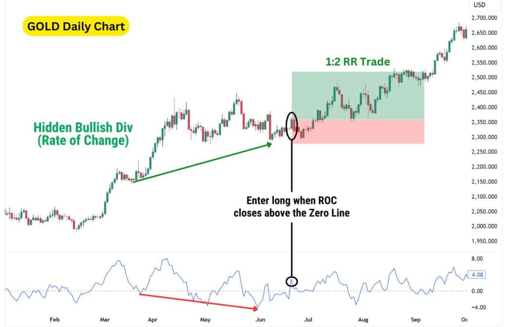
Steps to trade this strategy:
- Notice a hidden bullish divergence on the chart with the Rate of Change indicator.
- Enter a long position when the ROC goes above the Zero Line, after the divergence has been formed on both price and the ROC.
- Set the stop loss below the most recent pivot low.
- Use a 1:2 risk-to-reward (RR) ratio for your take profit.
Notice how in this chart, the higher low on price and lower low on the momentum did not form at the exact same time. This is normal and to be expected when finding divergences, as we laid out in a previous section above.
| Disclaimer: No strategy is universally effective across all assets. Backtesting preferred strategies with specific assets, to gauge how they perform over a series of trades, will be key to your success. |
Spot Bullish Divergence using Awesome Oscillator
The Awesome Oscillator (AO) visualises momentum as a histogram, similar to the MACD. However, it’s much easier to navigate as there is only one component of the indicator to find divergences from.
Like many oscillators featured above, the Awesome Oscillator also has a Zero Line. Traders will observe the placement and height of the histogram columns, in relation to the zero line to interpret momentum.
- Zero Line: When the AO is near this area, it means the momentum is low and in neutral territory (can shift up or down).
- Above Zero Line: The higher the AO is above this line, the more bullish the momentum is.
- Below Zero Line: The lower the AO is below this line, the more bearish the momentum is.
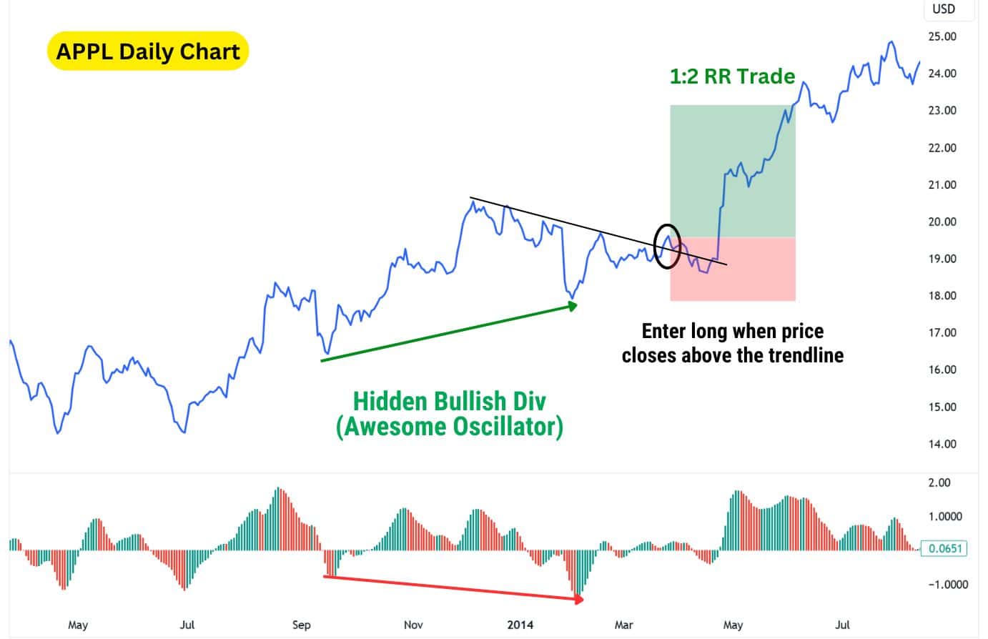
Steps to trade this strategy:
- Notice a hidden bullish divergence on the chart with the Awesome Oscillator.
- Draw a descending trendline connecting the previous highs.
- Enter a long position when the price closes above the descending trendline.
- Set the stop loss below a major low.
- Set your take profit at 1:2 or even higher risk to reward ratio.
Alternatively, you may set your stop loss to 2 times the average true range. This style of trading helps traders enter a long position right after the hidden bullish divergence has formed, allowing for greater risk-to-reward trades.
| Disclaimer: No strategy is universally effective across all assets. Backtesting preferred strategies with specific assets, to gauge how they perform over a series of trades, will be key to your success. |
Hidden Bullish Divergence with the RSI
The RSI, or relative strength index, is a classic indicator we’ve mentioned throughout this guide. It’s an extremely popular indicator due to its simplicity!
The RSI measures momentum from 0 – 100 and provides overbought and oversold conditions, when the RSI is over 70 and under 30, respectively. It uses the formula of Average Gain – Average Loss across a set period (usually 14 candlesticks) to calculate the Relative Strength of a price change. Then, all readings are scaled into a range of 0 – 100.
To trade hidden bullish divergences purely using the RSI, simply spot the pattern on your chart, and wait for the RSI to rise above its midpoint (50) to confirm a bullish continuation.
A hidden bullish divergence occurs when the price forms higher lows while the RSI forms lower lows, suggesting a continuation of the uptrend. However, it can be difficult to predict how far a bullish continuation will go, especially when an asset breaks into new highs.
Take this Bitcoin chart for example: we see Bitcoin break into fresh highs following a bullish continuation signal. The only price level we can have more certainty on the price tapping is the previous pivot high, which was the All-Time High.
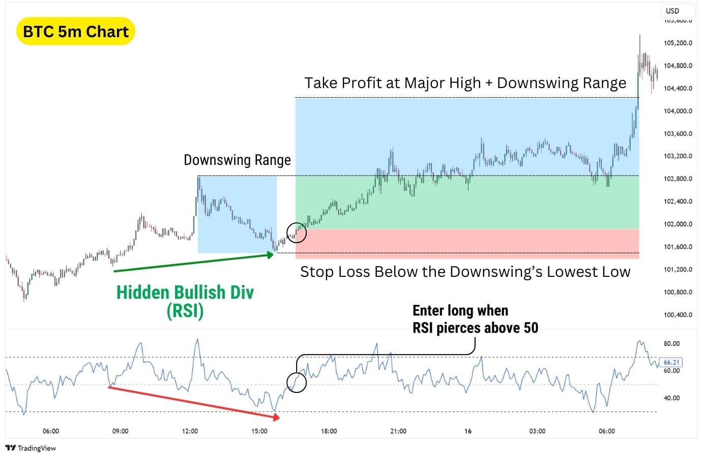
Beyond that however, are blue skies without any clear resistances. Therefore, it’s difficult to predict with full certainty where the continuation surge will end. A good way to deal with this is to take the downswing’s entire range, and pad it on top of the previous high to determine your take profit target, then split your take profit prices to two places:
- TP1 – Target the previous pivot high (top of the recent downswing). This level is more likely to be hit, securing initial profits.
- TP2 – Measure the range of the recent downswing and project it upwards. This assumes the price can move an equal distance to the prior bearish move.
Using this technique, you can more reliably take profit, while not leaving the majority of the profit on the table.Here is another example of this strategy working on the 5 minute Bitcoin Chart:
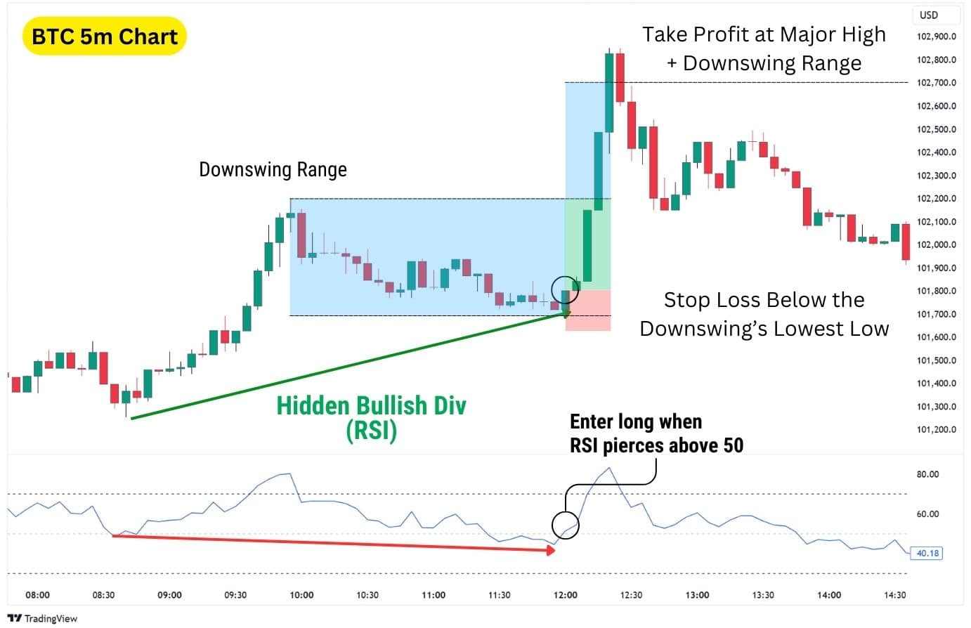
Steps to trade this strategy:
- Spot the hidden bullish divergence on a price chart (higher low on price, lower low on the RSI).
- Enter long after confirming a bullish continuation signal, by waiting for the RSI to close above its midpoint (50).
- Set your stop loss just below the recent downswing’s lowest low.
- Set at least two take profit targets (TP1 & TP2) to manage your risk and maximise account growth potential
Other RSI strategies to consider are the Double Confirmation Strategy, and Trendline Break Strategy. You can apply this take profit methodology to other hidden bullish divergence strategies as well, but note that the efficacy will vary depending on the strategy, asset, and timeframe.
| Disclaimer: No strategy is universally effective across all assets. Backtesting preferred strategies with specific assets, to gauge how they perform over a series of trades, will be key to your success. |
Advantages of Trading on the Hidden Bullish Divergence
The hidden bullish divergence is both a great tool for finding entries into a long (buy) position, and also a major caution sign for traders looking for a short (sell) position. This added awareness can help traders discover trade ideas, as well as avoiding bad trades.
- Avoid Short Trades: A hidden bullish divergence signals traders to avoid shorting the market, because it tells us the buyers are still in control despite the recent price drop.
- Trade Short Squeezes: Just as how the hidden bullish divergence can help us avoid bad short trades, it also allows us to take advantage of bad short positions in the market. Oftentimes, a hidden bullish divergence plays out like a short squeeze, rapidly rising due to triggering a cluster of stop losses, and therefore hitting profit targets quickly.
- Versatility: These divergences can occur on any timeframe, asset, and be observed with a variety of momentum indicators which exist in the market.
- Clear Invalidation: The pattern is invalidated if the price forms a lower low, relatively to its first low in the hidden bullish divergence.
Disadvantages of Trading on the Hidden Bullish Divergence
- Requires Experience: Though simple in nature, the hidden bullish divergence is difficult to spot in practice for the inexperienced.
- Can take time to play out: Hidden bullish divergences may take time to play out, lingering and chopping at the lows, before the price truly begins to continue in an uptrend.
- Requires confirmation: A hidden bullish divergence is not a long entry signal by itself. To get more consistency in trading this technical pattern, you will need to apply a confirmation signal, or have a trade setup.
What Indicator is Best to Trade in a Hidden Bullish Divergence?
When trading a hidden bullish divergence, line-based oscillators like the RSI, Money Flow Index (MFI), CCI, Stochastics, and Rate of Change (ROC) are the easiest to use. These indicators are effective because they show clear peaks and troughs that diverge from price action, making hidden divergences easy to spot.
In contrast, column or histogram-based indicators such as the MACD and Awesome Oscillator may make hidden divergences harder to identify. These indicators display focus on displaying momentum shifts rather than clear highs and lows. However, they can still be useful if traders look for subtle changes in histogram size or signal line crossovers. Combining histogram indicators with line-based oscillators can add an extra layer of confirmation, providing traders with more accuracy and confidence in their setups.
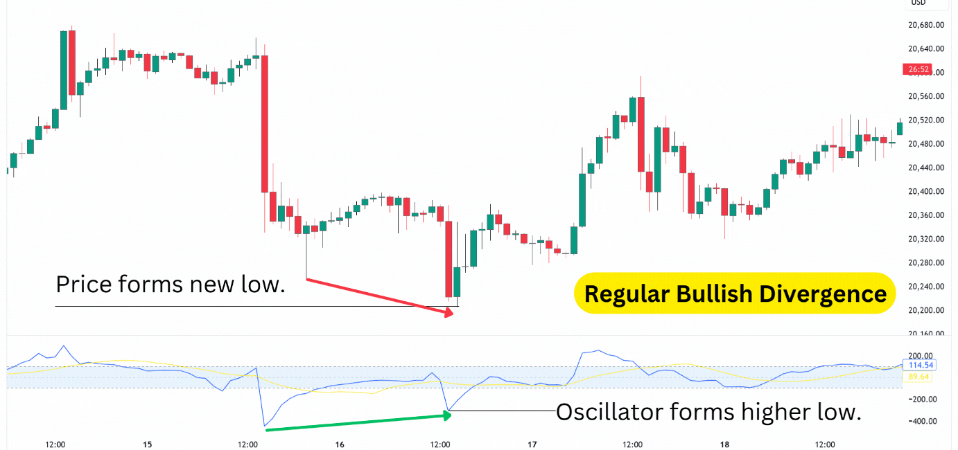
Hidden Bullish Divergence vs Regular Bullish Divergence
Also detected by using a momentum oscillator, regular divergences hint at a trend reversal rather than a trend continuation. The key difference lies in their shape.
A regular bullish divergence occurs when the price forms a lower low, but the oscillator (like RSI, MACD, or Stochastics) forms a higher low. This indicates that sellers have managed to push the price down further, but the momentum behind the move is weakening.
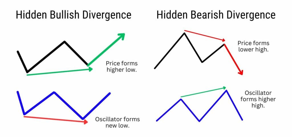
Hidden Bullish Divergence vs Hidden Bearish Divergence
A hidden bullish divergence suggests bullish continuation during an uptrend, while a hidden bearish divergence suggests a bearish continuation during a downtrend.
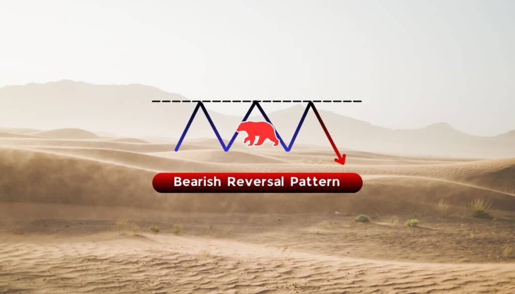
Bearish hidden divergence is the opposite of bullish hidden divergence. Hidden bearish divergences have a lower high on price, and a higher high on the oscillator. This hints at greater bearish momentum entering the market as bulls have been unsuccessful in pushing the price to new highs. When bearish hidden divergence occurs, it indicates that the price action is primarily driven by profit-taking rather than strong buying interest, prompting traders to consider short-selling the asset.
Hidden divergence patterns are difficult to spot at first because they are not as obvious to technical traders.
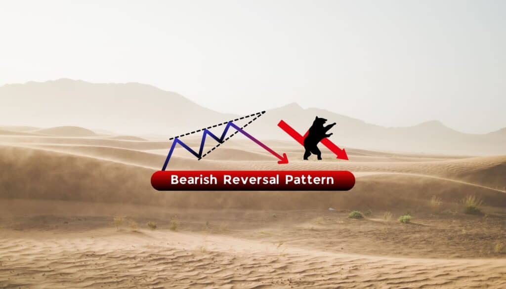
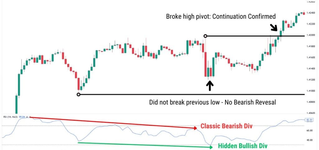
Hidden Bullish Divergence vs Classic Regular Bearish Divergence
The hidden bullish divergence and the classic bearish divergence can appear at the same time, leading to confusing signals. Notice how in the example illustrated below, the pattern’s shape is nearly identical.
A clear difference to keep in mind is that:
- Hidden Bullish Divergence is measured off the lows, where price forms a higher low.
- Regular Bearish Divergence is measured off the highs, where price forms a lower high.
That being said, a hidden bullish divergence and regular bearish divergence can appear simultaneously, leading to confusing signals.
Is it going to cause a bearish reversal, changing the overall trend? Or is the trend going to continue?
To avoid confusion, draw two horizontal lines on the price chart:
- Lowest price during the bearish divergence.
- Highest price during the hidden bullish divergence.
Depending on where the price breaks, we can confirm which divergence is winning.
For example, notice how in this USDCAD example below, the price briefly drops but does not fall below the lowest low. Then, notice how the price reverses from the lows, and subsequently breaks above the highest high – this confirms our bullish continuation.
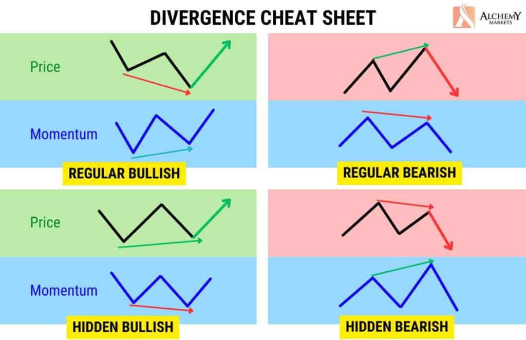
Divergence Cheat Sheet
Use this divergence cheat sheet to identify the different divergences immediately.
FAQ
What are common hidden bullish divergence mistakes to watch out for?
When trading the hidden bullish divergence, it’s important to note the presence of this divergence does not guarantee a 100% rate of continuation. The price can still fall to new lows, should the bears step in with more pressure, or if the buyers did not have enough strength to push prices higher.
It’s also important to pay attention to where the hidden bullish divergence has formed. In a broader uptrend, the divergence has a better success rate. However, if it forms in a smaller uptrend, within a broader downtrend, the ensuing continuation could be weak and not reach new highs (often stopping at a previous major high).
What is the best time frame to use for the hidden bullish divergence?
The best timeframes to trade hidden bullish divergences are the 1-hour, 4-hour, daily or weekly timeframes. By nature, hidden bullish divergences take longer to develop, making them more reliable when observed over a longer period of time.
On larger timeframes, the signals are less prone to market noise and false breakouts, providing clearer trends and higher-probability setups. For example, a hidden bullish divergence on the daily chart suggests a more significant continuation of the uptrend compared to a 5-minute chart, where short-term volatility could invalidate the signal.
How reliable is the hidden bullish divergence?
The hidden bullish divergence is more reliable during strong uptrends, where it often signals bigger and more consistent rallies. While it can work in smaller uptrends within a broader downtrend, its effectiveness is much higher when used in the direction of the overall trend.
Using larger timeframes like the 4-hour, daily, or weekly charts makes this pattern more dependable by reducing the impact of short-term price noise. Adding confirmation tools like RSI crossing above 50, trendline breaks, or volume spikes can further improve the reliability of hidden bullish divergence signals.