Written by:

Reviewed by:

- October 10, 2025
- 25 min read
Point and Figure Chart Explained
What is a Point and Figure chart?
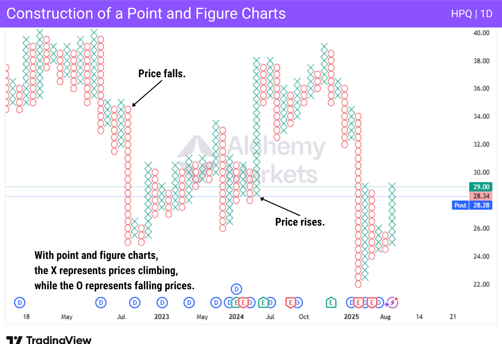
A point and figure chart is a type of financial chart used by traders consisting of columns made up of X’s and O’s to track the price movements of an asset, focusing solely on price changes while completely ignoring time and volume. With P&F, the X’s that appear represent rising prices, while the O’s represent falling prices.
Each mark on the chart is called a box and represents a fixed price movement. This can be adjusted by the trader, with a new column starting when the price reverses by a predefined amount, called the reversal amount. The P&F chart provides guide points for trend identification.
How to Identify and Build the Point and Figure Chart?
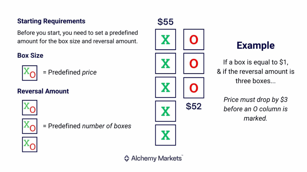
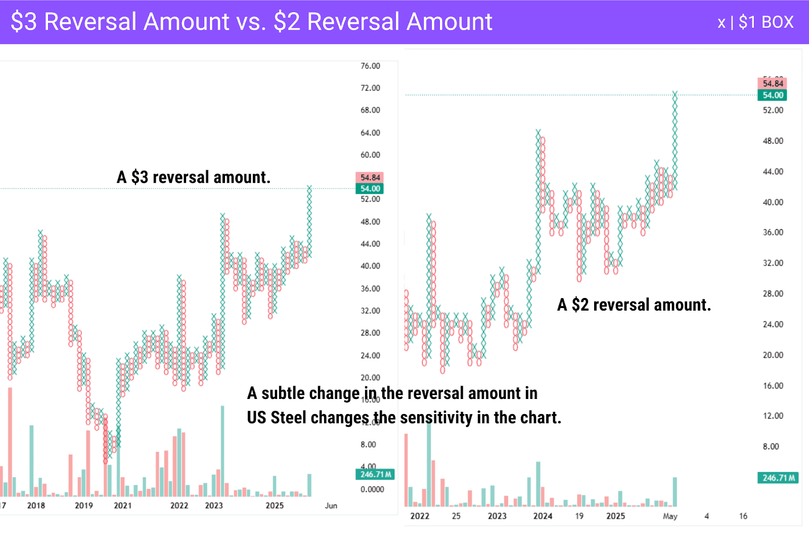
To identify a p&f chart, you must determine the box size. Each chart box size represents the number of price movements required to create a new X or O on the chart. The reversal amount is the number of boxes needed to change the direction of the overall trend and is used to represent filtered price movements, forming a new column on P&F.
An example of how to build a point and figure chart can be explained with the following scenario:
- You must determine a box size.
- Suppose each box equals $1, and a reversal will require 3 boxes, or $3.
- If prices increase from $50-$55, you would mark 5 X’s in a column.
- If prices fall $3, you start a new column of O’s.
By ignoring time, traders and technical analysts focus on breakouts above resistance or below support, as well as spot trend continuations or reversals. Support and resistance levels become based on the height or floor of columns and become fairly easy to spot on P&F. Traders determine price targets by using various vertical/horizontal count methods, just like other chart types.
Key Characteristics of Point and Figure Chart
While these charts show price movement, the way a p f chart is recorded can help clarify the overall trend and the overall momentum of a market. The following makes them different:
- Focuses on price movement, not time.
- X’s and O’s represent movement.
- Os represent falling prices. Xs represent price increases.
- Box size and “reversal amount” are adjustable.
- Excellent at showing support and resistance levels by printing columns.
- No time axis, only moves when the price does.
- A new column starts once price action moves a predetermined amount on P&F.
- Traders will use classic chart patterns such as double tops, triangles, etc.
How Does Point and Figure Chart Trading Work?
The p f chart is typically used for a longer-term investment and is not ideal for short-term scalping. They are one of the simplest systems for determining entry or exit points, showing supply and demand, while keeping an eye on any potential developing trends.
What Makes Point and Figure Charting Different?
What makes a p f chart so unique is that it focuses on price movement only. The market will remain in the same column with the same letters as the price continues in the same direction. However, if the reversal amount is met, the new column prints with the other letter.
Point and Figure Charting Shows Supply and Demand Clearly
The focus on supply and demand is clear, and as each X or O represents a specific unit of price, it eliminates a lot of the short-term noise, allowing traders to focus on the longer-term move. The reversal amount can be changed as well on P&F. The typical amount of a reversal is three boxes before you change from the previous column, but it can be changed.
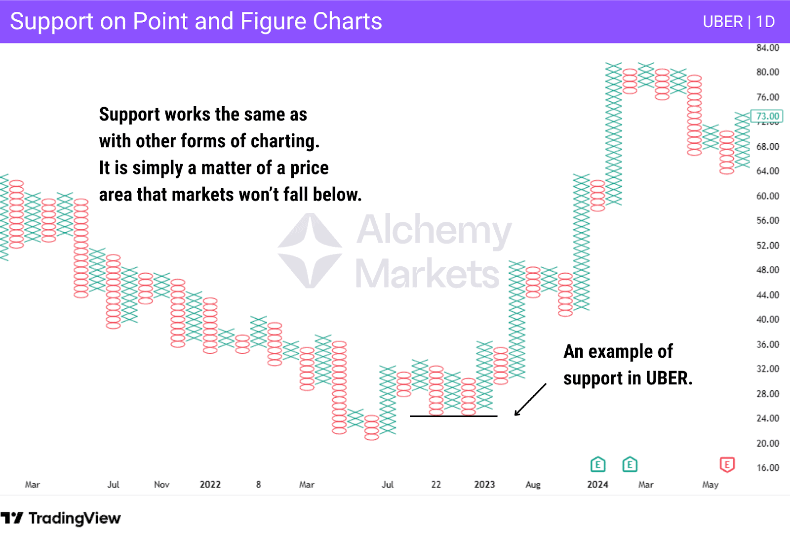
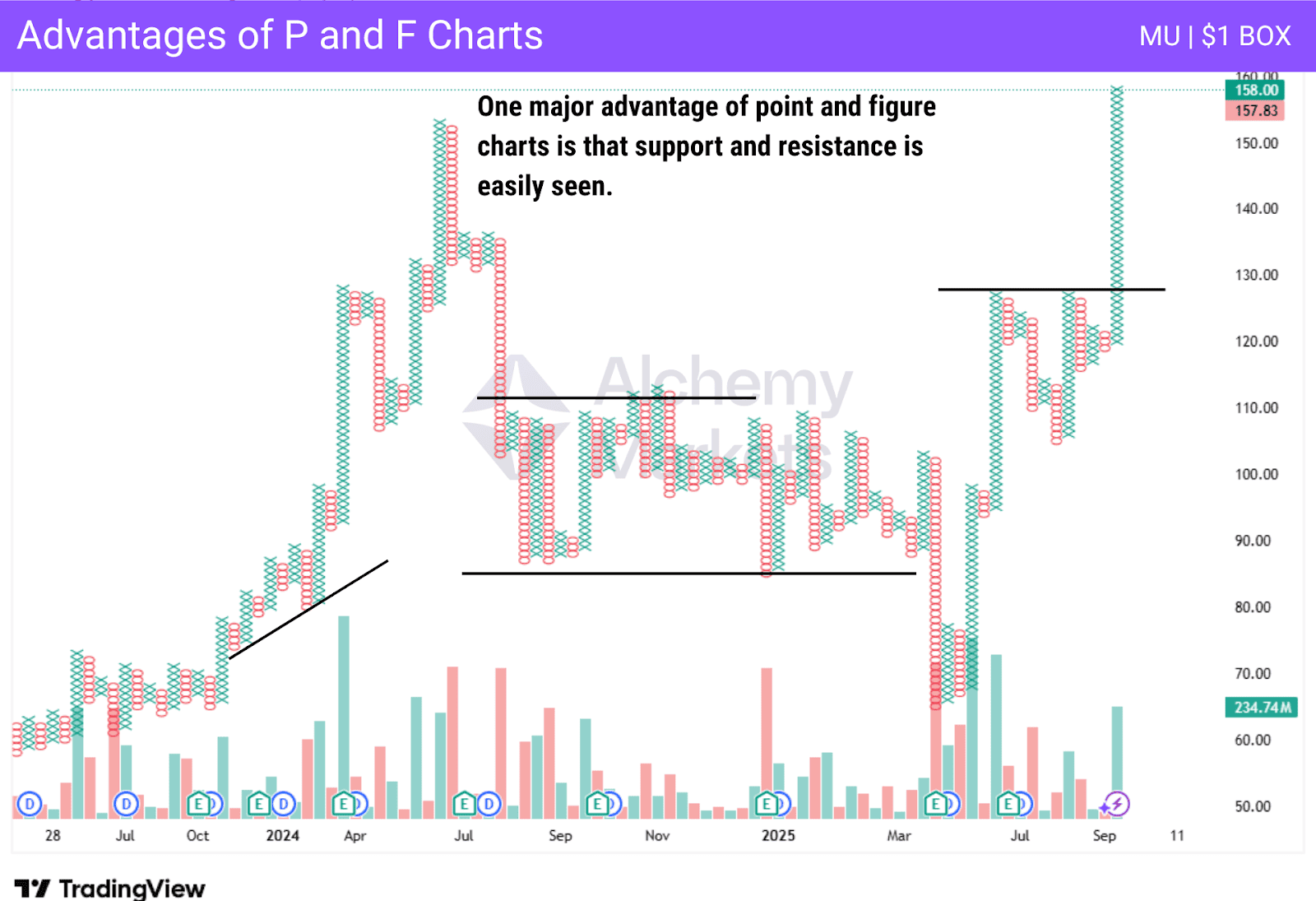
Support Levels
Support levels on a p f chart work similarly to other charts. It is a price that markets cannot drop below. The $24 level on the chart below represented short-term support, attracting buyers and pushing the market higher. Shortly after, you can see that the price increases. Additionally, these charts clearly display horizontal support levels.
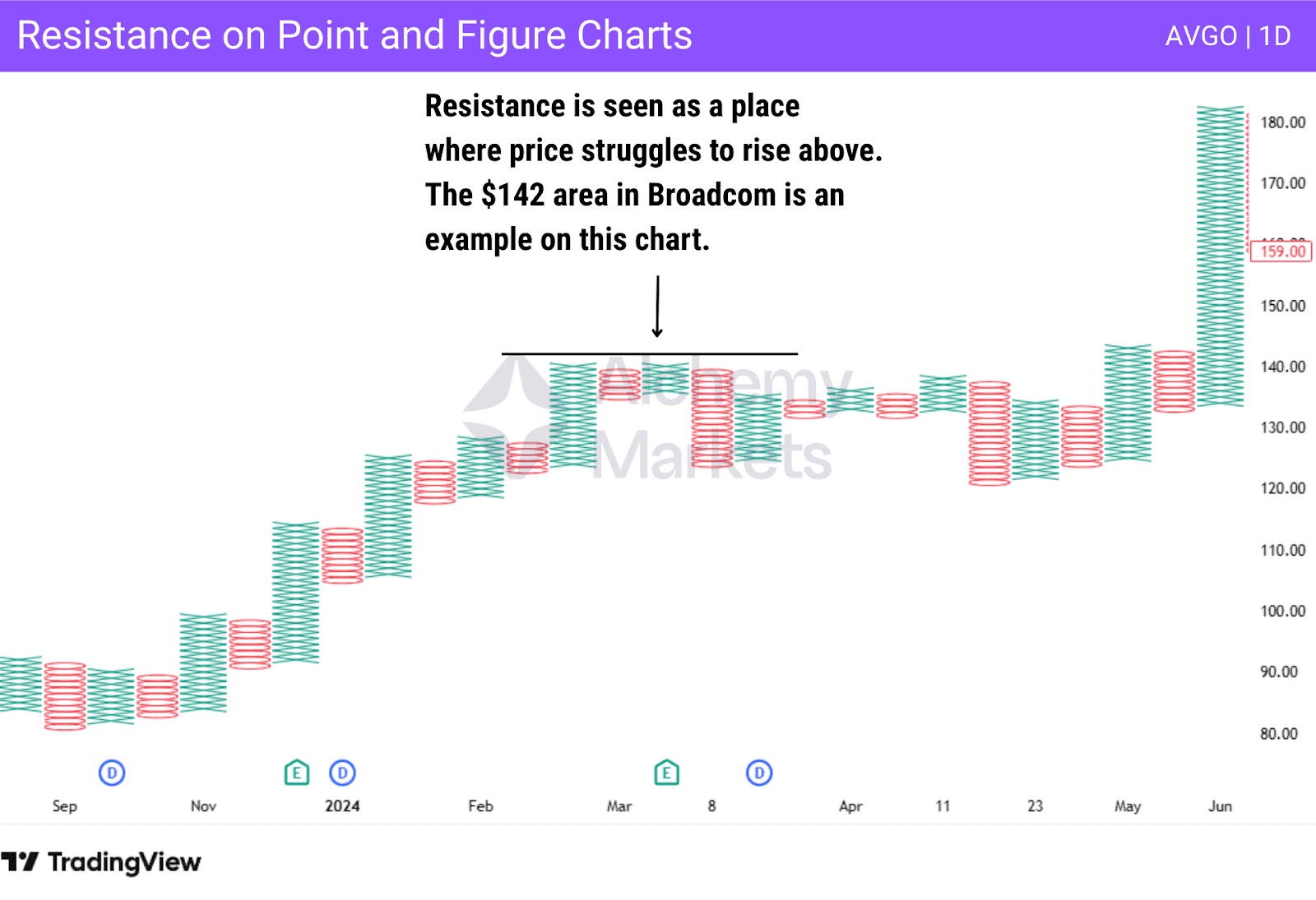
Resistance Levels
Resistance levels work as they do in other forms of charting, representing an area where price increases are met with selling pressures. In other words, there is a lot of selling pressure or a lack of interest in that area. The simplicity and clean look of P&F to show the horizontal levels of importance cleanly.
How to Calculate Point-and-Figure (P&F) Charts
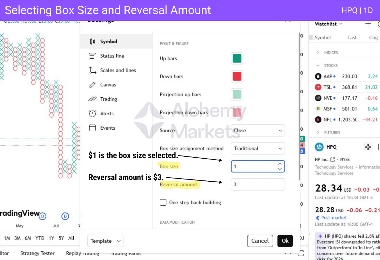
The p f chart generally doesn’t have standardised calculations. Price movements are determined by a user-defined value for box size and reversal amount. The box size can be any amount, while the reversal amount will be the number of Xs or Os needed to create a reversal. If the box size is $1, and the reversal amount is $3, you will need 3 Xs or Os to generate a reversal.
P&F are not represented by days, hours, or even weeks. It only contains price changes based on the box sizes. This can be changed to accommodate price movements. If the trader creates a $2 box, it takes more price action to create new X’s and O’s than a $1 box.
Point and figure charts make identifying support and resistance levels easier than traditional charts. Many traders continue to use technical analysis to forecast trends, examining support and resistance areas, price moves, and the closing price to determine how the market responds to them to make decisions.
What Does a Point and Figure Tell You
For some, the P&F provides a much clearer way than candlestick or bar charts to display price trends. Not only do some traders use point and figure charts to place trades, but some will also use them to confirm trade signals generated by other types of charts.
The box size is critical as it indicates the price movement needed to print a new X is O to the chart. After all, other types of charting can exhibit short-term fluctuations, resulting in noise or errant signals. In P&F, if the box size is $5 and a stock only dips $2 before rising $7, it filters out the little moves in price, showing that the longer-term momentum was still strong enough to push markets another box higher.
Selecting Appropriate Box and Reversal Sizes
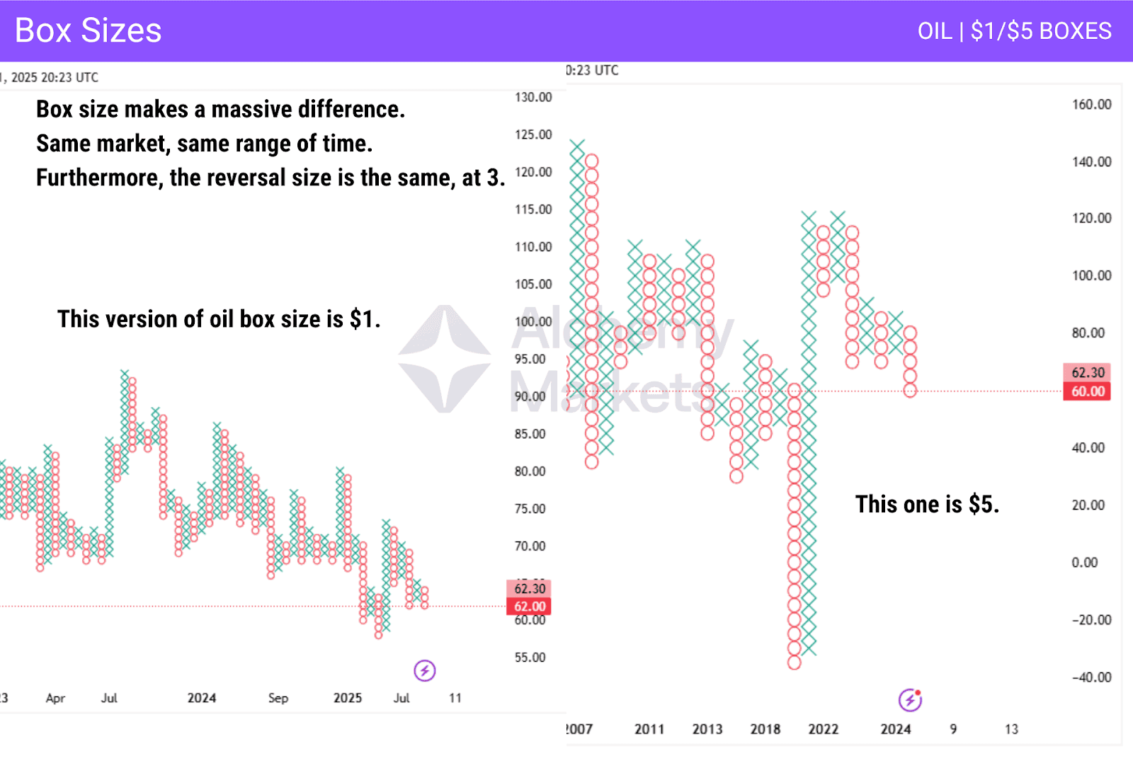
Selecting the appropriate box and reversal sizes is important for anyone using P&F. Not all assets will have the same volatility, so, for example, an appropriate setting for the price ranges of NASDAQ 100 may not be correct for Oil. While there is no definite “formula” for selecting the box size, many traders find the reversal amount of 2 or 3 to be reasonable for a new column.
If volatility increases, it’s wise to increase the box size. If an asset has significant price movements, it makes sense to widen the range for each X or O, which is essentially widening the box size. When markets are quiet, the idea of a smaller box size makes sense, until volatility or average range increases.
Box Sizes and Reversal Amounts
When it comes to box sizes and reversal amounts, there is no setting that will be suitable for all assets and, more specifically, all trading environments. When you select box sizes and the reversal settings, there are a few things to keep in mind.
- Timeframe being traded:
When viewing higher time frames for primary or even intermediate trends, you will want to eliminate shorter-term fluctuations. If you are a shorter-term trader, the opposite is true because you will want to capitalize on short-term rallies and corrections. - Use of point and figure charts:
Traders can use P&F for signals, or they can use it to determine the overall trend of an asset. Some traders use P&F to complement candlestick charts to gain clarity. Both chart types complement each other.
Remember that larger box sizes provide reliable signals, but can arrive somewhat late. While it can get you on the right side of momentum, you may be leaving some of the potential profit in the market waiting for a new column sometimes.
This makes sense because the same can be said for long-term versus short-term time intervals. Regardless of the charting method, shorter time frames, or, in the case of the p f chart, small movements can bring undue noise into the fold.
Point and Figure Chart Construction Example
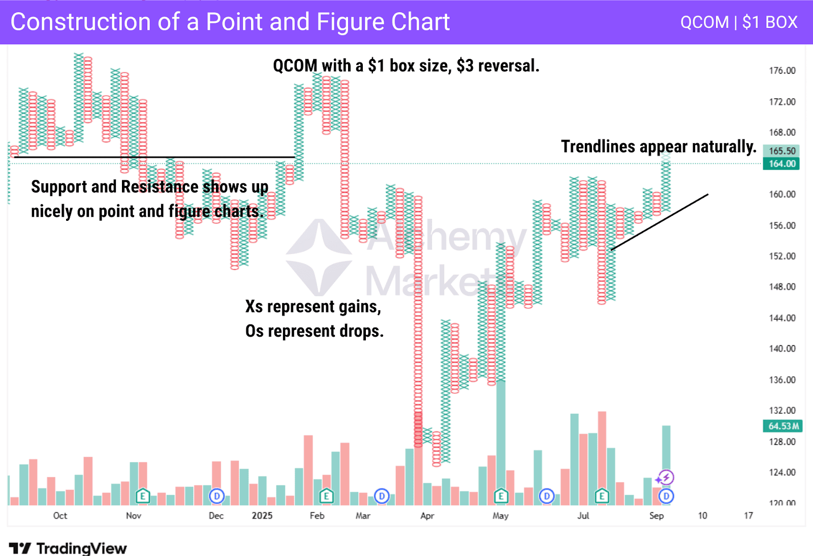
The p&f chart is a representation of a set amount of price movement. The box size can be whatever you want, allowing for flexibility. If the box size is $1, it means that the price must move higher or lower by $1 to print a character. The os represent falling prices, while the xs represent rising prices.
There is also a reversal amount that you can choose. The reversal amount of movement that you need to have to change to a fresh column. When the column changes from xs to os on these charts, it shows that the price has reversed by the necessary reversal amount. It filters out the noise of a market by doing so.
Trend lines are also used, but the horizontal support and resistance levels are where P&F really shine, as seen on the chart above.
Point and Figure Chart Trading Strategies
Some common trading strategies that point and figure traders use are shown below. These are general strategies, and only work sometimes. Nothing works all of the time, but these are some of the strategies that many traders will employ.
Point and Figure chart with Average True Range
One popular way to filter out some of the unwanted price action in this charting method is to use the Average True Range indicator. However, in the case of point and figure charts, it isn’t just a matter of attaching the indicator at the bottom of P&F.
No, in this kind of chart, the ATR can be “built into” the actual columns. Box size can be based on the ATR, thereby making the price moves fall in line with the market volatility.
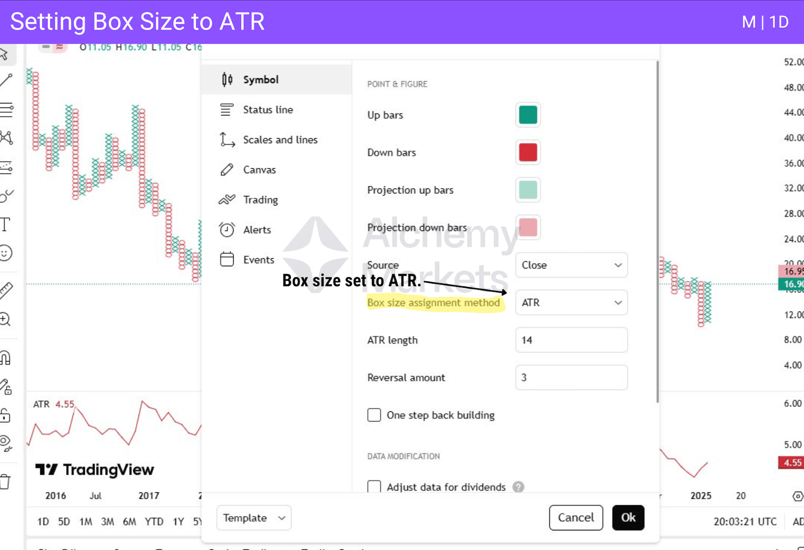
In cases of higher volatility, the X columns, as well as the O columns, will automatically base the box size on the ATR indicator, resulting in a more uniform representation on the charts. This means smaller box sizes in low-volatility markets and larger box sizes in high-volatility markets.
This allows for traders to filter position size and, of course, ignore a lot of noise in short-term movements on P&F. ATR also allows traders to understand how big the position should be.
For example, if the ATR is something like $14, you would have a smaller position than an asset that has an ATR of $2. Also, it is quite common for a trader to have a stop loss of something like “1.5 ATR”, meaning in the case of the $14 ATR, a $21 stop loss.
Point and Figure chart with Percentage Last Traded Price
The p f chart can also be drawn by using the “percentage last traded price” to place the next X or O in the column. This could bring in fewer x’s and fewer o’s at times, because you define the percentage of the price movement before another box is drawn.

In other words, if the trader chooses to, they can have it set to 1%. This means that before you see another box formed, the price will have to move 1% of the last price. These presented filtered price movements will make for fewer boxes in a rally, but perhaps more meaningful ones for longer-term traders.
This form of trading allows for traders to filter position size and, of course, ignore a lot of noise in short-term movements. By using percentages, traders will perhaps enter a position a little later, but they will also naturally be in tune with the overall price change. Traders will have a stop loss set to a specific percentage of loss.
Point and Figure Chart with User-Defined Box Scaling
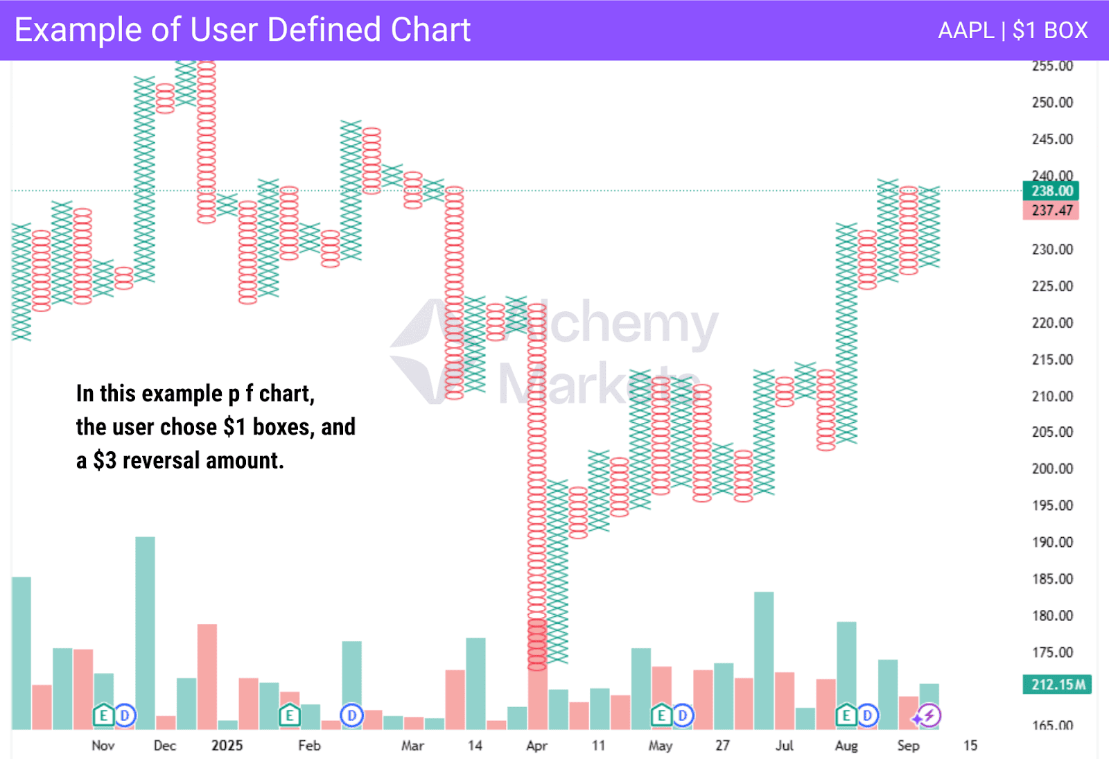
The p f chart is very flexible. The user can define whatever they want for the box size. They can also adjust reversal amounts, allowing these charts to be extraordinarily useful. A user will make the box size bigger when the market is volatile and when an asset is expensive. A stock that is priced at $400 can move $1 quickly. However, a $5 box size could be a bit clearer. The reversal amount is a predetermined reversal amount to make a new column that can be adjusted to accommodate volatility and price as well on P&F.
High/Low Method
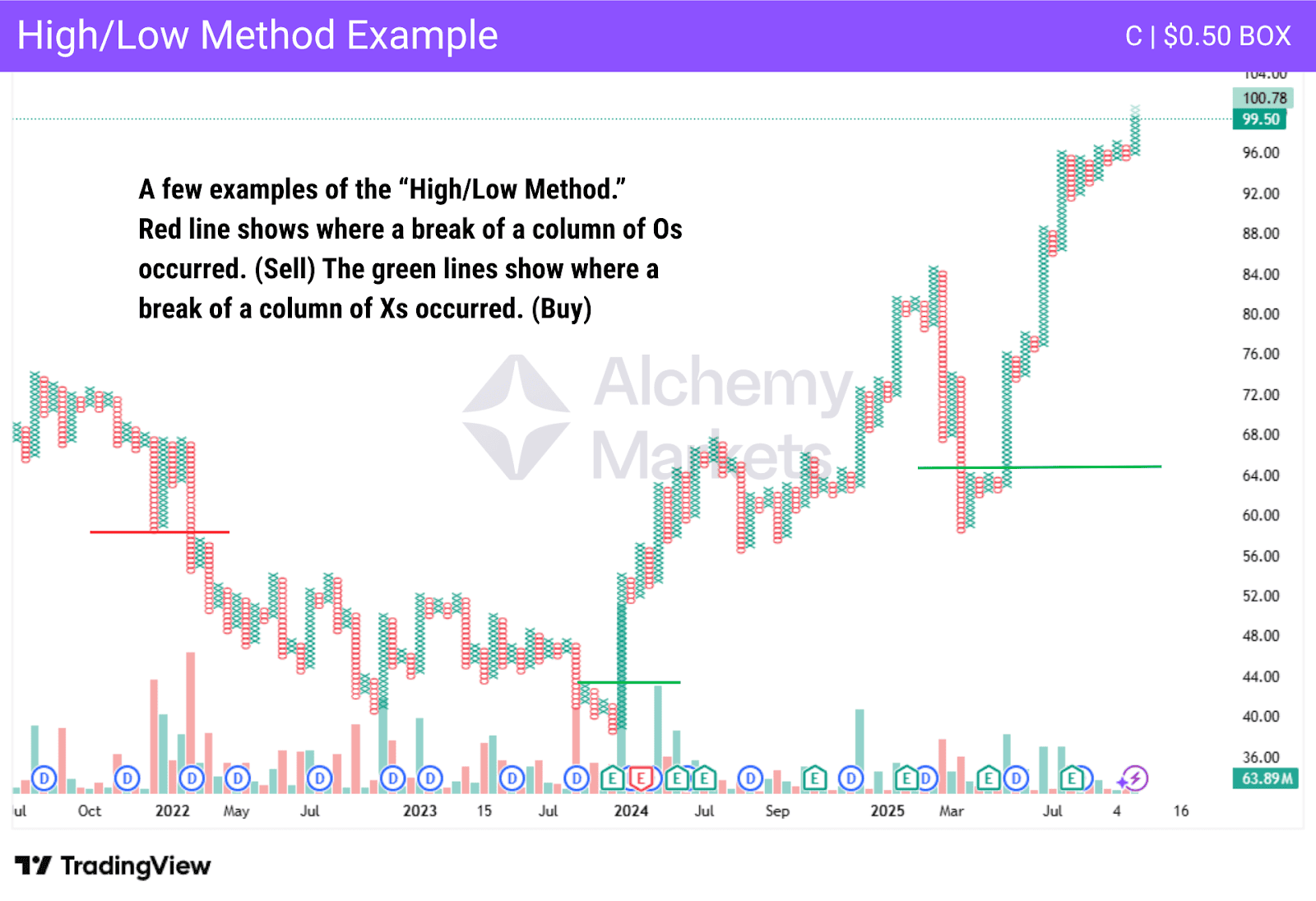
The “high/low method” makes use of the intraday data in a market. By using the highs in an uptrending market and the lows in a downtrending one to produce signals, this method allows for further sensitivity to potential trend changes on P&F. Instead of focusing on the high or low of the market, traders will focus on the latest X or O column to decide on a trade.
This can eliminate some of the inherent lag that a typical point and figure chart can have. Short-term traders will often use this method in order to confirm a potential move in the opposite direction or a continuation of support and resistance levels.
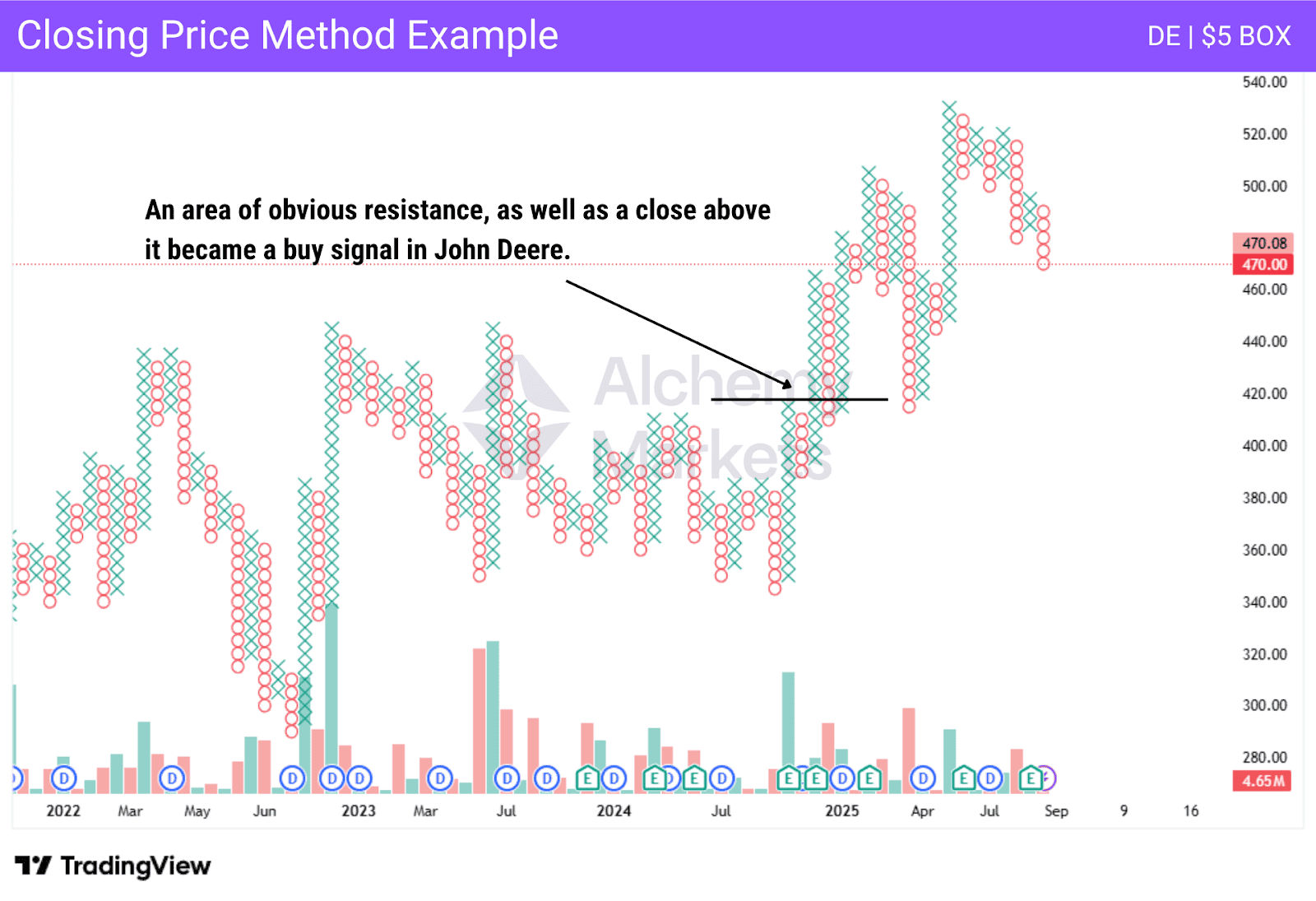
Closing Price Method
One of the more common methods used in P&F trading is the “closing price method.” This is suitable for longer-term traders, as it will focus on clear moves. It is based on buying the close of the box above the previous column high to buy, or below the previous column low to sell. Traders will almost always use support and resistance in congruence with this method as well.
Typical Price Averages Method
Typical price uses a single price for the day, calculated as (high + low + close) / 3. This is similar to how some moving averages are calculated, and has the effect of “smoothing out” the noise in a market. This is something that can be used on longer-term P&F, but is somewhat rare.
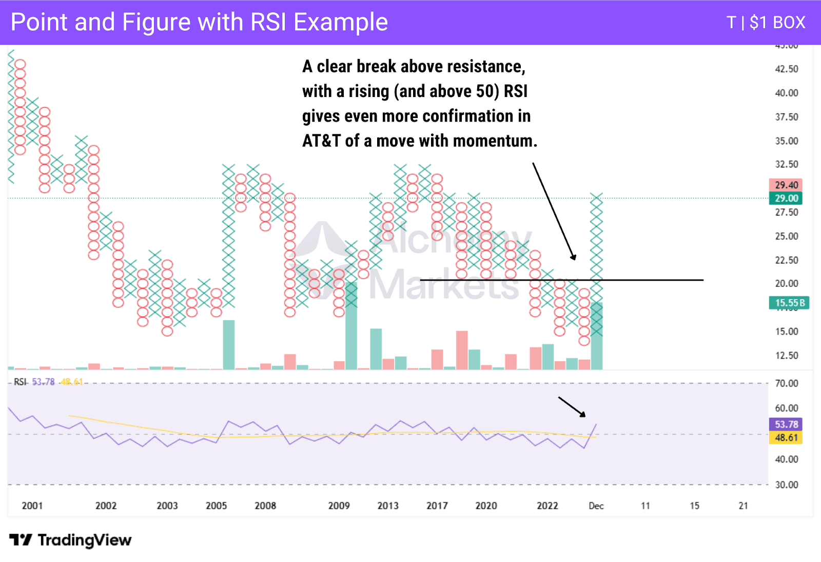
Trading Point and Figure Chart with RSI
With P&F, like any other kind of charting method, they can be used with indicators. One popular one is the RSI, or Relative Strength Index. It is used to confirm momentum, or even show a potential divergence between price action and momentum.
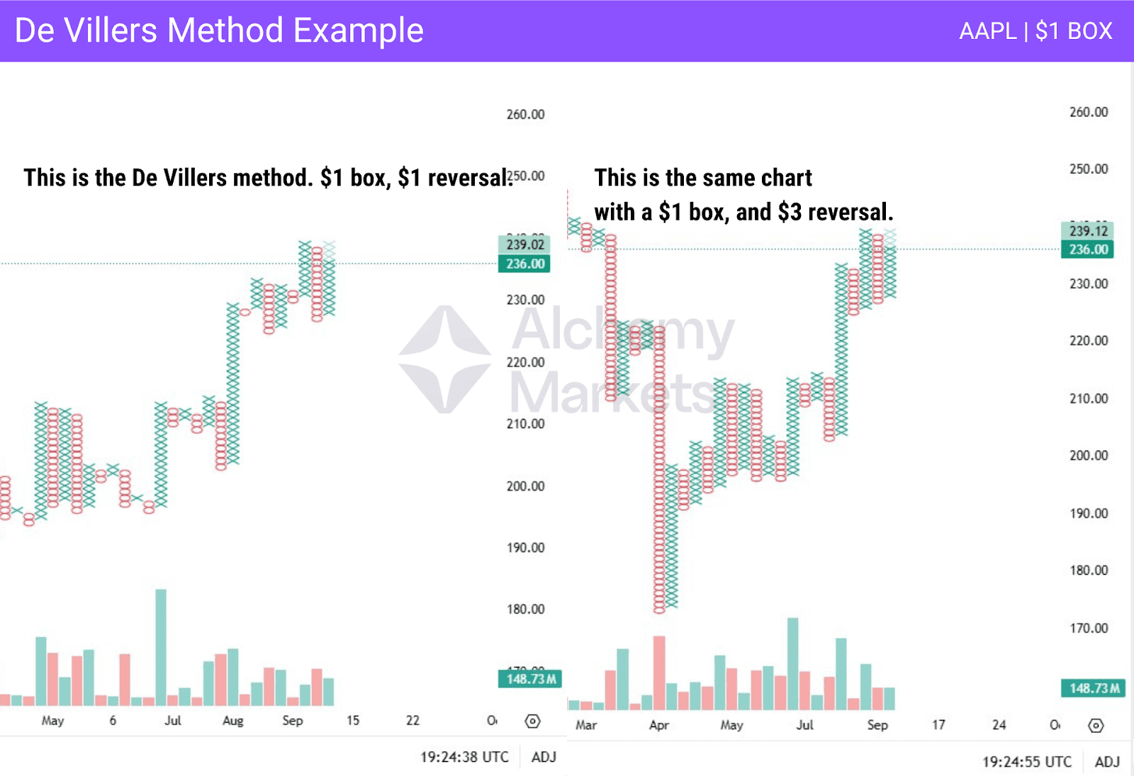
De Villiers’ Method
The earliest method of trading assets using point and figure charting was introduced by Victor De Villers in the 1930s. Straightforward in its approach, as it used $1 boxes and a 1-box reversal. It was used to track intraday movements, but it isn’t common, as many markets are too noisy to do this.
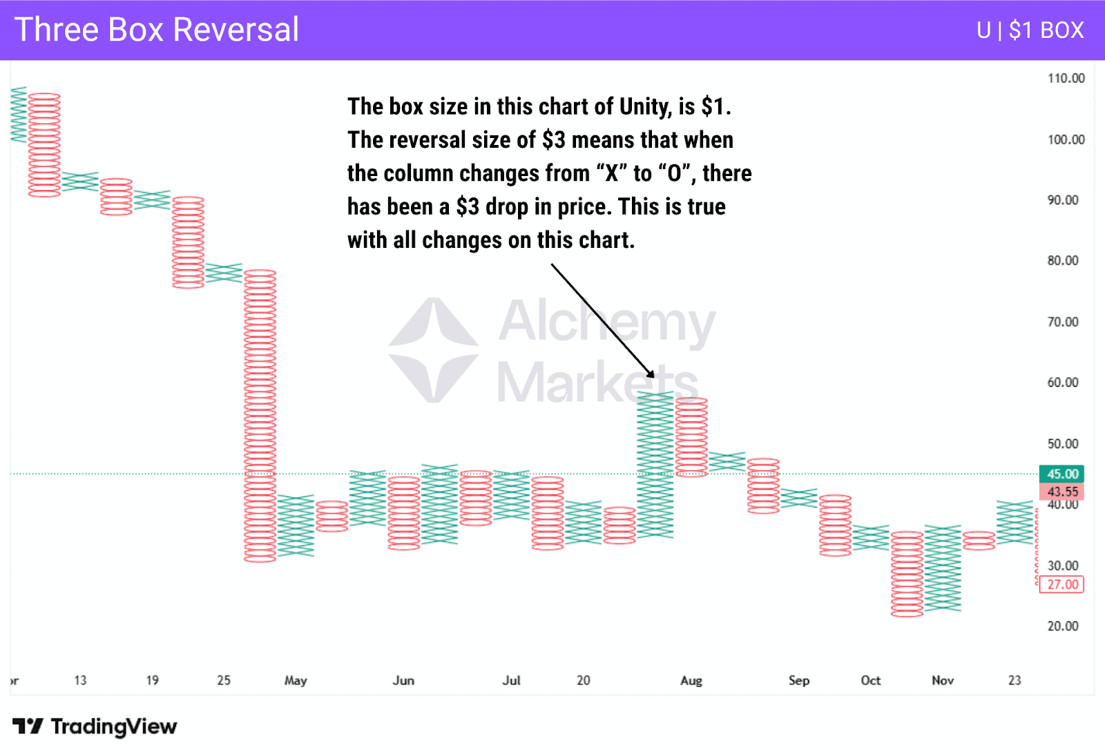
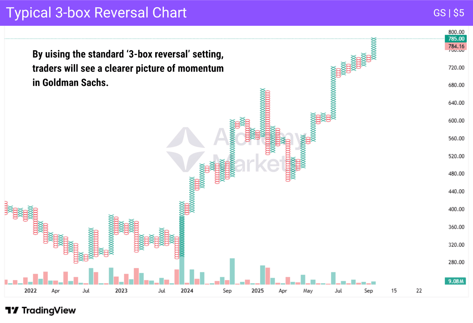
3-Box Reversal Method
The “3-box reversal method” is the classic way in which most traders will use a p f chart. It is simply using 3 as the reversal amount, meaning that if we are printing a column of Xs, and then three Os, the new column of Os will be printed next. This works in the opposite direction as well, and is a standard way to eliminate some of the inherent noise from the charts.
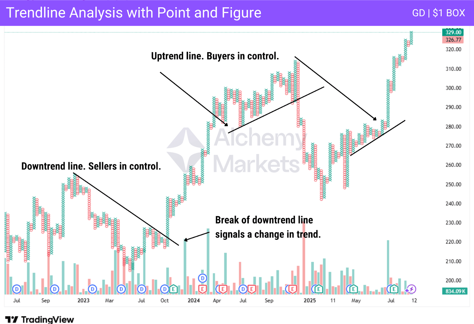
Trendline Analysis with P&F charts
Trend lines using a P&F are similar to other charting methods. Trend lines show support or resistance that appears over time, and at a 45-degree angle. This is due to how they are constructed. Trading with trendline analysis is buying on an uptrend line and selling on a downtrend line.
It is also used to determine a potential trend change. When an established trendline is broken, meaning price touches the line multiple times, the trend could be reversing. However, it should be noted that most traders are more inclined to follow the support and resistance levels that appear horizontally on the point and figure chart.
Advantages of Trading on the Point and Figure Chart
There are some major advantages to using P&F, with the most obvious and widely accepted one being the filtering out of noisy market moves. By having a filter in the form of the standard three box reversal, markets will wait to reflect the price change, and leave the current column.
Once a new column begins, it shows that there is a change in the behavior of the price. There are columns instead of the noisier plotting of traditional charts, which makes it easier to see support and resistance levels. The p f chart shows price and trend in a clearer manner than many other types.
Disadvantages of Trading on the Point and Figure Chart
The p f chart has a few things that traders need to be aware of. One major concern is that they can be slow to show price changes. After all, a three box reversal, the standard move needed for a new column, can be a bit “late” in relation to other methods of charting.
While preventing some “false breakouts”, they can still occur based on the “lag” of the printing of boxes. There are a lot of traders who use other pricing methods, such as candlestick charts, in concert with point and figure charts, with the point and figure charts being used to follow the bigger trend.
P&F Chart Patterns
P&F are similar to other charting methods as they have patterns. In fact, many of the patterns that appear in candlestick charts are also shown on P&F charts. However, they look a little different, and by their nature, point and figure charts tend to pay closer attention to breaks of horizontal barriers than anything else.
Bullish Breakout Patterns
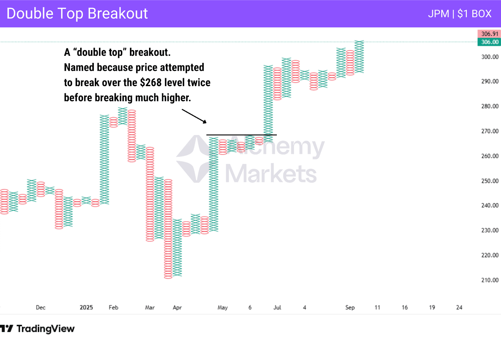
There are a handful of “Bullish Breakout Patterns”, although they are all basically the same thing. There are the “double top”, “triple top”, and “quadruple top” breakouts. They are self-explanatory, as they are just the number of attempts the price made on a resistance level before the market continued higher.
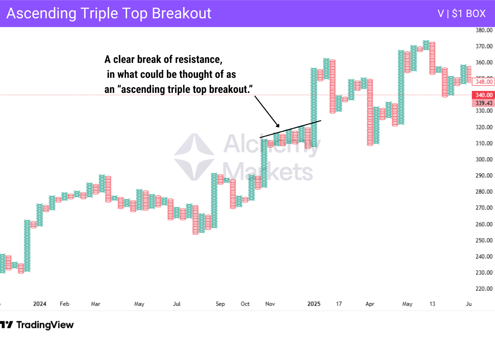
There is also the “ascending triple top breakout”, which is just a rising number of resistance points. Think of it like a trendline that gets broken, but has been rising. Momentum is building to the upside visualised as the upward sloping trend line. Then, prices spurt higher leading to a classic ascending triple top breakout with momentum bursting higher.
Bearish Breakdown Patterns
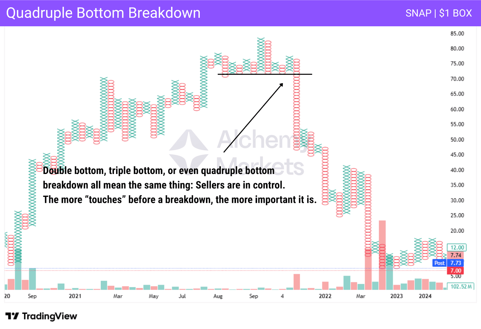
Breakdown patterns are the opposite of the breakout pattern. This is basically an expression meaning that “support has been broken, and sellers are gaining momentum.” There is the “double bottom breakdown”, the “triple bottom breakdown”, and so on. The chart above shows a “quadruple bottom breakdown.” Once support was violated, the price collapsed leading to a classic quadruple bottom breakdown.
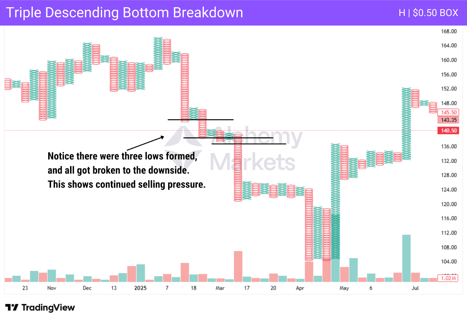
There is also the descending double/triple bottom breakdown. It is formed when a market has been “slumping” and forming lower lows, but it is still fighting. So, when two or three consecutive lows are broken, it shows sellers are in control.
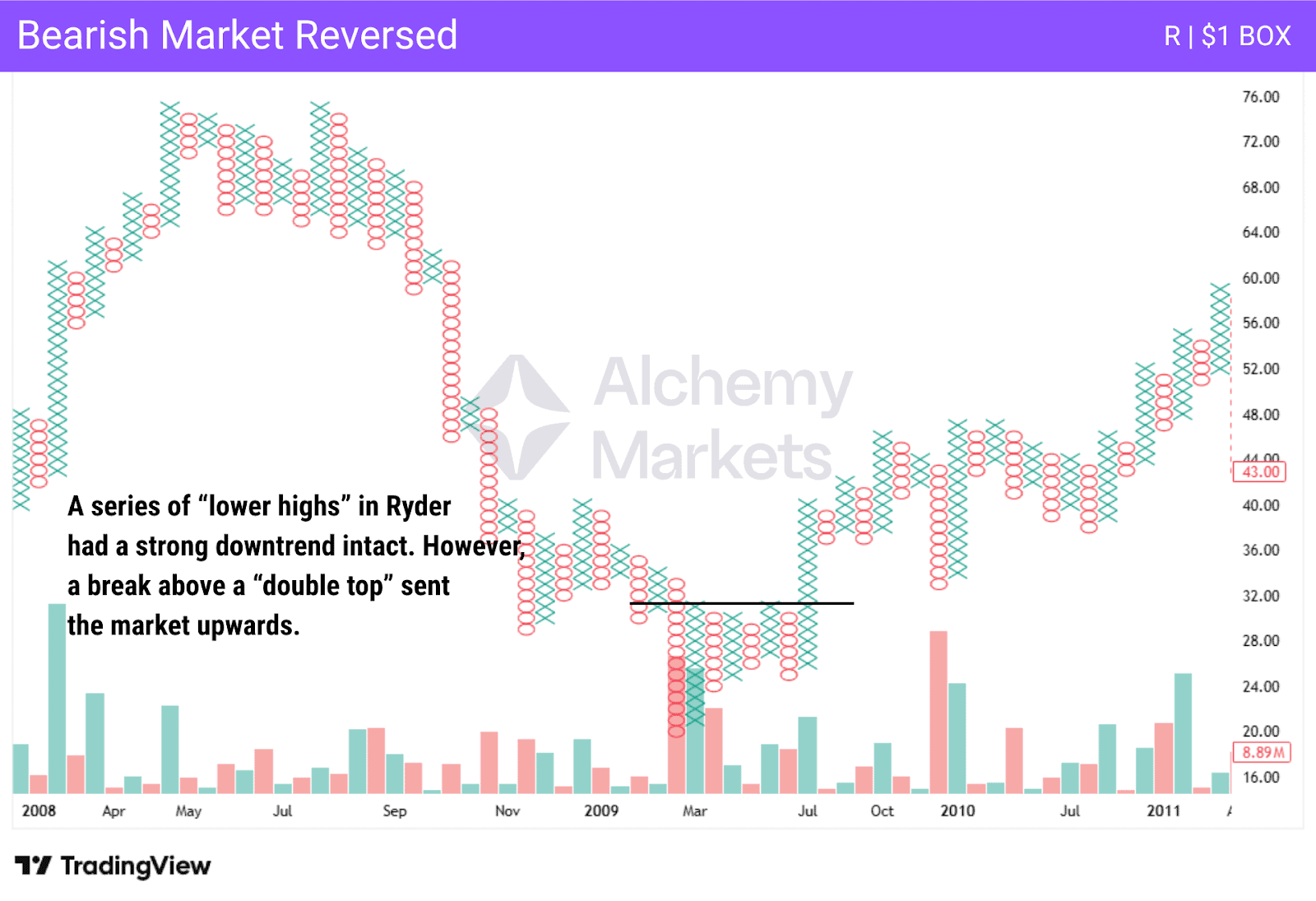
Bearish and Bullish Signal Reversed
The Bullish Signal Reversed and the Bearish Signal Reversed patterns can be thought of as simply a move in the opposite direction after significant price movements. A bullish signal reversed would be a series of higher highs, only to see a double bottom (or more touches) being broken below.
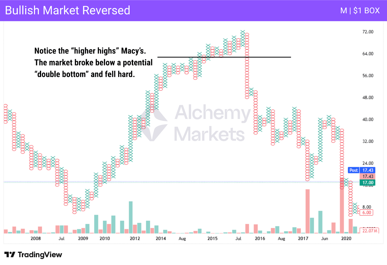
This suggests that the uptrend is over, and the downtrend has started. The bearish signal reversed is a series of lower lows, only to see a double top (or more touches) broken above. The buyers are taking control of the market.
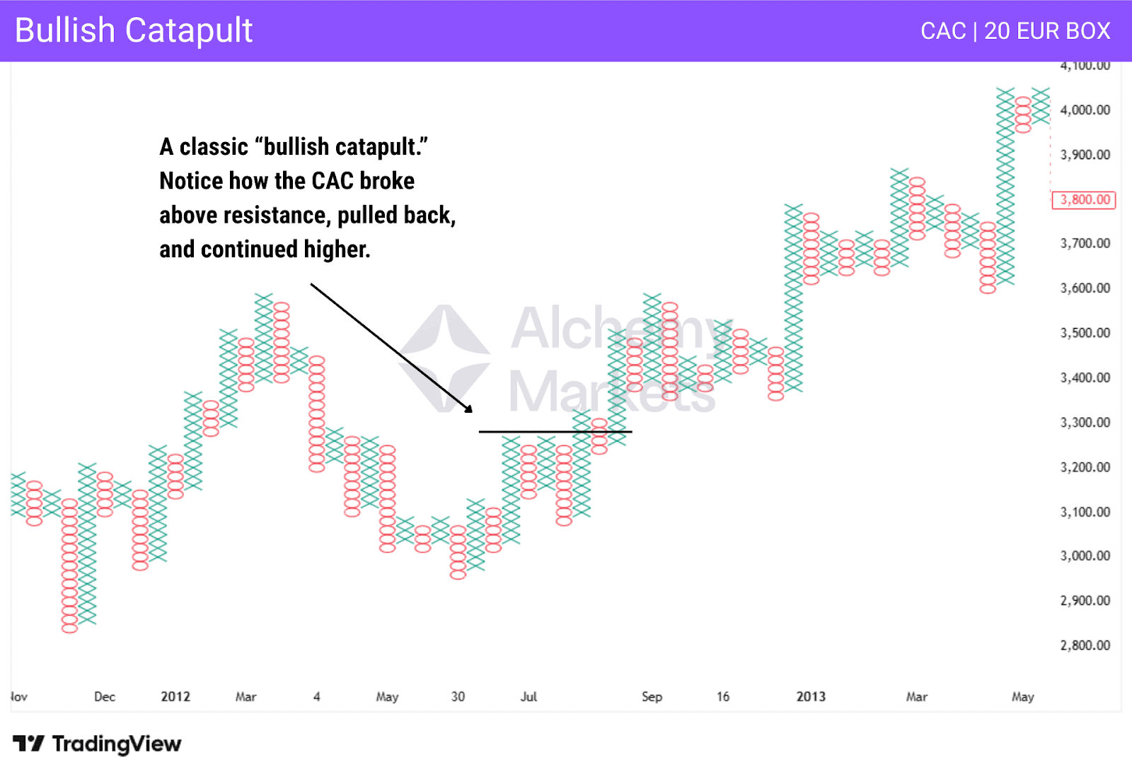
Bullish and Bearish Catapults
There is a class of signals known as “catapults” in the point and figure world that appear frequently. In the case of a bullish catapult, you see a break above resistance, a pullback – often below the initial breakout, and then a continuation higher. With the bearish catapult, it is a break lower, a bounce, and then a continuation lower.
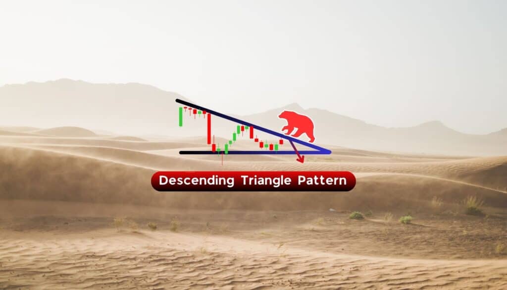
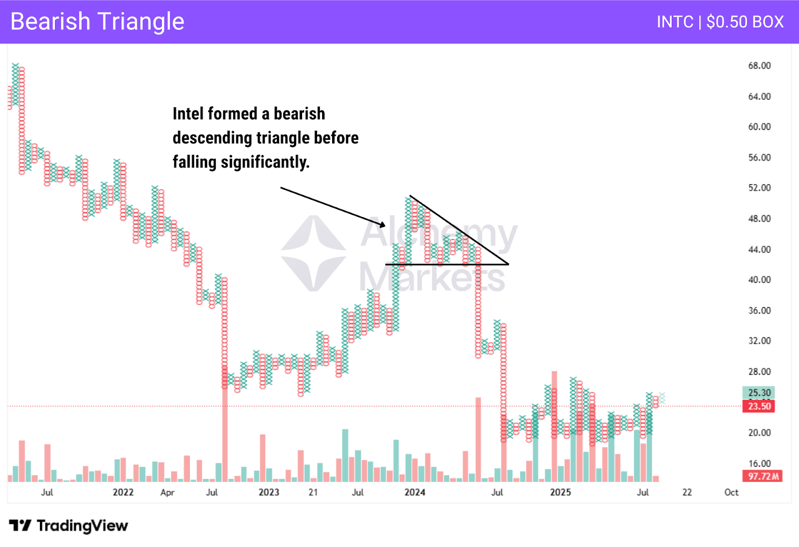
Bullish and Bearish Triangles
Bullish and bearish triangles are a mainstay for most technical analysts. It is drawn using support and resistance levels. The bullish triangle simply shows that there is a level that is resistance, but each pullback finds buyers at higher levels, forming an ascending triangle.
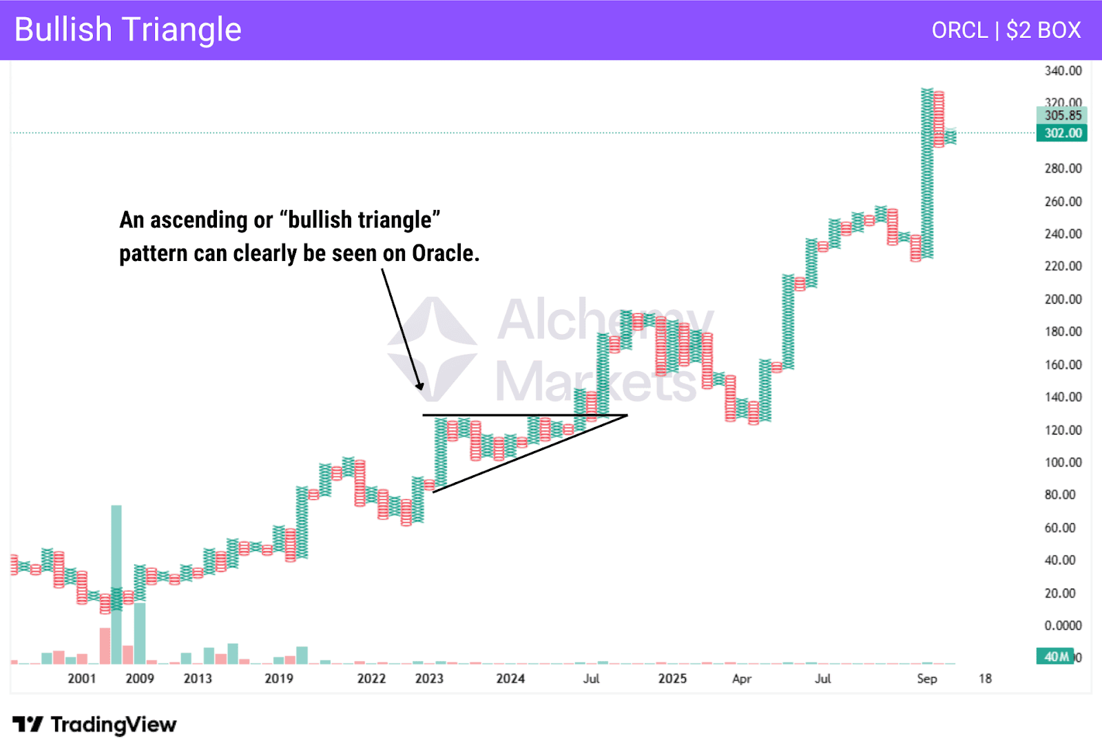
The bearish triangle is the opposite, as it shows support that is holding, but each time it rallies, it does so a little less. Eventually, the support or resistance gives way, and those pressing against it create more momentum. Most people will have a target of the “height” of the top or bottom of the triangle to the flat line. Stop losses are often on the other side of the sloped trendline in the triangle.
Bull and Bear Traps
Bull and Bear Traps work the same way in point and figure charting as they do anywhere else. Essentially, what you see is a break of support or resistance, and then a reversal in price. For example, a “Bear Trap” example would be a series of falling prices that test and eventually break below resistance, only to bounce from there. This has the sellers losing suddenly. It’s a “false breakout.”
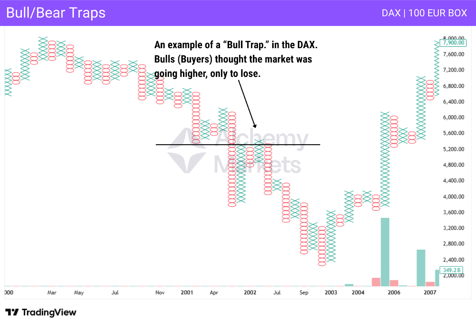
Bull Trap
With the “Bull Trap”, the opposite happens. Traders see a series of rising prices that finally break above a resistance area. However, the market turns around and starts falling again, causing the “bulls” to lose money. Most traders see this in the form of one X or O, then a reversal, although this is semantics.
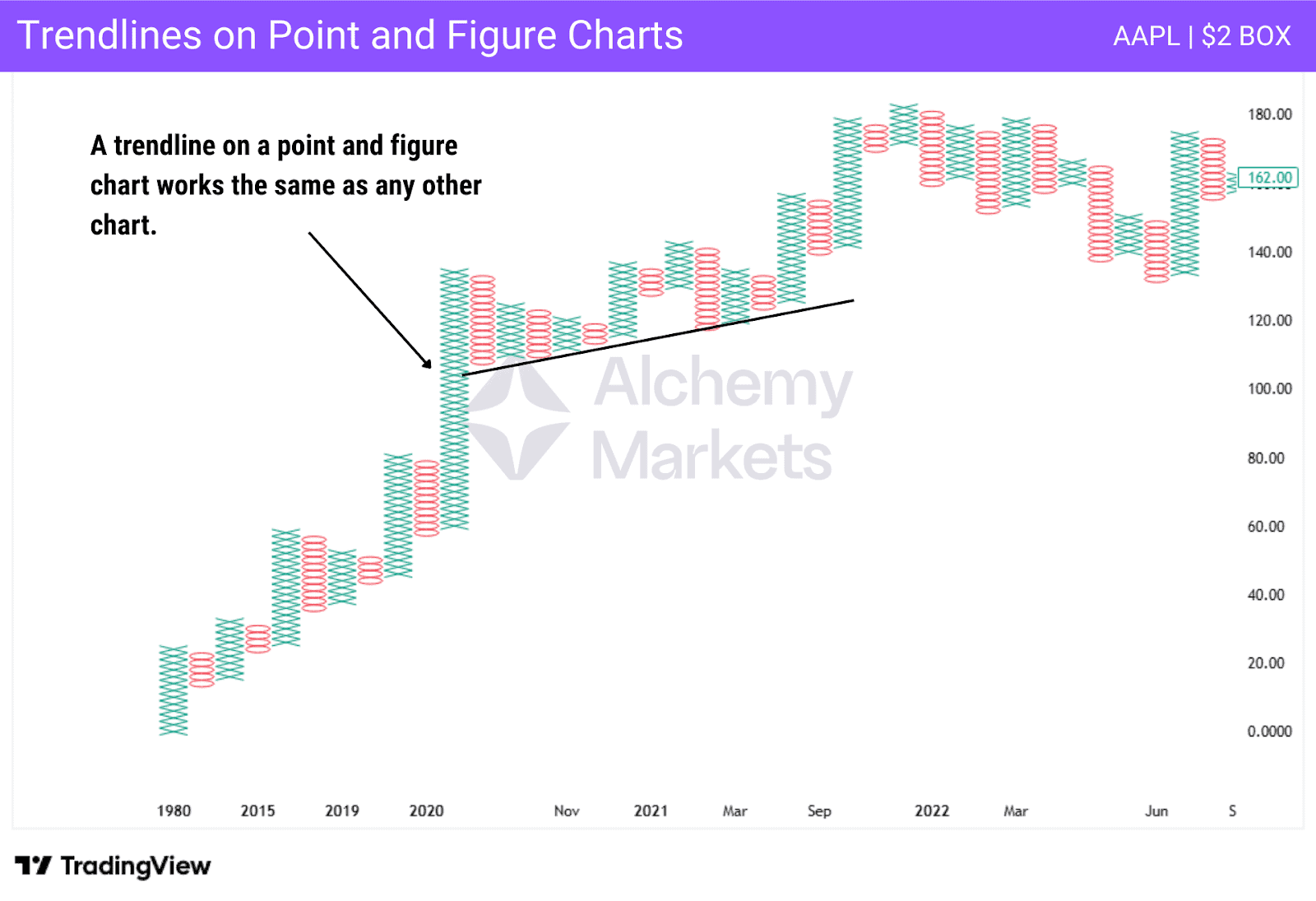
P&F Trend Lines
Trendlines work the same way on P&F as they do anywhere else. As long as the price action doesn’t break the trendline, it is expected that the market will continue to follow the trend. If they get broken through, then traders will start to look for a change in price action.
Point and Figure Charts vs Renko Charts
Renko charts are similar to point and figure charts in that they are also based on box size, and will print a new box when the price moves by the appropriate amount. However, Renko charts create an up or down brick that moves at a 45-degree angle from the previous box.
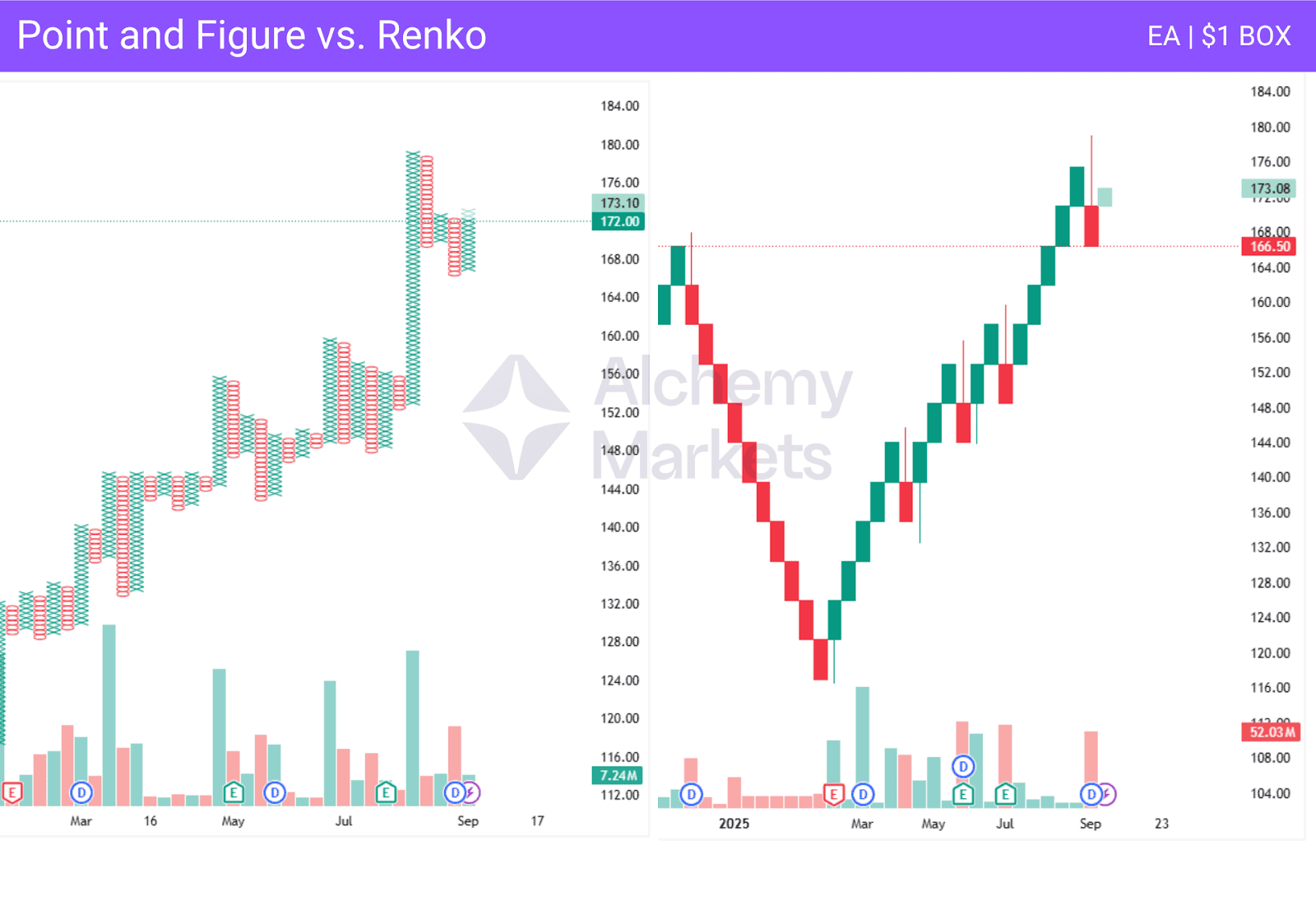
The Renko chart never has a brick next to each other, and as a result, doesn’t have columns like the point and figure chart. The reversal in a Renko chart is based on a price move in the opposite direction by two bricks.
Renko charts look different, as the point and figure chart has os representing falling prices, while xs represent rising prices, and the Renko chart prints bricks in different colours. The point and figure chart forms columns that show support and resistance easily, while Renko and its 45-degree angle bricks aren’t quite as cut and dry.
Point and Figure Charts vs Candlestick Charts
Japanese Candlestick charts are one of the most popular types of charting available. These charts will give you the opening price, the high price, the low price, and the closing price based on time. For example, each candlestick can represent a day, hour, or any other time interval the platform allows. This also shows the moves higher and lower that were rejected, showing more detailed information.
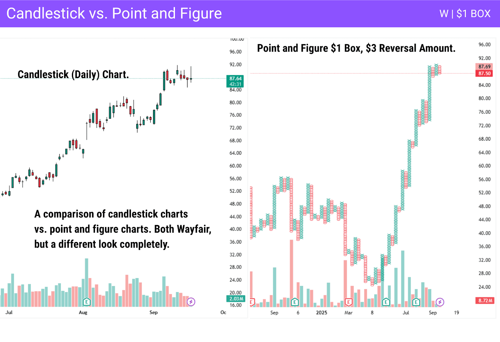
However, the point and figure chart filters out some of the noise that candlestick charts inherently have in them. The wicks of the candlesticks don’t interfere with the look and printing of the overall trend. By using point and figure charts, this can keep the trader on the longer-term trend, but candlesticks can be more sensitive to price fluctuations. Because of this, many traders will use both.
Quite often, traders will look at candlestick charts seeking a reversal pattern to confirm the possibility of a trend change when a new column appears on the point and figure chart. Candlestick patterns such as a hammer, inverted hammer, bullish engulfing or shooting star can confirm a column change. On the other hand, a lack of a reversal candlestick pattern can even filter out the column change on a P&F chart, suggesting a catapult pattern may be at play.
Point and Figure Charts vs Bar Charts
Point and figure charts are just one of the ways you can track price movements. The bar chart is a much more standard charting method. This isn’t to say that bar charts are superior, just that they are more common.
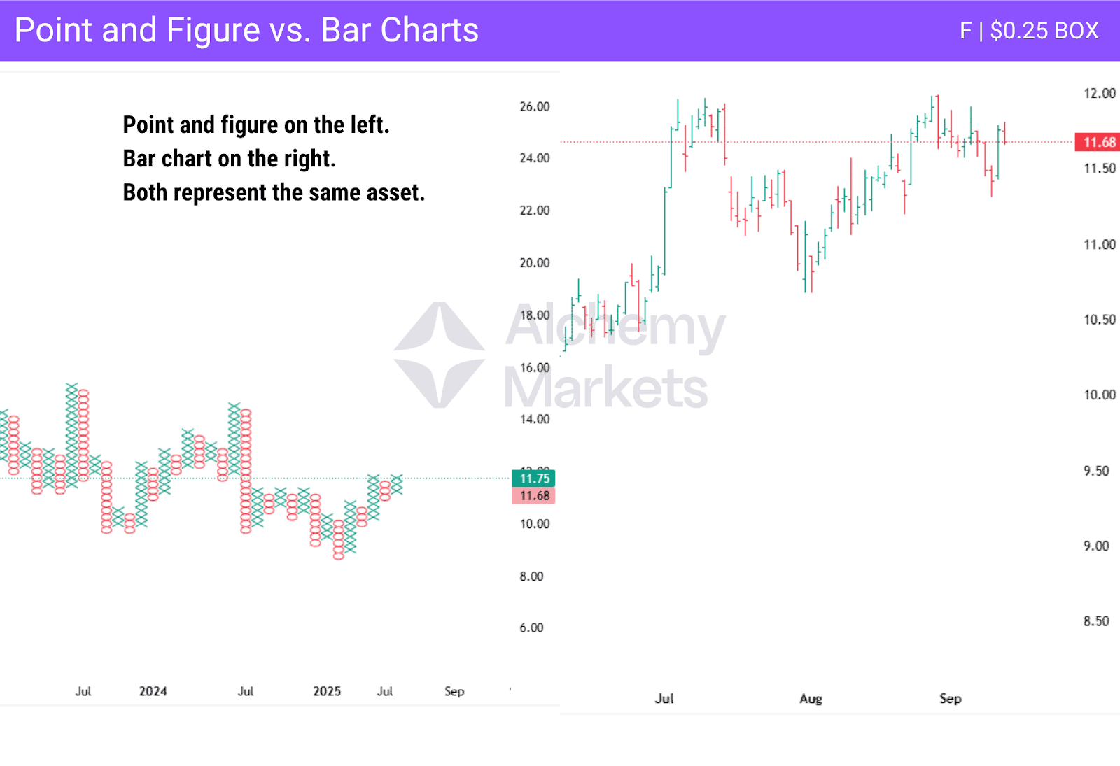
The box scaling of point and figure charts allows for customizing the representation of price ranges in a more specific manner, but the fact that time isn’t taken into account suggests that point and figure charts are more inclined to be used by longer-term traders.
Bar charts give four prices: the open, the high, the low, and the close of a specific time period. For example, you can have bars for various timeframes, but not all times are equal. By using point and figure charts, you only focus on the price itself.
| Chart Type | Strengths | Weaknesses |
| Point and Figure Charting | Filters noise, clear trends | Can lag |
| Renko | Good for volatile markets | Less clear support/resistance |
| Candlestick | Detailed OHLC data | Noisy |
FAQ
Do point-and-figure charts really work?
Point and figure charts are often used to find potential support and resistance areas. Trendlines become much clearer, and often, traders will use the point and figure charts to see the “big picture” of a market. Timing is often a bit late with point and figure charts, but ultimately, this is why point and figure is used with other charts for confirmation.
What is the best scaling to use for the point and figure chart?
There is no specific scale that is “best”; there are a few things to think about when choosing.
Traditional Box Sizes:
- Fixed value: Each box represents a specific price movement, such as $1 for stocks or 10 pips for FX pairs.
- Pros: The p f chart is easy to read.
- Cons: Doesn’t adapt to volatility. The price might be too small in volatile markets, and vice versa.
Percentage Scaling:
- Each box: Each box is a percentage of the price, for example, 1% of the current price.
- Pros: Adjusts naturally to the price changes in a market. A $1000 stock and a $10 stock both scale in the same way.
- Cons: Can smooth out small moves far too much in high-priced markets.
ATR (Average True Range) Scaling:
- Box size: Based on a multiple of ATR. As an example, 0.5 x 14-day ATR.
- Pros: Adapts to volatility, keeps the scale relative in both low and high volatility markets.
- Cons: Can lag due to the use of the Average True Range. Sudden spikes can take time to show up.
Logarithmic Scaling:
- Log scaling: Box size increases with price level, similar to percentage scaling.
- Pros: Keeps proportionality across long price histories.
- Cons: More complex, not available on all platforms.
What are the signals of point-and-figure charts?
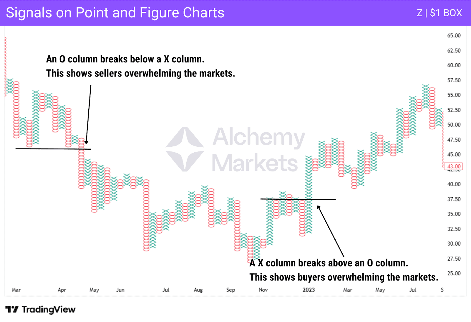
The signals on a point and figure chart are all based on when one column rises or falls in relation to another. For example, when x columns rise above o columns, it shows that the price is breaking higher, and of course, the opposite will be true as a break lower of the o columns below x columns shows that the sellers are winning.
What is the origin of the Point and Figure chart?
Charles Dow, the founder of the Wall Street Journal and the inventor of the famous “Dow Theory,” is credited with creating point and figure charting. He created the point and figure charts, with their Os representing falling prices and Xs representing rising prices, as a way to track imbalances in both supply and demand.
It is quite common for traders to use both point and figure charts and candlestick charts. This allows traders to see the trend clearly using point and figure charts, while finding the nuance of prices shown on the candlestick chart.
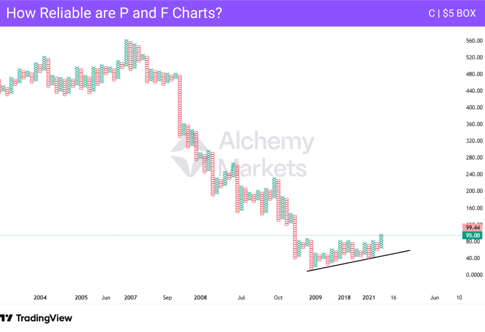
How reliable is the Point and Figure chart?
Point and figure charts are just as reliable as other chart types. It comes down to the individual trader themselves, as it is a preference. Ultimately, the chart will show if the price is moving higher or lower, and the predetermined reversal amount can also filter out a lot of noise.
What is a triple top breakout in a point and figure chart?
A triple top breakout is a bullish pattern in point and figure that develops when the chart box reaches the same bullish price level three times and breaks higher on the fourth attempt.
How do point and figure charts help in the stock market?
Point and figure is a purely price based chart that helps identify clear trends and patterns without the noise associated with time based charts. The patterns such as double top, triple top and ascending triangle provide clear entry and exit points.
How does box size affect trading signals in P&F charts?
Larger chart box sizes means less signals are provided. Additionally, the larger box size will lag more on reversals if the standard 3-box reversal is selected. Smaller box sizes make the P&F chart more sensitive to the whipsaws in the market’s price.