Written by:

Reviewed by:


- January 19, 2026
- 19 min read
Volume Footprint Chart Complete Guide
What Are Footprint Charts?
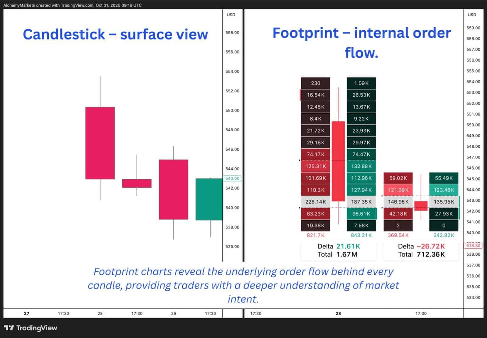
Footprint charts are an advanced form of volume analysis that give traders a detailed view of buying and selling at different price levels within each price bar. Unlike traditional candlestick or bar charts that only display open, high, low, and close (OHLC) data, footprint charts reveal what’s actually happening inside each candle, specifically how much volume was traded at each price level and whether that activity came from buyers or sellers.
In essence, a footprint chart breaks down the DNA of a market move. Each cell within a bar represents the interaction between bid and ask orders, showing who held the point of control at specific price levels. This lets traders look beyond surface-level price action and understand the real-time battle between supply and demand driving every move.
What Do Footprint Charts Reveal?
Footprint charts reveal the story hidden inside each price move. They show traders not just where price moved, but how it moved, who was buying, who was selling, and at what intensity. By visualising this data, traders can see whether a price bar was driven by aggressive buyers lifting offers, or by aggressive sellers hitting bids creating a downward price movement.
At a basic level, a footprint chart displays the distribution of volume data at each price level within a bar. Each price point is broken down into bid volume and ask volume, showing exactly how many contracts traded on either side. When bid volume dominates, it signals strong selling pressure; when ask volume outweighs bids, it reflects buying aggression. This information helps traders understand whether a move was supported by genuine participation or simply by a lack of liquidity.
Footprint charts also highlight imbalances, those moments when one side of the market overpowers the other. For example, if the ask volume at a price is 400% higher than the bid volume, that imbalance may point to institutional buying or a key breakout level. On the other hand, repeated heavy selling on the bid without further price decline might suggest absorption, where buyers are quietly accumulating positions against aggressive sellers.
Another crucial insight footprint charts reveal is volume clustering. Large concentrations of traded volume at a specific price level often indicate areas of interest for big players. These levels tend to act as future support or resistance, offering traders valuable context when planning entries and exits.
By studying these internal patterns, traders can interpret the market’s intent more precisely than with traditional chart types. Rather than reacting to what’s already happened, they can anticipate what’s likely to happen next based on how participants are behaving in real time.
The Importance of Footprint Charts in Trading
Footprint charts have become a cornerstone of modern order flow analysis because they offer something few other chart types can: clarity about the intent behind price movement.
Rather than just showing where price has been, they help traders understand why it moved and whether the move was driven by conviction or simply by noise.
In fast-moving markets, every tick represents a battle between buyers and sellers. Footprint charts visualise that battle in real time, showing who’s exerting pressure and who’s absorbing it. This level of insight allows traders to make more confident decisions about timing entries, managing risk, and identifying when momentum is likely to fade.
1. Identifying Genuine Buying and Selling Pressure
Traditional candlesticks might show a large bullish bar, but that doesn’t always mean strong buying took place. It could just as easily result from thin liquidity or stop orders being triggered. Footprint charts strip away that ambiguity by revealing whether volume was concentrated on the bid or ask side.
When the ask side consistently outweighs the bid across multiple price levels, it’s a clear sign of aggressive buying. Conversely, when selling dominates the bid side but price struggles to fall further, it indicates absorption, where large buyers are quietly taking in supply. Understanding these dynamics can prevent traders from entering false breakouts or missing true reversals.
2. Providing Context for Market Structure
Footprint charts also give valuable context when analyzing market structure. For example, when price revisits a previous high-volume area, traders can quickly see whether the same aggressive participants are returning or if the move lacks follow-through. This helps determine whether a level is likely to hold or break.
By reading volume clusters and deltas within key zones, traders can confirm whether a breakout has genuine participation behind it. This form of volume confirmation is a critical step in validating trade setups, especially in volatile or news-driven environments.
3. Enhancing Risk Management
One of the less discussed but equally important benefits of footprint charts is how they improve risk control. Because traders can see real-time shifts in order flow analysis, they can recognise early signs of exhaustion or imbalance, often before these signals appear on time-based charts.
If buying pressure begins to weaken at a resistance level, or large sellers suddenly appear within a previously bullish bar, that’s an early alert to reduce exposure or tighten stops. This granular view of the market helps traders act on data, not emotion, leading to more disciplined decision-making.
4. A Tool for Every Trading Style
Whether it’s scalping, day trading, or swing trading, footprint charts adapt to any style. Short-term traders use them to fine-tune entries with tick-level precision, while longer-term participants use them to confirm institutional participation at major levels. The ability to interpret the order flow chart in such detail makes them an invaluable complement to higher time frame analysis.
Ultimately, the importance of footprint charts lies in their transparency. They reveal the invisible layer of market activity, the push and pull of aggressive buyers and sellers. The traditional charts hide that invisible layer. For traders who rely on understanding behavior rather than prediction, that transparency can make all the difference.
How to Read Footprint Charts
Reading a footprint chart is about learning to interpret how buyers and sellers interact at every price level. Once you understand what bid and ask volume represent, and how delta and imbalances reveal pressure, you start to see where real intent lies behind the candles.
1. Understanding Bid and Ask Volume
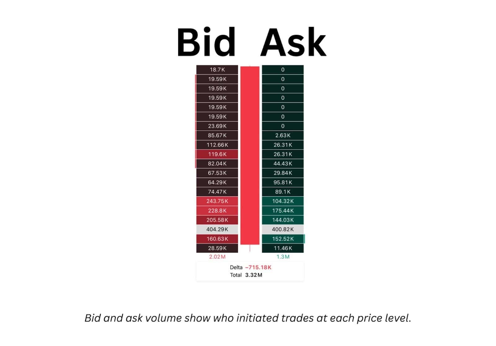
Every footprint chart is built around two core data points: 1) bid volume and 2) ask volume.
- Bid volume shows trades executed at the bid price meaning sellers were the aggressors, hitting existing buy orders.
- Ask volume shows trades executed at the ask price meaning buyers were the aggressors, lifting existing sell orders.
By comparing the two sides, traders can gauge which group is in control. A price level where ask volume far exceeds bid volume reflects active buying interest, while the opposite signals stronger selling participation.
Reading this correctly helps you see not just that price moved, but why it moved and whether that movement had genuine commitment behind it.
2. Reading Delta and Imbalances
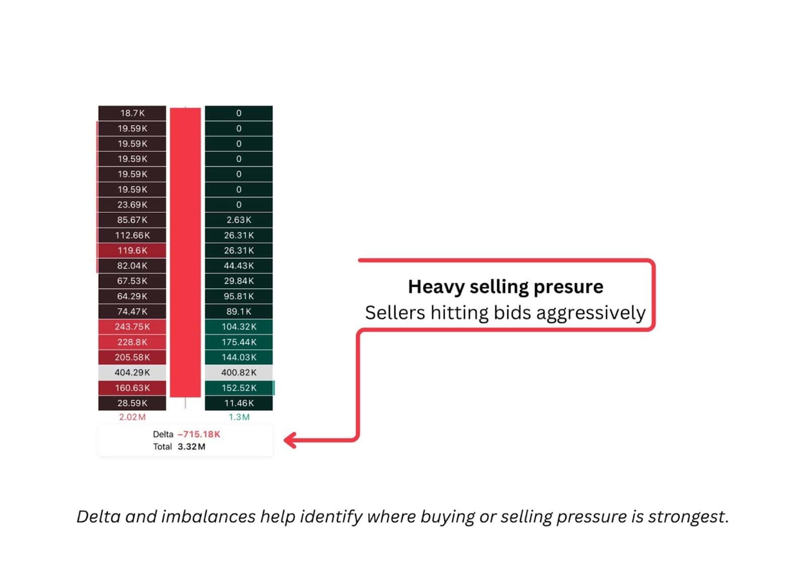
Delta is the heartbeat of a footprint chart. It represents the net difference between buying and selling volume within a bar:
Delta = Ask Volume − Bid Volume
A positive delta means buyers dominated; a negative delta means sellers controlled the session. But delta alone doesn’t tell the full story and that’s where imbalances come in.
An imbalance occurs when one side’s traded volume significantly outweighs the other’s at a specific price level. For example, if the ask volume is 400% higher than the bid, that’s a clear sign of buying aggression. These areas often become short-term support or resistance, depending on which side led.
3. Recognising Absorption and Aggression
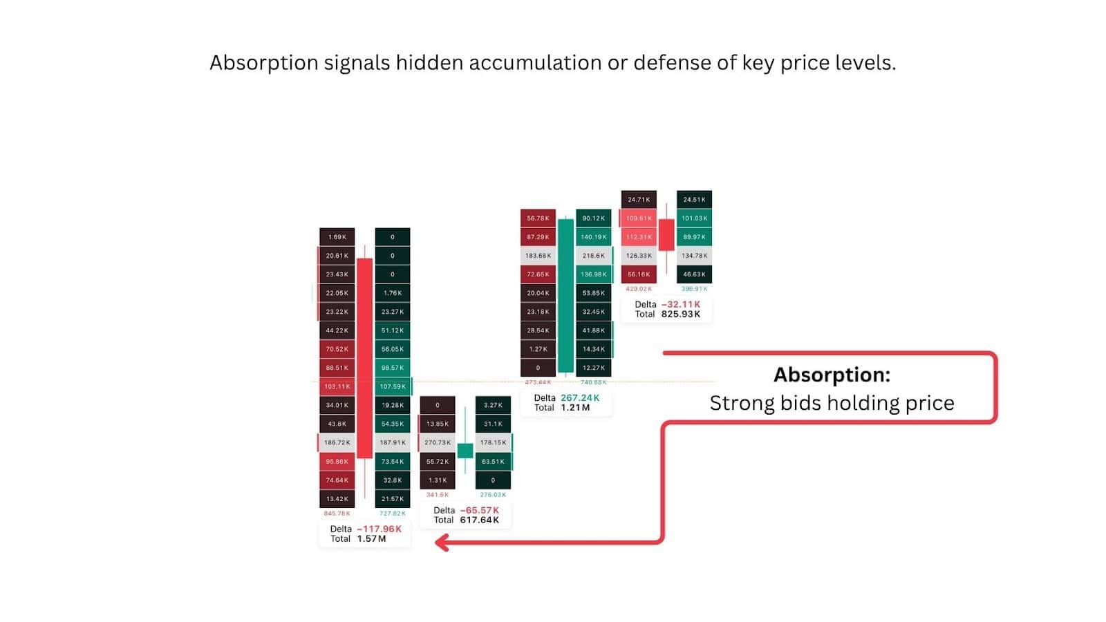
Absorption and aggression are key behavioral signals inside order flow.
- Aggression happens when one side repeatedly attacks the other. For instance, buyers lifting the offer level after level. This usually drives price continuation.
- Absorption occurs when heavy selling on the bid doesn’t move the price lower because large passive buyers are absorbing that pressure. It’s often a sign of exhaustion or potential reversal.
Footprint charts let traders spot these dynamics early. A cluster of large red bid volumes that fail to push price down, or a flat delta despite strong volume, often reveals institutional activity holding price steady. Recognising this distinction helps traders time entries far more precisely than with price action alone.
Depth of Market (DOM) – The Other Side of Order Flow
While footprint charts display executed volume, the Depth of Market (DOM) shows resting orders, such as limit buy and limit sell orders, waiting to be filled at various price levels. Together, they form a complete picture of liquidity and intent.
DOM helps traders see where interest exists before it’s executed. A deep stack of buy orders below price indicates potential support; a wall of sell orders above price may signal resistance.
By combining DOM with footprint data, traders can anticipate potential reactions: when heavy resting orders align with high-volume footprints, those areas often mark key liquidity pools where larger participants operate.
Footprint Chart Variations
Footprint charts come in several variations, each designed to highlight a different layer of market information. While all display traded volume within each price bar, their focus changes depending on what type of order flow chart a trader wants to study.
Footprint profile
The “footprint profile”, is a name people often mistakenly call the volume profile tool.
It operates similarly, but not exactly, to the footprint chart, as it vertically displays the distribution of volume across a stretch of time.
There are many benefits to this, such as:
- Makes it easy to see where most trading activity occurred. In other words, where liquidity is pooling
- Traders use it to identify prices with relatively higher trading volume. These are high-volume nodes, which often act as strong support or resistance zones.
- The Point of Control (POC) is the price with the highest traded volume. In the chart above, a red line extends out from the largest volume bar. That is the POC.
Volume profile can reveal the exact price levels with higher trading activity. When combined with footprint charts, traders can examine the reaction of price at these key levels with more context.
Bid/ask footprint

- The bid/ask footprint adds color-coded separation between buying and selling volume, helping traders instantly see who’s more aggressive.
- Green or blue tones usually mark trades executed at the ask (buyers), while red or orange tones indicate trades at the bid (sellers).
- This variation makes it easier to spot when buyers or sellers are the ones truly driving price movement.
Delta footprint
- Delta rises when traders lift the ask and falls when they hit the bid, since it measures the net difference between aggressive buying and aggressive selling at each price level.
- The delta footprint shows the net difference between buying and selling volume at each price.
- When delta is positive, buyers dominated; when it’s negative, sellers controlled the tape.
- This view helps traders confirm trend strength. If price is rising on strong positive delta, that’s a sign the move is backed by genuine buying momentum.
Volume footprint

- The best volume footprint chart, for example on volume footprint chart MT5 focuses purely on how much volume traded at each price, without splitting by bid or ask.
- Unlike a standard volume histogram, it breaks that data down by price within each candle, offering a more granular look at where heavy participation occurred.
- Traders often use this to identify points of capitulation, areas where trading volume spikes as one side gives up control.
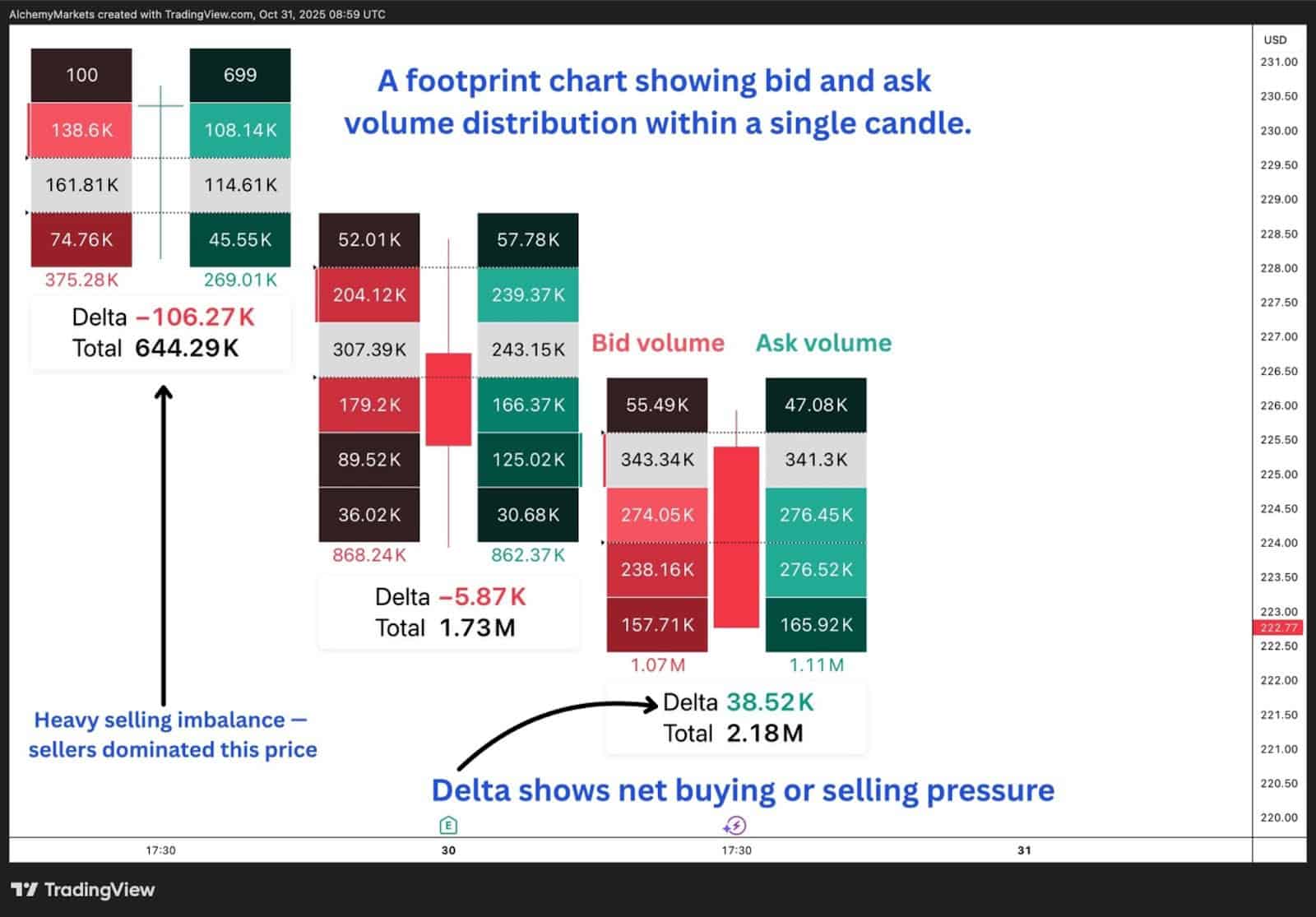
Footprint Chart Example
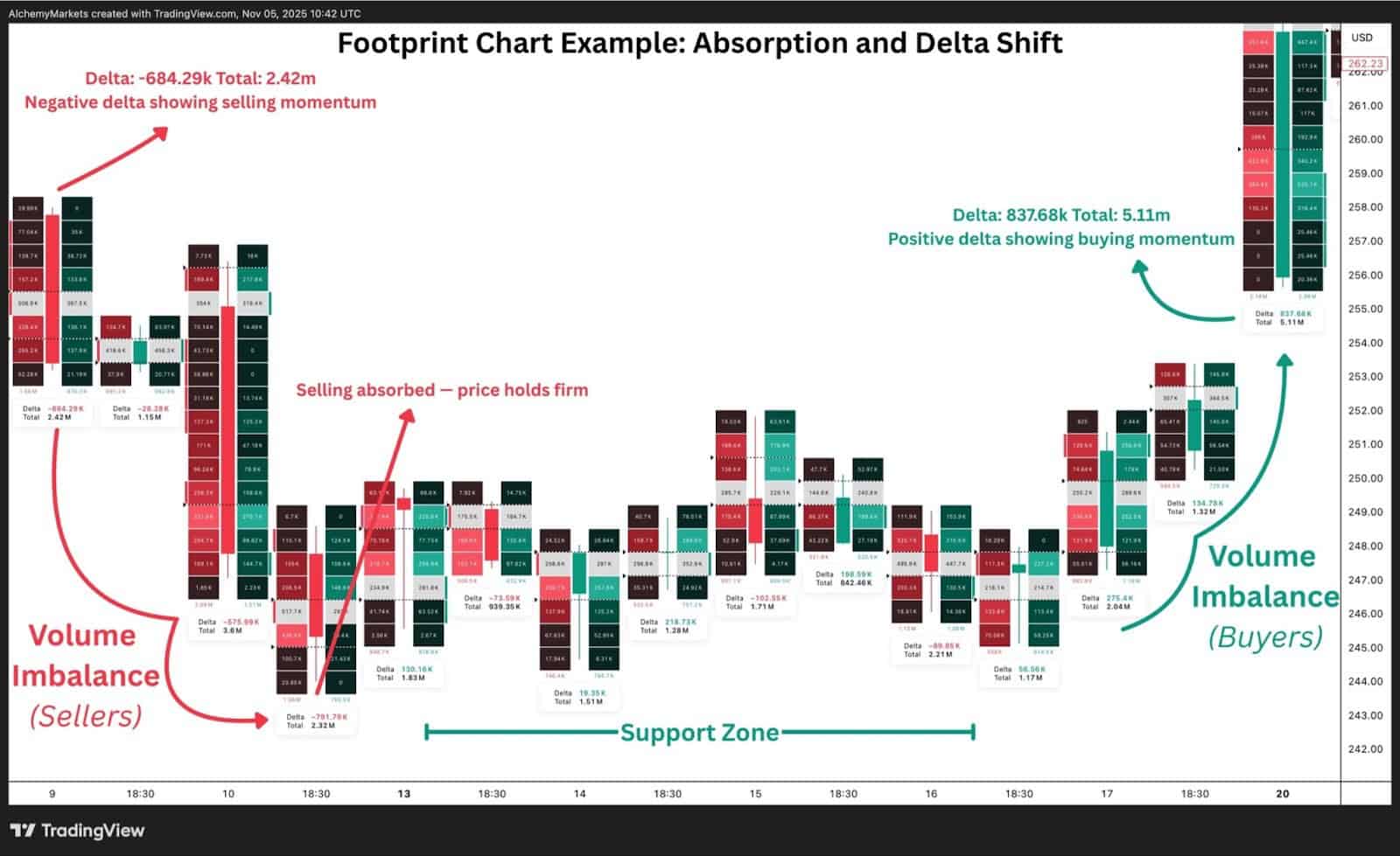
The footprint chart above demonstrates how traders can use order flow data to identify real buying and selling pressure, spot absorption, and confirm when control shifts between market participants.
In this example, the chart captures a clear transition between a period of aggressive selling and a subsequent shift to buying momentum. Early in the sequence, large red blocks on the left side show volume imbalances from sellers, accompanied by a negative delta. This is a clear indication of strong selling aggression. Despite this, price holds steady around a defined support zone, revealing absorption, where buyers quietly absorb the heavy sell flow without allowing price to fall further.
This absorption is often the first sign that sellers are exhausting their effort. As the sequence progresses, the delta flips positive, showing that buying volume begins to dominate. The footprint chart now displays green imbalances, signaling that buyers have taken control and that the market is preparing to move higher.
This kind of real-time visual feedback helps traders see what’s happening beneath the surface and whether moves are supported by genuine participation or simply temporary pressure. By tracking delta shifts and volume imbalances, traders can confirm when a reversal is forming, identify key liquidity zones, and avoid false breakouts driven by thin volume.
How to Read This Example
- Volume Imbalance (Sellers): Early red clusters show strong selling aggression, with heavy volume at the bid.
- Absorption Zone: Price stabilises despite high selling, indicating buyers absorbing pressure.
- Support Zone: Repeated failed attempts to break lower confirm the strength of this level.
- Delta Shift: Delta turns positive, showing buyers stepping in with conviction.
- Volume Imbalance (Buyers): Buying pressure expands, confirming control has shifted to the buy side.
Using ATR as a Volatility Filter

While ATR (Average True Range) isn’t an order-flow tool, it can still play a useful supporting role when trading with footprint charts. ATR simply tells you how much the market is actually moving, and that matters when you’re looking for follow-through after a footprint signal.
This is where volatility gating comes in. If ATR is flat or sitting at the lower end of its range, even the cleanest imbalance or delta shift can struggle to go anywhere — the market just doesn’t have the volatility to support it. When ATR expands, those same footprint signals usually carry more weight because the market has the range to push.
I like to think of ATR as a quick volatility gate. If the market is dead, I scale back. If ATR is expanding, I’m more willing to lean into footprint signals like stacked imbalances, absorption, or strong delta transitions. It’s not a decision-maker on its own, but it does help filter out the times when order flow looks good on the chart but the market simply isn’t moving. In other words, ATR gives you a simple form of volatility gating — helping you avoid slow, low-probability environments and stay active when volatility is actually there to support a trade.
The chart above shows how ATR can act as a simple volatility filter alongside footprint signals. As buyers step in with a clear positive delta and a strong buy imbalance, ATR is expanding at the same time. This rise in ATR doesn’t mean price must go up, but it does tell us the market has enough volatility to support a move. When footprint strength appears while ATR is rising — that is, when your volatility gate is open — there’s a higher chance the signal will follow through compared to the same setup forming in a low-volatility environment.
Footprint Trading Strategies
Footprint charts are not just analytical tools, they’re decision-making maps.
Once a trader understands how to read order flow, they can use it to pinpoint high-probability trade setups in real time.
Below are three of the most common and effective footprint-based strategies: stacked imbalances, unfinished auctions, and volume profile confirmation.
1. Stacked Imbalances
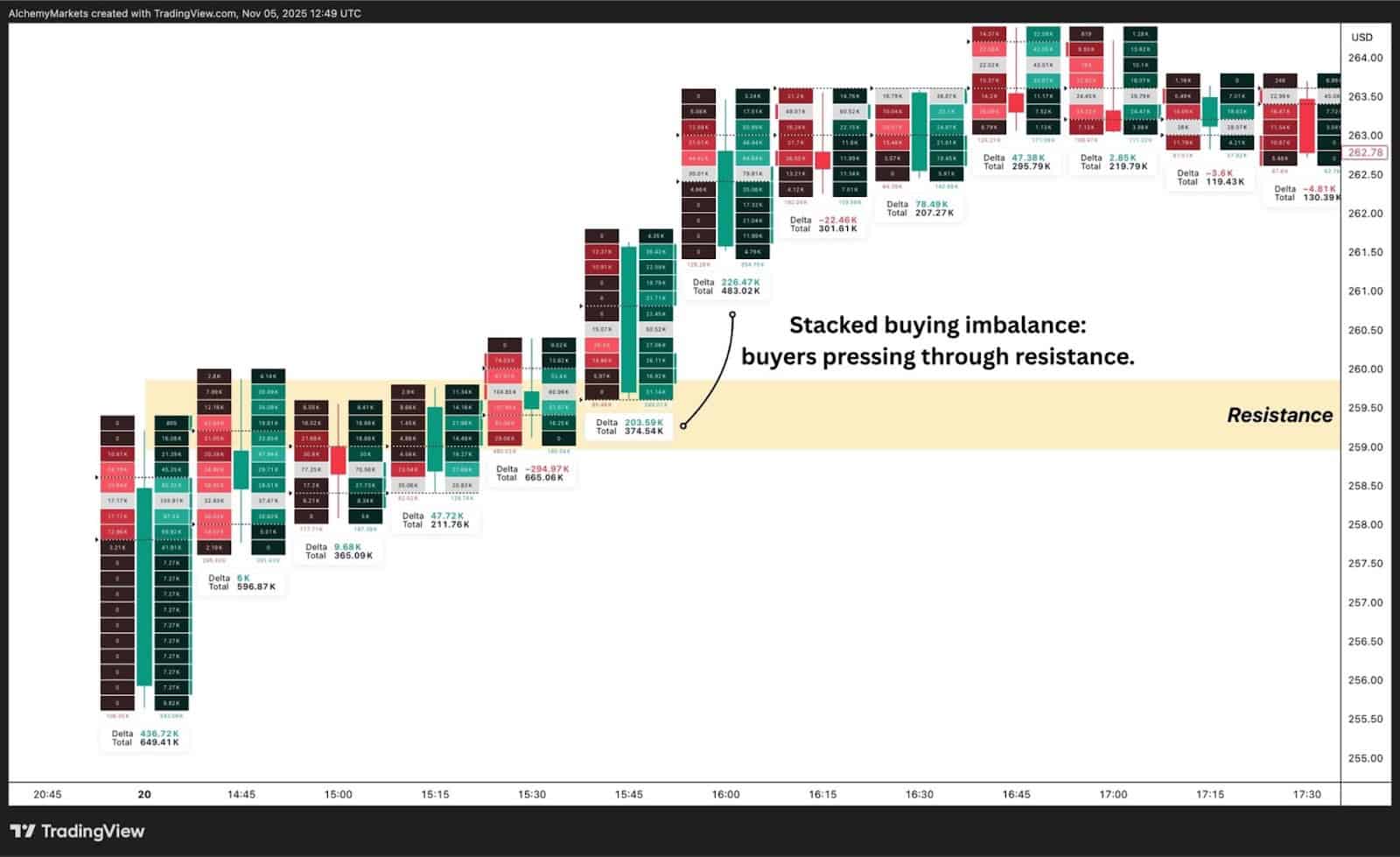
A stacked imbalance occurs when multiple price levels within a footprint bar show consistent dominance from one side. This could be either aggressive buyers lifting the ask or aggressive sellers hitting the bid.
In other words, several consecutive rows of the footprint show volume-weighted pressure in one direction.
This pattern signals that order flow analysis is one-sided, often preceding a continuation move or breakout. For example, three or more consecutive ask imbalances (green cells on the right) typically indicate that buyers are pushing through resistance with intent. The opposite applies for stacked bid imbalances — a sign of persistent selling through support.
How traders use it:
- Enter in the direction of the imbalance once the pattern confirms.
- Place stops just beyond the last stacked level to protect against failed continuation.
- Combine with delta strength to validate the move.
2. Unfinished Auctions
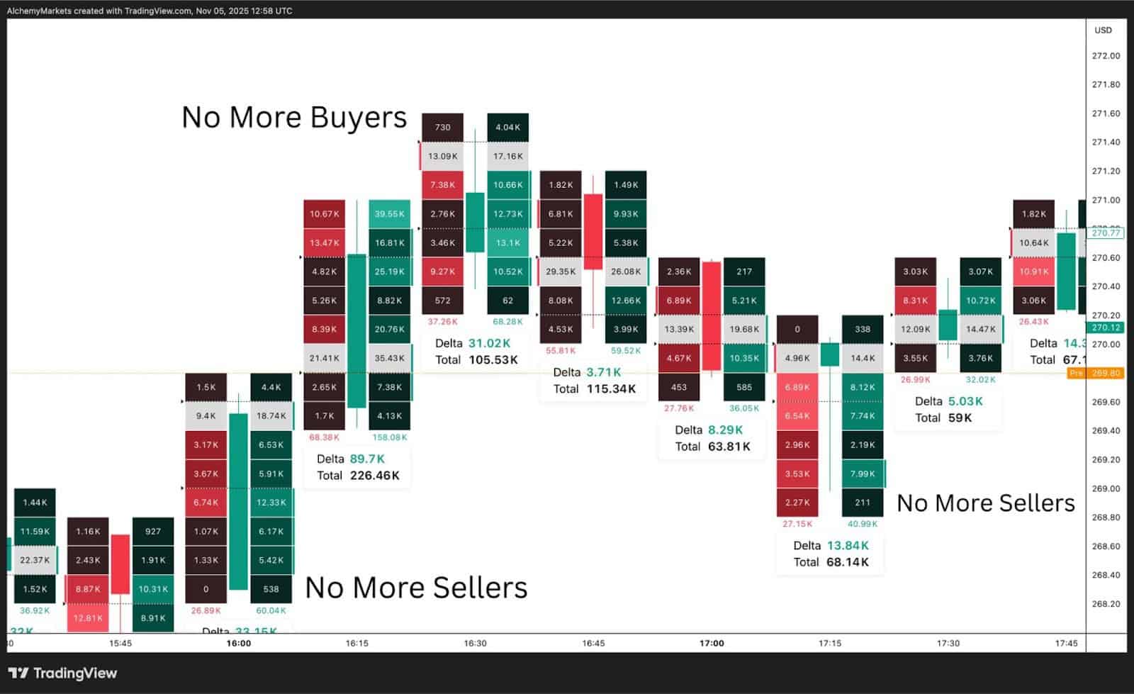
Unfinished auctions are a unique concept within footprint trading. The idea is that every price level represents a mini-auction between buyers and sellers within a single candlestick or bar. A move is considered unfinished when that auction doesn’t conclude properly, such as when one side runs out of participation before the other does.
On a footprint chart, unfinished auctions appear at the extremes of a bar, usually on the wicks, where you find zero bids or zero asks.
This shows that only one side was active at that price level. For instance, only buyers are active at a high or only sellers at a low and this suggests the market hasn’t yet found fair value at that point.
These areas often become future magnets for price, as the market tends to revisit them later to “complete” the auction.
In the chart above, you can see examples marked as “No More Buyers” and “No More Sellers.” These labels highlight the points where participation from one side stopped, signaling potential unfinished auctions. When price revisits these levels, traders watch for absorption or delta confirmation to see whether the imbalance is resolved.
3. Volume Profile Integration
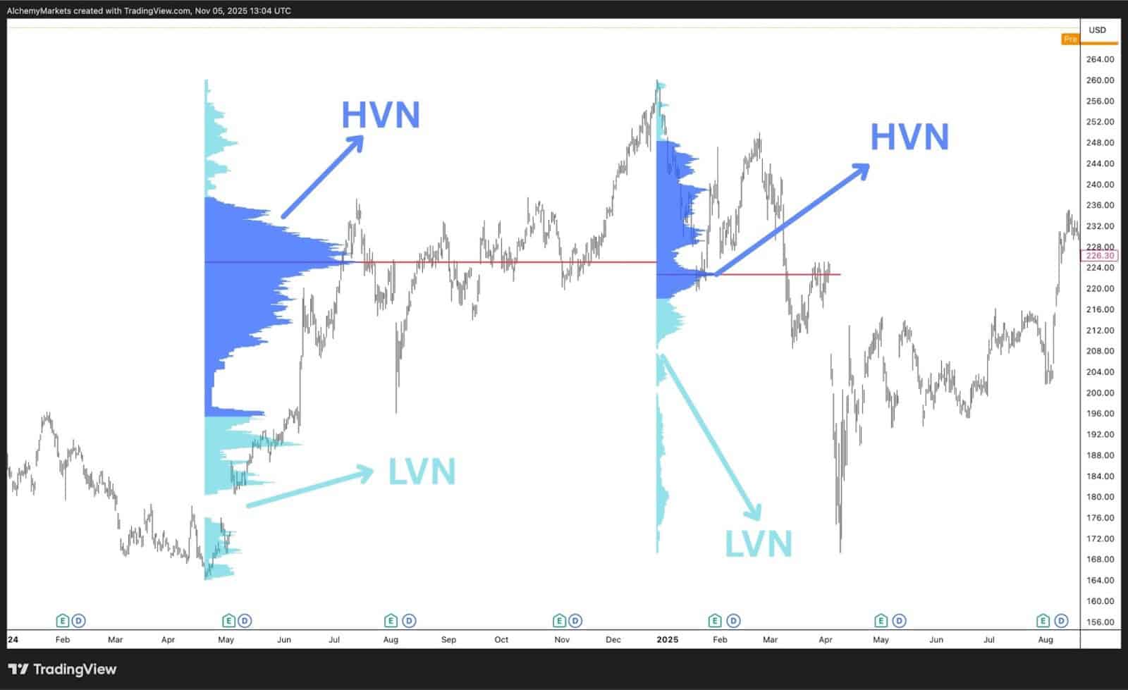
While footprint charts provide micro-level order flow, the volume profile adds macro-level market behavior and the distribution of traded volume over a wider range.
Using both together gives traders the best of both market dynamics: precision and context.
- The footprint chart tells you what’s happening inside each candle.
- The volume profile shows where the market spent the most time and volume overall.
This combination helps identify high-volume nodes (HVNs) and low-volume nodes (LVNs), which are areas of acceptance and rejection.
Traders can then watch footprint activity around these zones to gauge intent: for instance, whether buyers are defending a high-volume area or if aggressive sellers are breaking below a thin liquidity pocket.
How traders use it:
- Watch for strong delta near HVNs to confirm institutional participation.
- Use LVNs to anticipate breakout points.
- Combine footprint absorption with volume profile rejection for high-probability reversals.
Footprint Chart Advantages
- Reveals True Buying and Selling Pressure: Displays who’s in control at each price level, buyers or sellers, offering unmatched clarity on market intent.
- Improves Entry and Exit Timing: Helps traders identify precise zones of aggression or absorption for better execution.
- Validates Market Moves: Delta and imbalance data confirm whether a breakout or reversal has real participation behind it.
- Highlights Institutional Activity: Large clustered volumes often mark professional buying or selling areas, guiding smarter trade alignment.
- Provides Objective Volume Insight: Based entirely on executed trades, removing speculation and focusing on verified order flow.
Footprint Chart Disadvantages
- Steeper Learning Curve: Reading order flow accurately takes time, context, and familiarity with bid/ask dynamics.
- Data-Intensive Setup: Requires high-quality, tick-level data, otherwise unreliable feeds can distort results.
- Visual Overload: The sheer detail of footprint charts can overwhelm new traders during fast market conditions.
- Platform and Cost Barriers: Full functionality is often restricted to advanced (and paid) trading platforms.
- Short-Term Focus: Most insights are relevant to intraday or scalping strategies, less so for swing or long-term positions.
Footprint Charts vs Candlestick Charts
Candlestick charts show where price has been via the open, high, low, and close, but they don’t reveal how that price formed. Footprint charts go one layer deeper, showing the buying and selling activity within each candlestick. This allows traders to see who was driving the move, not just where it happened.
While candlesticks give a useful visual of structure, footprint charts expose the behaviour inside it. They show whether a breakout was backed by real buying strength or just a lack of sellers, and whether a reversal came from exhaustion or genuine absorption. In short, candlesticks show results; footprints show reason.
Footprint Charts vs Depth of Market
The Depth of Market (DOM) displays resting orders, bids and offers waiting to be filled, whereas footprint charts display executed orders showing what has already traded. Both tools come from the same order flow chart, but they focus on different sides of market activity.
Traders use DOM to anticipate potential reactions around liquidity walls, and the footprint to confirm what actually happens at a particular price when the price trades into those levels. Together, they give a complete view of intent and execution. The DOM shows where traders plan to act and the footprint shows where they actually did.
Volume Footprint Charts vs Volume Profile Charts
The best Volume profile charts summarises where trading volume has occurred across a wider range, creating a horizontal map of liquidity and participation zones. Footprint charts, on the other hand, break down volume within each candle, showing the real-time battle between buyers and sellers.
Traders use the volume profile for macro context, such as identifying value areas, acceptance, and rejection. Then, traders will use the footprint charts to fine-tune entries around those zones. The two tools complement each other: volume profile shows where the market cares; footprint charts show how it behaves there.
FAQ
How do Footprint charts help traders make better entries?
Footprint charts are cluster charts that show exactly where aggressive buying or selling occurs, allowing traders to enter in sync with dominant order flow instead of guessing based on price alone. By spotting imbalances or absorption zones, traders can time entries with higher precision and reduced risk.
What’s the difference between delta and volume in a Footprint chart?
Volume measures the total number of contracts traded at each price, while delta shows the net difference between buying and selling volume. Volume tells you how much activity occurred; delta tells you who controlled that activity, buyers or sellers.
Do all trading platforms support Footprint charts?
No. Only advanced platforms that provide tick-by-tick or order-flow data support them. Popular options include volume footprint chart MT5, TradingView, ATAS, Bookmap, Sierra Chart, Quantower, and NinjaTrader.