Bearish
- April 4, 2025
- 16 min read
Death Cross Explained with Ease
What is a Death Cross?
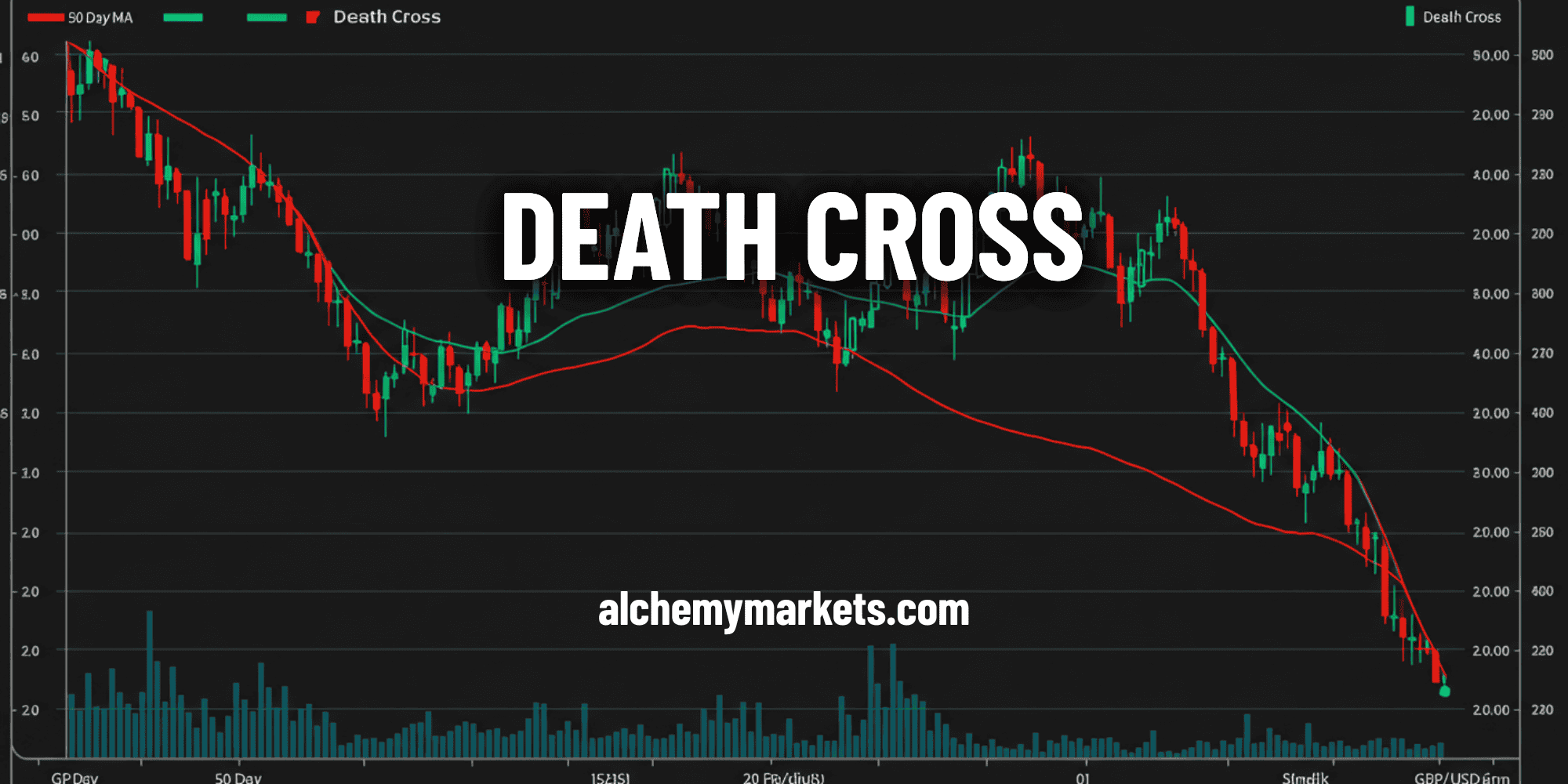
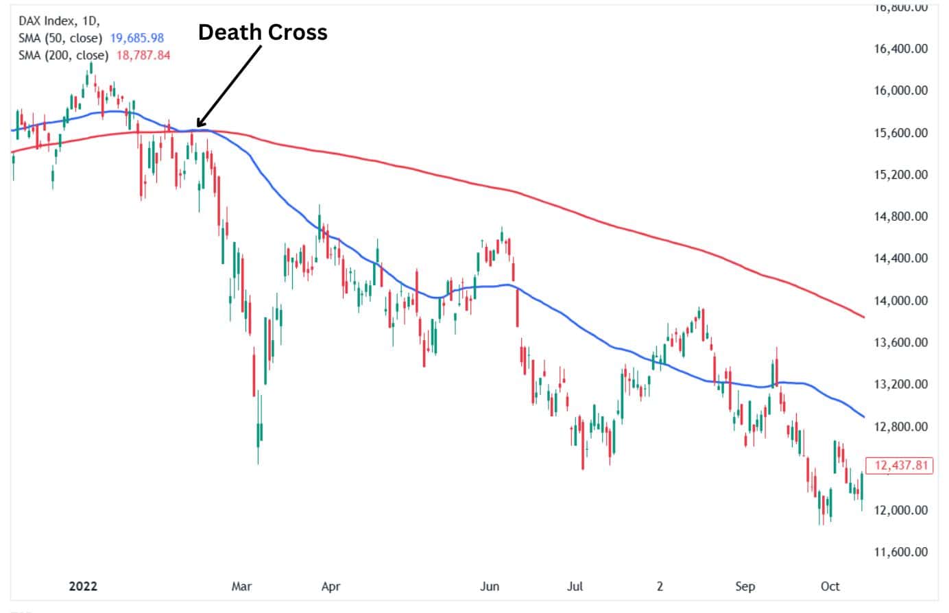
The Death Cross is a moving average crossover strategy where a short-term moving average crosses below a long-term moving average, indicating the start of a bearish phase. The Death Cross typically involves the 50-period simple moving average as the shorter-term and 200-period simple moving average as the longer-term average. However, technically speaking, the Death Cross could involve any variety of moving average including exponential moving averages and weighted moving averages too.
The Death Cross is a widely respected pattern used to identify long-term trends since it is unreliable in identifying short- to medium-term trends. This article will delve deeply into the Death Cross pattern, highlighting its unique characteristics, how traders use it in the markets, and its strengths and limitations.
What is a Double Death Cross?
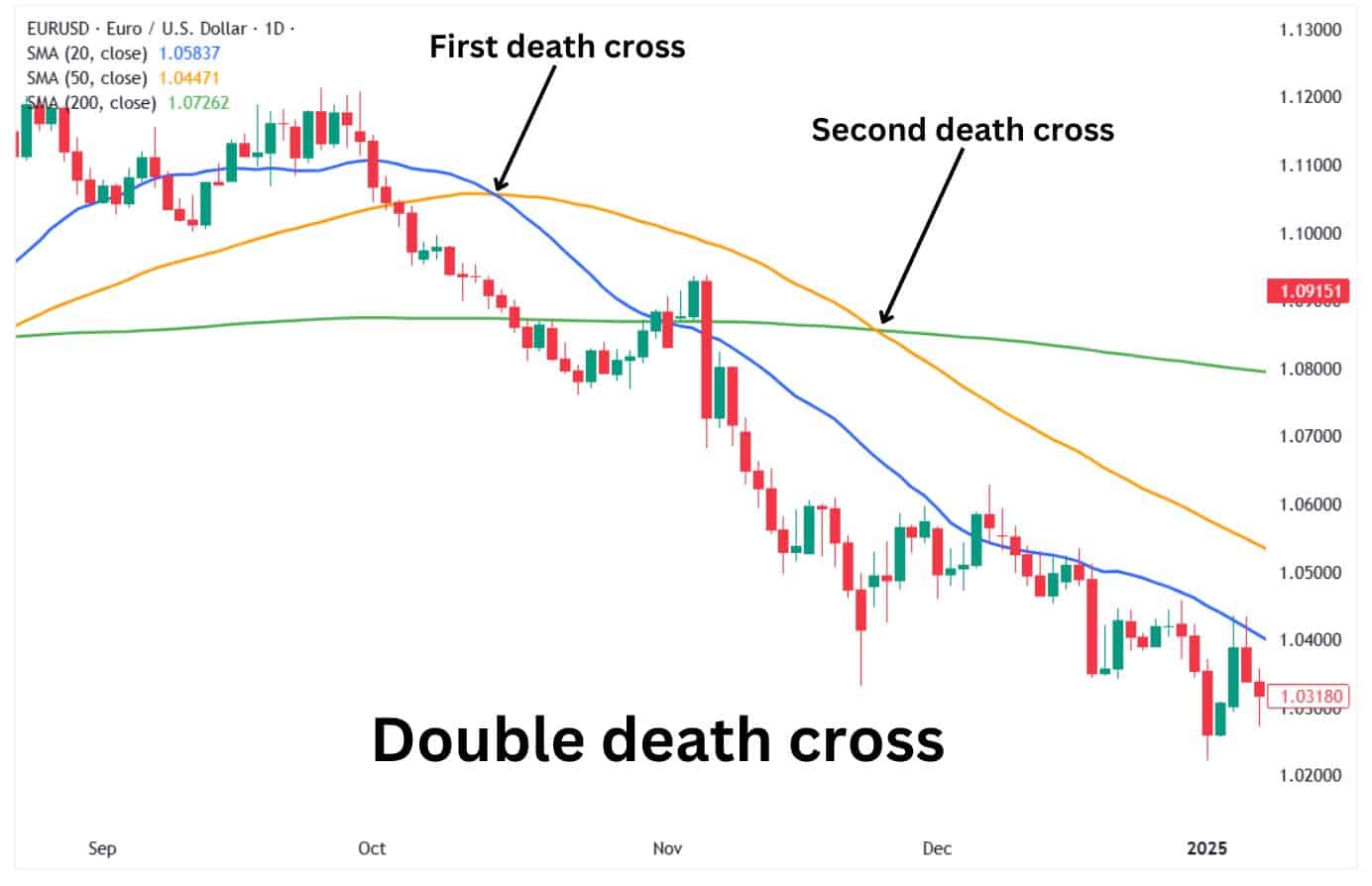
A double death cross is when the shorter term moving average crosses below two different longer term moving averages in close succession, reinforcing a downtrend phase. This typically involves a shorter-term moving average, such as the 20-day MA, crossing below a longer-term moving average, like the 50-day MA, while another crossover occurs within a different combination of moving averages—such as the 50-day MA falling below the 200-day MA.
This dual confirmation increases bearish momentum, signaling a higher probability of sustained downside movement in price action.
How Multiple Death Crosses Are Different From Double Death Cross?
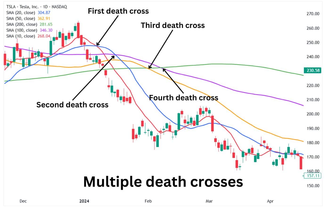
While a Double Death Cross involves two distinct bearish crossovers, Multiple Death Crosses refer to a series of moving average crossovers occurring within the same timeframe or across multiple timeframes.
In a single timeframe, traders often use a moving average ribbon, which consists of several MAs (e.g., 10-day, 20-day, 50-day, 100-day, and 200-day) closely spaced together. When these averages begin crossing over one another in a cascading fashion, it signals increasing downside momentum.
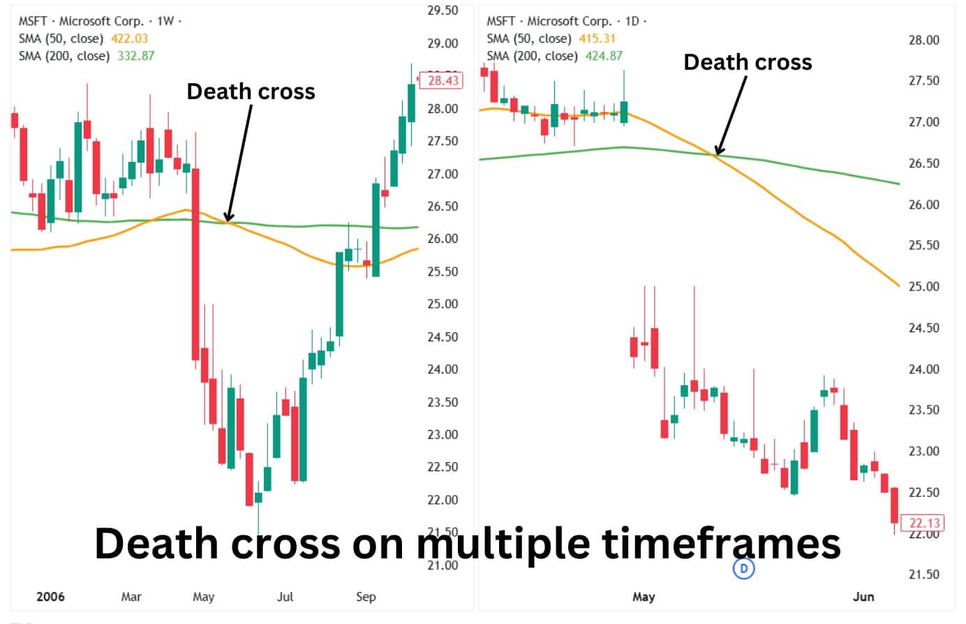
Across multiple timeframes, a death cross forming on a daily, weekly, and monthly chart at around the same time strengthens the long-term bearish outlook.
How does a Death Cross Form?
The Death Cross typically forms when the short-term moving average (usually the 50-day) crosses from above to below the long-term moving average (usually the 200-day). The crossover usually indicates a shift in sentiment from bullish to bearish as the new phase begins. The Death Cross usually signals traders that a new long-term downtrend could be underway.
The Three Stages of a Death Cross
1.The Exhaustion of the Uptrend
The first stage of the Death Cross’s formation is the exhaustion of the previous uptrend, which tends to taper off ahead of the upcoming crossover. In this stage, the bullish momentum stalls, and the short-term (50-day) moving average starts flattening as it approaches the long-term (200-day) moving average. The price also starts falling at this stage as sellers gain control.
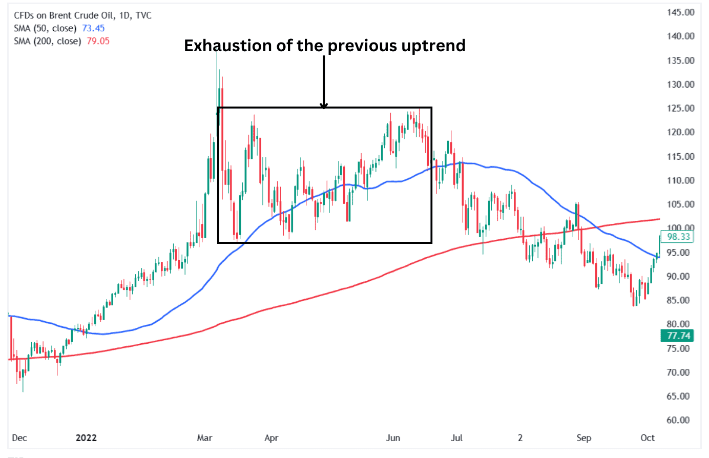
Alt text: The exhaustion of the previous uptrend in a Death Cross pattern.
2.The Crossover Event
The crossover occurs when the short-term moving average (50-day) crosses below the long-term moving average (200-day). It occurs after the price falls to a certain point, dragging the 50-day MA lower until it touches and crosses below the 200-day MA. This event also signals that sellers are now fully controlling the price.
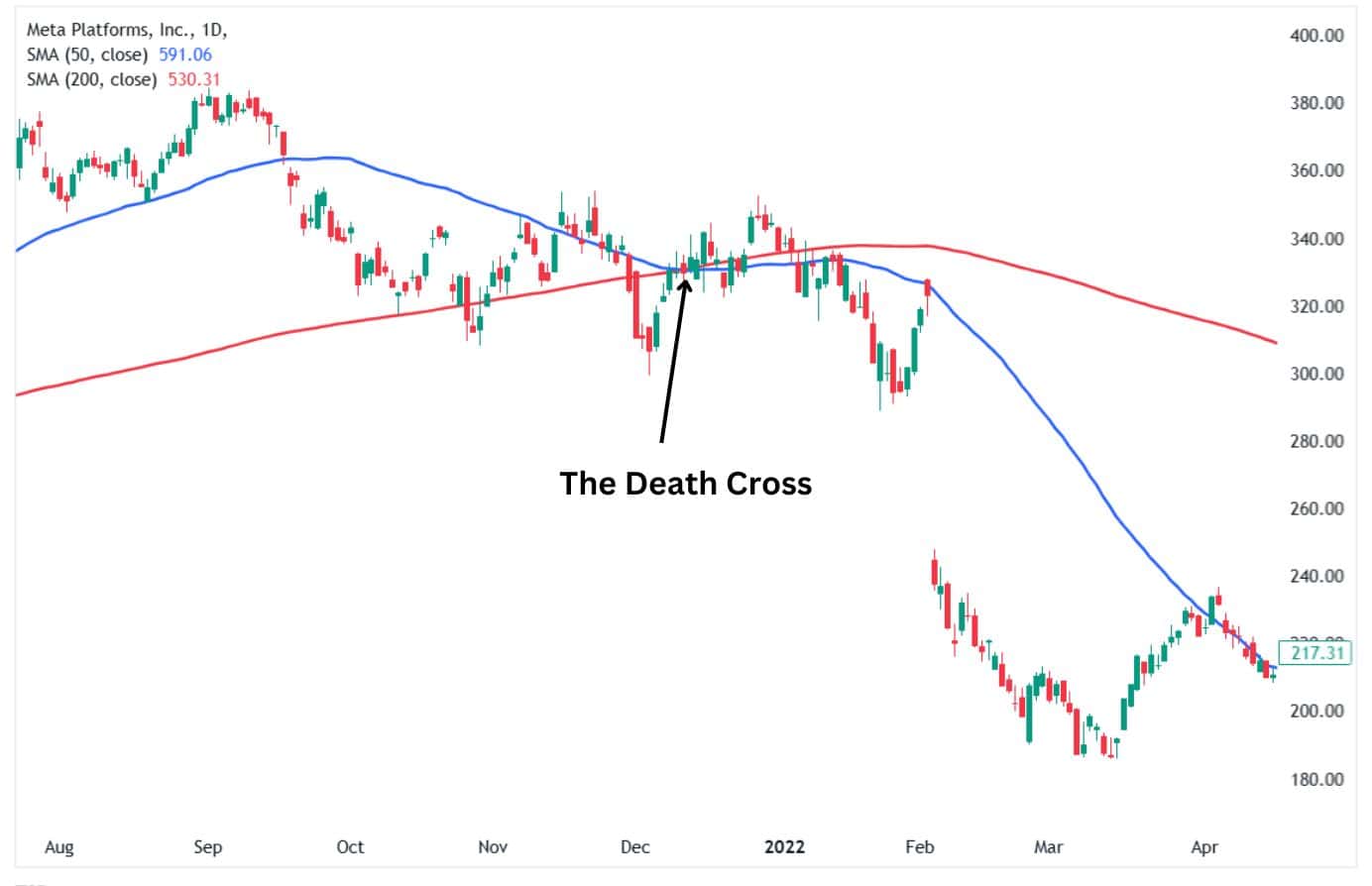
3.The Downtrend Confirmation
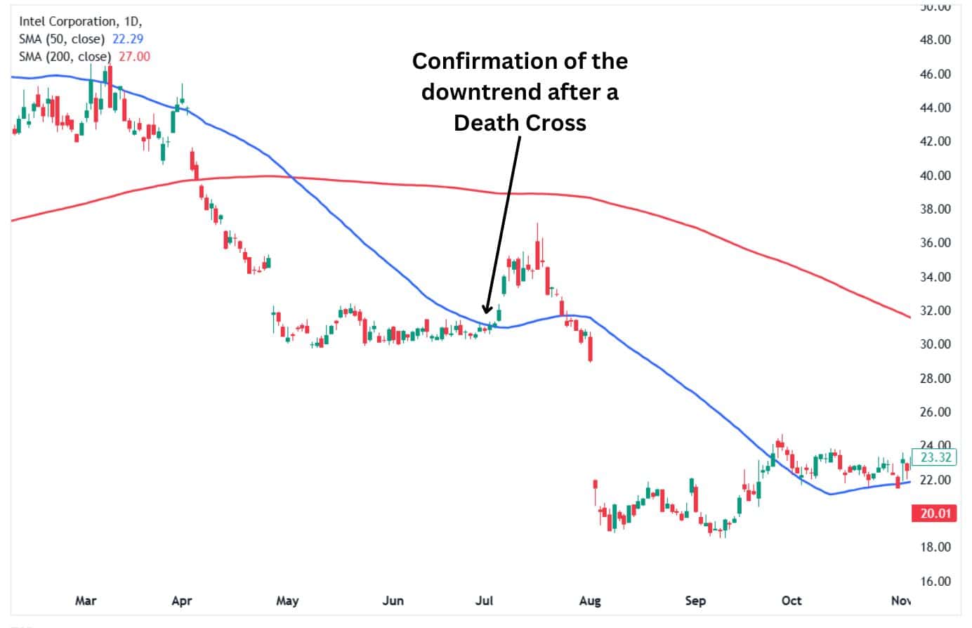
The third and last stage of the Death Cross’s formation is the appearance of a sustained downtrend that confirms the pattern. The confirmation can be found when the gap between the two moving averages widens, signalling the downtrend is picking up momentum. The Death Cross pattern is a false signal if the price does not enter into an extended downtrend but reverses higher.
How to Identify the Death Cross?
You can identify the Death Cross quickly by looking for a crossover between the short-term (50-day) moving average and the long-term (200-day) moving average. The Death Cross appears when the 50-day moving average crosses from above to below the 200-day moving average.
You can typically identify the Death Cross from the sustained downtrend that ensues after the crossover has occurred. The Death Cross can also be confirmed at any point in time whenever the short-term 50-day moving average is below the long-term 200-day moving average.
What Does a Death Cross Tell You
The Death Cross typically signifies the beginning of a bearish phase. It usually indicates that sellers control an asset’s price. The death cross is often a warning sign that a market is entering a weak and bearish phase.
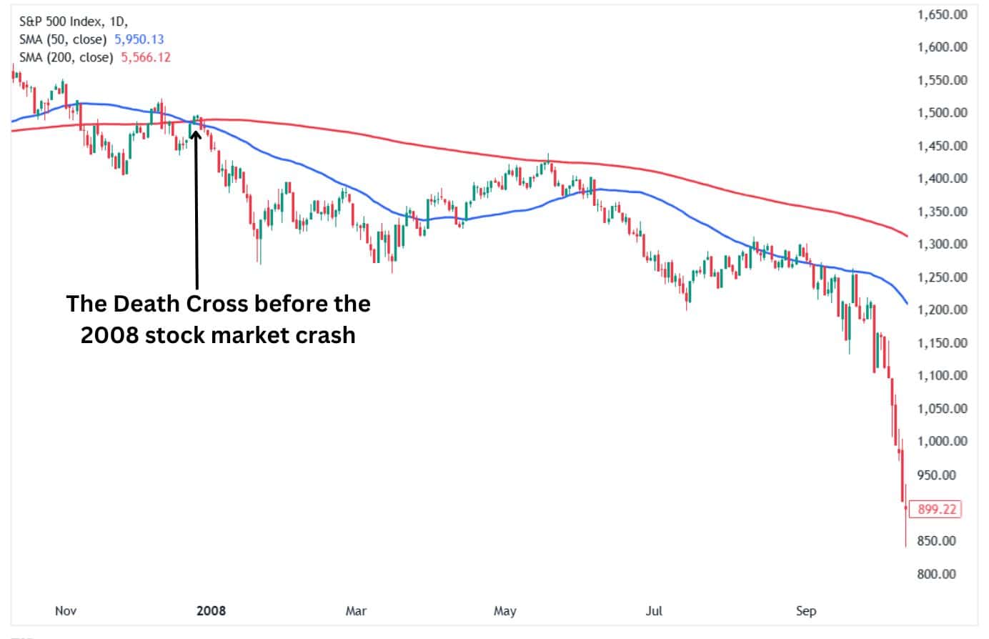
For example, the stock market crashes of 1929, 1938, 1974 and 2008 were all preceded by a death cross. However, not all death crosses lead to stock market crashes as most result in nothing much.
Can the Death Cross act as a contrarian indicator?
The Death Cross is a lagging indicator and as such, it usually occurs after the price has already hit a top and is on its way lower. The lagging nature means that sometimes the death cross occurs towards the end of the downtrend as shown by the DJIA daily chart below. Given that much of the downtrend had already occurred, it is understandable that some traders could consider the death cross a contrarian indicator. The price headed higher after the death cross since the downtrend was almost over by the time the crossover occurred.
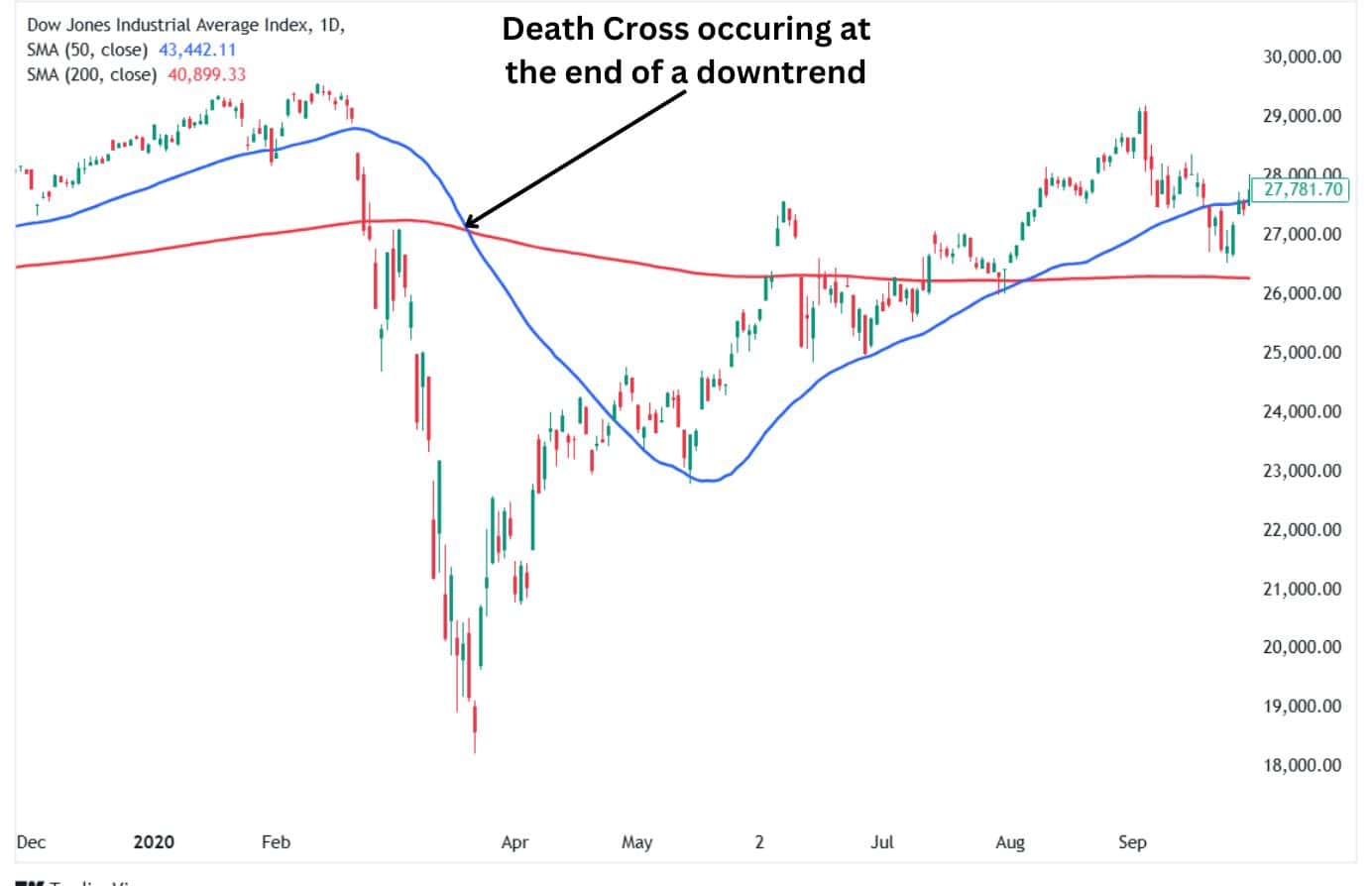
The above chart shows that the Death Cross occurred after most of the downward trend had run its course. As a lagging indicator, traders should seek to identify potential downtrends before the Death Cross occurs. Still, the indicator works well in bear markets, which have lost about 20% of their value.
Death Cross Examples
Stock Market Downturns:
The S&P 500 often experiences a Death Cross before extended market declines. For example, in early 2020, a Death Cross formed as the pandemic triggered heavy selling. It highlighted the shift to a bearish trend, aligning with broader economic fears.
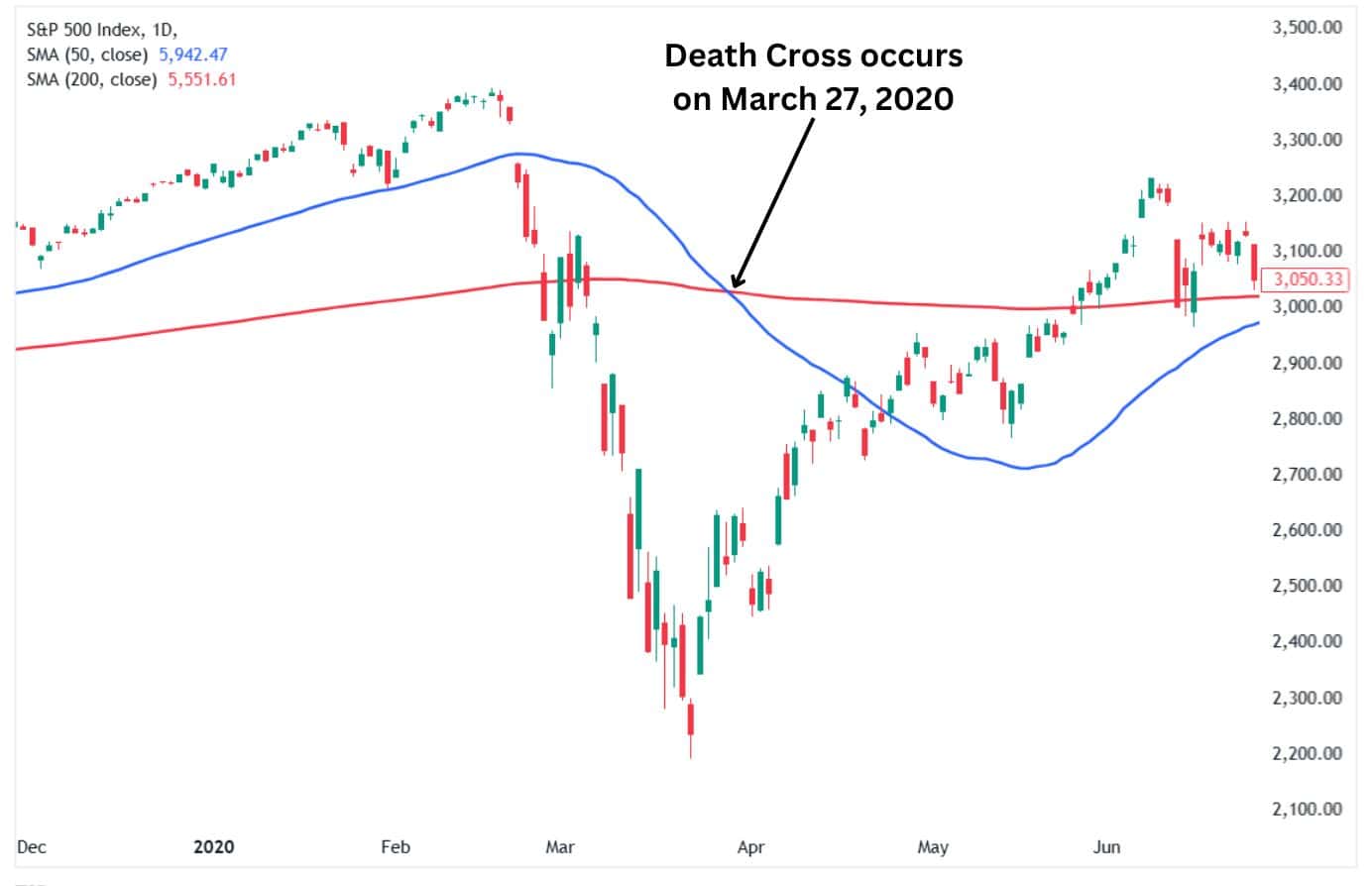
As can be seen from the chart above, the lagging nature of the Death Cross meant that it occurred after the downtrend in the S&P 500 was over. The crossover took place after the uptrend had already begun on March 24, 2020. This means that traders who were relying on the Death Cross as a trade entry signal would have missed the trade. This is one of the reasons why we say that the Death and Golden Crosses are unreliable indicators since they have significant lag.
Cryptocurrency Markets:
Bitcoin experienced a Death Cross in January 2022, when its 50-day moving average dropped below the 200-day moving average. This signalled a cooling-off period after its rapid price surge to new all-time highs, with prices drifting sideways for a while before eventually continuing the downtrend.
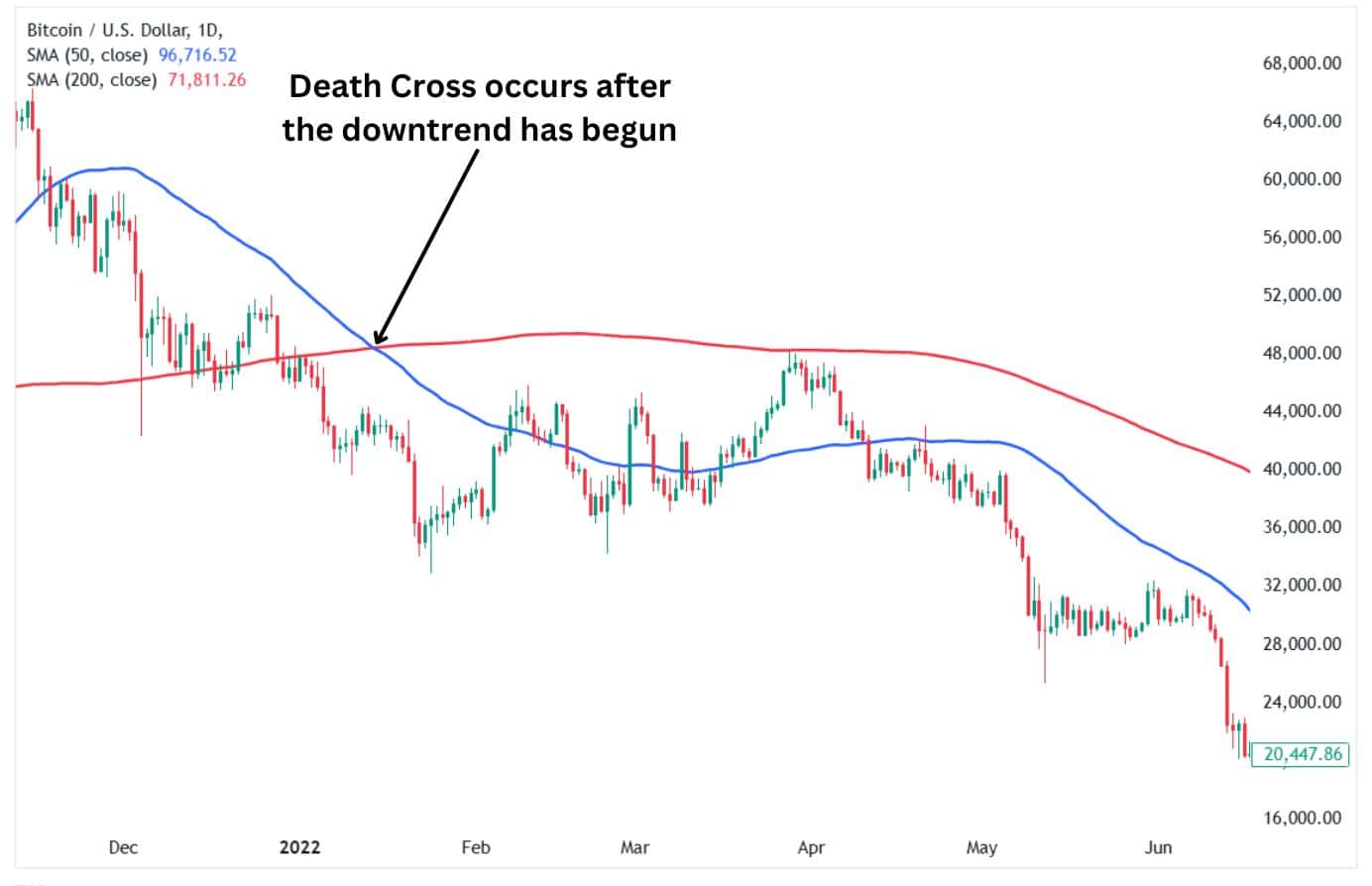
As with the S&P 500 chart above, the Death Cross on the Bitcoin daily chart also occurred after the decline had already begun. The downtrend started shortly after Bitcoin hit its then-all-time highs above $69,000. However, the death cross occurred when the price was at $42,572. This means that traders would have missed out on a significant portion of the move lower.
Sector-Specific Stocks:
Death Crosses can occur during specific downturns in individual sectors like tech or energy, like when oil prices crash or tech stocks face regulation concerns. They often align with larger trends affecting the sector.
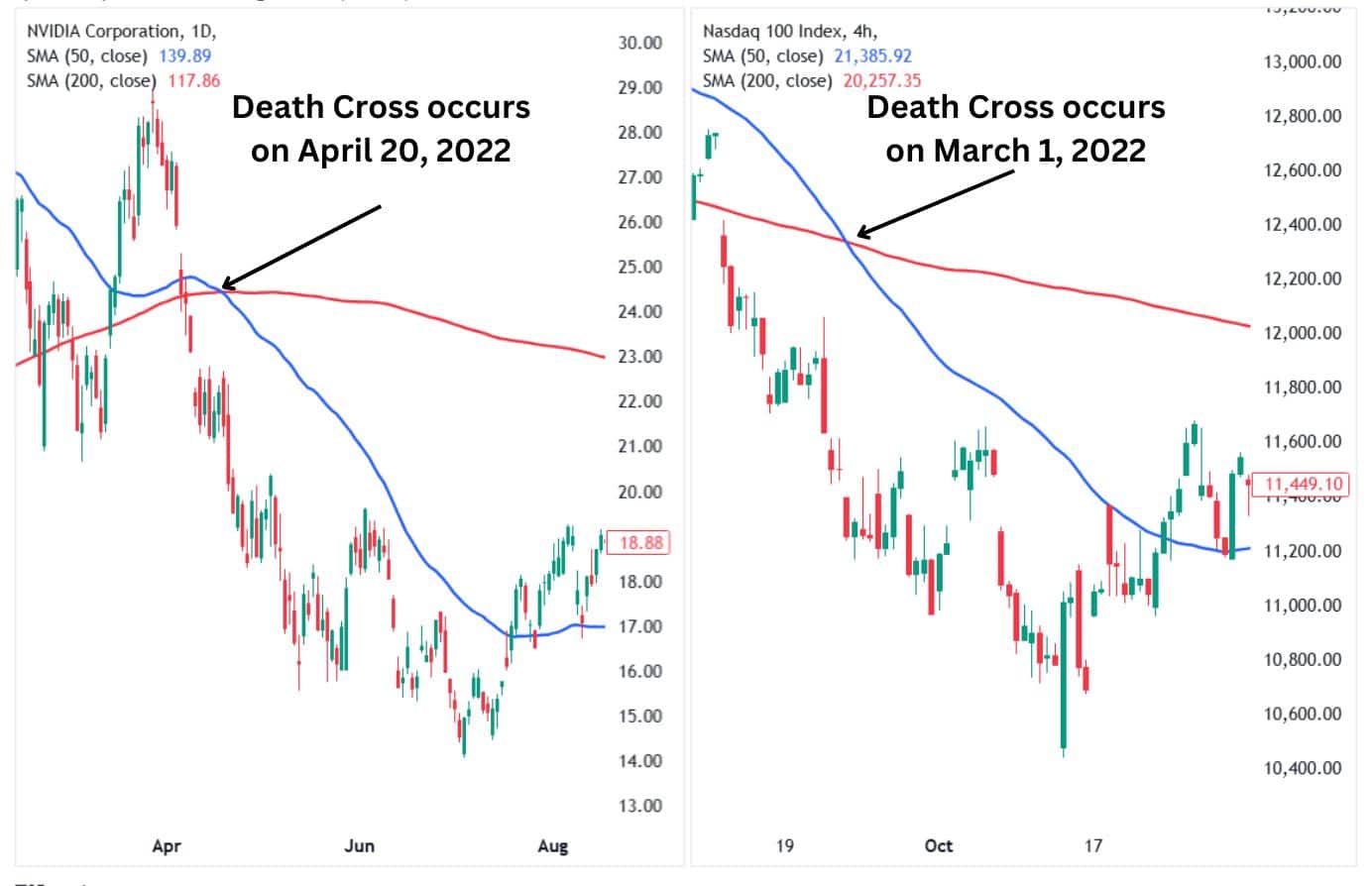
The above chart shows that the Death Cross on the Nasdaq, which tracks the tech sector, occurred on March 1, 2022. This was over a month and a half before the Death Cross on Nvidia happened on April 20, 2022. This shows that the Death Cross on an entire sector can act as a leading indicator or a warning of an upcoming Death Cross on a specific stock within the sector. However, this is just one example and does not represent all situations in different sectors.
Death Cross Trading Strategies
Basic Trend-Following Strategy
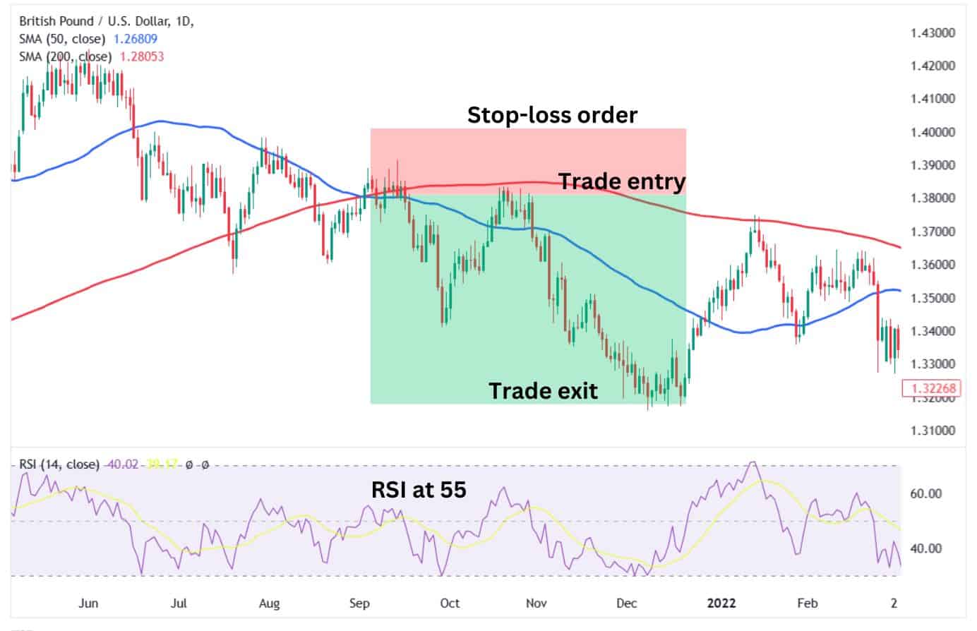
- Entry: Enter a short position when the Death Cross (50-day MA crossing below 200-day MA) forms and the price closes below both moving averages.
- Stop Loss: Place a stop loss above the most recent swing high to protect against sudden reversals.
- Take Profit: Aim for the next significant support level or use a trailing stop to capture more of the downtrend.
- Risk-Reward Ratio: Maintain at least a 1:2 ratio or more, risking a minimum of $1 for every $2 potential profit.
- Supporting Indicators: Use Relative Strength Index (RSI) to confirm the trend is not oversold and ensure volume spikes for momentum validation.
Death Cross Signal with Volume
How It Works:
Volume confirms the strength of the Death Cross signal. Higher trading volume during or after the Death Cross suggests strong bearish momentum.
- Entry: Short-sell when the Death Cross aligns with a noticeable increase in volume and the price breaks below a key support level.
- Stop Loss: Set the stop loss just above the moving averages or the nearest resistance.
- Take Profit: Target the next significant support zone or Fibonacci extension levels for potential exits.
- Risk-Reward Ratio: Stick to a 1:2 ratio or higher for safer trades.
- Supporting Indicators: Add the Chaikin Money Flow (CMF) or On-Balance Volume (OBV) to validate the volume’s role in confirming bearish momentum.
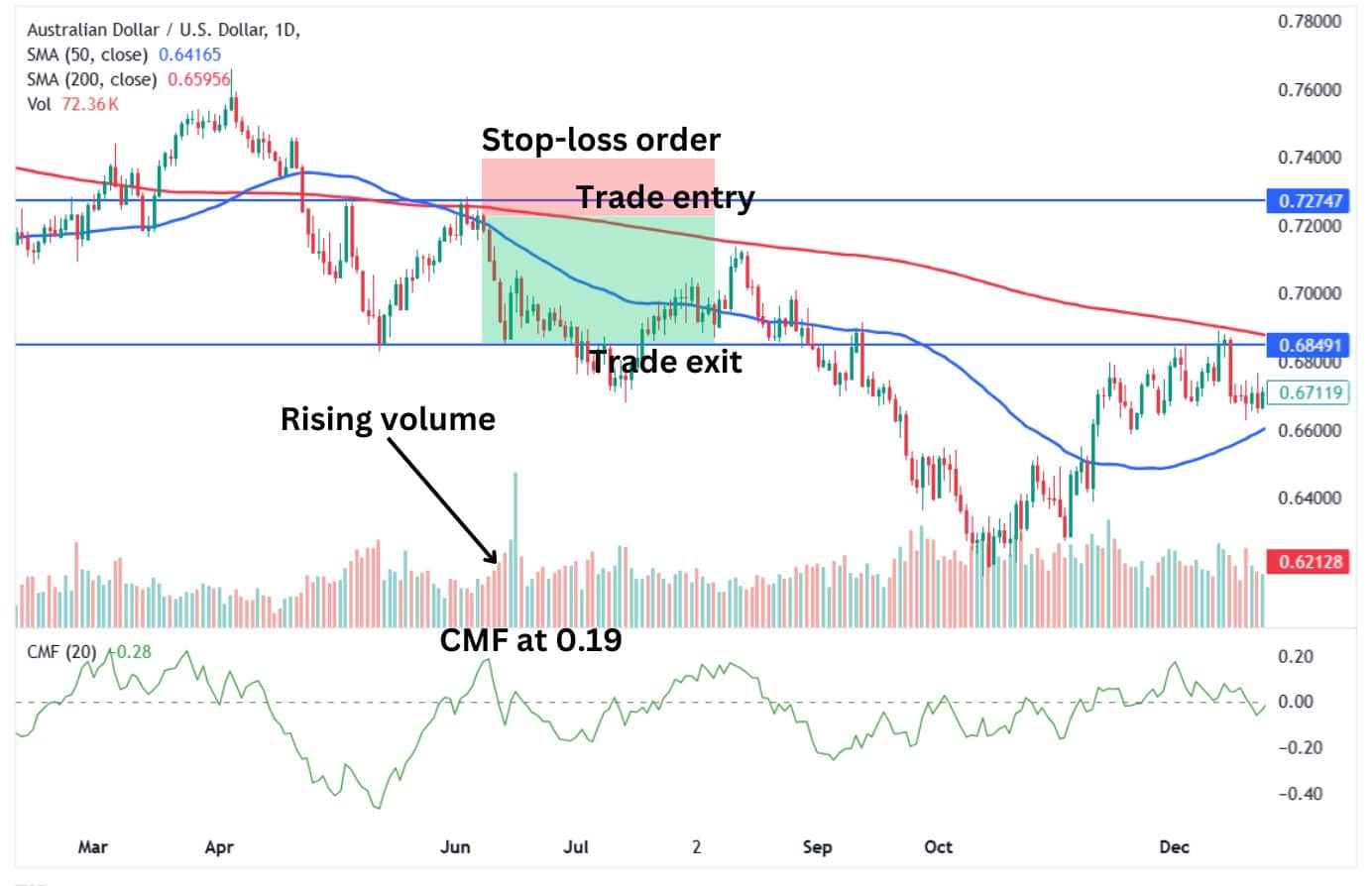
Alt text: Trade setup based on the Death Cross, volume, and CMF.
Death Cross Signal with Moving Average Convergence Divergence (MACD)
How It Works:
The MACD (Moving Average Convergence Divergence) adds depth by confirming momentum and the quality of the trend.
- Entry: Go short when the Death Cross occurs, and the MACD line crosses below the signal line, preferrably in negative territory.
- Stop Loss: Place a stop loss above the moving averages or the MACD’s previous peak to cap losses.
- Take Profit: Exit when the MACD histogram begins to narrow or when the price nears a major support level.
- Risk-Reward Ratio: Aim for a 1:2 or higher ratio, adjusting based on market volatility.
- Supporting Indicators: Combine with Bollinger Bands to assess potential volatility or ATR (Average True Range) to determine optimal stop-loss placement.
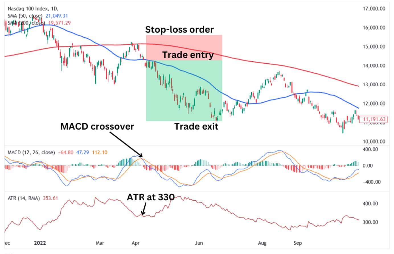
Alt text: Trade setup based on the Death Cross and MACD indicator.
Key Notes Across All Strategies
- Entry Timing: Wait for confirmation, such as a candle closing below the moving averages or a clear breakout from consolidation.
- Avoid Overtrading: Death Cross signals are stronger on higher timeframes (daily or weekly charts) to avoid noise.
- Risk Management: Never risk more than 1-2% of your capital on a single trade.
These approaches can help you leverage the Death Cross effectively while managing risk.
Please mention entry, take profit, stop loss levels, risk reward ratio, and other technical indicators that goes well with it.
Advantages of Trading the Death Cross
- Clear Signal of Trend Reversal
The death cross, which occurs when a short-term moving average crosses below a long-term one, clearly indicates that a market may be transitioning to a downward trend. It’s easy to spot and can help traders prepare for bearish moves. - Timing for Short Positions
This pattern often signals a good opportunity for traders to open short positions or close long ones. It aligns with bearish momentum, giving a structured way to act on falling prices. - Reduced Emotional Trading
Traders avoid making impulsive decisions by relying on the death cross as a mechanical signal. This is a systematic approach to identifying potential market weaknesses. - Confirmation of Bearish Sentiment
The death cross is a widely recognised indicator, often aligning with broader market sentiment. When other traders see the same pattern, it reinforces the bearish outlook, potentially increasing the validity of the signal. - Works Across Timeframes
Whether you’re a day trader or a long-term investor, the Death Cross can be adapted to various timeframes. This versatility makes it a practical tool for different trading styles.
By keeping things simple, the Death Cross offers an accessible way for beginners to identify possible downturns and plan their trades accordingly.
Disadvantages of Trading the Death Cross
The Death Cross signals potential bearish momentum. However, it has its drawbacks:
- Lagging Indicator: The Death Cross forms after the price trend has already shifted downward. By the time it appears, much of the decline might have occurred, leaving less opportunity for profit.
- False Signals: Markets often fluctuate. A temporary dip can trigger a Death Cross, but prices may rebound quickly, causing traders to exit positions prematurely.
- Not Suitable for All Markets: In volatile or sideways markets, the Death Cross can give misleading signals, leading to frequent losses for trend-following traders.
- Limited Standalone Use: Relying solely on the Death Cross ignores other critical factors like volume, market sentiment, or support levels, which can provide a fuller picture of the market’s direction.
- Risk of Overreaction: Many traders treat the Death Cross as a definitive sell signal, which can amplify market panic, causing additional volatility rather than clear trends.
Understanding these limitations helps traders approach this indicator with caution and combine it with other tools for better decision-making.
Death Cross vs. Golden Cross
The Death Cross is the polar opposite of the Golden Cross in technical analysis, but they are both used to identify shifts in market trends using moving averages.
The Death Cross
The Death Cross occurs when the short-term moving average (50-day MA) crosses below the long-term moving average (200-day MA). It usually signals a downward trend and could indicate that markets will continue falling after it appears.
However, it is essential to note that the Death Cross is a lagging indicator and usually occurs after a downtrend has already begun.
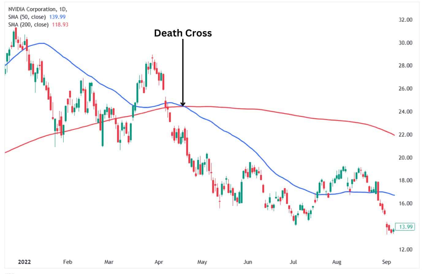
Alt text: Death Cross example on Nvidia’s daily chart.
The Golden Cross
The Golden Cross is the polar opposite of the Death Cross, which features a short-term moving average (50-day MA) crossing above the long-term moving average (200-day MA). The pattern usually indicates the presence of bullish momentum as markets rally higher.
As a lagging technical analysis pattern, it usually appears after a recovery has already begun and the price is moving higher.
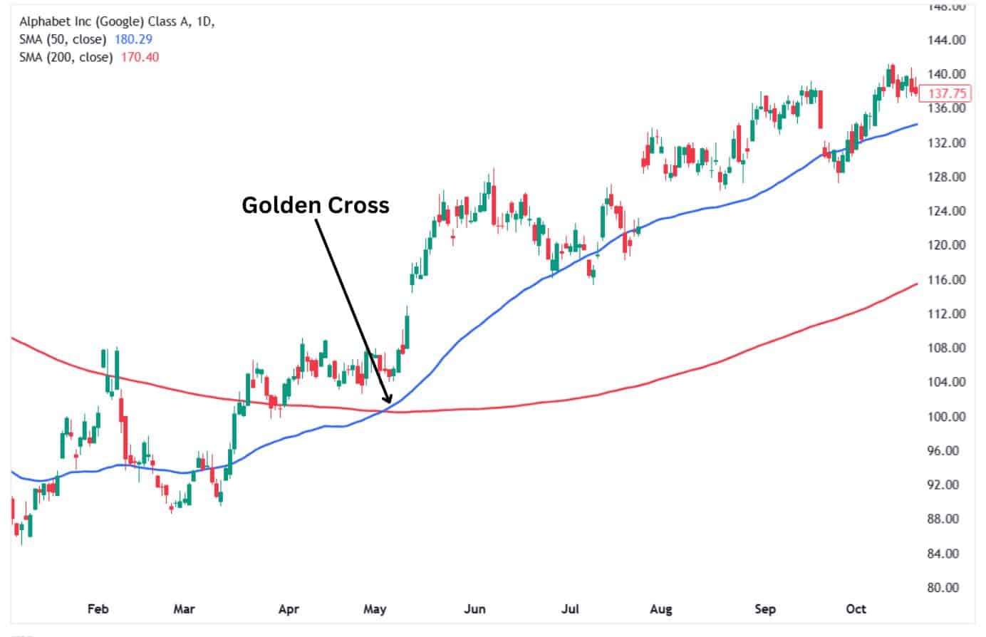
Key Differences Between the Death Cross and Golden Cross
First, the Death Cross usually signals bearish momentum, while the Golden Cross indicates bullish momentum within an asset’s price.
Second, the Death Cross typically reveals pessimistic market sentiment, while the Golden Cross indicates optimistic market sentiment.
The two patterns share one similarity in that they are both lagging indicators and, as such, tend to highlight trends long after they have already begun.
What are the Common Death Cross Mistakes to Watch out for?
Here are common mistakes traders make when using the Death Cross—and how to avoid them:
1. Taking It as a Standalone Signal
- Mistake: Assuming that the Death Cross alone guarantees a downtrend.
- Why It’s a Problem: The market may rebound or consolidate instead of continuing to fall.
- Solution: To confirm, combine the Death Cross with other indicators, such RSI, or support and resistance levels.
2. Ignoring Market Context
- Mistake: Using the Death Cross without considering broader market conditions.
- Why It’s a Problem: In a sideways or volatile market, it may generate false signals.
- Solution: Assess the overall trend and economic backdrop before acting on the signal.
3. Overlooking Timeframe Alignment
- Mistake: Applying the Death Cross on one timeframe without checking others.
- Why It’s a Problem: A bearish signal on the daily chart might contradict trends on weekly or monthly charts.
- Solution: Align signals across multiple timeframes for a clearer picture.
4. Entering Too Late
- Mistake: Acting only after the Death Cross forms, often missing most of the move.
- Why It’s a Problem: The lagging nature of moving averages can result in delayed entries.
- Solution: Watch for early signs of a trend change before the Death Cross confirms it.
5. Overreacting to False Signals
- Mistake: Panicking and selling immediately when a Death Cross appears.
- Why It’s a Problem: Not all crosses lead to prolonged downtrends; some are temporary dips.
- Solution: Be patient and verify with additional indicators or patterns.
Understanding these pitfalls allows traders to use the Death Cross more effectively as part of a well-rounded strategy, rather than as a signal that fits all situations.
FAQ
What is the best time frame to use for the Death Cross?
The daily time frame is the most commonly used for the Death Cross. It offers a wider perspective on trends and is commonly relied upon by traders and analysts. Nonetheless, shorter time intervals such as 4-hour or 1-hour charts might display Death Crosses for intraday trading, although these indicators are generally less dependable and more susceptible to noise.
How reliable is the Death Cross?
The Death Cross can serve as a useful indicator, yet it isn’t infallible. It’s a trailing indicator that verifies a trend only after it has started. Although it has traditionally forecast significant declines, inaccurate signals are frequent in volatile or stagnant markets. To improve its reliability, pair it with other tools like volume analysis, RSI, or MACD.
What happens after a death cross?
After a Death Cross, the market often continues its downtrend, but the intensity varies. In strong bearish markets, prices may fall further. In weaker trends, it can be followed by sideways movement or even a reversal. The market’s behaviour depends on broader conditions and whether the cross coincides with other bearish indicators.
Why are the 50-day and 200-day moving averages important in the Death Cross?
The 50-day moving average demonstrates short-term price changes, while the 200-day reflects long-term patterns. When the faster 50-day crosses below the slower 200-day, it signifies a shift from bullish to bearish sentiment. These two averages are favoured as they maintain a balance between responsiveness to price fluctuations and dependability.
Can a Death Cross occur in both uptrends and downtrends?
Yes, a Death Cross can appear in both scenarios. In a downtrend, it typically confirms bearish momentum. In an uptrend, it may signal a reversal or consolidation phase. Context is key—an uptrend Death Cross might lead to a temporary dip rather than a full-blown trend reversal.
Is the Death Cross indicator a leading or lagging indicator?
The Death Cross is a lagging indicator. It reflects past price movement and confirms trends after they’ve already started. While it can provide valuable insights into market direction, traders should not rely on it alone for predicting future price action. Use it alongside leading indicators for better timing.


